I’ve been using blender on and off for probably five years now but this is the first time i’ve really used blender to do something more personal and imaginative.
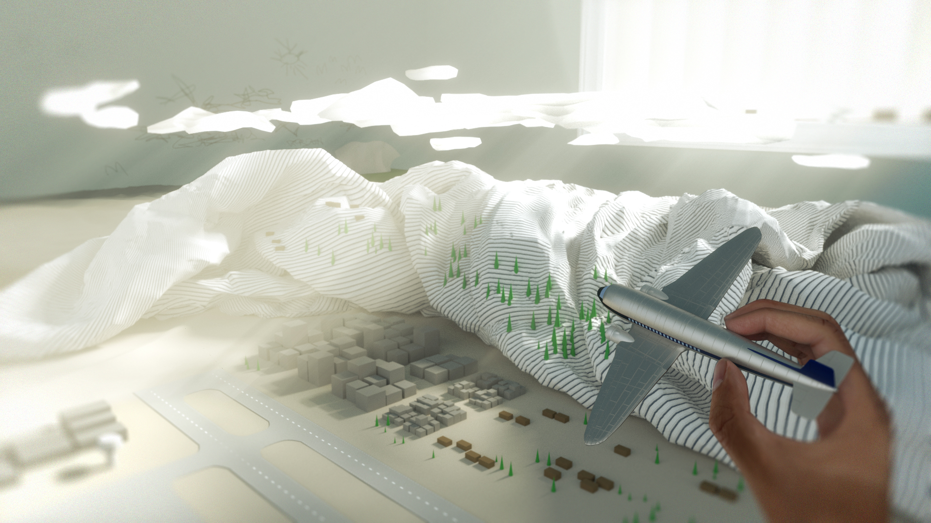
I was trying to go for a low poly ‘abstract’ look on top of realism.
I would love any of your feedback on the concept, composition and the realism of the quilt/doona. I had a lot of trouble trying to get a quilt that looked alright which has meant that my UV mapping was bad.
I really like your idea and what you’ve done here. Great job! The feel I’m getting is a child playing in their bedroom with their toys, but many of the things are in that abstract style. Like the buildings, trees, and hills.
There are a few thing that can be tweaked, the edges of the render seem blurred, I believe there’s a bit too much light coming through the window, not too much but too bright.
I really love this , its beautiful work. What I would do is play with the contrasts a bit more because they image is too bright and loses some of its details.
I liked that blur , what I said, its that the overall image could use a bit more contrast and dynamics. the right side has more than the left side. For example you could make your wall a bit darker and the drawings on the way as well so it pops out of the clouds in front. Though clouds could use a bit more detail to stand out. I like their low poly look , but I do think a bit more detail with similar look would improver the overall contrast. But overall I think the image is very nice.
this piece is a fantastic idea, and you’re off to a great start. my advice would be on composition. to pick up on what kilon mentioned already, I’d say it needs two things: more value range, and better balance. right now, your darkest dark is the blue on the airplane, and it’s about 80% darkness. bring in some 90% dark somewhere, and lots more 60% and 70% darks. also as noted above, all the sharper detail is one the right, with little on the left to balance it out. if this were my piece, i’d experiment with one thing first: try making the wall in the upper left corner the same color as the blue on the model airplane. it would be bold and stong, so it would be a gutsy change, but i’d be curious to see how it works. might also make the clouds slightly more blurry to emphasize that they are imaginary. last finishing touch would be looking at the color scheme. right now you’ve got blue and green, which is an analogous color scheme. either complete it by throwing in a yellow-green or blue-violet (not both) or contrast it by tossing in the complement red-orange (like, one of the imaginary building clusters).
in any event, great work, and I’ll be curious to see where you go with it!
I agree with the previous users that the postprocessing is the way for further improvements, but I would like to rate your work high for general, non-trivial concept and details. From my “field” - the airplane model (of a plastic or forged model) is very convincing. Good work!