Mats:
That’s definitely not ‘old stuff to me’! I was using a completely different method, with results not as good as this at all. I’ll have to try your technique (are you going to submit it to the tutorials section?)
Thanks:)
Mats:
That’s definitely not ‘old stuff to me’! I was using a completely different method, with results not as good as this at all. I’ll have to try your technique (are you going to submit it to the tutorials section?)
Thanks:)
I love this model, I love rennaissance,
I don’t like to go to church trought…
I can’t wait for update!!!
It looks great-but not sure about renaissance!
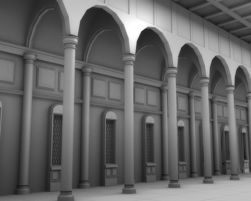
For me it doesn’t matter. However if you were specifically trying to do renaissance then you’re not quite there. The main thing is the very long narrow pillars. They are far more gothic which is a slightly earlier period(think cathedrals for example),
For renaissance you really need thicker pillars and for a church it is more likely to be based on the shape of a Greek cross than the long narrow structure you have.
I may even have a crack at this myself to show you what I mean!
whoops-didn’t notice that you had a deadline!
You’ve got a bit of mismatch of styles here at the moment-which you could probably pass off as ‘renaissance’ providing no one is being too picky-so don’t worry!
Cool, I wasn’t even sure if I should post it at all. To be honest, I can’t say I even knew there was a tutorial section (I’m using Google Reader, and get all BAF posts in one big pile). Maybe I should give it a try. Feel free to use it anyway (all images are under CC-BY 2.0 at flickr (link)).
/ Mats
Exile: Thanks!
richy76: Thanks for your reply. The deadline is pretty far off really (end of January), but I really want to do this to the best of my ability. So I really do want to make it as renaissance as possible… and yes it will be shaped like a cross, but I just haven’t got to that part yet 
Mats Halldin: Well, I think you should post it there. I never would have though of doing it your way ( I would have started with a circle, deleted the bottom half of it, copied and rotated it 90 degrees 4 times, and then tried to fill in the faces from there. If I explained that well enough, you’ll probably see that that shape would require a lot more tweaking to make it look decent.)
http://intranet.arc.miami.edu/rjohn/images/New_Folder/St%20Peter%20plan.jpg
Thinking about how I’d go about this myself, the above is a link to Bramante’s original plan for St Peter’s in Rome. Note the Greek cross design rather than the ‘traditional’ medieval layout which you seem to be utilizing.
I am considering drawing this out on a flat plane then extruding upwards to get the basic structure. Note the thickness of the supporting pillars which are necessary in order to support the central dome. Obviously some elevation drawings would be useful!
richy76 :Well, I’ve already planned a lot of the main design, so if my research is correct, a traditional cross would also classify… So I’ll stick with that I think. But thank you for the plan image, it could still be useful to me.
Now, update:
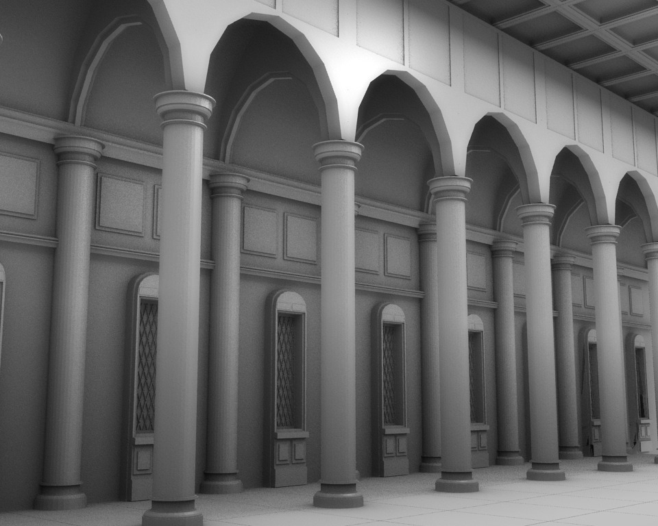
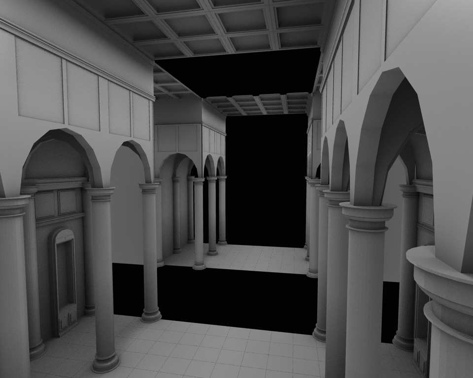
This is what it looks like with both sides of the curch (mirrored, basically) and at the right length for the ‘bottom’ part of the ‘t’. For some reason it appears to me that there are too many windows and pillars, or that they are too close together. Hmm.
Might just be the angle at which you took the picture.
It looks right ot me… I agree with Borgleader, probably just angle of camera.
Blenditall,
I think the reason the columns look numerous is they are to long and slender. In the Basilica of San Lorenzo you can see Brunelleschi have placed sort of cubes atop of the capitals. If you use this trick your columns should appear more reasonable in length. However, in your previous update you used a different angle and there the columns appeared as much shorter. If there is an easy way of doing it, I really suggest you try to pull everything between the arches and the middle of the windows down some small amount. This will also create more space above the arches, which you will be able to use to throw in the edges running along them in San Lorenzo.
Hope I managed to make myself clear
/ Mats
Nice progress. One thing I noticed that might be throwing things off a little bit is the scale of your floor tiles. Scale them down and see what affect that has on the perspective of your columns.
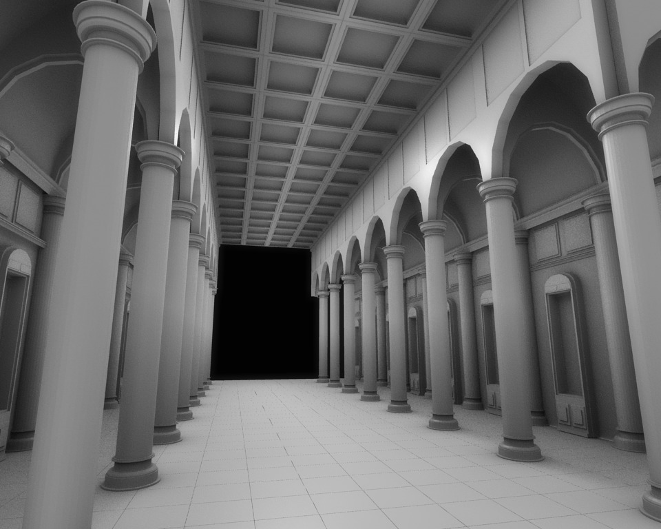
Thanks everyone for the replies. All of the above is probably true, but just for comparison, I’ve reduced the amount of ‘units’ by half:
Now I wonder how it would look of I thickened the pillars here…
Let me know if I’m losing my mind and should go back to the previuos version;).
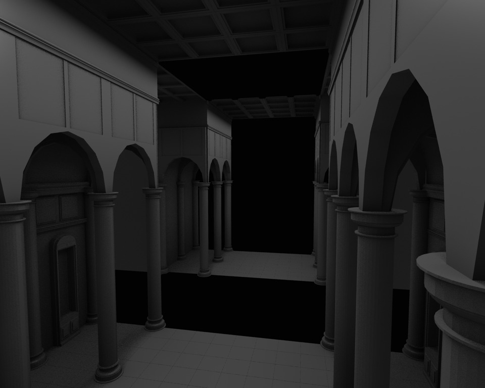
Here’s what that it looks like with thicker pillars. I’m thinking this is probably better than before… but I just got a few books on renaissance architecture from the library so I’ll do some reading…
More tweaks:
-Further adjusted pillars
-Resized tiles
-Resized and revised windows
I’m thinking of moving on to the next section now.
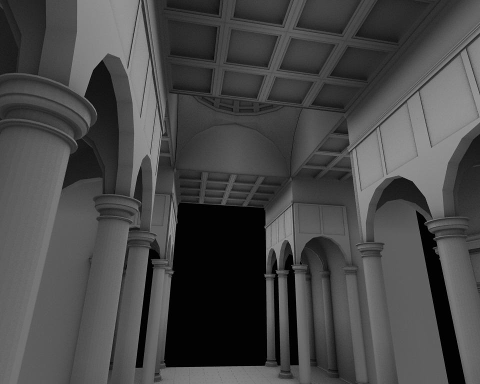
A quite large update:
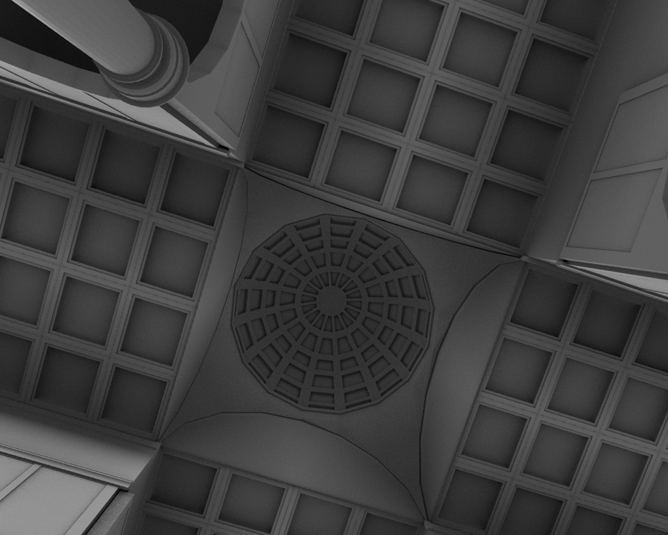
Now the basics of the main structure are done, and I’ll be attempting the dome next.
Edit, a brighter render.
You work quickly, great result.
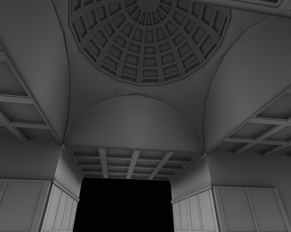
Just a small opinion: The coffered ceiling don’t look convincing ending abruptly like that. (Referring to the San Lorenzo Basilica again), in renaissance architecture the pendentives normally reaches down the the height of the column capitals of the nave and the transepts. So, I suggest you move the arches under the dome down together with the dome.
/ Mats
Maybe I’m misunderstanding what you’re suggesting I should do, because moving the dome/arches down looks incredibly stupid…but I agree about the coffered ceiling’s abrupt end… hm…
I’ll post a quick render later on today.
Great work. Some comments:
If you’re looking to model a truly accurate version of the period, you’ll want to make sure you follow the rules of the Vitruvian Orders. Here’s the wiki link.
In addition to San Lorenzo, you could use Santo Spiritoin Florence as a reference as well. Note the crossing detail: because of the added weight of the dome, the columns become engaged to square pillars. That solves the problem of how the coffers end (an arch) and the thin-looking corner at the archway, like Mats noted. Some other things to notice: Brunelleschi used a the same cute trick here to extend the height of his columns by placing an entablature on top of the capital and then springing the arch from that. Above the arches is a cornice, which I think would be a good thing to add. Also, any thought to adding windows into the nave?
