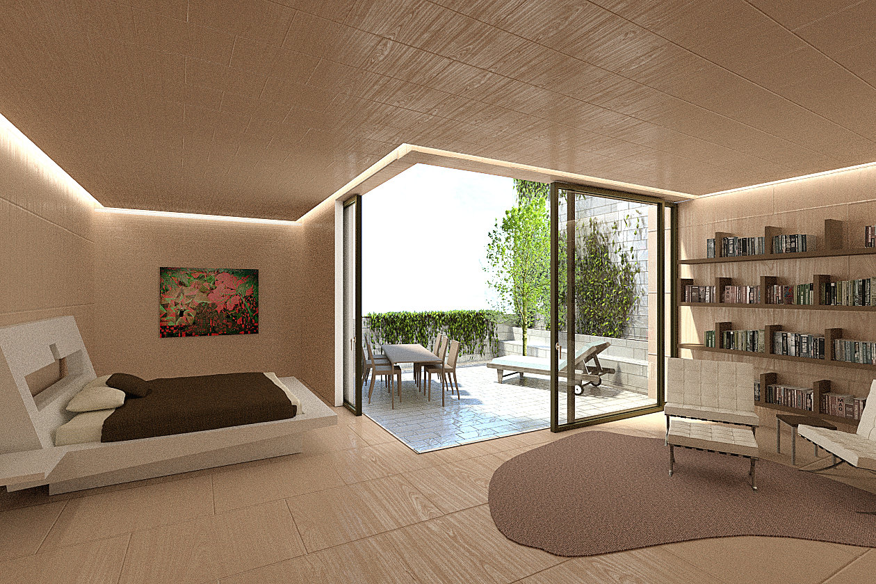
These are some renderings I did at my job, where I am very happy to be bringing blender in. What this means as many of you know is that there isn’t always complete freedom. For example, slight depth of field that would make the images pop a bit more was removed.
for the first image, didn’t get enough time to drop in a good background image. There is one with a background, but it doesn’t look so good, so I prefer to show this one.
I think to make this scene more realistic you should focus on some of your textures. I think that your Furniture placement is good, but maybe you should work on some modeling. (but this is me being overly critical) In your first image you should refrain from using the same texture all over.
But it looks really good and I will be following your other work.
I think they look really good! I imagine your boss wanted a clean looking image, but as you say a bit more of contrast between the foreground of the image and the background would help. You could have “burn” more the background as in real interior photography it usually happens that way.
One quick trick I usually do is to make the light areas warm and the shadow ones cold. The other way around also works, but if you leave the tones of your image untouched, they usually look plain.
I have taken the liberty to do a quick mock-up of the first image to explain a bit further. I know it doesn’t looks amazing as I have burn it too much, but bear in mind I have used 5 minutes to retouch it.
I just made the mid tones warm and the shadow tones bluish with a color balance adjustment, painted some “dodge” light in the windows, painted some shadows as a vignette with the round brush in a normal layer, applied a selective color layer affecting only the neutrals and used some curves to give a bit more contrast.
The second image needs more samples and the wooden texture tiling is too repetitive.
If you put someone in the scene (a girl sitting on the bed, for example) you will also give a better sense of scale.
Thanks all for the comments and I agree with all of them.
Carles, thanks for all the tips for the tone adjustment. Beyond these tips, I imagine a good background will work well, which I shall post later.
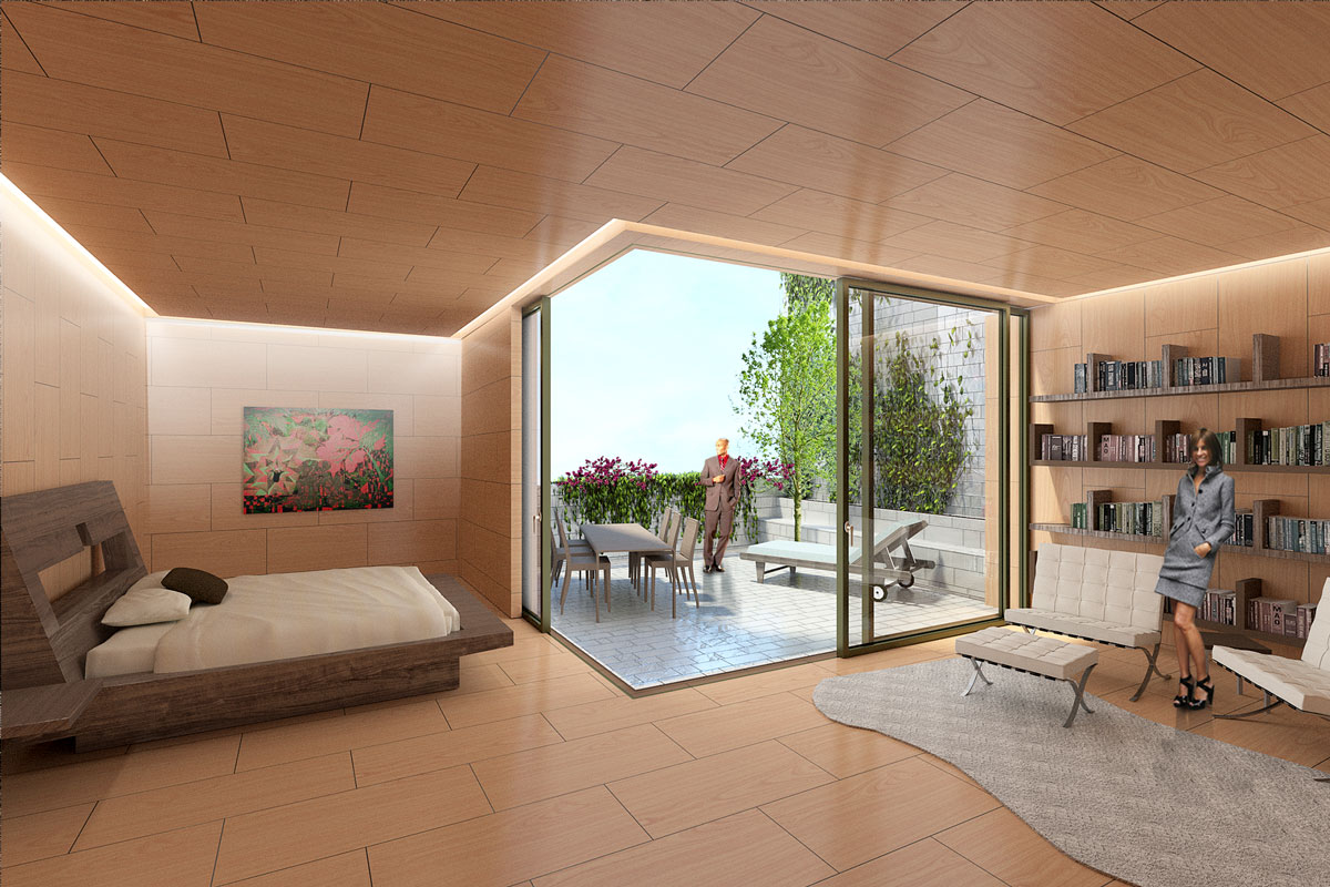
The repetitive same tiled texture on all interior surface was a requirement for this image with tiles that are the size shown. I wouldn’t do my bedroom like this, and you probably wouldn’t either, but that was part of the brief. The actual final image of the bedroom is this:
I did spend quite a bit of time making the wood panel texture. Really keen what you guys think of it.
The one material I had the hardes time with is the golden coloured window framing. I am not quite satisfied with, since in doesn’t have the texutring or the depth to look like a metal coloured frame. Any suggestions?