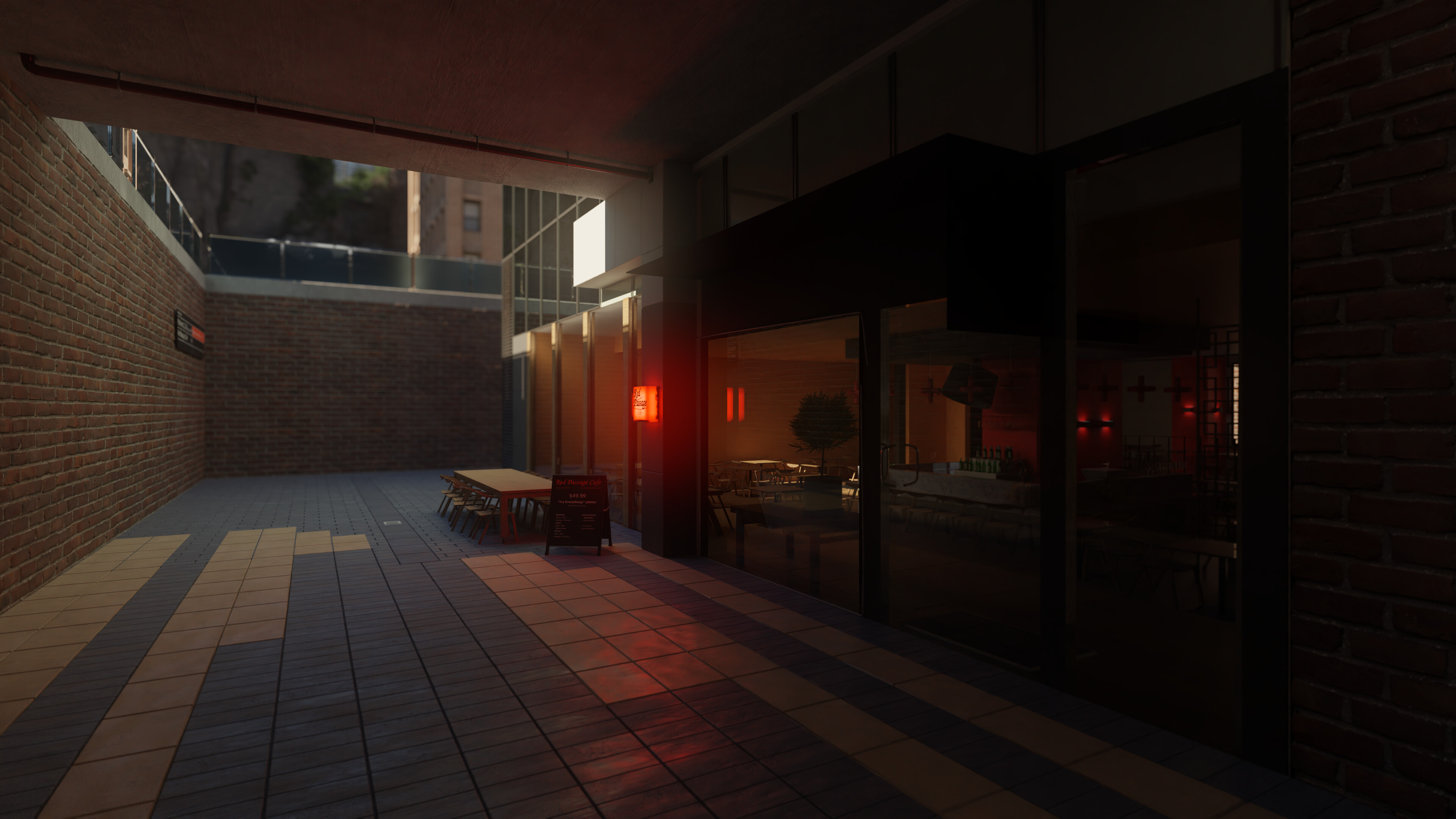
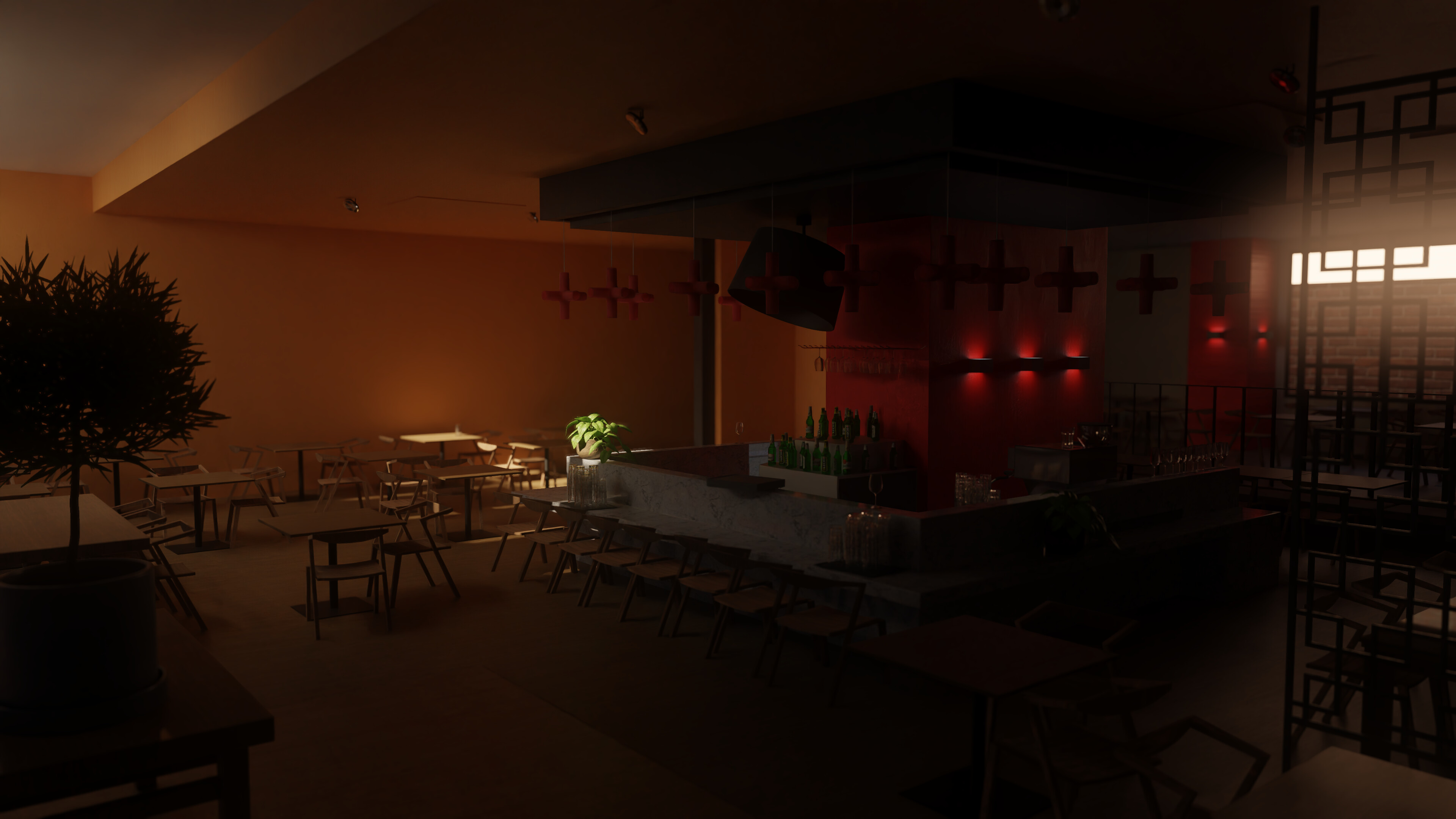
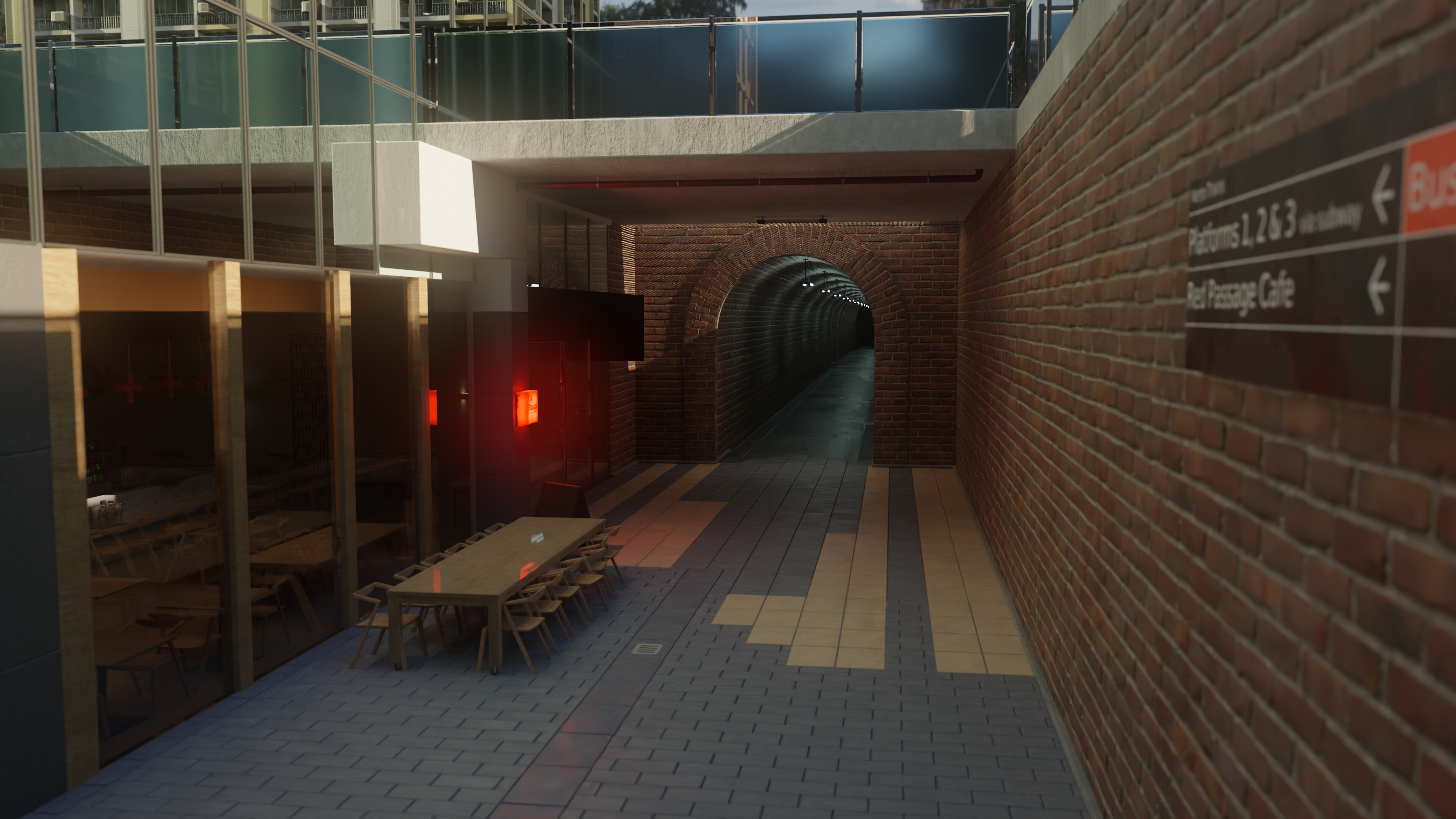
I was hoping to get some feedback on a small environment I thought would be fun to make, and also (if it’s not too far off topic) get a reality check on how far my skills are from being marketable yet haha. Here are three shots that cover the majority of it:
It’s supposed to be a restaurant/cafe thing that sits at the entrance to an underground subway.
Honestly I’m pretty happy with it, but that’s precisely the problem haha - I think it’s more complacency than really believing it’s finished. Does anything stick out as odd to anyone here? Is there any way I could improve it, and the final images? I’m not really aiming for photo-realism (it’s a bit smoother than real life I guess), but even with that in mind, any ideas how I could make it, for lack of a more specific word, better?
If it’s not too much trouble, to anyone out there doing paid work modelling environments:
Do you think this level of work is good enough to get paid for?
It took about a week and a half…is that too much? Normal?
Most textures from AmbientCG and PolyHaven - thanks!.
Also I used a few assets from Blend Swap ( I got lazy towards the end haha…), I really appreciate these!:
Blend #83379: Decorative Plant in a pot by MZiemys
Blend #84195: Indoor Plant In A Pot by MZiemys
Blend #60265: IKEA Glass by Michal David
Blend #73879: Table Glasses by tombombspot
Blend #71632: Drink Bar assets v.2 by b2przemo (it’s behind the red divider thingy haha)
Blend #28283: Prop Buildings by ShalmonAnandas
Inside: some pictures on the wall?
Outside: potted plants, dirt lots of dirt, thrown away bubble gums, leaves, advertising paper posters, spray tags (i was here) … okay no… you don’t wana go realistic
@Okidoki
I started wondering if the interior wall was a bit empty, pictures are a good idea! And yeah adding some potted plants outside along with leaves and rubbish sounds good (I imagine they would easily get swept by wind down into such an area and get caught) - I think I also need to add some more grates along the wall, I suspect flooding might be an issue currently haha. While I’m not aiming for photo-realism, these sorts of details should help make it feel a bit fuller, thanks!
@dogdayfear
Yeah I suppose I started aiming for a closed up feel, with mostly bounce light illuminating the interior (and some small lights left on overnight as I see a lot of places do). You’ve made me realise that the current setup doesn’t quite make sense though - while perhaps the interior is plausible as is, the outside area should be visibly packed up in some way, which’ll hopefully communicate it better. I’ll try and work on this, thanks!
I’ll try to have an updated version posted next week, thanks for your help!
The interior and texture stuff was summed up above.
What I noticed is the outsode scaling. The outside chairs and tables seem to be a bit small, while the brick wall too tall, almost a bit frightening
If you measure it to the scale of the glass wall above, it is more apparent. People should be able to lean on it with their forearms, right? Compared to that, the tunnel feels a bit tall, and the mentioned furniture small.
If you want to keep the wall height, consider some tags as mentioned. Maybe some plants like ivy?
Apart from this, it is overall nice work, keep it up!
Cheers!