Hey guys,
I finished this last week… it was just a small project to train myself with a moi3D,Blender,Substance Painter workflow. And it works veryyy well ! From that i should be able to do many things !
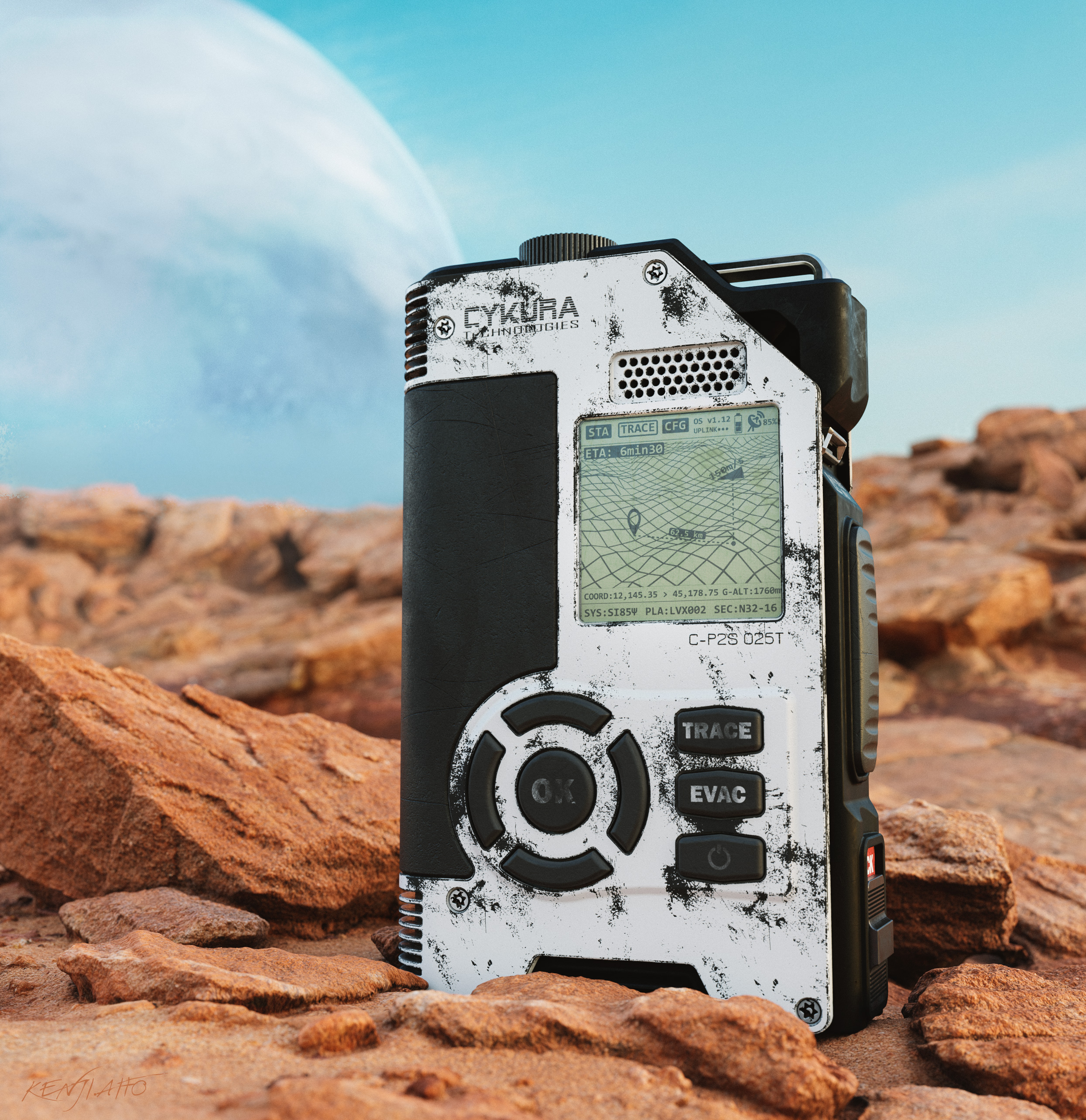
Anyway, simple old design stuff… i wanted to make on of those LCD screens. (home made texture in Photoshop/Illustrator) . Rendered in EEVEE. The planet is an a 3D object, not a part of the background. The rocks are scanned assets (yeah well sometimes it’s nice to use some).
Since here we are talking about BLENDER : i can tell you that in total, i only had to mark 10 edges as seams. This is because i used the automatic unwrapping function of Blender (Smart UV Project). If tuned right, the result can be very nice… It really shines with hard surface objects actually. For more curvy objects it’s not that easy and might put some seams where you don’t want them. But other than that, it’s wonderful…
Then, i used Blender triangulate modifier before exporting to Substance Painter. There, triangles won’t be a problem (as long as there is nothing weird) and baking was clean.
Hey @aito_kenji, nice work here. I can feel sci-fi vibe here.
If you’ll excuse me to give you some critique. I think it’s better if you blur the background, so the eyes of viewer is gonna focus on the deive. And make the sky more red and less blue, so the color is more or less close to color of the rock. It’s gonna create a contrast between the device and another area of the picture. it’s gonna make the device pop out even more. I also included the kind of sky that i mean so you can see it as reference.
Hey Jaki. Thank you , i always appreciate critiques ! and yes… i guess it’s true, indeed. I just tried to make some color change in Photoshop quickly and yes, it works better for the contrast between the subject and the background.
Though, honestly, because those rocks already looked so much like Mars… i did not wanted to make something like this for the sky… But yes, my sky is very (too) saturated…
I often hear a lot of comments about focus and i think it’s a very hard point in composition…
How not to make it “too obvious” but not to make it too weak… ?! how to know the balance… are we all seeing the same way ? in 2 seconds, or 5 ? or 10 ? etc etc.
Yeah, i’d like to learn stuff about painting and composition and all… aaaaah…
Honestly on Artstation most of people, when they do prop, they don’t really bother with environment… i think i was… happy with those red rocks haha
It’s almost impossible to make picture that’s gonna pleases everybody. But it’s much easier to create picture that pleases most of people. Just do the rule of average. I recommend a book called Picture This by Molly Bang. She focuses on the basic of composition in this book. She’s gonna teach you how to not make it too weak or too obvious.
It’s much better, maybe you could half the saturation for the sky. The color variation between rocks and sky is quite similar. It makes the picture kind of boring.
Hey Jaki… amazing… just before you sent your message i was telling someone else i was looking for some literature about composition and the “average” you mentioned… when i tried on Amazon i got lost. so , your recommendation is gold ! thank you !