Rgb

Just some boring planet renders that have come out quite good, i needed a new desktop, so these are my choices now.

http://img264.imageshack.us/img264/722/redplanetot2.jpg
http://img49.imageshack.us/img49/1152/planetpu5.jpg
http://img441.imageshack.us/img441/9531/bluepanettk9.jpg

So which do you think is best? Personally i think the blue isn’t as good as the other two.

If you’re interested i’ve uploaded the blend for the red planet, its 44Mb, all of which bar 300kb are my carefully-ish prepaired texture files, it may be of interest that i didn’t use any OSA filtering (apart from blue) and that they havent had post pro after blender aswell.

http://www.mediafire.com/?0o5rji1pmzb

Man i love this! they are all good but the best one i think is the red one, then the blue one and then the brown. the red and blue is more striking cuz the colors are stronger then the brown.

Il ike the background from first pic (the red one) and planet from secon one.

The first planet has a little texture flaw, there is clearly visible pole of sphere mapping.

First of all, dang these pix are massive, it took a few minutes for them to load and Ive got dsl…

I thiink I like the green one best, the cloud layer is nice, I like how it casts shadows on the ground.

Dude… I love all of these… to tell you the truth I wasn’t expecting these to be this nice. Incredibly detailed (No OSA… .I was wondering how you got those clouds so sharp). Did you make the textures yourself?

i like in the second how the planet texture is rly good. you can see past the clouds and see the distance from the clouds to the ground. i wish i knew how to do that =)

to have the best mix i would say the blue ones backdrop and the brown planet… sweet work by the way! :smiley:

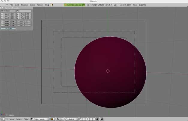
l.lundstrom, thanks, the brown one was my first and was intended to be the “realistic” one, i was also tinkering with the node setup and there’s a tiny bit of AA which i couldn’t hide. I used a little feature called ambient lighting for the other two, where you can add an overall colour to what ever degree you want, it really turns up the saturation aswell.

Myn.pheos, cheers, that error was sort of deliberate, i was having trouble getting rid of it or even just hiding it so i thought it would make a nice crater impact or volcano. I think that the red background is slightly over done IMO, with the pink bits especially, but i wanted three diferent styles.

free_ality, sorry, i always forget to compress them down from 100% jpeg. The green one has my personal favorite nasa photgraph find, the cloud shadows add a little something that the others don’t quite have.

blenditall, thankyou very much, the blend file is there for you to pick at if you desire to know how i made them

killking7, thanks, like i said, the green planet has my personal favortie texture, the cloud to ground depth was a happy accident

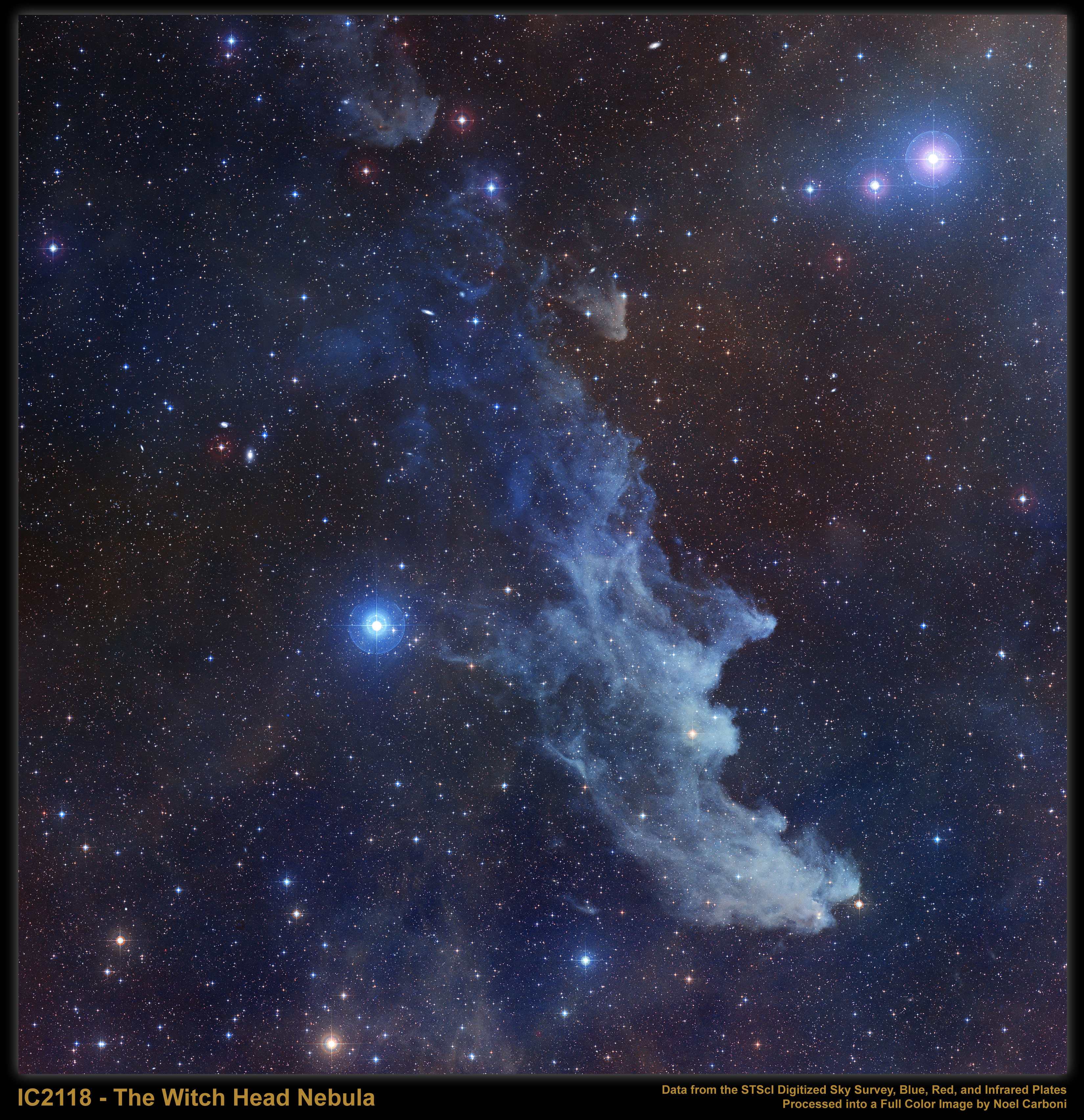
iliketosayblah, thanks, i tried that originally but it just didn’t feel right, and that blue background had the most extensive work, it originally looked like this:http://antwrp.gsfc.nasa.gov/apod/image/0612/ic2118_dss_big.jpg

I’ve been talking to a freind of mine on I.M. and we agreed to call the red one; Thunder C***, the green one; Kernow, and the blue one; Laceti.

This is what the ultra-complex 44mb blendfile looks like:


Ha, that was hilarious. Though a bit disappointing.

The texturing and the materials were the hard work, and check the nodes aswell. Lol if you thought the scene was ultra complex, sorry.

Textures are really great! Will check node setup as soon as I download! Great looking pics!

You take me too seriously. I did check out all the textures and nodes (very clever, blurring the planet for the atmosphere. Creates appropriate glow.) I just thought it was funny that the first thing you see is – a sphere.