Hey there!
Two weeks ago I started with this project, inspired by all the robot stuff postet lately
Because I’m actually pretty new to Blender I’d really appreciate some honest and objective critics!
Now tell me what you think, be honest and even harsh if it is needed, I’m ready to take it :evilgrin:
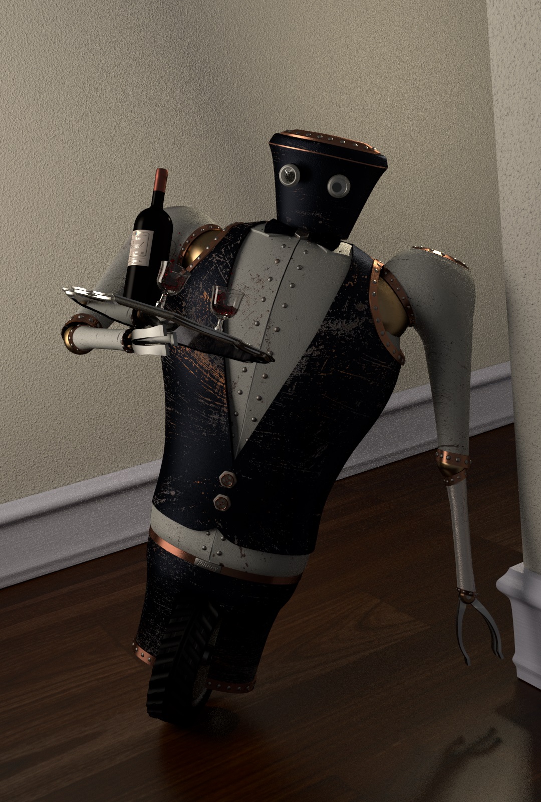
Make faster harder turn, put one finger on the the floor (just like skaters, feel the ice), add motionblur to wheel, lower light on wall, add light on robo, lift tray hand higher, floorpanes (as usuall) is to big, add wine in glasses, let him have contoll over glass and bottle. Thats my suggestions. The rest is great!
Thank you all for the feedbacks!
It’s true the scaling of the hallway is a bit off, i have to change that!
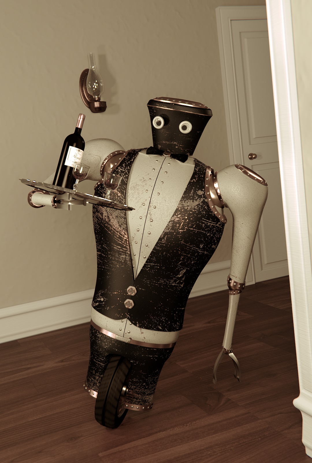
Here is an attempt according to the comment of ola.oxelhag, I just learned how to use motion blur in Blender and it looks great I think, thanks for that the faster turn looks good too but yeah it’s a butler so I’m probably gonna change that back…
I’ll play around with the camara angle and lighting, update guaranteed
The texturing is great, the lighting is much better than it was before, and the overall concept is cute and engaging. Your use of scratches in his finish gives him way more character than just about anything else you could do with that model. I also like the ‘leg of lamb’ looking ‘sleeves’ he’s got. Reminiscent of an older time-period.
Only thing up, for me, is the scale - against the baseboard/wainscoting and the size of the floor planks (which match fine), he looks like he might be transporting airplane-sized booze and is himself quite tiny.
The other thing that catches my eye just the slightest bit is the angle of the tray and his hand - it looks very precarious, and like nothing more than the briefest spot of centrifugal force is holding that wine and those glasses down. Maybe just tilting it level would work?
I already changed the sizes a bit, but I’ll make the hallway a little bit wider and adjust the tray to make the turn saver ;)… the material on the walls will be changed too, simply because it doesn’t match in the victorian architecture style… I think it would help to add another object like a door to give the eye a size reference, because those victorian baseboards are really big and that probably fools the eye… or what do you think?
Coming along nicely. I like the blur on the tire. Maybe there should be some blur on the robot as well. Another thing about the tire, I think the shape of the tire is off. I think it should be more rounded like the tire in this image: http://cdn.slashgear.com/wp-content/uploads/2010/02/honda3rc-1-sg.jpg
Update!!
The proportions are much better now I think, but maybe my eyes are fooling me again?!
I’m still not convinced by the lighting the corner on the right side is too bright compared to the rest… but I’m pretty happy what came out until now and this is mostly because of your comments and advices! I really appreciate it, thanks alot!!
I know, but to avoid scratches in this expensive floor I don’ allow him to do this anymore
Today I’ve just got the book “Light for Visual artists” and I hope it will improve my lighting skills =) I’ll update asap…
Thanks tahnk
About the scratches: I agree with you on the legs, thats why I already made I change even before your post^^
I’ll give it a shot on the vest as well, but I don’t want to lose this used look because this is what gives him the character I think… every scratch tells a story
Btw: a little update, completely new lighting (still needs improvement, gonna try some AO) and some minor changes… and i figured out what the clamp setting in cycles is for… not even half the samples and still less noisy

 the faster turn looks good too but yeah it’s a butler so I’m probably gonna change that back…


