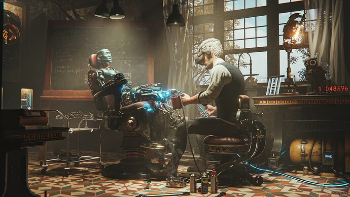
Good work. Something looks off about the mans posing tho.
Thanks man and ou, will work on it.
Amazing work!
Thank you man!

Great work, congrats.
Looks great. Thank you very much for sharing…
Great work!
I think it’s caused by the thigh muscles not falling naturally - like, they should be hanging at the back the thigh instead of arched like that.
Maybe.
Beautiful 
Very nice work. Great.
Impressive work!
Very nice.
I don’t know if it just me but I always find numbers or writing very distracting. What do the red numbers mean? I keep trying to make a date out of it.
Is this rendered with Cycles?
WD-40, this man knows what’s good for you.
Nice work 
I featured you on BlenderNation, have a great weekend!
I’m liking it, too here! 
I guess it’s inspired by this painting by Cedric Peyravernay https://www.artstation.com/artwork/4Xzzn
Really nice work! I like the way you light the scene.
Looks like a huge scene to pull off!
