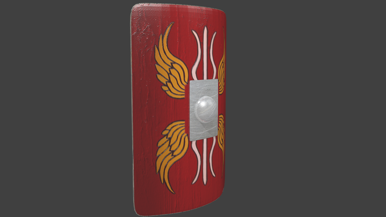
I’m in the process of making a Roman Scutum (shield, used by a legionary unit) and a Gladius (sword, used by all roman infantry) currently, I have completed the shield, and I’m working on the sword.
I’m in the process of texturing the gladius now, and the sword and shield will eventually be in a scene in which the shield, gladius, and maybe some Pila (Roman javelin, used at close to medium range) will be leaning against a large roman stone wall.
Any feedback would be appreciated
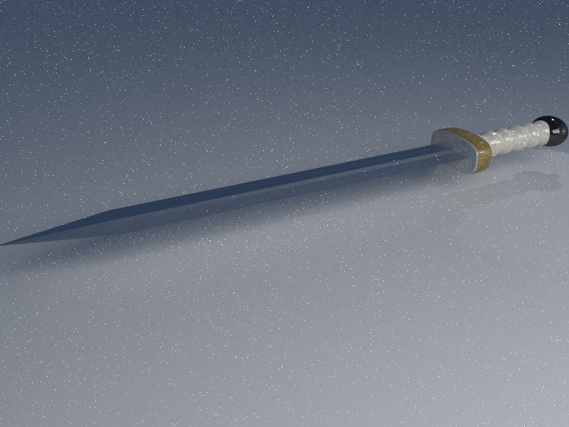
Also, could anybody tell me how to achieve the best, shiny ‘steel-ish’ texture/material for the blade? and is there any way I could achieve a good bloom effect, if so, any help would be greatly appreciated!
Thanks in advance for any feedback. Most recent updates!
Here is the first render of the textured Gladius, has normal maps but they aren’t very noticeable, I think I might just completely redo the texturing and materials all in cycles as I’m really not satisfied with the way it turned out, any advice?
These are looking good! The painted sections in particular. I think you need to up the gloss on the metal parts, but without anything to reflect its hard to tell. I find it best to use a plane for a floor and an HDR image when testing materials rather than a blank world. The grunge on the top left of the shield is great, is that a separate image?
The shield and paint is just a painted wood texture that I colored red on photoshop and added a roman design to, then I just generated a normal map and mapped them both to the model, and that was the result! I think the shield turned out the best, but I’m really not satisfied with the sword, especially the blade, I ended up joining all of the different components of the sword into one mesh so now I can’t modify the blade on it’s own, is there any way I can separate them into different meshes again?
Also, I have no HDR skyboxes I can’t find any free ones and I’m broke haha, if I were old enough to get a job I’d have so many skyboxes by now
note: Yeah I’ll turn smooth on for the shield haha, for some reason it’s a habit for me to never use smooth shading, it just looks cartoony to me so I rely on subsurface, but I guess in situations like this it is needed aha
Also none of this is in cycles, so the renders don’t look as good as I’d like them to.
Could you explain to me how to properly import objects (with their textures, UV maps, materials, bump maps etc) into other .blend files? I tried appending, and got the object and it’s textures in, but i wasn’t able to move any of the objects I append/linked in
To separate objects once joined, go into edit mode and hit ‘p’, this will bring up a menu. Before this I usually clear all selections and hover over the part I want to separate. Then I press ‘L’, this will select all joined verts. Then I press ‘p’ and choose ‘separate by selection’. And there you go!
To import object press shift and F1. Or, with 2.67 onwards you can open the file you want, select the object and copy (ctr c) it, then open the other file and paste (ctr v) it in.
i really need a normal map generator… What do you use?
I used to use Crazybump, but then it went commercial and as I’m broke I cannot buy it, so I now use this program that was originally for games on the Source engine, but it generates normal and height maps just fine, and you get the hang of how to use it in a couple minutes, it’s called SSBump, here’s a link: http://sourceforge.net/projects/ssbumpgenerator/files/latest/download
However, I recommend getting Crazybump first as it has a 30 day trial period in which you can use it free of charge, and it generates normal, spec, bump, and AO maps that you can use for your projects, it’s all very good, I highly recommend it!
Thanks for the help with importing and seperating objects, it helps a lot
Njobis another alternative tool. It does most of the maps Crazybump does. But it doesn’t create specularity maps. I use it when I need such maps and I create the specularity map in gimp.
Here I finished the materials for the sword and rendered it out in cycles, I think it looks great to be honest. Blade still needs a little tweaking though
It looks good at all, but in my opinion it does not look realistic. The blade is to sharp and to thin. A beautiful sword has also some etchings on its blade and ornamentation on it´s handle. Maybe this would be the challenging part of your sword Maybe you could try something like this … http://100falcons.files.wordpress.com/2010/09/gladius.jpg. I guess this would look more interesting.
Apart of that i would try that it doesn´t look as it was all of a piece. Try to seperate handle, knop and guard a little bit more.
As macktruck6666 said you can use the opposite of a bump map, not the blue one, that’s the normal map. But I personally have better results if I simply take the original diffuse image and desaturate that to get a BW image. That’s basically a spec map. Darker areas will be less glossy then lighter areas once you took this into your node setup. I use this in combination with a RGB curve and a color ramp to get better control of the reflections. The output of the color ramp is plugged into the factor socket of a mix shader for diffuse and glossy.
There are lots of fireflies in your last image. Perhaps you have small objects with a glossy shader that has 0.0 roughness? A little more roughness or/and a little less glossiness could reduce them. What kind of lights do you use? Small intense lights produce fireflies also.
To be honest i usually plug my diffuse into a colour ramp to get a spec map, that converts it into a black and white image and then you have more control over it.
i think the blade owuld look better if you got somewhere between you last render and the one in post 2
I addressed all the issues that you guys pointed out, I also got the perfect blend of the texture and the glossiness I think it’s about done, now I need to work on the shield
@Topper- I listened to your advice and made it slightly more ornate, but I didn’t want to go overboard and make it look too fancy, as I intend it to be just a regular sword that a soldier would use, not a high ranking official or some rich person, but I did take into account what you said, and now the blade is no longer perfectly sharp
I love the material on the handle. All I can think to improve this now is to put a hole in the metal plate that tightly fits the blade, so you can see that the blade goes down into the handle. Good job
Yeah that looks way better i guess! About the material of the handle … what should it be ? Right now it looks like marble but i suggest that you wanted it to look like ivory ? Maybe take back the glossiness a little bit and increase roughness.(And add an SSS-Shader to it)


 I can’t find any free ones and I’m broke haha, if I were old enough to get a job I’d have so many skyboxes by now


 I think it’s about done, now I need to work on the shield