My latest project is a Roman soldier. I was looking for a person to sculpt when Phillip Seymour Hoffman died, and I just started sculpting him. Afterwards, I retopoed and began sculpting again with multiresolution. I abandoned recreating PSH and just kept exaggerating his features and creating a new character from him. Even though he doesn’t have a Roman nose he somehow reminded me of a soldier and so I began with a helmet and some armor. I’m trying to come up with a strong scene to finish the piece. I am planning on adding more/thicker hairs/beard but my system is completely maxed out right now.
Any ideas, notes, critiques, good and bad are appreciated.
I have to say this is coming out excellent… I really like the scar you gave him, it looks pretty realistic. In someways I think the upper one is maybe overkill… it kind of a resembles a cold sore on his lip from a distance. But its all a artistic decision at the end of the day.
Something looks a little off to my eye on the coloring of his lips… maybe just a touch too desaturated.
The armor / uniform looks really nice… and I must say, those are the best eyebrows I’ve seen you do to date The facial hair in general looks great.
@harleynut97, thanks. You’re right on the lips, too glossy and too destaurated. I’ve made changes and it looks more natural now. As for the upper lip wound, I think I’m going to keep it. I may be putting this on the burner until my new quad core system is ready. It’s due to arrive Tuesday. I already have the GTX 780, and have been trying (unsuccessfulyl) to get it running in a Dell box under linux, just to take it for a spin. The scene is just taking my laptop to it’s max and it’s starting to not be fun to work on, or I’m just working on one piece in a separate blend. Maybe I’ll start the scene around him today.
@orinoco. I hear ya he does seem overweigh for a soldier. The beauty of multires of course is that I can slim him down some, and keep the higher detail. But I don’t know, He was created from the stock of an overweight man (PSH), and I am thinking about making him a gladiator. This from the wiki on Roman gladiators:
“Despite the harsh discipline, gladiators represented a substantial investment for their lanista and were otherwise well cared for. Their high-energy, vegetarian diet combined barley, boiled beans, oatmeal, ash (believed to help fortify the body) and dried fruit. Compared to modern athletes, they were probably overweight”
Ignoring that, do you (or anyone else) see anything else that is off in the renders.
I’ve heard that roman gladiators wanted to be somewhat overweighted. Because the body fat protects the muscles from being cut by the lightest strokes of the enemies’ sword.
Skin is really good. And the eyes and the chain mail are fantastic. For the other armor I wonder how realistic you want to make it?
The armor is just temporary, I’m going to get some good reference images and put in some detail. I think I will expand the chain mail as it is the best part of the clothing so far. I’m going to watch part 2 of the blendercookie cycles skin. I watched part 1, and almost all of it I had already done before, learned a couple tricks. But I want to add a scattering layer and more. I’m just not exactly sure how to paint the maps.
Added the galea (protruding from top of helmet) and changed the hairs
Removed the sculpt on the helmet, I plan to re sculpt something else.
Added a silver material to the helmet
Added more chainmail, adjusted the rotation and added more randomness
Sculpted the shoulder armor, and changed the material
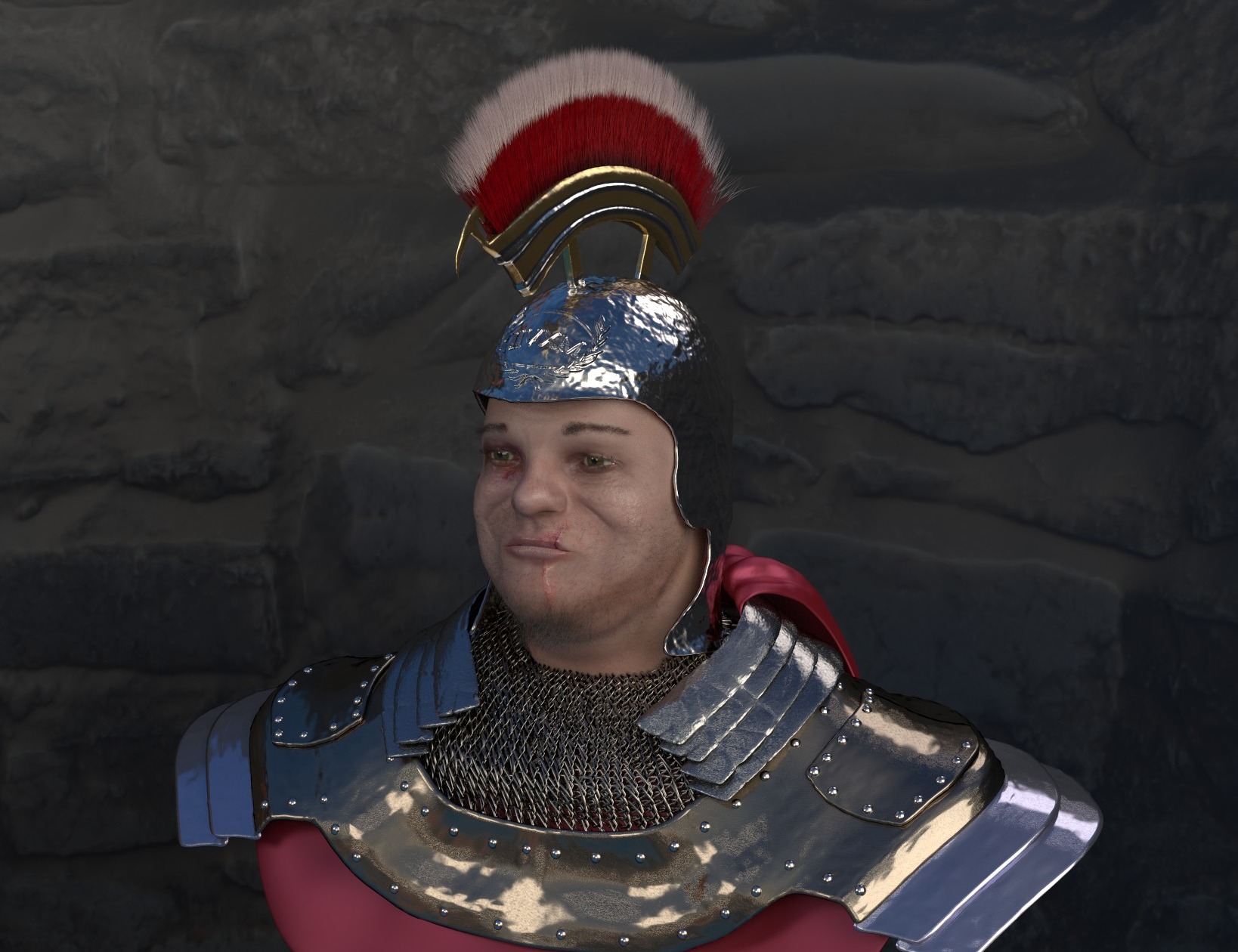
Added a quick background image of a stone wall
The scene is now too large for my computer so I split it up into clothes/armor and the Roman. I have a new blender rig which will be ready by the end of next week and I hope to be able to start working on super fine details. This is 60 samples which took 20 minutes.
Added the galea (protruding from top of helmet) and changed the hairs
That came out really nice. As does the chainmail. (wonder where they came up with that name…chainmail )
Did they mix metals up in their armor back in those days? I’m not sure, I think it would also look good if the helmet was silver in leau of the the gold.
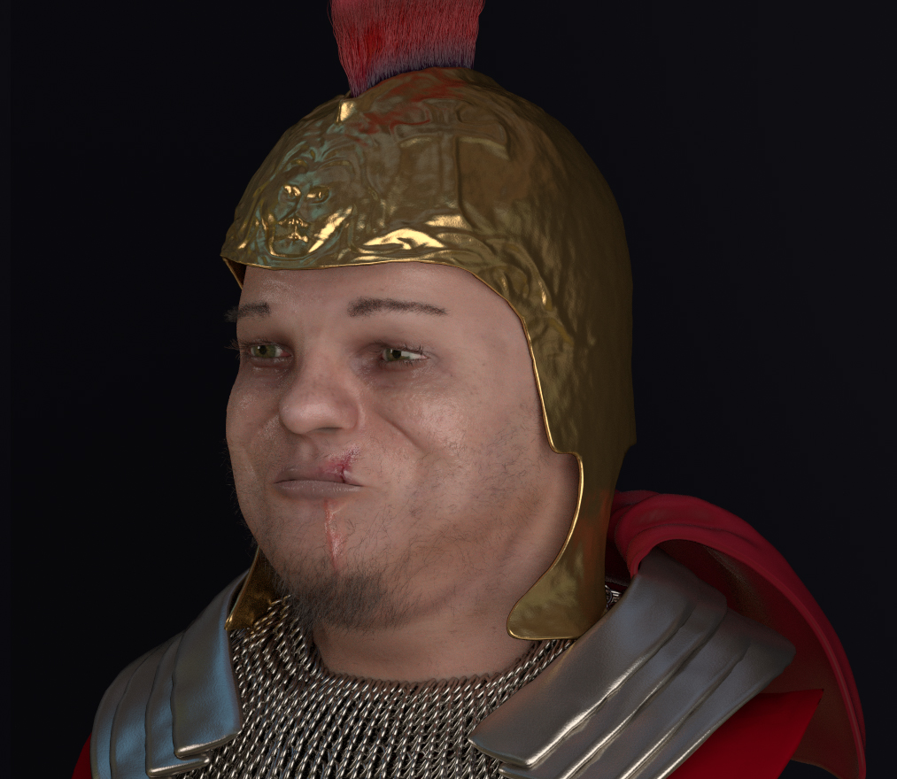
I took harley’s suggestion and went silver with the helmet with gold adornments. I like the change, although the silver needs some work, too much mirror.
I haven’t dug too deep into the metallurgy of the helmets, but many reference images have a mix of silver/bronze. It’s probably iron or something else but I am not going for historical accuracy.
More detail on the helmet. Including a new insignia (with some historical accuracy) tighter loops on the front and added a sickle.
Added a breast/shoulder plate which I really like.
Added rivets for some medium detail.
Material tweaks, and lighting changes.
Just noticed that the chain mail gets funky at the bottom. Easy fix.
As I said I can’t render this on my laptop anymore so I shot it off to render street for a $4.88 higher resolution and bounces, 800 sample render. Zoom in to the high res if you can.
There is a ton to like about piece. It’s cool. But it’s needs some tweaking.
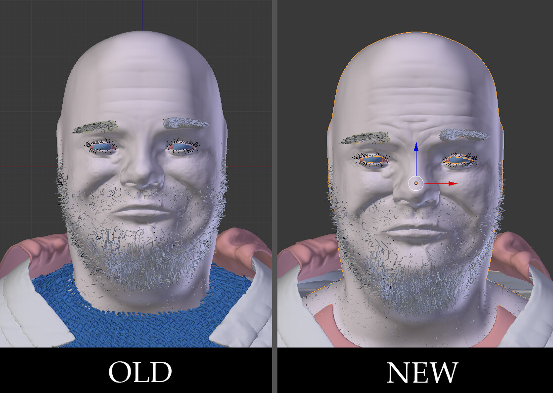
IMO The crease where the bottom of the cheek bone transitions to the upper mandible is too high up the face. The origin of the crease should be slightly above the nostril opening and behind it. Even in highly outraged expressions or during a moment of extreme exertion the cheek mass wil rise like your depiction. But the back of the nostrils rise simultaneously with the cheek muscles
You can see this in your ref pics
I feel that the PSH sculpt captures his likeness. It took me about 4 hours to do, which is slightly longer than usual but my reference images were all different. Doing a likeness takes alot of faith as it looks absolutely awful for the first hour or two (for me) I didn’t want to do the multires to look like PSH as I kind of a feel that a persons face is their own property, but feel that making a character inspired by him would be something PSH would have approved of.
And yes, the cheek lines are misplaced. I have been studying faces for a few months and I should have caught that. Thanks for pointing that out. I went through the levels and re sculped/moved the lines around and added a bit more detail. I made him a tiny bit thinner in the process, as he seemed on he obese side. The change is subtle but noticable. Now I’m worried that I moved the cheek lines too far down.
Just for fun I changed some main colors around, they will of course be returned to roman traditional.
Here is a side by side of the new sculpt including the modified cheek lines pointed out by FXR. And a lower res/sample render shot straight on. Anything else jump out? I’ve been working on it for so long that I can’t see the big picture any more.
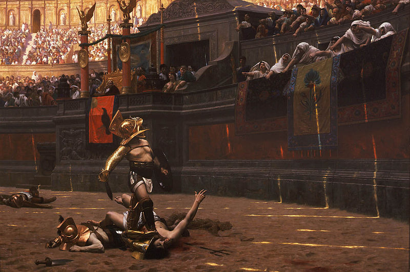
More sculpting on the face, and a first pass at a body/pose. Obviously I have not textured the skin yet. The pose is loosely based on the Gladiator in Pollice Verso by Jean-leon Gerome. It’s a macho, puffed up, chest out pose. Now the lack of hands and the temporary skirt make the pose look a bit fruity at the moment, but it will have a different feeling when he is carrying a bloody dagger and possibly a severed head.
My back story is that this is a captured slave, who through effective fighting has just won his freedom.
It kind of seems like his body now is too big for his head, like the proportional scaling is off. His trunk seems long to my eyes, but his head is definitely too small for his body, or viceversa. I will be curious to see if any else feels the same.
The metal work looks nice, and I can see where the pose would work based on your description of what you want to do ultimately.
Yeah it is. I’ll scale them to match. My new system is due to arrive tomorrow, although I’ve got to travel during the day so I won’t be able to use it. But with that beast in hand I can really start a scene. This is a detail shot of the face. It’s still looks plastic, and I’m not quite sure what to do about it. It’s 100% SSS with spec map.
sorry to say but i think he’s a bit out of proportions
look to where your own bodies arms reach on your legs when you stand
i think he’s upperboddy is a bit to large
The body wasn’t working well, and by pulling back the shot I was losing all my detail on the face and the armor. So I’m going to just push in the whole shot and focus on them. I’ve been experimenting with the new 2.7 volumetrics, but haven’t quite found the lighting I want. It seems that HDRIs have no effect when using volumetrics, and I’m losing too much range in my reflections. Here is a raw test render 200 samples. I like the shadow and the feel, but my glossy armor is just terrible. Just look at the difference from post #17.


 The facial hair in general looks great.


