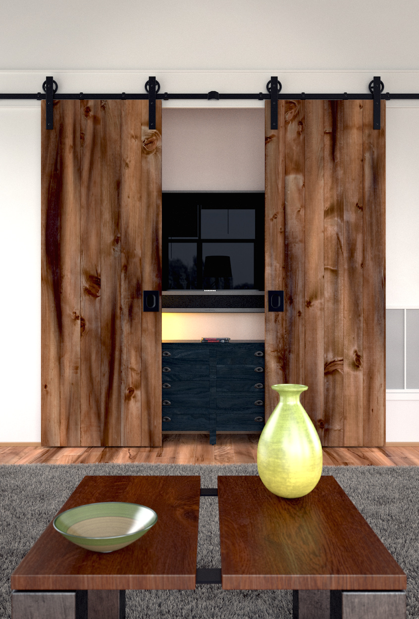
All is created by myself. But i recreated the rug from a andrew prize tutorial. I got to change the color though, it’s always a time-taking event on my laptop to check the color of a particle system (due long render times).
For the realism of the wood on the “curtains” I added an on z-axis lengthened noise texture which gives that dark areas.
Looks quite good, but it can be better. I don’t like the composition. The fact that one can’t see the bottom of the table makes me feel that I’m too close. On the other hand the ceiling which is totally boring has quite a lot of space.
Second I’m not sure about the rail with fixtures which would stop the door. Also what’s the focal point of the whole image? I do like the reflection which shows that there’s something behind the camera.
Just several adjustments and this could be much better.
yeah try to mimic some natural light coming from a window to the left, the light in the reference is also coloured slightly yellow and casts harsher shadows, the pots need dirtying and the wood material needs work; the surface looks too flat, more like laminate than wood. This could be cleared up when you change the lighting as it might bring out the bumps a bit more. Try splitting the planks into separate objects so you can rotate them slightly (as with the planks in the reference image). The colours in the wood look a bit funny, the darks should be darker. You need to add bumps to the vases and table, they’re also a bit too shiny. The sun light should be coming for one place and everything else should be lamp light which is not as strong.
Pick a detail (e.g. the vase) ignore the rest of the image and work until it’s perfect. This is the best way to avoid being overwhelmed by the complexity of the whole scene.
I know it’s annoying but you’ve put in a lot of work so far and it would be a shame to give up now.
now when i look at the image, i see all the things you mentioned. sometimes I lose the view for the important things. i guess i will give the image a second try, although it was just a 2-day-exercise for me