Saïyan Monkey

Here’s my last personal project I was working on. I can’t say if I’m happy or not, I’m just fed up and I’m sure that I will find that this last render doesn’t make justice to the model. But anyways, I wanted to make something that had an 80’s touch and I think I approched it. I’m happy with that.
The lighting is okay but I don’t find it incredible. Maybe I wasn’t sure of what I wanted first. I don’t find it bad but it’s kind of weak. The fill light is maybe too strong.

I also wanted to use the volume scatter for the background but it would have taken for ever to render just the background so… I can’t.

I’ll post more close ups later maybe.


well it doesn’t look half bad, but not so great either. i think the lighting look good, but the main character, the saiyan monkey looks… odd. the pose is so weird, it could have look better in maybe this pose:

http://i206.photobucket.com/albums/bb266/wwechampvictor/Vegeta9.jpg

but with the head looking upward (perhaps towards the moon) and the mouth roaring. the hand look kinda weird, some more sculpting-modeling could have done it justice.

Okay… it was the pose I wanted to get when I first imagine this project and then… I don’t know how I got to this pose.
I don’t know if I will choose the pose you proposed me but I will defintively look for something better.

Thanks Bill.

Okay… it was the pose I wanted to get when I first imagine this project and then… I don’t know how I managed to have the actual pose you see.
I don’t know if I will choose the pose you proposed me but I will defintively look for something better.

Thanks Bill.

Ok… I changed some litkke thibgs. I relit it entirely, removed some parts of the background that unfortunately distracted the eye, I change the pose (there’s a litlle deformation on the arm when you twist it and I don’t know how to manage to avoid that. I think it’s a normal “error”. Nevermind, I let it like that I want to move to another project). It’s obviously not perfect but it’s better than the old version.

So thanks for Bill for pushing me up to enhance this render even if I didn’t take your advice at 100%, at least the monkey looks better like that. Too bad you didn’t follow the WIP you could have given me some good advices.


Hi SOL

You have done a really good job with this. Some small things if I may that may enhance this somewhat. Try add some dirt to the boots, the white of the eyes are too white and need to be toned down maybe. Maybe some DOF on the buildings and background, just a little.

Good work though he looks really dominant.

Shaun

Dirt would certainly enhance the realism, but when we’re talking about 80’s-inspired armored ape, I think that would be missing the point. the idea is for it to have a somewhat over-the-top vibe, and I think having it appear as if this was a costume of a Saiyan Monkey rather than an actual one would be the better approach. if you want it to look 80’s, you have to think about what was capable at the time. I think a lot of this really works well, especially the costume. What doesn’t particularily work is in majority the backdrop. The post-apocalyptic city ruins is good, but the color scheme doesn’t compliment the 80’s theme very well. I think some purples, pinks, greens, oranges, and browns would have done the trick. Non-primary colors, basically. Oh, and some gradients, because that dominated the 80’s.

http://ak-hdl.buzzfed.com/static/enhanced/webdr03/2013/4/12/13/enhanced-buzz-10729-1365786788-2.jpg

Blues and reds would be alright in terms of lighting the scene, however, so long as the bloom illuminating from it is extreme.
A lot of this really works. The Saiyan Monkey and his armored suit especially. Maybe him weilding a machine gun, sword, or Machette would have pushed it further, though.

Anyway, pretty cool entry! Will you be doing more 80’s styled posters?

i actually did check out your WIP thread, but i didn’t have any suggestions back then, only until i saw the final render. the pose is much better now, but what is that black thingy next to his shoulder? his tail? a kind of gun? and i only just realized that he’s missing his gloves, though it’s not that necessary, and perhaps some more muscle too. he looks rather slim right now, maybe make the shoulder wider, and the legs a bit shorter.

Hi Shaun, I’m glad you like it. You’re totaly right about the mudd I could have added on the boots. I did scratches on some edges and on the yellow but it’s not vey easy to see it in this render.
@Lusterflask (by the way very nice ice cream, very credible) I see what you mean by the choose of non primary colors and the dominance of pink, purple, green, etc. on the 80’s graphic stuff. I love the kind of images you posted as exemples. I love the new wave retro album covers for that (lazerhawk, perturbator, dynatron etc. etc. ) but the gradient background, as the lazer grid, fit very well in a more graphic work… as been take out of the context, the environnement. But yeah, if I had chosen to not integrate the saiyan in a universe, it could have been great. I can easely imagine the render of a retro futuristic car with that kind of background.
I will check that in a future project, it must be fun. SOOOO 80’s though, but I kinde like that.
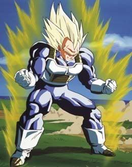
The references I go in my mind making this were obviously the first squences when the saiyans appear (or also the “Story of Baddack”) in the DBZ series, Hokuto No Ken and Blade Runner. But I so love the work of Jordan Cronenweth in Blade Runner that I really want to make a render in a near futur, totally inspire by this universe. Totally 80’s with neon lights everywhere, yellow, purple, pink, maybe rain… lights on wet asphalt are so beautiful. And if I can use the volume scatter this time it would be orgasmic… but I doubt. I’m glad that at least it appears like the monkey was wearing a costume of a Saiyan. I would have prefer that it looked like a real Saiyan armor but at least it appears kind of credible, like something kind of real, cheap, but a little real. It’s okay for me for the moment.

I think I will concentrate for a little moment on doing more simple stuff but with more attention on the shader.

@Bill:
Yeah I didn’t model gloves on purpose because I didn’t want them to cover the fingers. It would have been a solution of facility I thought at the time and if I remembr well there’s some shots of Saiyans without gloves. But maybe if they don’0t have gloves they have wrist protections… but since the hands aren’t so great it could have been good idea to add glvoes. In another project surely.
I really want to model a Radditz quite soon.
Yeah, the thing you see behind him is a tail. The hair is splatered at the end it makes something weird. A litlle pass with the comb on the tail to arrange that wouldn’t have been too much of a work. I could render just this part again, I’ll see. I’m kind of bored with it though. If I make the changes you suggest and you’re right, he’s a little slim in comparison of a Vegeta monkey form, it will be some months later I imagine.

@Shaun again, concerning the DOF, I ste the camera with an aperture of 1 and a focal length of 150mm but the only manner to have blurry stuff would have been to put an element really close of the camera. I tried to enehance the effect on the backgroun with the bokey node in the cmpositor but it seemed to take forever to make a render, it was weird. So I decided to do it on photoshop with gaussian blut but it’s not credible. I did it though but very light. If you make a close up on the city you’ll see it’s blurier than the front (result of the natural DOF of Cycles), I enhanced a bit more but very slightly and did too for the clouds. If I make a close up of the face with the same settings the effect would be killer. I dont post lost of clos ups because for the moment the images I got in my mind were more… large? if you kknow what I mean, even if the focal length is long.

I got to go. Good to have feedback from you guys, it cheers me up a lot.

Happy blending folks.

Shaun I didn’t see your advice on the white of the eyes, you’re right. I’ll do that on photshop.