Cheers for that lanc - I didn’t even notice that one leg was longer. I do remember that there is a good section/link that namurul sent to me earlier regarding the human figure. For some wonderful reason I just glanced at it and then discarded it. Lucky for me, I have a copy of it on my laptop, and I will indeed spend some time on it this weekend!
id say, darken your darks and lighten your lights! 
and get a range of tone going, not just two tone.
try to go like this |||||||||| || || || || || || || || | | |
(not sure if that is really visible but yeah)
using pens try to get a range, using pencils vary the hardness from maybe 3H to 9B?
and i like the stapler, looks promising keep it up 
Well, in my approach when drawing in 3/4 view Specific measurements can get slightly tedious, but It gets to the point where you know what looks (and is) right when you see it. When you draw in 3/4 all that’s required is know-how on what your character’s proportions are.
I suggest trying to picture your character 3-dimensionally in your mind and imagine what they look like from different angles. I’d also suggest drawing on manuscript paper, because that’s what actual manga is drawn on, and it alows you to cram in enormous amouts of detail.
As for measurements, I find the distance between shoulder to neck is aprroximately 1 hl (headl-length) and the body, depending on your character’s constitution is about 3
I’d also suggest checking out the manga institute its a site devoted to manga tutorials and they’ve also published several books in english.
@C harlie - thanks for your tip - it’s just what the tutorial books said. I need to get a decent drawing set so I am budgeting quite carefully these days. And yes, thickness is something I need to work on as the facials is a bit tricky with a thick nib gel pen.
@Mr. Moehawk - you are correct when you state that I need to watch the 3/4 views. I like your comment "distance between shoulder to neck is aprroximately 1 hl (headl-length) " this is something I hope to subconciously do - these days I get a bit finicky about my work.
I’ll check the manga institude out - I sort have a female heroine in my head - the male hero for my intended webcomic is a bit tricky.
Thanks to y’all for the tips and please do not hesitate to offer advice and critics !
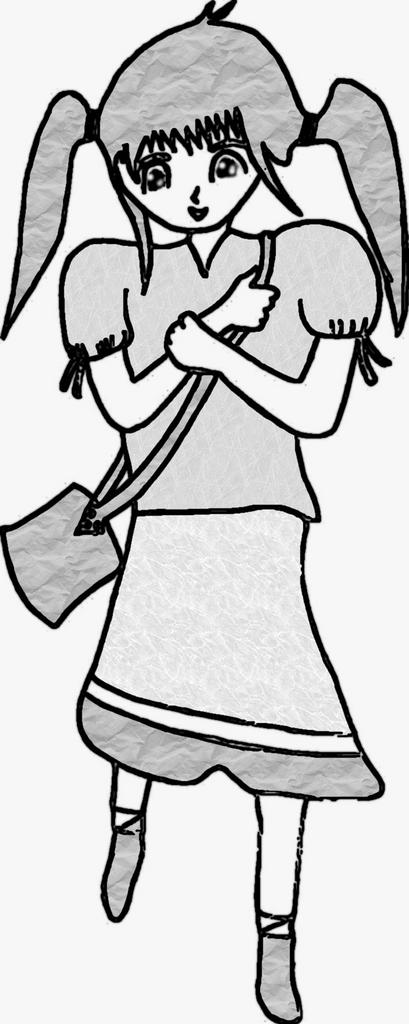
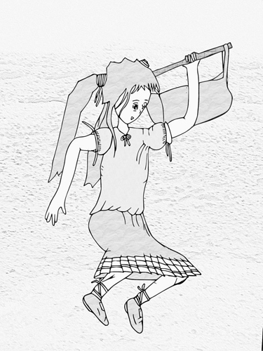
Here’s one I did of my heroine. I think I have her sorted out, I need to do some of a hero. So the next few sketches I plan for him, unless of course I get inspired for something else. Can’t tell with wannabe artists you know!
I tweaked it a bit with inkscape and GIMP.
Attachments
Well, I can see some improvement:yes:! But you still semm to be getting a sort of greek (or Roman) look (cant remember the name of the art style:() anyways it would be great to see some of these sketches with shading and environments.
Remember, practice makes perfect and you probable want to draw your characters over and over again to start seeing them in three demesions.
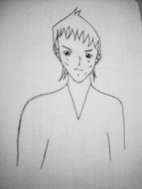
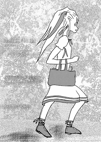
Cheers Mr. Moehawk. And thank you for noticing the greek/roman look! Indeed my characters in the webcomic will be Roman, set around 50 years after the pasing of Christ so I want to have the lead characters on spot for this! I have kind of been working on the 3/4 look view, so here’s the sketches. Regards background, I am concentrating mainly on the organic’s, perspective studies is next on my list!
Attachments
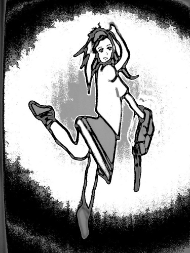
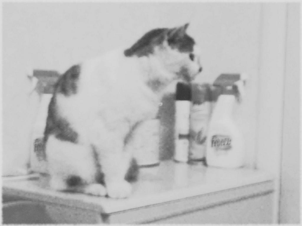
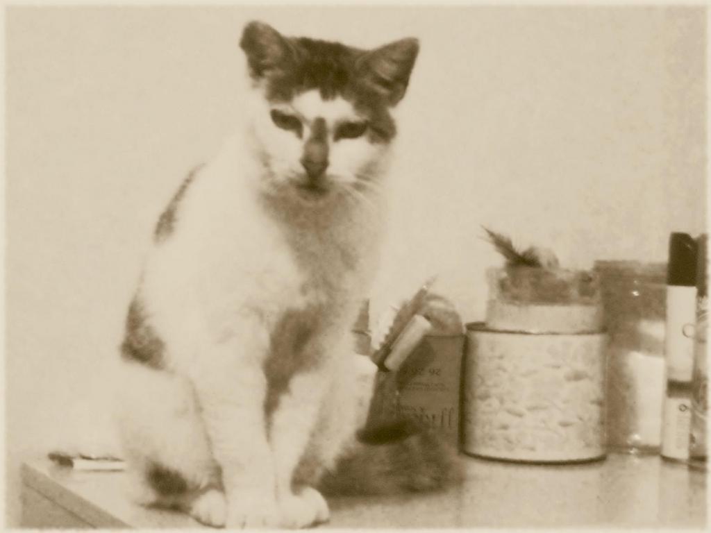
I had a mare with one of the equipment - usually I don’t blame the tools, rather the artist, so I took some pix of my cat and modified them in GIMP as way to see how the GIMP performed at some settings!
Attachments
Another flat 2D image. Please not that the background is from Macouno of the BA - he submitted the pattern to the community as a freebie . . . I don’t always acknowledge that I have nabbed some aspects from other folks but I appreciate it alright. And yes I don’t often quote the sources either . . . so if you find something “borrowed” feel free to point it out!
Attachments
Still more improvement and I’d say you try to put some characters in motion.
Mabe something simp;e like sitting or reading.
Cool - Mr. Moehawk. I am working on a sketch with the “hero” leaning on a branch next. I will give the “sitting” a go again - now that I have him/his clothes quite well in my mind, I can take it further. Here’s another couple - I had the “creatures” in my mind for a flash and decided to take it further.
@ Mr. Moehawk - you are great with your comments - any chance of viewing your sketches ?
Attachments
I’d love to post some of my stuff and probably will as soon as I can cet my hands on a scanner.
Also, I like the millipede it reminds me of a mythological monster of sorts.
I also look foreward to seeing more of your sketches.
I use a digital camera to take a picture of my drawings, then inkscape to “trace the pix”. These takes off unnecessary distortations like the light bands, and makes the drawing a bit smoother. Then I tweak it with GIMP.
I really can’t sit in front of the laptop for more than 40 mins straight . . . my attention span just won’t allow it.
Any help in my process would be appreciated - I can’t afford a scanner both $$ or space constraints at home.
EDIT - Mr. Moehawk - I had something quite different in my mind’s eye for the “milliepede” monsters - to scale they are about 50 metres long and very thin. I wanted to have them kind of creep/ hang into a tunnel with the light at the background so as the viewer would have to get past them to get out. What I got after I snapped the pix really reminded of Da Vinci’s sketch book . . . so I did as little editing as possible on GIMP and then put it up!
Attachments
Alot of your drawings remind me of pictures off of pottery. It would be awesome if you took advantage of that when making a webcomic. I can imagine it now, a picture on an ancient piece of pottery from a lost civilization that depicts a hero warding of mighty beasts and saving the kingdoms from ruin. I like the idea I don’t see why it has never been done before (by my knowledge anyways)
But I degress. Is he trying to break the stick?
I am a little curious what manga/anime you find most influential to your work?
As far as critique, the most important thing I would recommend is paying attention to the characters skeletal structure. I noticed some awkward poses, and disproportional parts. To remedy this situation practice sketching your characters while you study a posed makehuman model, or get one of those wooden dolls that they have at art supply stores if you want to use the old fashion way. I am not suggesting that you trace anything, because that could potentially hinder the learning process. The important part is to study the proportions and perspective of a 3D object while you draw it yourself. That way it can get into your subconscious and become almost like a reflex. That is why life drawing classes are important for artists, but of course the same thing can be achieved outside a classroom with a little determination.
Well I hope you don’t find my comments discouraging at all because I have enjoyed looking at your sketches and look forward to seeing more cool stuff. 
Hey Post_Modern boy - thanks for that tip. I may just use make-human. I was considering a wooden doll, but given my budget, and the fact that I will possible invest in a set of caligraphy pens first for the better quality inking it in theory does, the make-human is a good choice - especially as it comes out in a flat 2-d that I can understand.
For inspiration I am using the basic models from tutorial books that I get from my local library, so the sketches are combination of what I picked from several books.
Mr.Moehawk - he was meant to be leaning on a branch that is attached to a tree. Haha ha - yes I know now I didn’t complete the drawing - too much effort into the smaller details and my eye never wandered into that major blunder!. Yep I may look up the pottery pictures and other ancient “roman/greek” books - the kids section is simple packed with stuff like that!
I have picked up that my untrained drawings contain some of the basic errors, but I only seriously picked the drawing pen about the time this thread started. And often I miss what the authors/ BA members emphasize . . . some bad habits are here to linger unfortanetely.
Anyways on a brighter note - I made some break throughs on my Scanning/Editing process the sharp image testifies to this.
Attachments
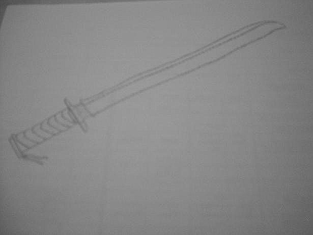
Another one I did last night . . . appears I need to draw the images a bit bigger to get that setting I like.
Attachments
You’re making great progress on these. Keep at it - practice practice.
