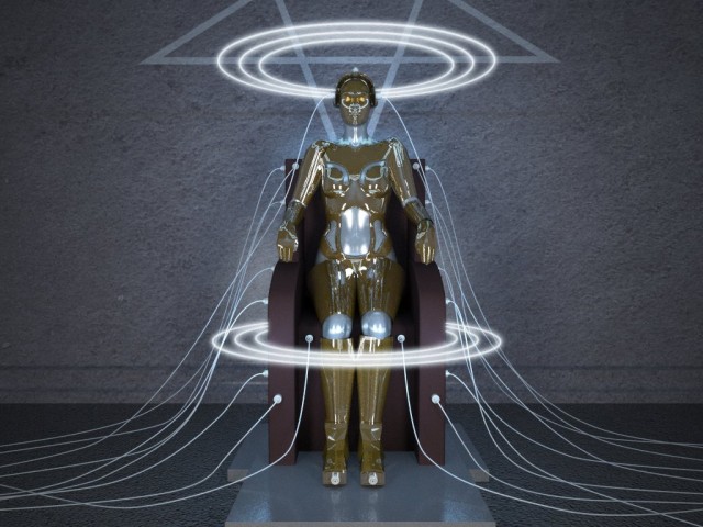
I’ve been working on this on and off for a little while now, long enough that my brain has turned to mush. This is modeled in blender and rendered in indigo. does anyone have any suggestions on how to improve this image?
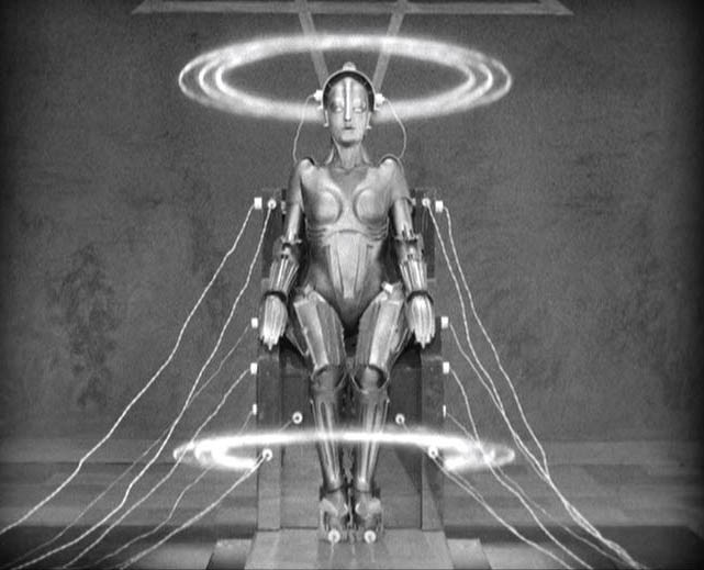
I suppose i should mention that its a scene from a movie, i’d like to portray the same sort of feel, so i’m also posting the screencap i used as a reference image. i’m not trying to make an exact copy, but i would like my image to look less… boring? i dunno… some suggestions would really help me get through the rut I’m in i think
Add more details and variations. If you look at the chair from the movie is has more curves at the bottom, the floor takes up less of the image and also has more variation, and is generally not as clean. Little things like that make a big difference in how visually interesting a render is.
Are you familiar with Osamu Tezuka’s Metropolis? Very similar to the original, but i believe his ver. is the better of the two.
Could you elaborate? Wasn’t Fritz Lang’s the original, that inspired Osamu to create his manga comic series ‘Metropolis’, it was then Katshurhiro Otomo ( another great man) who turned the manga comic series into the movie, but even then it only borrows vaguely from Langs ‘original’ ie. a large city divided socially and vertically.
I really don’t see how you can compare and judge one over the other simply because they share the same name and vague similarities.
Lang’s, Tezuka’s and Otomo’s ‘Metropolis’ are fantastic achievements.
Giorgio Moroder created a version of Lang’s Metropolis, (1984) with coloured up sequences and new soundtrack. That I would say could be compared to the original and the original iscertainly better.
Great work so far. Got to love CG fan art for a silent film. If you want your scene to be more interesting than the move, just add more to it. The movie had very sparse props, which may have been a budget thing(idk). Since you are reinterpreting the scene, add your own touches. May be add some machinery in the background. Or change the energy rings to be multi-colored.
P.S. I loved Lang’s original (or as original as has survived) movie.
Two remarks:
1
The original material rather looks like a painted oven pipe while yours is like polished gold with almost no diffuse and loads of ray mirror. But that dissolves the overall volume and female shape to a bunch of symmetric colorful lines.
2
The original scene as a very homogeneous light distribution. I an pretty sure they had lots of white well lit canvas behind the camera. That also helped to gently model that ghost like but real being.
That is i think why the original somehow looks sexier for me.
One thing that makes the original stand out is the obvious `implied’ female shape. The whole movie was about the dehumanizing effects of a technocratic future. This figure is almost the ultimate symbol of that dehumanization.
The contrast in the original is much stronger and adds a lot to the scene. I’d redo the lighting so that the wires and character are MUCH brighter than the background. Right now my eyes go straight to the rings and I hardly notice the robot.
Also I cannot clearly make out your bot’s face, especially the mouth. Very important in establishing identity. Agree on the hardness/spec - turn it wayyyyy down.
its nice to see so many people who’ve actually seen the film.
I agree with most of you who’ve said my version is too shiny/reflective, i’ll definately dull her metal down a bit. I think i’ll also add some bump maps / textures to dirty up the scene a bit.
bobg: I like your observation, and that is indeed the feel i’m trying to pull off. im just not doing a very good job of it
also, the real difference is that in my scene the light is coming almost exclusivly from the energy rings. Perhaps i’ll brighten up the camera back lights… thank you all for your suggestions