Hi Everybody,
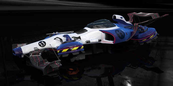
this is my sci-fi racing car that I’ve done for the challenge some time ago. It’s been done in Blender and rendered in Cycles. I spent about 8-10 hours total on it. I like the concept that I’ve done but now I’m thinking to revisit it and make some changes/additions to the model, so I can put this work in my portfolio.
So, if you have any recommendations I’d really appreciate it. Tell me what you like (if any :evilgrin:) or what you don’t like! :evilgrin:
I like how it resembles a formula 1 racing car.
The grill on the front doesn’t look integrated well.
The thruster on the back might have some topology problems. I think it’s resulting in some bad reflections.
My opinion is that the wing in the front is to big.
oh wow. i hope racecars really look like that in the near future! what is that silver ended thing sitting right in front of the big air intake? it looks cool, but its not clear what that is (for)
The point i dislike is: the black and yellow stripes… Feels like a “danger” sticker. Dont’s think it’s the right thing to do there.
It makes sense to me. Thats where his turbine engine looking thing is…generally those are the areas you want to stay away from.
My opinion on the yellow and black stripes, is that orange and black or a lime green and black might work better. Or just go with the red and black stripes that match already whats on the car. We are at the point where we can recognize stripes in that pattern on any machinery as a form of “danger” or something to be careful of.
Thanks for the feedback guys!
At this moment the only thing that I like is the body itself and turbines. all of the accessories (including front and back wings) will be changed/replaced. Also, I’m not sure if I like the design of the cockpit area. For the turbines: I like the design and placement, but I want to change frame that holds them in place and add some wires. Black and Yellow stripes on turbines are to show that there’s a “danger zone”.
