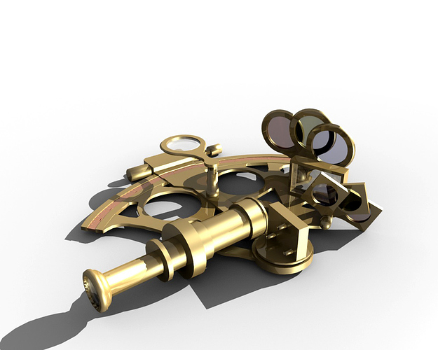
Tell me what you think :p. Any ideas on what sort of scene I could put it in would be appreciated to.
Nice model, looks great.
In somebodys hand on a ship in the ocean!
or inside a ship on an old wooden table.
Just ideas.
Very nice modelling Saypen!!
One thing you might want to do is texture it, so that it looks like it has been used for a while, like worn out parts of it,etc.
You could put it anywhere really, an old table/desk, inside a treasure chest, at the bottom of the ocean, in someone’s outstretched hand, think outside the box! Coming to think of it, putting it on a table would be a bit boring and clichéd. Try and think of a back story to go with this object - who used it before, what kind of person where they, did they use it for good or bad… and try and tell this story or it’s consequences with a really powerful image…
Looking forward to see what you’re gonna do with this!
I agree leojS it looks great… you might try a sort of brushed metal texture…
Very nice so far! Good color on the brassworks. Some observations:
The finish is too uniform, it could use some subtle indications of use, slight discolorations from skin acids, a patina of light scratches, nothing too bold, to help suggest of a well-loved, well-cared for but also well-used instrument.
The glass parts could use some more evident refraction, especially if they are lenses.
In a nicely-finished dark wood box lined with velvet, with perhaps a rolled-up old map in the scene, and a lit pipe on a stand or, if you’re really ambitious, in an old, gnarly sea-captain’s hand. Just some “accessory” suggestions.
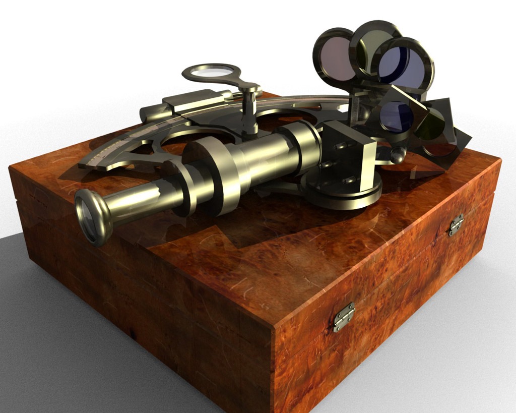
I’ve attempted to ‘age’ the sextant by a few years and also made a case for it. The sextant’s material still needs quite a lot of work but i’ll post it anyway :p.
Attachments
wowo nice.
the glass could use a bit more mirror transparency, the modelling is very accurate :thums up:
some kind of story idea: it could be situated in a museum and a thief is trying to steel it with high tech tools and so on but don´t ya copy mission impossible!
Or it is used in a history course to make the stories / tales of pirates more lively / someone buys it on a market for old things and discovers the true value of this artefact.
btw what are ur light settings ?
The case is beautifull, but I believe that it should be open and that the sextan should be insibe, on some sort of “pillow”. Good job!
I think your brass coloring was better in the first image, more yellow, but it’s still too even over the entire instrument. This image show a somewhat extreme example of what I mean by “use-weathering.”
Case is sweet but the edges look as sharp as the sextant’s metalwork, could perhaps use a little distressing.
Brings back memories. The filters are darker in real life, and with modern sextants at least there are fine-tuning knobs to get an exact angle. The brass does not look good to me, maybe the lighting. It would look great alive and in use, not laid in a coffin. (the box is beautiful, not criticizing that, but you get the hidden message).
Yeahh!! Now it’s starting to look much better… I think the rings around the “scope” need to have some bevel on them… or are they supposed to be that sharp?
Keep workin’ on it!
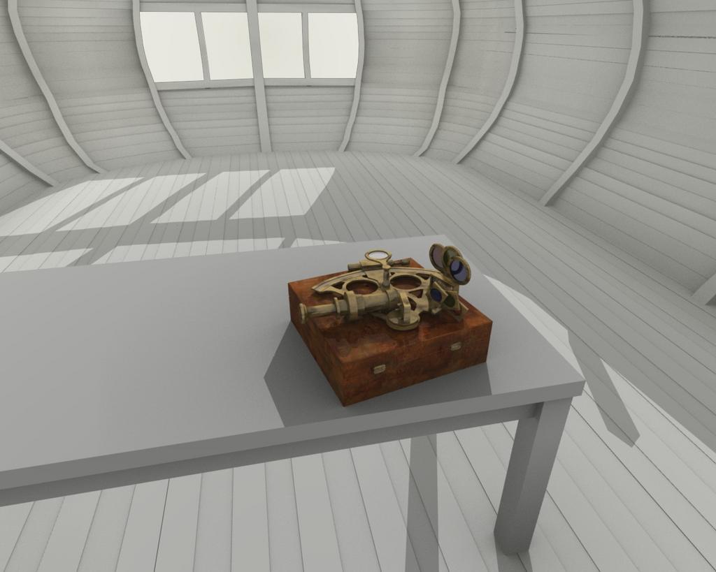
I think i have nearly got the ‘old but loved’ look for the sextant (thanks for the pic chipmasque it helped a lot) and I’ve started working on the cabin in the background.
Attachments
Hey that’s looking really a whole lot better. I know your camera angle probably isn’t thought out yet or anything but it might be worth deciding now, because at the moment the composition is a bit weak. So head over to good 'ole wikipedia: Composition (Visual Arts).
Keep it up!
Next update. Hopefully the composition works a bit better this time. Anyway, a picture tells a thousand words so here it is.
Attachments
Really starting to open up into an image with an interesting story. Some composition and technical observations:
– The sextant doesn’t seem to rest properly on the box, too flat, as if all the projections exactly compensate for one another. In fact, the second “collar” of the eyepiece barrel clips the case lid pretty severely, unless it was designed with a flat surface there.
– At the top left case corner, a very distracting tangent is formed by the stylus and the case. Maybe move the stylus closer to the case in picture-space?
– Another tangent is formed at the bottom left case corner, with the map edge; either pull the map edge forward some to clear the case corner, or make sure the case fully and clearly overlaps the map edge.
– Map image doesn’t seem to fit perfectly square on the paper mesh, runs downhill to the right slightly, leading to some bleed-off.
– Double shadows look unnatural, since the scene seems to be lit solely by sunlight.
– Balance of key light, fill and ambient looks very good to me, but I think some of your hot-spot speculars on the brass parts could be more condensed and metallic-looking.
– Wood texture in extreme FG are starting to pixelize and fuzz up, you may need a higher rez texture image, same for map image.
– No apparent refraction in the glass parts – even optical flats would show some.


