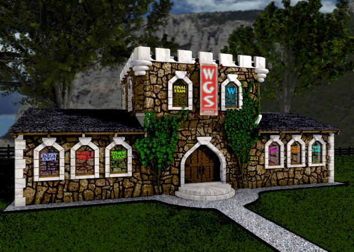
Obviously I am a newb. And could use some feedback on this image. I am using 2.62 with Blender Internal Engine. This image consists of layers of PNG images (sky, mountain, left tree, right tree, grass, then the building) in the Compositor.
Thanks for the feedback. There is geometry to work with since the PNGs I am layering in the Compositor were created in Blender. I was thinking the marble trim should be smooth; maybe even reflective with more specularity. However, the stonework can probably use some more normal applied to it.
In what way do you think the lighting might be off…castle to bright? So just add a Brightness/Contrast node to the castle noodle.
Would this image benefit from some mist/fog behind the trees but in front of the mountain? I was thinking (to stay realistic) that there couldn’t be any fog at this time of the day (afternoon or late morning because of the angle of the sun). But am I trying to be too realistic and the fog just might bring this image some additional depth and emotion?
Thanks Mike. One thing about this image is that all the stones are individually modeled. It is not just a plane with an image applied. The mortar between the stones is a plane so the mortar can be any color or texture. It was a lot of work, but for a newbie it was good simple modeling experience, which I needed.
Anyway, I took your advice and turned up the normals on the stonework. I also changed the modifier on the stonework from subsurface to bevel.
Wow. Individually modeled. That is a lot of work. And it looks much better now. However, you are right, the castle is much brighter than the background. Need to balance that a bit more.
I am a programmer (game developer)…a total art newb and Blender newb. I didn’t even make a color palette when I started this project. So I just wanted to say Thanks for taking the time to voice your opinions. It means a lot coming from experienced artists.
The entrance is way too small in proportion to the windows. I can’t help but feel dwarves live there and if they went inside they wouldn’t be able to see out the windows. Second I think the biggest problem is lighting. You would be amazed what you could do with this if you just played with the lighting. Materials actually look quite nice, but are too bright in color saturation.