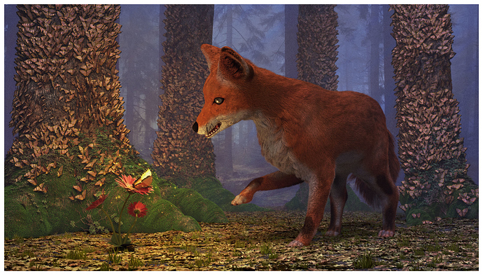
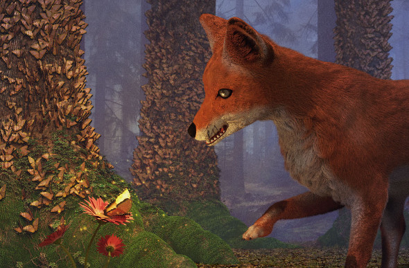
This little project took me like 2 weeks of my free time and to be honest, i think it ended pretty terrible. However i can�t figure out exactly what is failing in the image. The render ? The lightning set up ? The materials ? The particle system ? The compositing ? So, i would love your critique on this piece, it would help me to improve my art and honestly i would love you for eternity if you do so.
Hi,
I think all the parts of the image are in a decent quality, but the way they are put together in the scene makes it look like more like a game.
I would try to change the lighting. I can’t say, it the scene is evening, morning, or somewhere between. Because of the strong glow in the foreground the background seems to light to me.
Also the ground is very flat and looks hard. I would try to subdivide it on the foreground and use a displacement modifier to make the ground softer.
The trees could be integrated into the ground a little better, by pulling vertices of the subdivided ground higher around the trees, where dirty is not likely to be blown away from the wind.
The fox is pretty nice, only the mouth appears to be an awkward smile. I can’t tell you, how to improve that, though.
You did a good job with this image, I understand that it took much time, but since the effort is in the details (and the fox) , this is not visible at first glance.
First of all, I think this has a lot of potential, but as Cebbi said, there are a few composition errors. I strongly suggest you change all that Cebbi said, but here are some additions to them:
the fox mouth indeed looks off. When looking up reference pictures of a fox, I noticed they often just have a closed mouth. If you really want it open, I suggest putting a slight angle on it, so doesn’t parallel and straight. Further more lighten the in-mouth colors: foxes have a light pink tongue.
also maybe the eyes are a little off. I don’t know for sure but I think they should be less round.
On a more composition-like note, the balance is wrong. I think this has two causes: The tree on the right is attracting to much attention and the flower (which should be your focus point) is too good camouflaged.
I think the tree on the right is easily dealt with. Make the hind quarters of the fox overlap the tree in order to break its symmetry. Perhaps you should also play a little bit with the light on this one, making it darker and thus less notable.
The flower however is difficult. I would suggest playing with the light or the background of the flower. I have often seen works where the artist exaggerate the colors to let it stand out. What I would do is (while you’re busy subdividing the ground) giving it a very small hill. Now I think about it, the way to go is leaving an open space around the flower. That is: a small circle around the flower with a little less dead leaves.
However, this are just a few things that spring to mind. The modeling and idea is great. Good luck improving it and a look forward to the result!
Lighting: The lighting creates an even lighting and low contrast. This is good in certain subjects but, based on your image, a more low key lighting would be much better. My impression is that the butterfly is glowing, hence, it is a light source. Try turning off all lights, even the world, except the glowing butterfly light. That would make the butterfly the main light. Then add a little ambient lighting, very little; and then add some low powered light to selectively illuminate certain objects and parts of the image. Like those butterflies on the tree trunks, illuminate some of them.
Composition: The focus here is not very clear. At first glance, it seems that the fox is the focus. It could be, but there is also the glowing butterfly, which is a more interesting subject and many elements point to the butterfly. I suggest that you make the focus more clear.
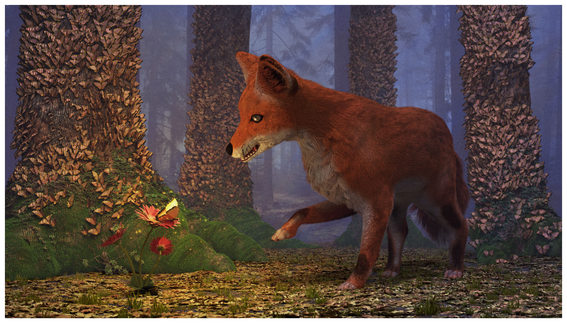
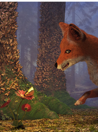
Another issue with the composition is its plainness. It is direct, shows us everything (the butterfly and the fox) and perfectly centers them in the fame. That is rather boring. Try playing around a bit and find a much better arrangement. You could also try to just cropping the image. Here are some of my crops:
You could also try adding some foreground objects like ferns or a bush or maybe a tree root with a bit of tree trunk. That would add some depth into your image and also separates us from the fox. Though you don’t need to do that if the separation is not what you want.
Modeling: Overall, they are ok. Cebbi has noted the issues. The mouth does looks a bit odd and the ground looks like a plain flat plane.
And then you could do some cool stuff like DOF and glows and color correction.
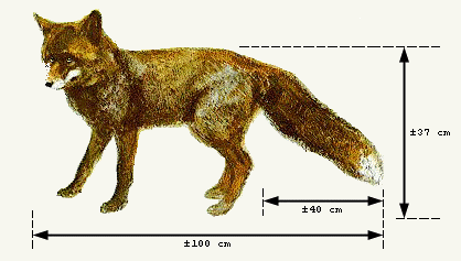
Size compared to a german shepherd and a household cat
Your fox also looks a bit too bulky in the image. They’re quite slim, just look bigger because the fluffy fur. Fur in yours looks short and closer to the actual body.
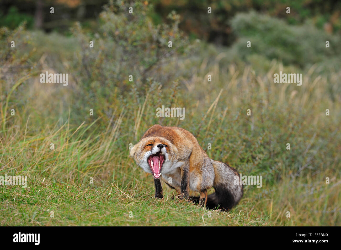
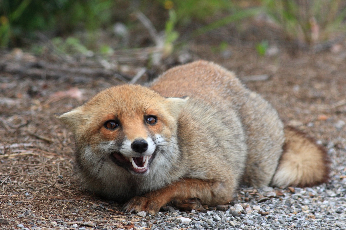
The pose/expression could be more clear so that the viewer immediately knows what is happening in the scene and what the fox is doing. Is it surprised, defensive, submissive, playful. Could search for pose references and exaggerate it for the viewer if necessary. They have similar poses and expressions that dogs/other canine have.
If it’s surprised by the butterfly (movement), have its head back, maybe tilted, ears up, mouth closed, eyes looking at the thing. Could also lift the front feet off the ground like it was jumping away. Butterfly just off the flower.
It’s not threatened by the butterfly, so it could also have a curious/cautious look. Ears back, trying to approach slowly and in a non-threatening/submissive posture (body down). That also works in human-dog communication, lowering your whole body to a more vulnerable position, dog level, and slowly approaching from down and towards is non-threatening. High up fast/suddenly might mean bite first ask later.
Hi @Cebbi !! First of all, thank you very much for your critique !! I agree with you in the lightning, there was something that was bothering me about that and i think you just pinned it down, i will try to give him a better contrast. The ground !! How couldnt i saw it earlier !! Forgot to give him some displacement… i guess i was too engrosed with the particle system. And the mouth… not sure if i can fix it, some of my other models have the same problem, will try to give him a better smile… sort of
Hello @Ralmon Meril !! Thank you very much !! Your critique it’s amazing ! As with @Cebbi you are right about the lightning, in my attempt to create some kind of mist effect, i prepared a low constrast lightning, however i think i over did it. Will try to increase the contrast with yours and @Cebbi recommendations. With the focus of the image… To be honest, i tried to focus on the butterfly and the fox, maybe too greedy ?? According to the composition the focus should be the butterfly, will try to center the image around her. And finally, about cropping it… Dont think i like that, sorry, i understand what you mean and the reasons behind it but to be honest i like the balance the image already have, however i like your third cropped choice !!
And hello Ja12 !! Your critique surely came as a surprise. To be honest, i havent seen the fox too big till the exact moment where you pointed out, i think it need to be like 1/3 smaller or so. i swear i used a reference to sculpt him, but forgot the volume of the hair and think that’s why it seems so…chubby. I completely love the poses you suggest, they seems so dynamic and full of emotion that are amazing, each on it’s own, in contrast my fox seems too static… like dead. However im not sure to be able to pose him like that, will try my best tought.
Again, thank you very much to all of you, your comments were exactly what i needed, hopefully i can make the modifications quickly enough as to not let the topic get cold.
The overall lighting looks like an interior scene with the main light source coming from fluorescent lights. In other words, it’s lit like a warehouse! And, the lighting on the fox’s face looks light someone is sitting just off camera aiming a harsh utility at the fox.
To me it looks like too much Environment lighting. You might want to go into world settings see check the Environment and AO lighting settings. If the Environment or AO lighting is turned on, try turning these down to zero, adding some lamp lights instead, and rendering again.

