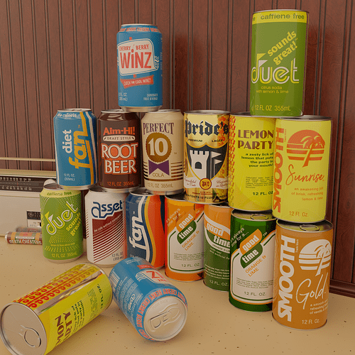
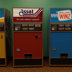
Yeah, I know, a soda can isn’t much but a glorified cylinder and it’s probably even more of a My First Model than the ubiquitous donut, so the modeling isn’t much to write home about, but this one’s all about the labels. My hope is, once I get them all done, and once I find or write a license that suitably covers my butt, I’ll be releasing both the cans and the machines as assets.
I’ve been working on a late-1970s/early-1980s pop machine model for a while now (Coming soon! Really!)…
…but what’s a pop machine without an actual can to come out of it? So, I’m in the process of taking all the logos from the machine and putting them properly on cans. The pop-machine project started with silly obvious stand-in brands, like “FPO”, “Lemo-Demo”, and “Placeholder’s Pride”, but a pop machine model isn’t all that useful without the graphics, and I’d rather provide a solid, usable set of graphics with it. So, tweaking turned into overhaul, and I ended up with this.
The crimped-steel pull-tab cans (older style, on the right) are mostly labels I’d done a while ago for different projects, but if I’m making cans, I might as well dredge up everything I’ve got. The Duet can on the top is the outlier there-- it’s part of the new set, but the first draft of the Duet can looked too simplistic to be a 1980s can, so I relegated it to the crimped-steel style.
Brands
All the brands are fictional and, to the best of my knowledge, don’t exist. (Everything about “This company produces that” is just talking about continuity in the small print on the labels.)
- Fan/Diet Fan - The knockoff “Coke”. It’s got a one-syllable name and a wave. Originally, this design was “FPO” soda, referencing the “For Position Only” label on stand-in graphics that aren’t meant for final use, found on a design draft. “FAN” was close enough to “FPO” to re-use the style.
- Duet - A very 1970s, maybe 1960s simple, “graphical” design for a lemon-lime soda, with the tagline “Sounds Great!”
- Aim-Hi! Root Beer - One of my favorite fake brands, because it really feels plausible. Aim-Hi! is listed as the producer of Aim-Hi! Root Beer, Perfect 10 Cola, and Duet. In my mind, they’re kind of the mid-tier soda brand. Not the first household name you think of, but not the bargain basement. Somewhere around A&W, Cadbury-Schweppes, Dr. Pepper level.
- Asset - “The Cola Without Compare”. One of the less well-thought-out ideas, this came straight off the “Names that all mean placeholder” first round of designs. It’s “Asset”, like a 3D graphics asset. Get it? But, it rolls off the tongue enough to be plausible, so it made it to the big leagues, and I turned it into… some oddly financial-themed soda? Whatever. It’s an asset. That’s what it’s there for. Asset Group also produces Winz.
- Cherry-Berry Winz - I’ve got a few favorites, but this is my favorite-ist. It’s got a jangly '60s vibe that works well as a quirky soda flavor and brand that never really evolved but never really died, either, just kept pushing on into the '80s as a budget brand beloved by its diehards. I’m not sure what flavor “Cherry Berry” is, and I’m not convinced that a “Cherry Berry” soda would taste all that good if there was one. The flavor might not tempt the palate, but the name really rolls off the tongue. Produced by Asset Beverage Group.
- Perfect 10 Cola - The also-ran “RC Cola” of my fictional world. Produced by Aim-Hi! as a recognition that every wannabe soda brand needs to have a cola somewhere in their lineup.
Now we get into the junk I dredged out of the depths of my old “Projects” folder…
- Pride’s Premium Lager - One of my other personal favorites, this is was one of my first pull-tab beer can designs, and one that I think works solidly as a plausible 1960s or 1970s beer brand. Brewed in Milwaukee, Wisconsin, since 1874. Better than piss and colder, too, though we all know “Premium” is a load of bull, this one goes down great after dragging a lawnmower around your suburban yard for a weekend.
- Good Time Orange & Lime - I’m not sure if this one’s going to make the cut. I like the name-- though it’s a bit too good and I’m suspicious I just suck at doing trademark searches-- but the logo never quite fit into the space right, and I never found a layout I really loved. It’s not part of any running project, so it’s ripe for jettisoning. I might reuse the name for the ginger-ale brand I still need.
- Duet - Duet is a brand that’s best in its gawky, cheap, 1970s slap-a-logo-on-it simplicity, so I had to rescue the original draft for the older-style crimped-steel can.
- Dick’s Lemon Party - I don’t know what all the fuss is about. There’s nothing in here but a cheap store-brand soda from the 1970s, officer. Okay, this one just betrays that I’m old enough to know what “Lemon Party” refers to, but immature enough to make a fake soda can that has a (totally plausible logo for a supermarket chain!) “dick’s dick’s dick’s dick’s dick’s” down the side. To quote Arlo Guthrie: I’m not proud… or tired…
- Smooth Sunrise/Smooth Gold - I dredged these up from one of the first “1970s pull-top can” attempts I ever made. They’re another simple, a-bit-gawky design meant to evoke the store-brand sodas of the '60s and '70s.
To-do
- The Duet crimp-steel can still needs some tweaking to make it pop more.
- I need to make up a brand of ginger ale. I’ve got a ginger ale on the pop machine, but it’s just a handwritten one with no brand.
- See if I can salvage anything at all from Good Time.
- Find a new script/handletter font for the Smooth cans that doesn’t have restrictions on using the output from it. I think I’d be okay using it, but it’s a bit unclear and I don’t want to chance it.
- See if I can make the “Caffeine Free” on the Duet can a bit wider.
- As for this particular demo screen, get some relief in the wood paneling, tweak the lighting some, and fix how the Winz can is sitting. There’s about a 1-2mm difference between the height of the new can style and the old one, so the Perfect 10 sits with a bit of an angle, because it straddles them. However, I forgot to account for that when I put the Winz can on top of it, so it clips through a bit. Oops.
Colophon
Software
- Can labels were made in Adobe Illustrator, as was the bump map for the pull-tab/1970s lid.
- Bump maps for the 1980s/modern can lid were made in Affinity Designer, because it can output 16-bit PNG that doesn’t have the stair-step artifacts of 8-bit
- All models and procedural textures were made in Blender
Sourced Imagery
- The palm tree used in the Smooth logo was from OpenClipArt: Palm or Coconut Tree Silhouette by davidblyons, Public Domain
- The General Electric logo used on the radio was from Wikimedia Commons. It’s actually aged into the public domain, though there’s still trademark protection on it.
- The background detritus was from past projects: Radio and Zero Flavor Death Cheaters
Fonts
Links included to free fonts.
- Arvo (Anton Koovit, SIL OSL): “fan”, “diet fan”, “one calorie”
- Bauhaus Heavy BT (Bitstream), with lots of modification: “duet”, “sset” in Asset
- Bauhaus 93 (URW): “dick’s”
- A028 (Knockoff of Albertus by URW++, Aladdin Free Public License): “sounds great!”, “Aim-Hi!” (with modification), “ROOT BEER”, “10” in “Perfect 10”
- Yanone Kaffeesatz (Yanone & Cyreal, SIL OSL): “Cherry Berry”, “WINZ” (with modification), “CATCH THE COOL WINZ” (with effects)
- Avebury Black (Parkinson Type Design, avail. on Adobe Fonts): “Pride’s”, “P” and “1874” on Pride’s can
- English 111 Presto BT (Bitstream): “Unparalleled in Taste”, “Unrivaled in Quality” (on Pride’s can)
- Ad Grotesk (Mannesmann Scanographic): All sans-serif typography on the Pride’s can
- Compacta (Bitstream): “good time”
- Zurich (Bitstream knockoff of Univers): Secondary type on Good Time cans, small print and amount on Asset, Winz, and Lemon Party cans
- Swiss 721 (Bitstream knockoff of Helvetica): Small print on Fan, Diet Fan, Aim-Hi, Duet, and Good Time cans, “caffeine free” on Duet cans
- Binner (URW): “Lemon Party”
- Bold (Diogene/Claude Pelletier, Public Domain)
- Brownhill Script (Faisal Tanjung/Sizimon Studio): Script on the Smooth cans – and I just realized that the license for this might mean I can’t redistribute the image as an asset. I’ll have to either find another script font or forgo giving this one out.
- OCR-B: Bar codes


