Here are some of my finished projects in Blender. I apologize in advance for the long post, but I figure it’s better to post them all in one rather than clogging up the forum with lots of individual posts. As always, comments and criticism are welcome and appreciated!
Hello Zeke, when I saw the cliff scene I immediately remembered one of my favorite places in Brazil - Arraial do Cabo, in Rio de Janeiro. There is a cliff as you did.
Congratulations.
Thank you all for the comments!! I really appreciate it!
Wireheadking: I will make the tutorial as soon as I get a new mic and screen recording software. In hindsight, I shouldn’t have put “soon” in the title…
Chosen one: Thank you!
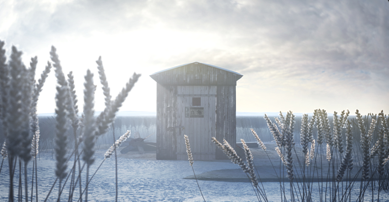
CCTrevis: I love it! Wow, look at that beautiful turquoise water! Thanks for sharing.
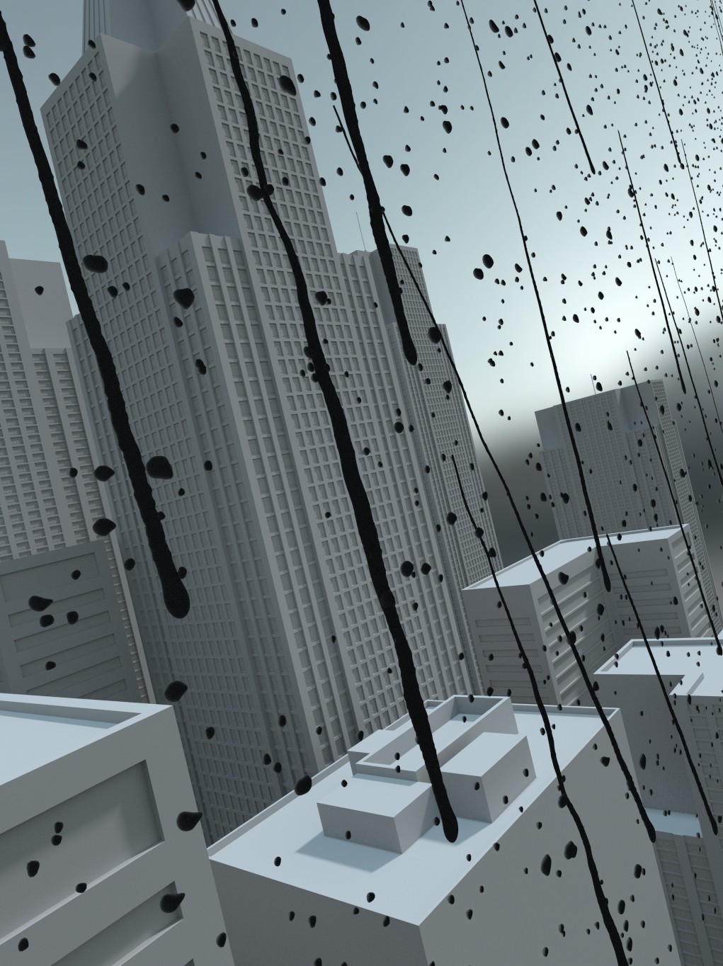
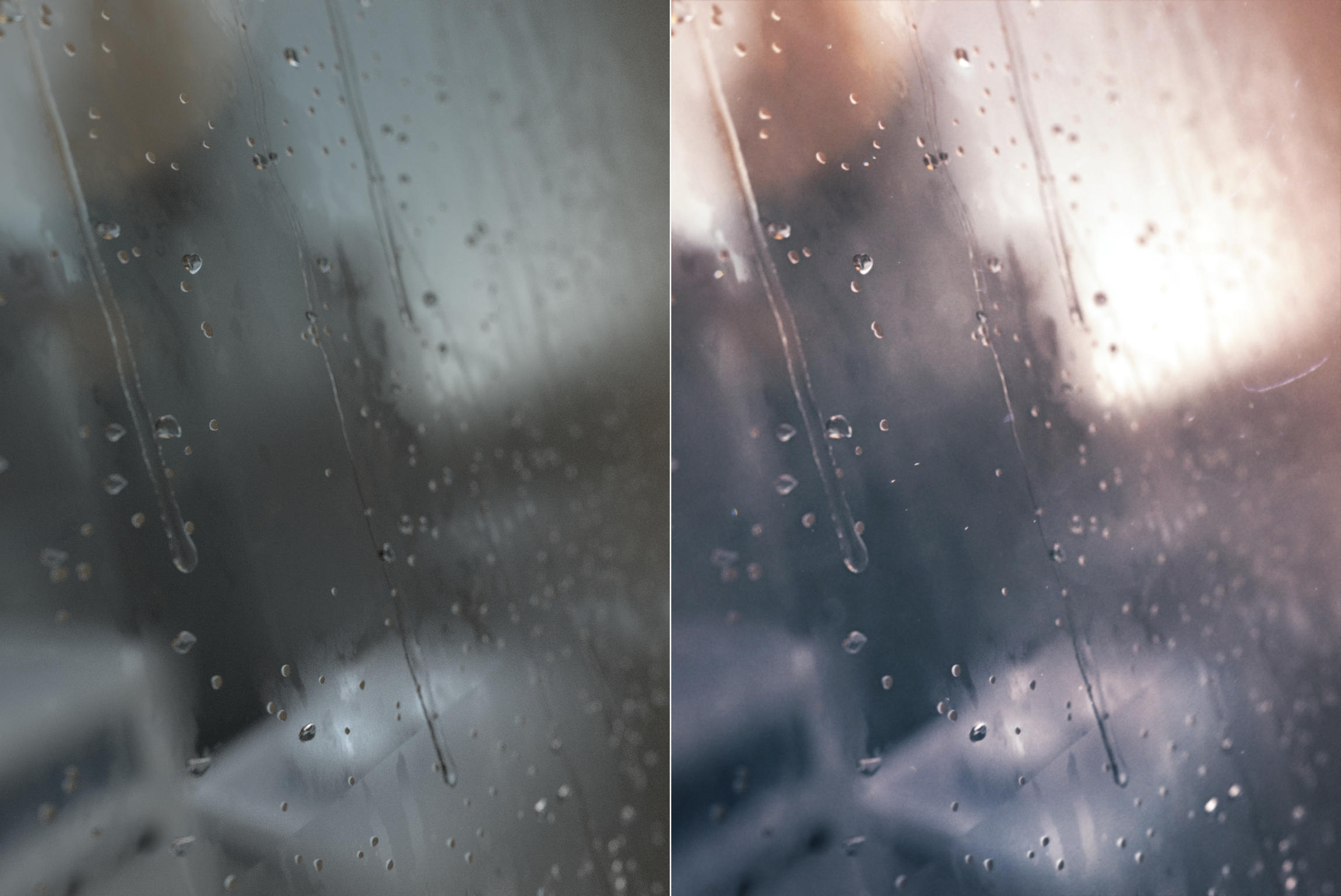
awesome work! i especially love the drops on the glass. any chance for a wireframe or clay render of that? or some insight into how you created the drops?? my only other comment in general would be that i feel like you could crush the blacks just a little so that there is a bit more dynamic range in the images, particularly in the shadows of the cliff, the foreground wheat, and the dark pots of the drops.
Thank you for your suggestion! Well actually, the blacks are already crushed! What you’re seeing is the light spill from either a glow or a lens flare. Crushing the blacks will actually decrease dynamic range, and I like to make sure things don’t look too graded. The trick for all my images is tons and tons of post processing, almost always done in After Effects. Take a look at a before and after image:
It looks super flat and boring out of the box, but clearly much better in the composite. For some reason, heavy post processing seems to be looked down on, which I find ridiculous.
Anyway, regarding the contrast, I suppose it’s a matter of taste. High contrast and crushed blacks have their place, but in the case of each of these images, it wasn’t conducive to conveying the tone I imagined.
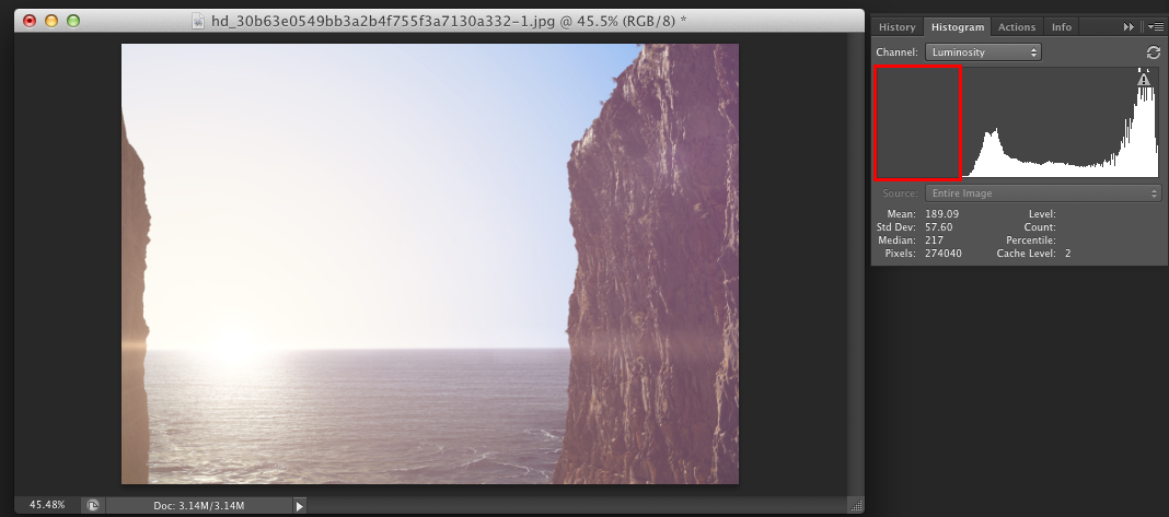
@zeke - definitely all fair points. thanks so much for posting the before and after, along with the clay render. and i agree with you on heavy post processing - im all for it. regarding crushed blacks, perhaps “crushed” isnt the right term as i wouldnt advise actually clamping any data, but more just leveling them so that you are filling the full range of values (see attached screengrabs). again, though, its definitely personal preference. and regardless, great work.
And thank you for your advice, mgolden! Good point. I’m certainly clamping the whites, but in the case if the sun or a bright sky, I think that’s acceptable. In the case of blacks, as you say, it’s subjective. Still, I probably should have added some darker areas to the wheat field.
Here are some more finished projects I don’t think I ever posted. Both of them are Portal related (it’s a good source of inspiration for me!). Sorry about the flashy breakdowns. I just love to make them!