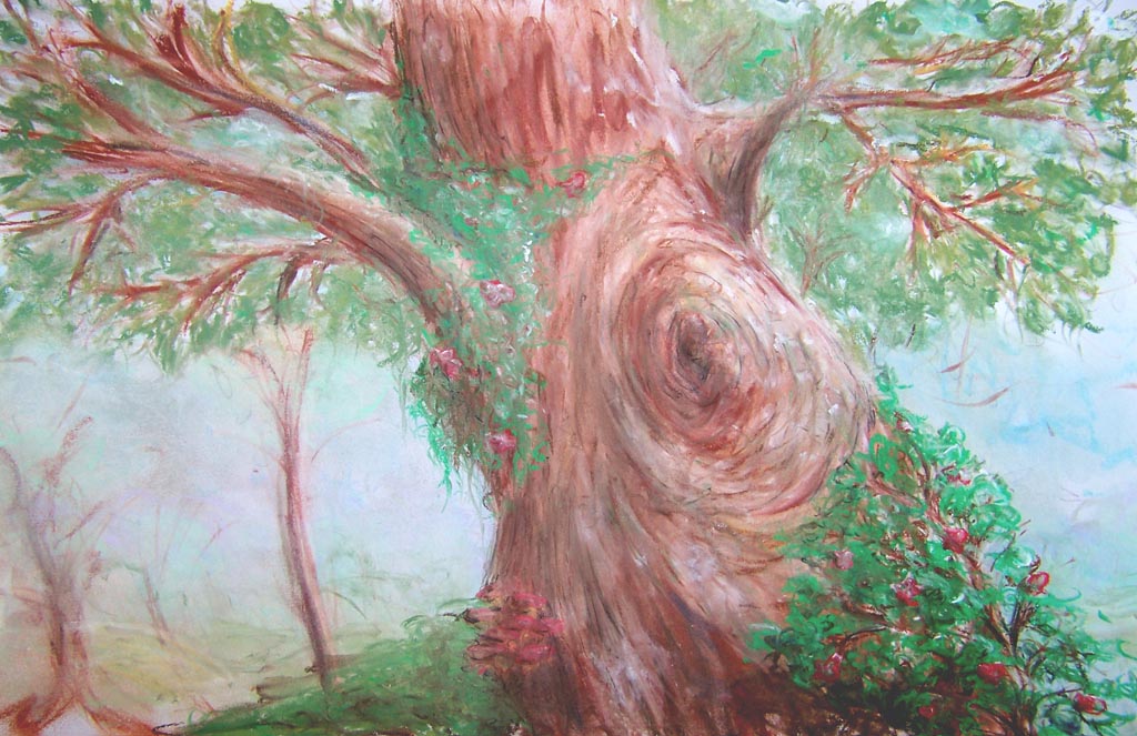
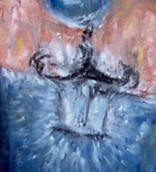
I’m on holidays and had the first chance in years to just sit and draw for the sake of it so I’ve been getting back into the good old pastels. The photos haven’t come out as well as I’d have liked, especially the second one looks rather scribbly in the caravan window and sky, but what do you think? Each is about 3/4 A3 size.
Yeh I like the second one best too, I was playing with different tones and seeing what kinds of effects you get when you layer the pastel down. I wasn’t expecting to have plenty of free time so I’m taking a trip to the art store tomorrow to stock up
ya, i agree that the second one is the most aesthetically pleasing due to the use of contrast. (i notice that the third is simply a more detailed look at the lamp in the second) but aside from the use of contrast and better composition, your trees in the first picture are quite something! trees are something i really struggle with. the only one i have successfully painted omitted the top with all the leafy areas… i.e. i cheated…
i think its the tone in the coloring of the second that really draws you in, and yeah the wheel is a little see through haha
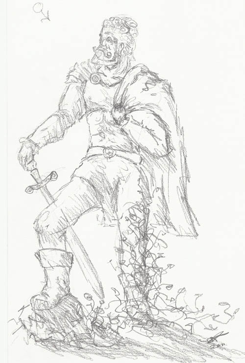
Yeh the wheel needs some more work, I’m going to add some more definition soon and cover over that slight blue line that makes it appear transparent. I’ll do some more tomorrow and post up my results. I love drawing trees… They’re almost all I do so here’s a really quick sketch of what I’ll draw tomorrow:
ey mon, any chance we’ll see some more pieces anytime soon?
Hey sorry everyone I’ve been visited by a certain sister-in-law who seems to need lifts across the country-side every second day Tomorrow is a free day though, and it’s going to be cold too, so perfect outdoor drawing weather
haha, that sounds like quite a dilema… thankfully i’m writing A levels, so my time is spent in leasure for the most part… hence the rediculous amount of time i spend on trivial persuits…
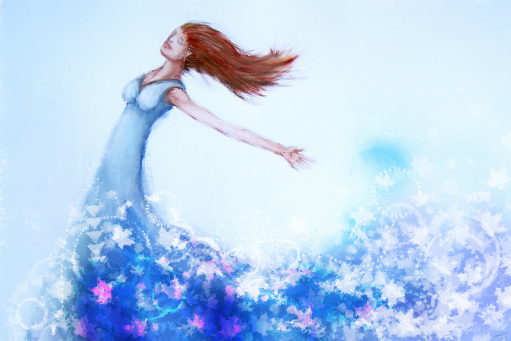
Well it’s been a while but I did another quick one last night I thought I’d post up. Overall about 3 hours, a few issues as always but I experimented using brushes to get soft lighting. What do you think?
Umm… Good use of pastels, But you need to work on human proportions a little bit. first of all, you are missing the ears. Second of all, the eyes are too big and too close together. If you don’t know correct proportions, fun with a pencil has a pretty good section on it.
Yeh I never paid enough attention to proportions, people aren’t really my thang, the ears are meant to be behind the hair but now that you point it out it just looks more like there aren’t any. Thanks for the tip I’ll have a look at it.
Hey all, it’s been a while since I’ve posted, I’m just setting up my own design business so that’s been pretty hectic. Anyway, anyone who knows my art (see above) knows I’m pretty crap when it comes to people so today I’ve tried to work a bit on that and draw a believable person. Here’s the result:
I did the base drawing with pastels and worked the bottom effect using Illustrator and Painter. The top half of the image (up to the swirl effect) is just pure pastel.
No reference, which I suppose is a bit counter-intuitive of trying to get better at drawing accurate people so there are probably still issues