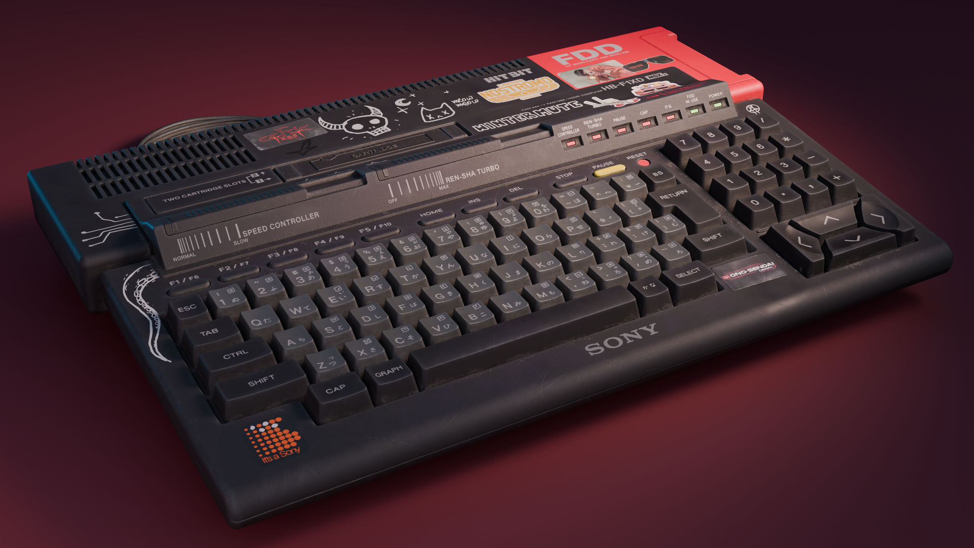
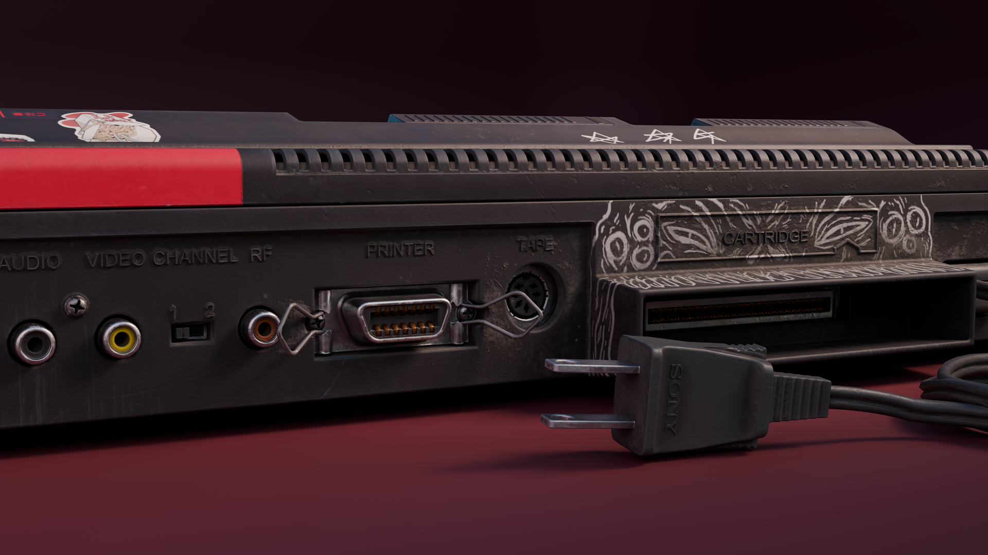
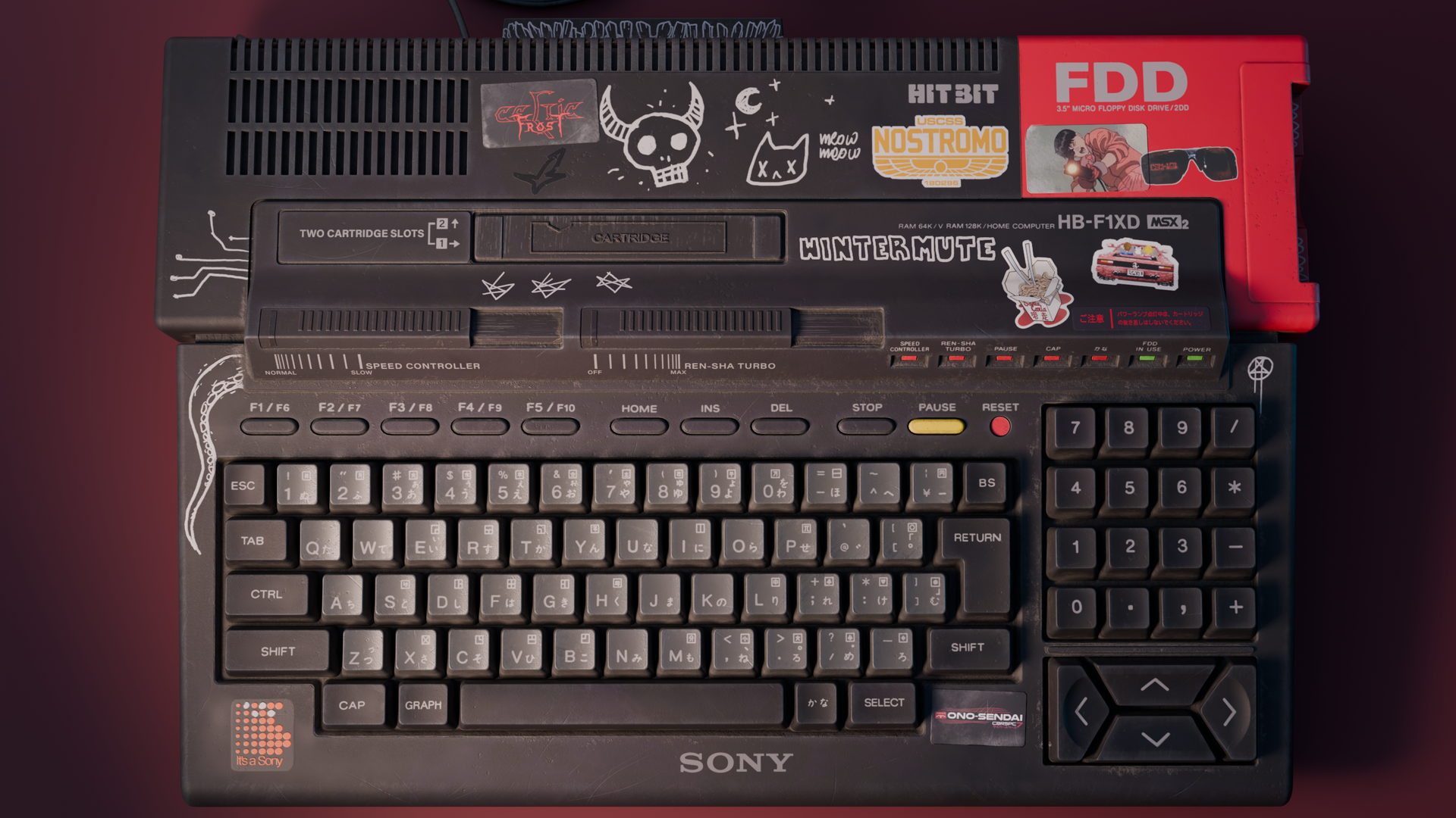
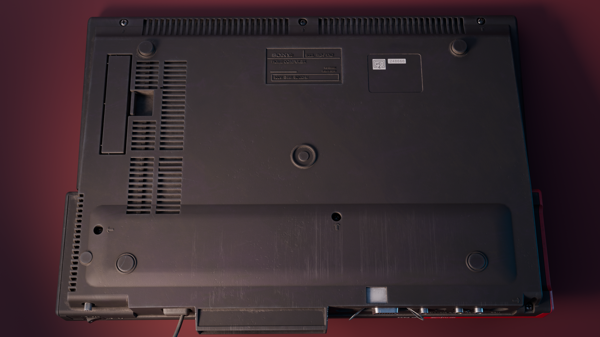
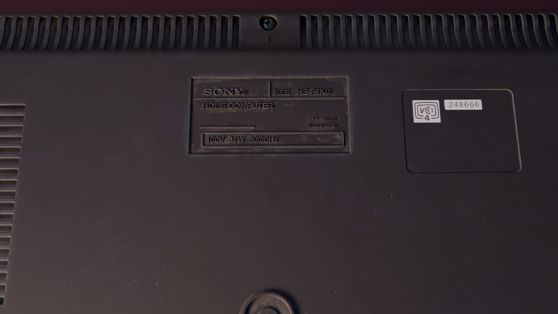
Sony HB-F1XD Home Computer

Hello Blender folk.
Just wanted to share with you my latest work.
It’s this beautiful piece of hardware that I stumbled on recently.
I instantly fall in love with its design.
It might be because of nostalgia but I think that we reached the peak of product design in the 80s and early 90s.
Contemporary stuff is just so blend and neutral.
What do you think?
If you have any feedback then please do share!
I personally think that the renders are a bit too dark in some places. But maybe it’s okay?
Also, here are my socials if you wanna follow along:
Artstation
Instagram

Thanks! :sunglasses:


79 Likes

This was always my idea of a cyberdeck from one of Gibson’s novels :slightly_smiling_face:

Really nice work and renders! :+1:

3 Likes

this is one great render !

3 Likes

Deserves a lot of attention. Excellent work.

2 Likes

Really cool and detailed work, especially the use of marks and drawings. Thanks for sharing!

@RobWu Yeah, exactly my first thought too haha.
Looks so futuristic!
@LazloWoodbine @pbeckerp I challenged myself to capture every little detail from the photo references that I found online.
Thank you guiz!!

1 Like

Thank you!

Great work! Brings back sweet memories of the 8-bit days. :heart_hands:

1 Like

I featured you on BlenderNation, have a great weekend!

1 Like

You’re on the featured row! :+1:

1 Like

OK, you asked, so here we go:
I think designs from the 80ies were the peak of ugly as sin. This blunt, unsophisticated, dull and plump edgyness, void of all elegance (including the Bauhaus kind of elegance)…

I would search for good design rather somewhere between the 20ies and the 50ies (kind of varies in terms of subject matter and stuff, e.g. architecture, automotive design,…), but that’s just me.
Just look at how ugly and outright silly the design of Warhammer 40K Space Marines looks and then take their illegitimate bastard-son’s (=Star Craft Space Marines) design as a counterexample :slightly_smiling_face:.

But great renders. A bit of selective wear on frequently used buttons would have been the cherry on top.

greetings, Kologe

Oh men… call me weird but I like the old W40k designs, haha
They were really charming and totally over the top bombastic.
The modern designs, as most modern stuff, is very safe in its appeal.
Also the oldschool fantasy (Sword & Sorcery) is waaaay more climatic then what we go now. But I grew up in the late 80s and 90s so it’s just what hits home for me.

Thank you so much for the tips, I did have more wear and tear but I brough it down. I struggled a bit with finding the right balance… I should actually have asked for some opinion back then. :raised_hands::raised_hands:

Now you made me curious. Would you mind elaborating in what sense you mean the term ‘safe’ here? :slightly_smiling_face:

greetings, Kologe

Perhaps as in “supremely boring and expected”?
Reference: see “Apple design”. See 99% of smart phone design.

Since this is a thread about an 8-bit computer render, I will limit the design discussion to the topic of home computing. Also because the scope of product / visual design as an entire topic yields useless discussions (for example: the 80s represent a golden age in terms of music and film design).

The final years of the 70s and throughout the 80s were a quite experimental era for industrial product design in home computing. But for the typewriter based keyboard that influenced all designs, a lot was in flux and product designers were trying out new things, which resulted in both beautiful and also at times zany visual product designs.

Rick Dickinson’s designs of the ZX81 and the revolutionary ZX Spectrum (based on Bauhaus design principles) were extraordinary. And other quite beautiful designs are seen in the physical shapes of the Elan Enterprise, the ZX Spectrum 128K and QL (also Dickinson), the original Mac, Memotech MTX, the classic Gameboy, as well as certain Japanese MSX models like the one rendered here, with distinct Japanese stylistic characteristics.

Even quirky designs such as the Commodore 64 ‘bread-bin’ still represent iconic shapes. Almost every new generation of home computer and console design featured unique physical designs in the latter half of the 70s, the 80s and part of the 90s.

I am not saying it was all successful; yet far more interesting in terms of industrial design since the variety (in particular in the 80s with many different companies trying to get a piece of the home computing pie) and experimentation led to some outstanding and outlandish stuff.

It was an interesting and exciting time in that sense.

And while it is completely understandable that we no longer live in these times of the early Wild West of home computing, still current main-stream industrial product design in computing is rather…

…well, boring for the most part. It certainly lacks visual excitement.

This, at least, is my opinion.

[[Similar to how cars are designed nowadays. And on that topic: I wonder why all car designs look so ‘angry’ and aggressive these days? As if they are intent on killing every pedestrian and cyclist that gets in their way?]]

@crowbringer Really nice work. A friend of mine had one of those.

I am personally still on the lookout to get my hands on this Sony MSX2 machine:

Most MSX machines had a dark colour scheme. This one was released for the European market, and sports a light scheme.

Well Apple’s design-department is just distilled weapons grade narcisism, let’s best not talk about those morons.^^

That’s probably because it’s like 5 dudes working for 3 companies, nowadays. Or maybe one machine-learning algorithm used by 3 companies.

Anyway, I’ll prefer the Crysler Building over the WTC any day (even though the latter wasn’t even particularly bad by 80ies standards, pretty Bauhaus in fact). But yeah, kind of a senseless side-discussion, I know.

greetings, Kologe

I would tentatively agree with you, that on the whole, 80s architecture is rather boring and unexciting :slight_smile:

…and I did try to find my hardest to find interesting examples!

Well, it is just my observation, haven’t really researched it. By “safe” I mean devoid of interesting features. Designed to not stand out so that it doesn’t evoke strong emotions. If it stays neutral, more people will accept it thus it will sell better. This is everywhere in modern design, phones, cars, furniture… you name it.
It’s such a shame what happened to the car industry, the concept cars from the 80s were just on another level, futuristic af.
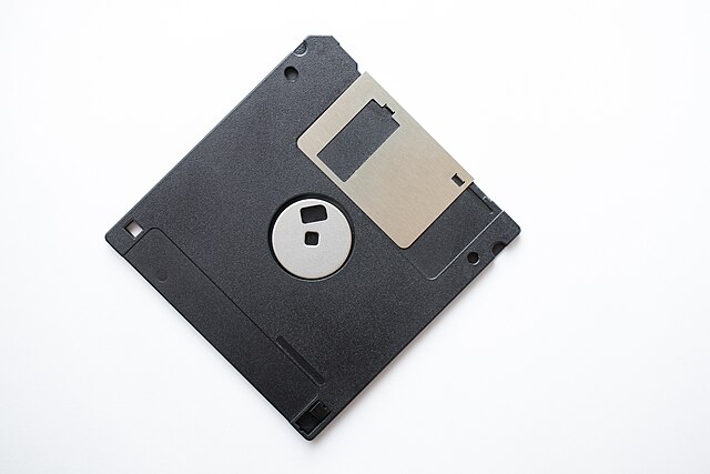
You know what? 3.5" floppy disks! Oh, man these were the most iconic data storage devices ever. But minimalisation killed it, imagine that the design for portable data storage didn’t change much but only increase in its capacity. I wanna a bunch of 3.5" 1TB floppy disks. The need to go smaller and smaller is so overrated.

I owned a C64 as a kid and I literally called it “Chlebak” with my friends, it translates to “Bread Bin” haha
It’s design was not that interesting to be honest but I can still hear the sound of the tape being read.
That HB-F1XD though, this design really kills, I wanna get it, put a RaspberryPI in it and turn it into a cyberdeck haha

1 Like

Sounds like there’s money to be made from the nostalgia of guys like yourself (something along the lines of manufacture fake floppy disks which internally contain a modern microSD-card and then sell you those, along with accordingly oversized 3.5’'-microSD-card readers).^^

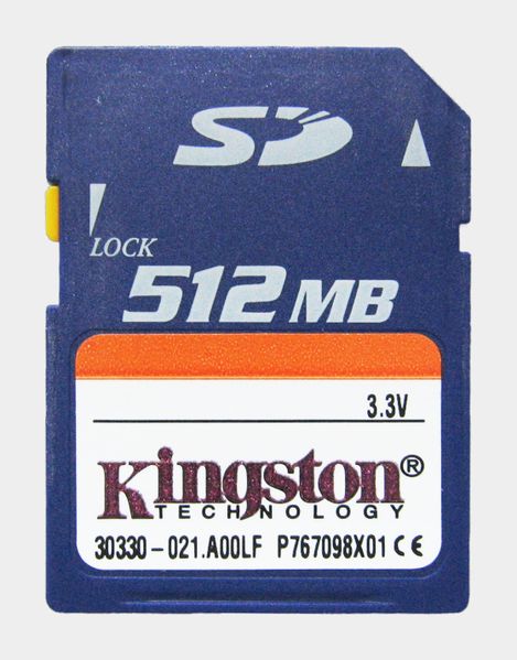
But honestly, how’s the ‘design’ of a 3.5’’ floppy disk all that different from that of a modern(ish) SD card?
The former was a flat square shape with one corner cut off.
The latter is a flat rectangle shape with one corner cut off.


In fact, I even fail to see how there’s any design involved at all. I’m pretty positive what either of these devices look(ed) like is/was 100% governed by technical considerations only (e.g. the cut off corner exists solely to physically prevent insertion in the wrong orientation). I’ll dare say there’s about as much design to a floppy disk as there is to Blender’s default cube. :stuck_out_tongue_winking_eye:

greetings, Kologe

P.S.: I promise I’ll stop it now.