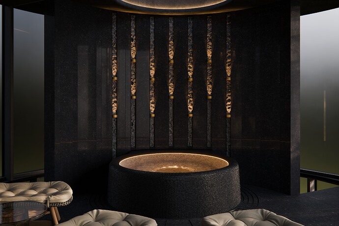
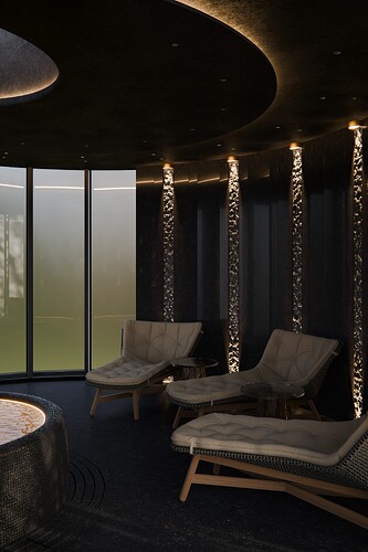
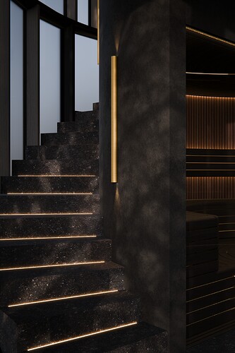
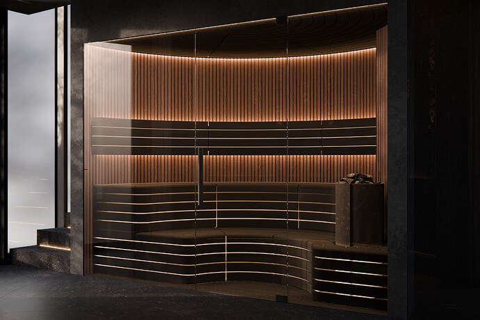
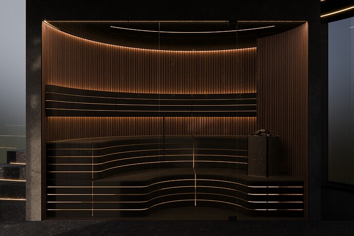
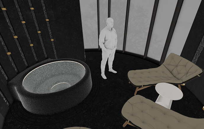
Looking for feedback. What could be better in visualizations or interior design?
Great work!!
Just one more thing…
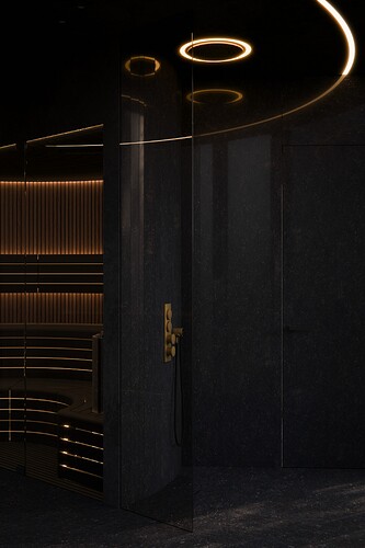
As a regular spa user i am missing the “typical” thermometer which is normally in every spa.
Yep, those are missing. For the tub I suppose we could imagine, that there is a phone app for that or something ![]() , but the sauna should probably have more usual accessories. That would be an improvement.
, but the sauna should probably have more usual accessories. That would be an improvement.
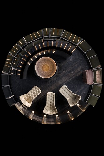
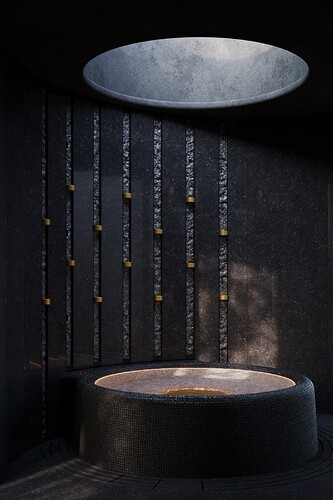
The tub looks very small compared to the recliners.
Oh, it’s not huge, but that’s how big the products are. I think 4 people would still fit very comfortably. It’s not a very huge space (not too small either I suppose). Does it look out of proportion or weird? I think the high ceiling might make the tub look even a bit smaller than it is. I don’t know - I wouldn’t consider that to be a problem. Thanks for feedback. Anything else that might look weird or could be better?
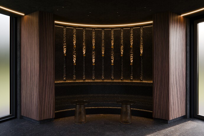
I think the fabric material of the beds could be better and the glass tables could be brighter - they sort of disappear now. I could have worked a bit more on the shadows that come from the outside as well, I think they are nice, but could be nicer and now that I think about it, maybe a few accessories or plants would also improve things.
Nice design, and I agree with you that it would be better if there was some plants. And, I see that this is a pretty small space but I think that you need to show it in a better way. Try different angles and experiment with a focal point to add a bit of depth.
