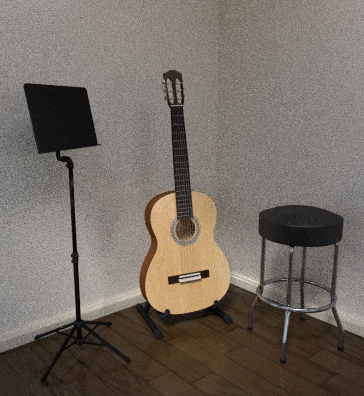
The last couple of weeks I’ve been trying to model a spanish guitar. Later on I thought the guitar alone would be kinda boring so I modelled a music stand and added it to the scene.
Now the scene is far from complete. It’s rather empty and I haven’t done any post-compositing, because frankly I don’t know too much about it. However, I feel like the scene has some potential of becoming pretty nice.
That is why it would be nice to hear some honest criticism of what you think of it
Btw. this is my first post on Blender Artists so I apologize if I’ve made some mistakes while writing this post
Generally I like it - there are some drawbacks, but I am going to be mostly punctilious:
As you said, it’s rather empty, I guess you know which things are missing (sheet music, chair, the thing one puts under his foot, probably a case for guitar, table with stuff like tuner, metronome and other things regarding guitar… (and one generally does not have a plain wall without any furniture around etc.))
Proportions and sizes seem wrong - I guess it is all caused just by bad focal length of camera. (i.e. compare the angles the side of the guitar with the stand, compare size of the head of guitar with body - they just seem wrong).
Another thing is position of camera - generally it should be placed somewhere where you would place it if you made the photos in real. This is not bad, but I think it could be improved - I would try to place it a bit higher, and see if it is better or not).
Check the distances between the frets - they seem to be too short at the 0-3 fret (i may be wrong, I am not able to tell from this whether it is exactly the (1/2)^(1/12) proportion or not).
Check whether you really have stand this high when you play guitar (you may, but generally it is higher than usual).
Regarding materials - I am not able to tell what are the exact setups used, but you should definitely use materials as they are supposed to be used - that means according the physics. That means that nearly every material should be mixed of glossy and diffuse shader - some problems here:
the floor is too reflective (or the roughness is too small - i like it, but it looks unrealistic)
play a bit more with the material of the soundboard - I personally imagine a material mixed of glossy shader with zero roughness and some diffuse shader…
Think a bit about light - if you wanted you could change the mood of picture a lot by just rearanging light sources. Notice that the central part of image gets the smallest amount of light (compared to the top edge of image, the light from left and reflections from right).
I.e. You may (or may not) want some lamp (as part of scene) that would illuminate the stand (and of course if well placed, it could light the guitar as well).
I like the models, but the image as a whole needs a better story. As it stands, the guitar and music stand were put against the wall to get them out of the way while something else was going on in the room. At least, that’s how I read it.
Think about what is happening in the scene: is the musician practicing and just stepped out for a bit? Is the music teacher setting up the room for his guitar student? Was this fellow playing guitar for his sweetheart and they have moved on to other things?
Tell a story with your image and it won’t be boring. You have an excellent start: the guitar looks just like my Yamaha.
First of all thank you so much for taking the time to write the feedback - I appreciate it very much!
Second, I tried to improve some of the things you guys mentioned:
Made the floor less reflective (suddenly I don’t think it suits the scene anymore… :-/ Hmm, what do you think?),
Added in some new objects to make it seem less empty and to add a bit more personality (guitar stand, picture frame, and night stand),
Made the front of the guitar a more wood-like material and placed it onto the guitar stand so it doesn’t just stand directly on the floor,
Tried to be more creative with the background wall: Made it more of a warm color, added a slight glossiness and added an image texture as displacement in material output.
Looks better than the first one, I can actually see the wood grain on the soundboard much better now.
Two things that seems to look odd about the guitar, and it looks like it to me in both pictures, is the width of the neck appears to narrow a bit at the nut, almost like the nut is just a bit to small for the neck. Could be camera angle or perspective or lighting causing it to appear that way but it just doesn’t seem correct. Also typically on spanish / classical guitars the strings are tied off on the back end of the bridge and typically there would be loose ends showing. It almost looks like you have the strings going through the bridge like an electric guitar would have. I wish i could zoom in better to see, so if I’m incorrect ignore that part.
Also most walls have a baseboard where they meet the floor.
I’ve been thinking of trying to model one my guitars but my skills aren’t quite up there yet.
Consider binding the top for more detail, and real string materials would also be another means of adding some tone and color, winding with wire and silk just for color and shine, ie not the wound texture as such.
Too much subsurf on the bottom of the furniture means it’s going to fall forward! A dark floor would anchor composition nicely. If you are feeling adventurous a nice yellow! cloth modifier polishing cloth dropped on top of the furniture would be a nice contrast to all those hard surfaces
Well sorry for doing this, i did not really want to write most of this, but some things require comment (and while I am at it, I will comment all):
Ryeath’s note on “loose ends” - no, from this perspective the ends of strings would not be most likely visible, because, if tied properly they are not loose. Properly tied every string’s end is attached to the “knot” of neighbouring string (from the bottom side of bridge), so that it is not loose. The problem with ends that are loose is that these do resonate from the bridge, and if they lean to another part of guitar, they generate unpleasant sounds.
Regarding the bridge - bridge itself is actually that thin piece of bone or plastic that supports the strings*, that is of course usually white (or cream yellow or something like that), but the rest of the “bridge” (I do not know how to call that better) is made of single piece of hard wood (that in fact means a dark-coloured wood), which especially applies to the part where the strings are tied (edges of the block are usually enforced by some material, which is usually white, but the block is wooden)
holes in the head of guitar seem too wide from this perspective
tuning pegs of tuned guitar are in fact never aligned
the only point I find important of these above is regarding the soundboard:
[LIST]
Subjectively i find the new colour too bright - it would have to be a plywood soundboard intentionaly coloured to so bright colour. Massive soundboard will always be at least a bit darker. I cannot really prove this, but it seems to me so.
The texture is completely wrong (that’s why I did not mention possibility of texturing it - I somehow expected you would do exactly what you actually have done). Guitars’ soundboards are not made of such type of wood. Sound board of a guitar is made usually of two completely identical slices of wood (slices that were actually paralelly one next to another in the wood - as if you took a thick board and cut it lengthwise into 2 thin boards of exactly same sizes as was the source board), that are glued together in the middle. These have to be cut of very qualite straightly growing wood in perpendicular direction (actually perpendiculary in one direction, and paralelly in the other one). Generally these have very dense wooden pattern (of dense completely straight stripes) and are made from very old trees - on my board it is around 160 stripes per every half of the soundboard (thus tree had to be over 240 years old). You just wont make pattern of soundboard visible on a render (unless you render in really very high resolution) - the only point of texture is/would be to make the shades slightly differ at different spots of soundboard.
[/LIST]
*point of this is just to explain which part of guitar I am talking about
Another thing the guitar stand - when i first saw that, i could not believe my eyes - i would never put an acoustic guitar to such stand, and I guess most of ther classical guitarists would not do so either. On the other hand I must admit that when one knows what to expect, or does not think of that (or does not play guitar) it visually looks nice.
The bottom of the furniture does actually not have enough of subsurf. It may be sufficient to change shader to smooth but if it is not, then you will have to add some loop cuts to keep the shape right and increase the subsurf.
But as it is I really like it - the simple, polished nearly cartoon style altogether with the details of guitar and some other things.
I am gonna write a response to some of the things you guys pointed out and post a new render which hopefully will show some improvement But I haven’t done so much yet, which is why I won’t write it right now.
I just wanted to hear your opinion on this bar stool instead of the night stand:
(sorry for the poor render, didn’t have the patience :P)
Again the only thing I did was to replace the night stand and remove the picture frame and add that thingy where the floor connects to the wall, so I wanna hear the opinion on that
Oh, btw, darker floor? (I’m not even gonna apologize for the awfully low samples this picture was rendered with )
Stool is too sharp and too clear, if you know what I mean. dark board isn’t a good idea because you need to stick with the same theme. light-colored guitar with light settings, like you wall. Need better juxtapositions,(one of my favorite words ) You might also want to add a story to make everything a little more realistic.
Hey guys,
So I decided as you said to keep a light, warm floor. I worked a lot on the guitar, tried to make it darker and worked with glossiness and all that
I am fully aware of the fact, that I did not change everything you mentioned: Subsurfing and the story. Also I was thinking of rotating the picture towards the room instead of towards the guitar. I will try to work on that, but I just thought I’d show the new guitar, so I could hear you guys’ thoughts
The stuff on the top of the pole of the stand looks a little strange. You could use blur in the compositor, just something to get rid of it. I’m guessing it’s because of too much glossy? The thing holding up the guitar looks fake, try adding more “vivid” colors, also the stand needs to be more of a metallic. right now it looks like play-dough… bottom of the table is fake-looking. I don’t know how shiney a guitar is, but there seems to be too much reflection on the guitar from the table
Also, to clear up my previous comment: answering the questions like “Who lives here?”,“how new is this place?” are the story part. Adding the picture is part of the story because it isn’t just a guitar and a music stand, it’s a legit room corner, or that’s what I think you’re trying to do.
Hope this helps
 (sheet music, chair, the thing one puts under his foot, probably a case for guitar, table with stuff like tuner, metronome and other things regarding guitar… (and one generally does not have a plain wall without any furniture around etc.))

 Again thanks for all the kindness towards me, my work and my noobishness