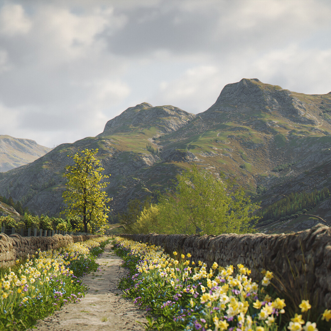
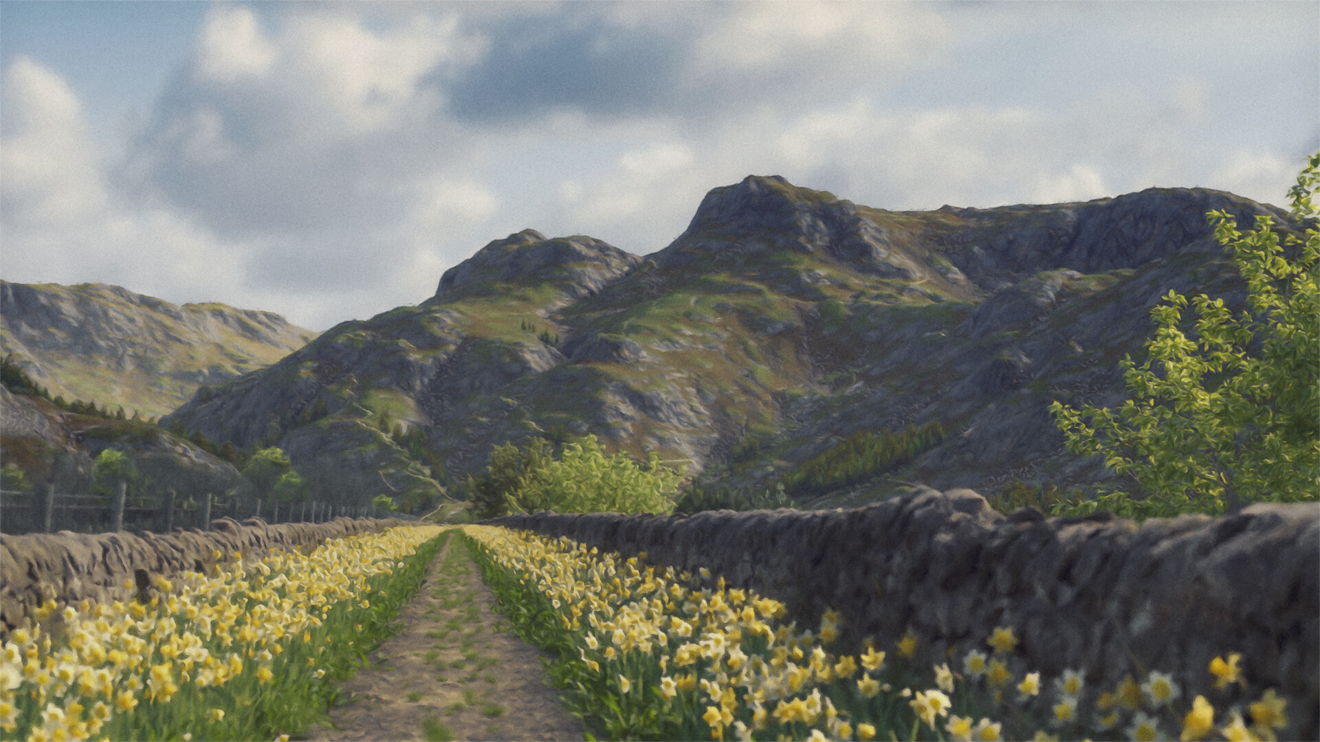
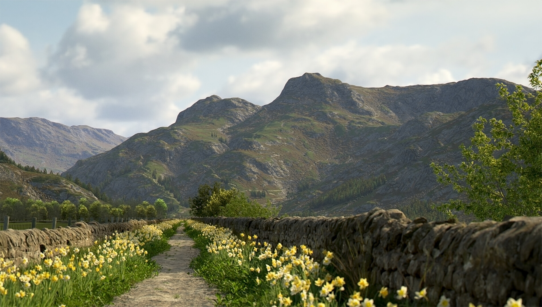
Not sure whether this is finished or not, so its a WIP for now (might end up being some other angles and crops and tweaks and other such messing around).
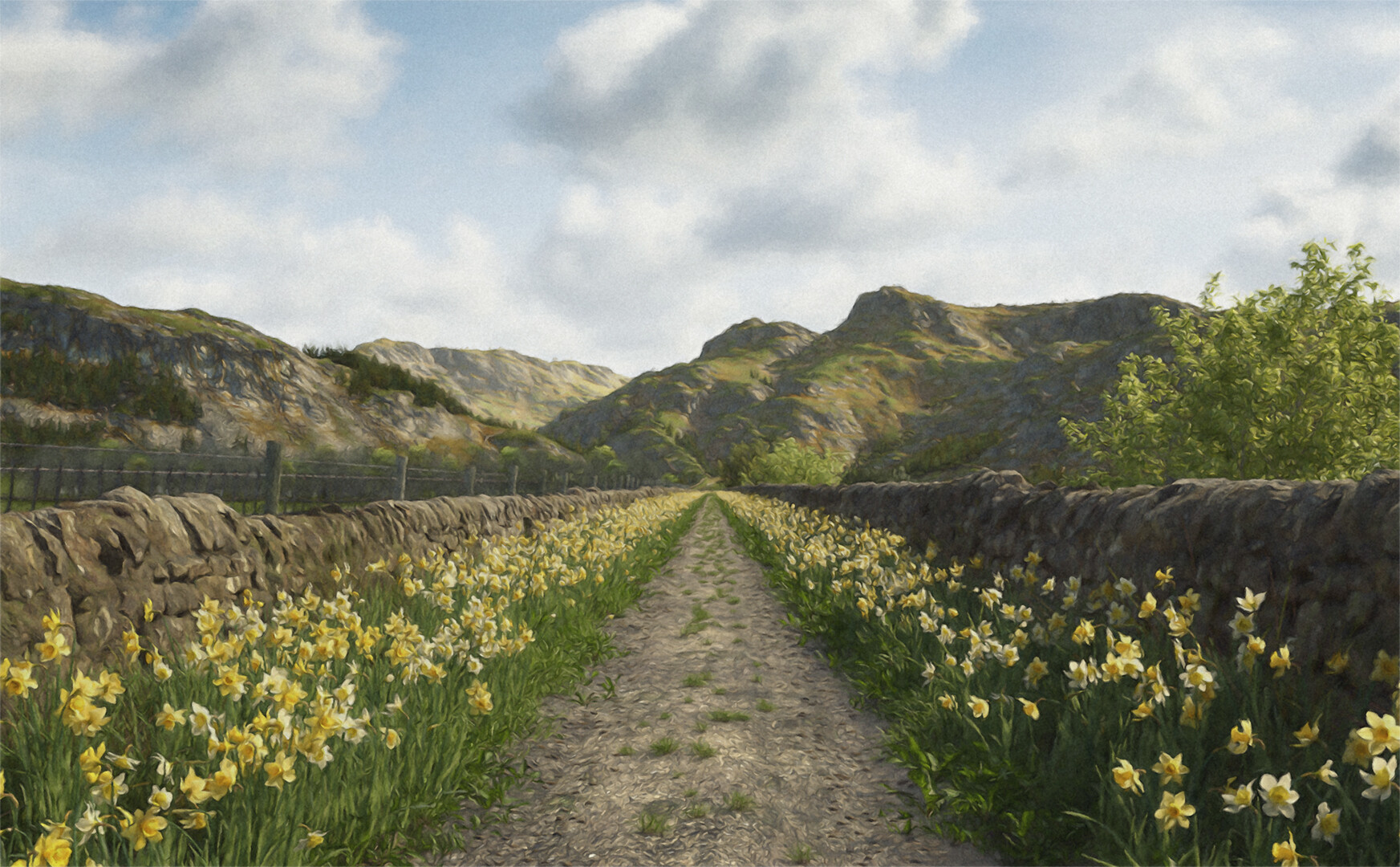
Yet another landscape, this time with probably a few too many daffodils (artistic license!!). As usual, a ‘proper’ one and a ‘painterly one’.
The fells in the background are based on a real place (no prize for guessing other than pride), but the path is made up. I’m going to go out on a limb and say this is the best material for the hills/fells/mountains that I’ve managed so far (perhaps not saying that much, but there you go).
Comments on improvements always welcome (but please be kind !)
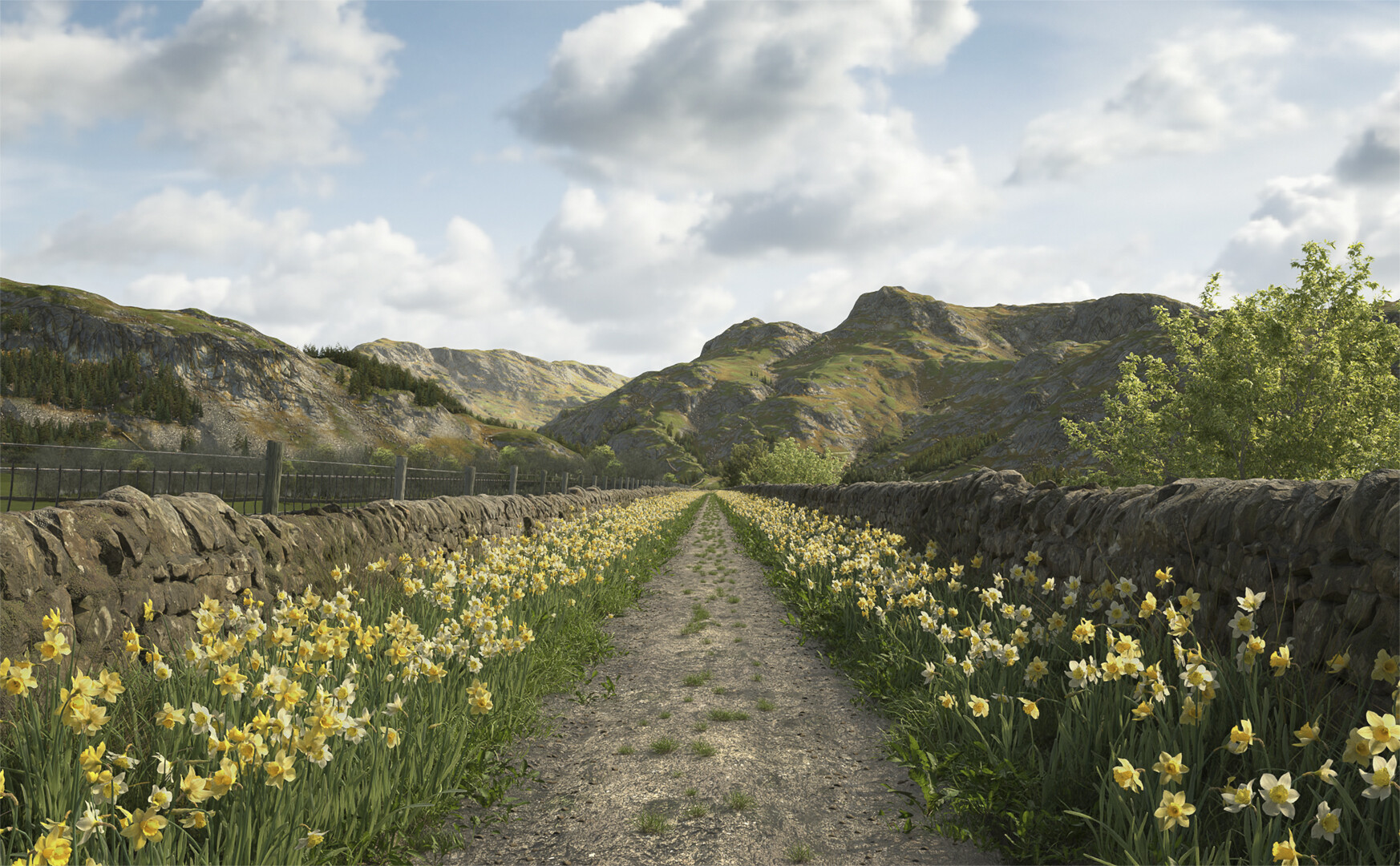
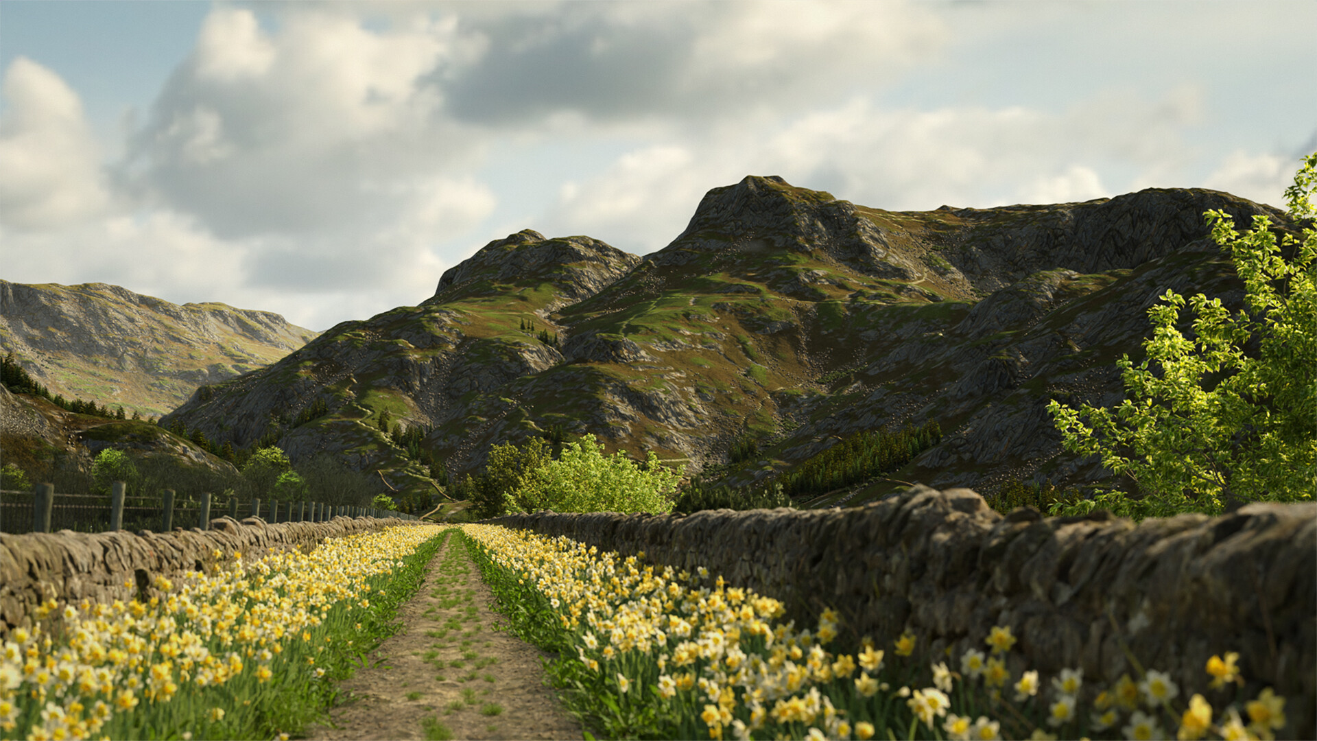
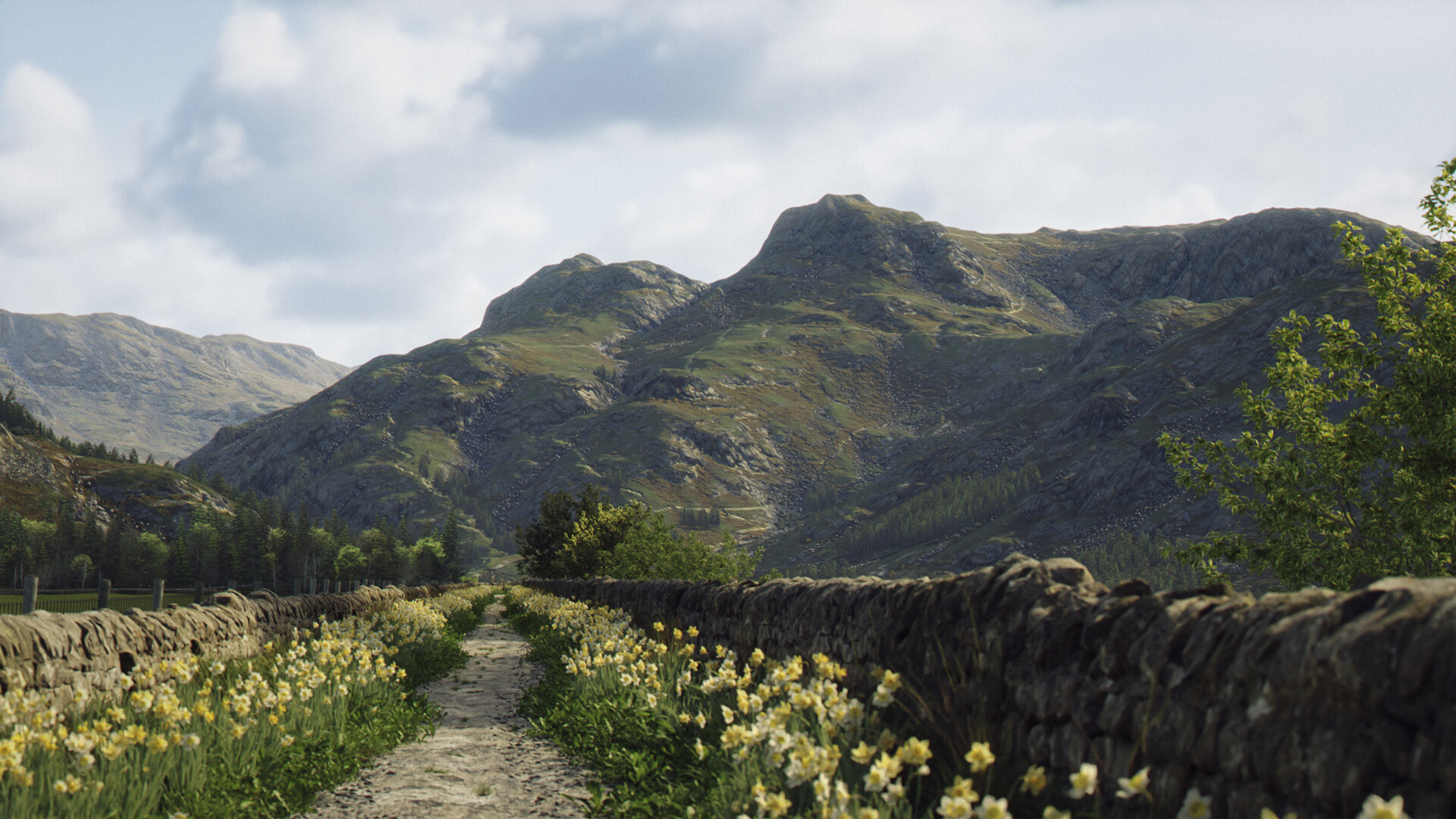
Bit of variation #1. Hope you like it (and if you don’t, tell me what can be improved (but, as always, be kind - I’m very sensitive ) I can already see some things that stand out - which is why this is a WIP).
Are you using Ambient Occlusion? Your shadows seems a little bright on the hills. Wonder if the overall contrast and realism might be a little better with darker shadows? Might just be me though
Thanks for the feedback - much appreciated. This is lit by a HDRI and I’m not sure how to darken shadows in the render - but I have increased the contrast on this one and darkened the shadows a bit in photoshop. Not sure if its any better (or that noticeable a difference) but always happy to experiment!
Thanks for the suggestions - much appreciated… I’ve included some volumetrics in this one and a gobo (not that noticeable, but its there) and some stronger chromatic aberration (there is some in original but probably too subtle) + stuck with higher contrast to retain darker shadows. I’ve not included any birds as yet; tried but looked a bit convoluted (or even more convoluted!!). I think it does look a bit better (maybe a tad dark and the depth of field might need adjusting… but other than, quite happy with how its coming along).
@LazloWoodbine , u’re great !
Can see Gobo on the road and flowers. Personnaly, i like when it’s contrasted (so shadows are great for me), Can see volumetrics on far mountains. Good job
No birds (a big one in the center of the road can be great )
I wish spring looked like that here… The last of the snow just melted day before yesterday… everything wet… muddy and filthy from all the trash under the snow. City Life!
Given the title, I think it’s right not to have birds just to lead the viewer to question it.
Spring is sprung, the grass is ris
I wonder where the birdies is?
Something strikes me as slightly off with the path (or the daffs along it), but I can’t put my finger on it. Unhelpful, I know. But the whole thing is great and makes me miss going walking. I need to get back to that.
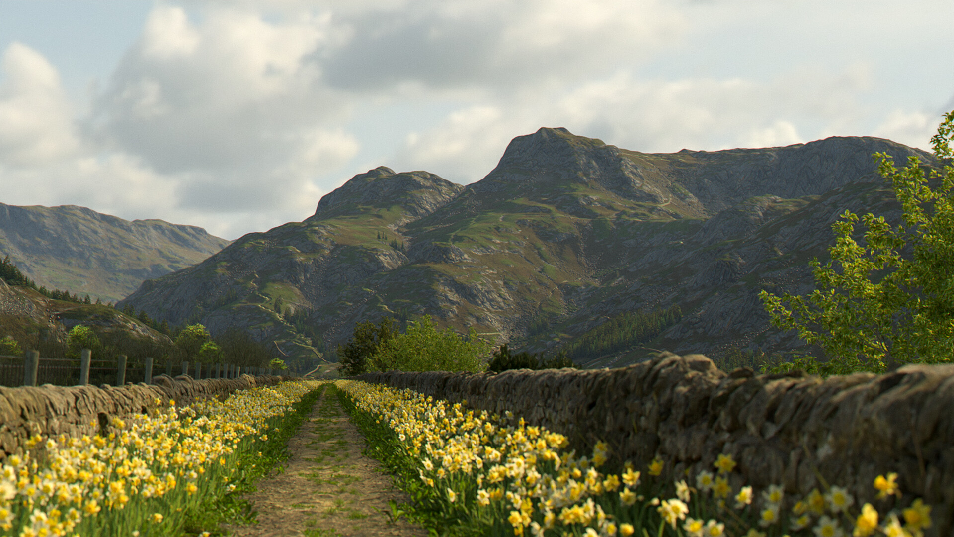
Thanks for the feedback. Not sure what it is that is ‘off’ either. But FWIW I’ve had another go (always tinkering) where I’ve decluttered the path a bit - maybe there was too much grass on it (does it need to be wider, bendier, both too?). Also removed some of the shrubbery from the fields on the other side of the walls to make it feel a bit more open. Changed the colour of the path too - made it a bit lighter. Made any difference, or still ‘off’?
It definitely feels better. I think lightening the path really helped. Looking at the two side by side, the previous one feels “heavier” than the rest of the composition, whereas this one fits more.
Unlike Joseph, I have seen paths that straight and consistent in width in managed countryside, but if you want to add variation maybe give it the odd kink: people don’t always keep to the path proper and if they stray often enough it can leave patches where only hardy grass grows next to the path, or sometimes leaves a complete bare patch. Whether it wants to be wider depends on what traffic it gets. Is it a footpath, a bridleway, or does it get farm vehicles down it? That also helps with grass placement. In my experience, four wheels would lead to a central clumping like in your original images. If mainly foot, bike and horse, they’ll be all over the place, so no real central clumping.
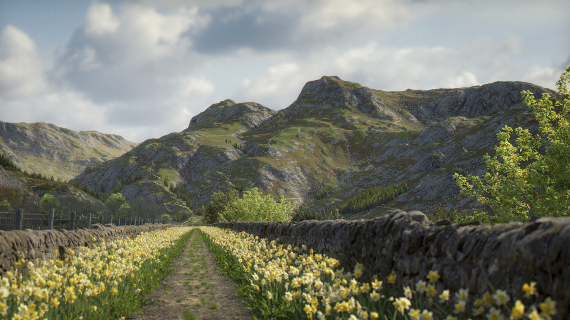
More tinkering, taking on board above comments (many thanks) and some other tweaks to main hill material and other subtle changes. As always, the returns are diminishing on every pass (but keeps me off the streets!). Still some more little tweaks to make though.
Shadows have gone lighter again (even though on high contrast). Wish there was still a shadow pass. Tried a different HDRI but didn’t look right. Any suggestions on how to darken shadows (or better still output some kind of shadow mask) which doesn’t make everything else darker at same time?
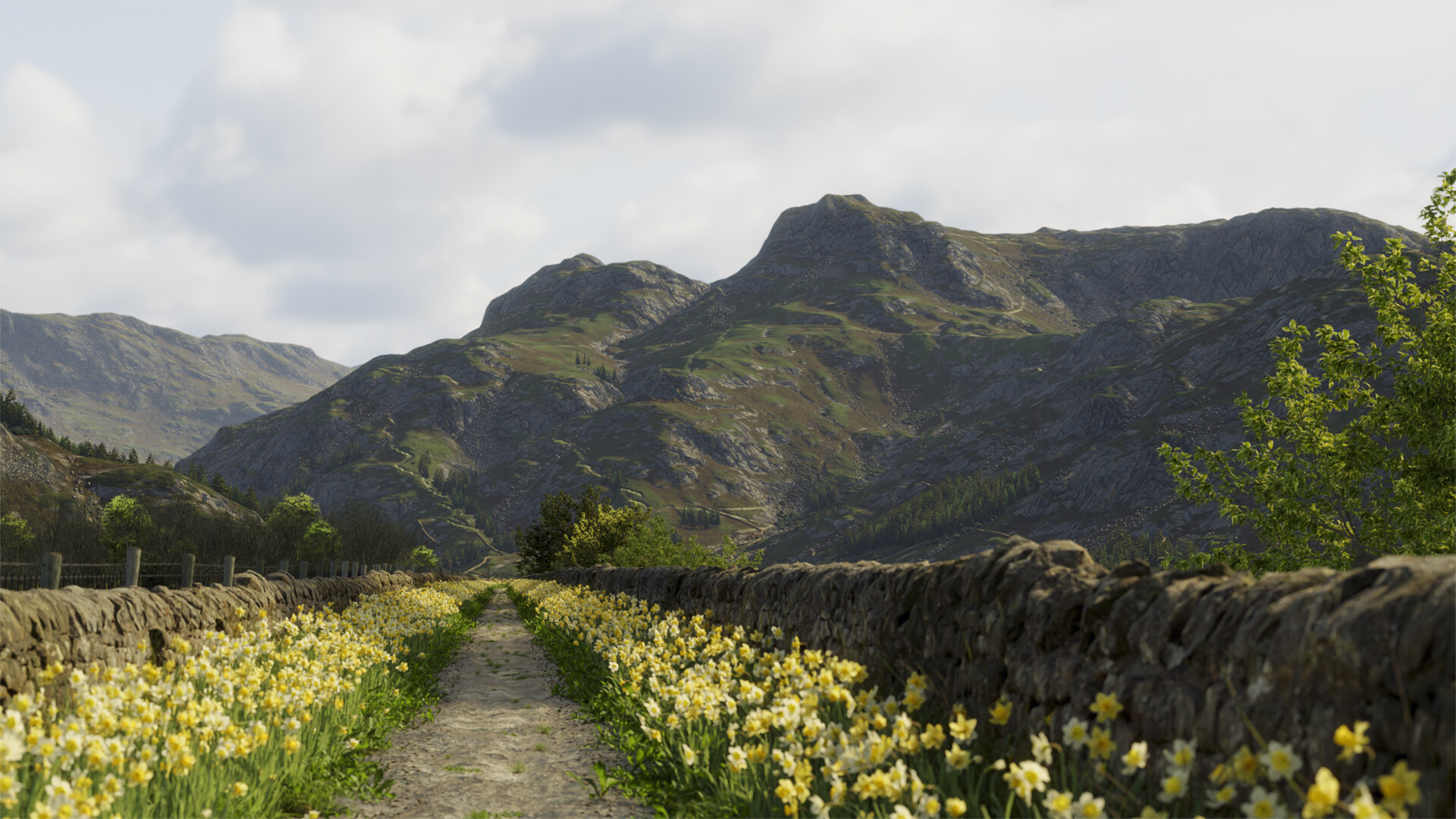
There are some differences to the last one, honest. Reaching the end of what my skill level and patience (and particularly my PC) can get to in terms of realism. Not sure it will ever get to what I have in my mind’s eye. Nevermind.
I think it’s looking great. Not quite sure about the lighting of trees just to the left of the path—the sunlit one, with what appears to be a darker conifer in front of it… or is it just one tree with parts shaded from the sun in the shape of another tree? It’s tripping my brain, but actual nature can do that too, so unless someone else can say it looks wrong it’s probably fine. Other than that I’m struggling to find issues. I think the path and daffs work a whole lot better now. Is it me or did you add some stonier ground to the border area? Good call. The shadows/contrast also seems improved: better sense of distance between the mid-ground hills and the one in the back.
Maybe take a little break from it, and come back to it in a few days, or even a week. Seeing it with fresh eyes might let you see what’s missing (to your minds eye). But it’s a lovely scene as is. I’d certainly like to take a walk here!
@Jvry Thanks I think the tree issue might be something to do with the randomisation of the colour of the trees (I’m not too sure about them - have tinkered a lot with them but not sure they look quite right). There were always stones there but too small to see properly so made them a bit bigger. Good spot on those trees ! My other half told me to get rid of them… and I do what I’m told! Hmm, sheep - something to think about!
@Magnavis Thanks. Probably a good idea to have a break. You can have a walk there if you want though…
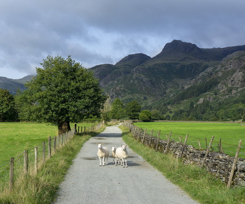
(The irony isn’t lost on me that this is probably a better scene and composition than the one I’ve come up with, but when I started this one it wasn’t intended to be a representation of this photograph (I took on holiday in the Lake District last year) - I just ended up using this mesh as a backdrop (I created this for another image I made) and it sort of took over… maybe after the break I’ll actually make it look more like this - with the sheep too!).
@NeilJamesFrarey Thanks for the feedback (I think ). I have got the rule of thirds grid on the camera. Maybe stuck to it too rigidly . There has been quite a lot of criticism of my path - not just on here - for being variably too straight, too long etc. But it does curve off at the end, so isn’t intended to go on forever. However, I probably need to bring the bend closer to the camera to make it more obvious or terminate it in some other way. Thanks again.
Seconded. Flowers in the wild are never just one color. Even if they were deliberately planted, wildflowers have a way of springing up. I think some purple heather would be an excellent touch here