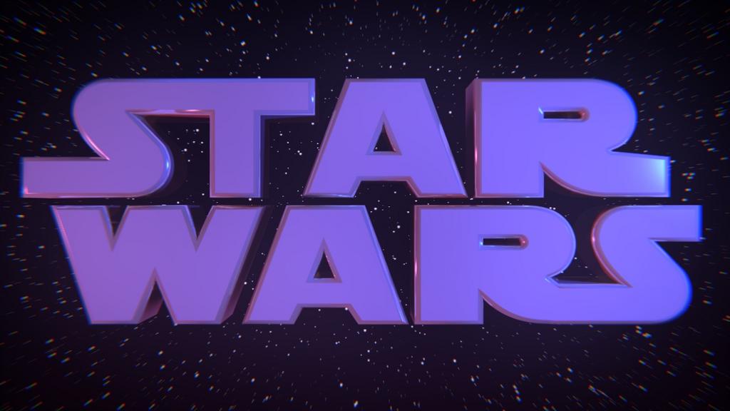
Hope you like it! I was basing it off of the logo for the edited version of the Return of the Jedi. I may be adding a lens flare above the A, but I’m not sure.
did you use the star wars font to create it.
its not bad but its what i would call a 2 minute job seeing as you can use fonts in blender
I would assume he probably didn’t use a font, noticing how the letters run into eachother.
awesome! 
not awesome. the chromatic aberration kills it.
pretty nice, you modelled this or used a font? spacetug is definitely right, way too much chromatic abberation.
How’s this? I put the Chromatic Aberration as low as it would go, but if you want me to turn it off completely, I’d do that too. I also added a lens flare. Actually, I originally did use a font, but I had to do so much editing to the letters, I scratched that idea and just modeled them. Sorry about the poor quality of the image; blenderartists did that. The image was rendered at a quality of 100.
Attachments

Why is the “Star” part of it moved over to the left a little more than the right, it makes them look a little uneven. But really good otherwise, I love star wars.
yeah, the “Star” does seem a bit off, now that Inferno mentions it…but it looks awesome with the flare!
thats a lot better. and the “star” does seem a little off from the “wars”

looking good! i dont really like the purpleish color, what is the blue on the edge of the “R”?
looks a lot better! the purple fits nicely, it’s just like RotJ’s logo
…though I am curious as to what’s causing the blue shading on the right 
probably the spec… the light source must be just to the right of the camera and is reflecting off the edge of the ‘r’… all you have to do is move the light an inch to the right… haha… that rhymes…
So do you want me to move the light so that doesn’t show? @ MeshWeaver, yes, it is from the RotJ. I was just watching it the other day, and I thought it looked kind of cool.