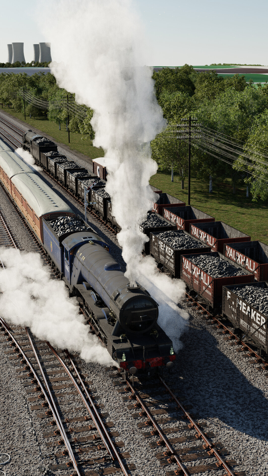
This work in progress is based on one of my favourite watercolour pieces by Ted Rose. It captures a passenger train passing coal trains servicing a distant power station. The setup is fictitious, but I’ve used LiDAR data from England for the background landscape. Still very much a work in progress, but there is enough here to share - please give feedback!
8 Likes
Do the coal should have such reflection? It seems to be taking light from more angles than it should.
Water vapor seems more like cotton candy  It seems too well defined.
I like the ground, the rail lines and the dirt in the locomotive and illumination feel.
1 Like
Thanks for the feedback @Bullit . I’m pretty sure that the lighting is physically correct (just a single sun lighting the scene and the world). Perhaps you are referring to the coal being too shiny - not dirty enough?
It seems to have too much sides with reflection. Does it have displacement to give it some sort of rugosity, cracks?
But looking at this photo maybe you are right, maybe just toned the reflection a bit down.
1 Like
Thanks for the reference. I’m guessing there are many types of coal with different properties. I’ll take a pass at giving more detail (as you suggest, cracks, etc.) and see how that changes things.
1 Like
I really love the dirt and grime you got onto the engine, so lifelike. Great work.
P. S. Coal can be highly reflective if its been sliced so spot on.
1 Like
A very nice subject that’s close to my heart.  I agree that the coal should be less shiny, and also watch out that the ballast doesn’t make it look like a model railroad. Notice how in the Getty Images reference the ballast looks dirty and not well-defined. (Now of course, this was a shot of an industrial siding, not a main line which the railroad would “re-dress” from time to time.) Very possibly, you could simply very-slightly blur the texture that you now have … not by much at all. I think that all of the modeling and cinematography here is very satisfactory.
1 Like
Ballast - yes! I mixed in some dirt, but it didn’t take how I expected. Will redo.
Coal - I will render out some coal in isolation and see what that looks like.
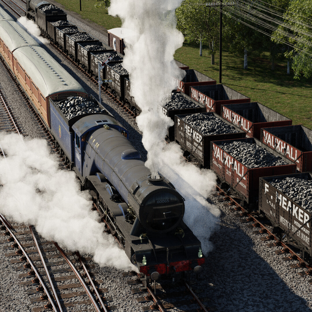
This is a photo for me. Nice convincing photo. If there are mistakes, they are made in such a way that they only improve the beauty and persuasiveness of the photo. Maybe coal is too shiny and not black, but it looks so nice! That coal is not just a black stain Maybe smoke is like cotton, but it is beautiful and convincing. The only thing that might be good is to remove the empty cars on the right side. Their void pierces the image, and there is a black line at the edges. There is monotony in the headlines on the wagons. In my opinion, this photo is a real masterpiece! Congratulations on such a successful creative work.
1 Like
Thanks for the comments @comotempera . Regarding the empty wagons - part of the story here is that there are full wagons en route to the power station, and empty wagons coming back. But your comment about the way that these wagons cause a hard line is useful. I will see what I can do about breaking this up.
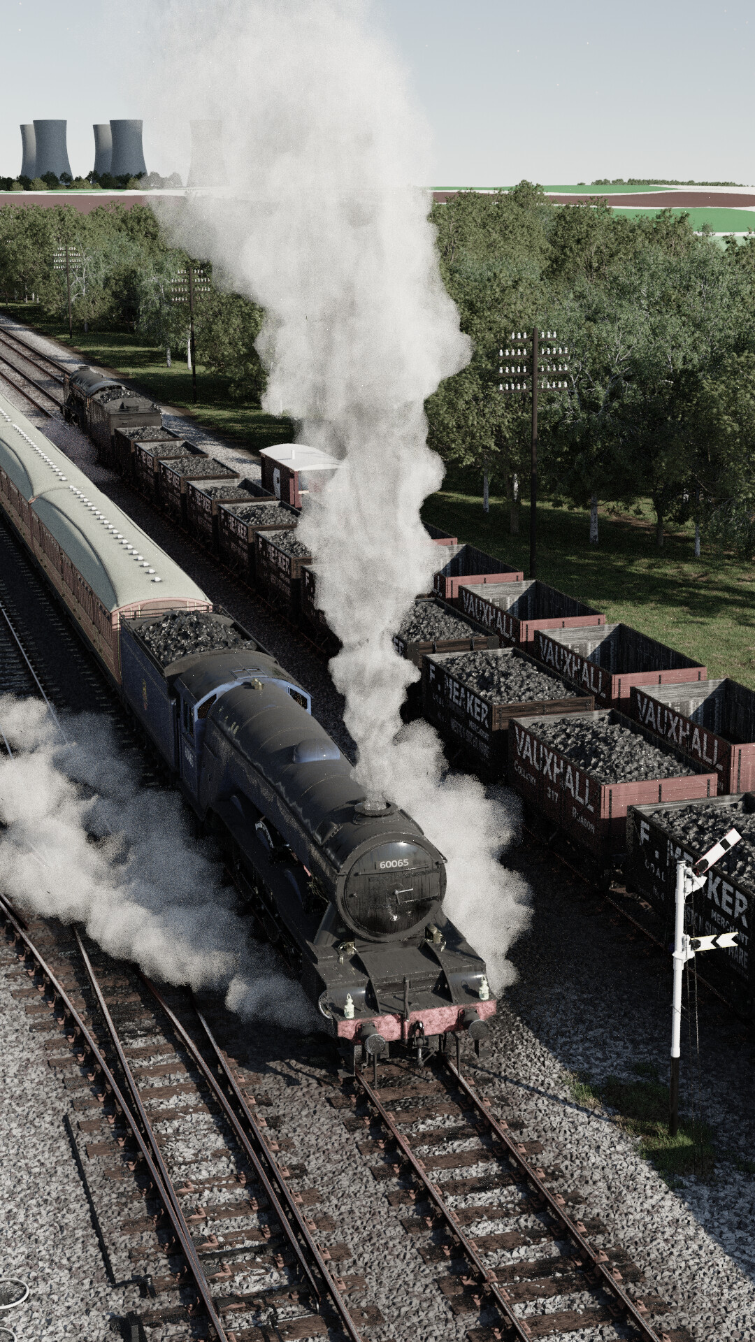
I made some small updates - mostly addressing @sundialsvc4 's comment about the ballast (I’ve added some dirt running the length of the track). I also wanted to address the issue that the semaphore (the signal) wasn’t visible. Moving the sun position 180 degrees allows the semaphore to stand out and has the added benefit of the shadows from the trees cast over the track giving more visual interest. I took the overall saturation down a notch as well. Overall, I like this direction, but it does highlight the steam and smoke not being up to snuff.
I really like your railroads.
What are you using for your steam? The edges still look hard and crisp?
The foreground objects are excellent, but the green in the top right of the pictures looks very primitive. Maybe more detailing there too?
Thanks @Mark06GT -
The new lighting set up highlights the fact that I need to work on the steam. It is sculpted by hand and I’m generally happy with the envelope shapes I produce, but not so happy with all of the volume density.
The background is underdeveloped - I usually just mark out the elements of the background with colours to help manage the workflow. However, it occurred to me recently that these poster paint-like colours remind me of the old posters in the UK for the various railways, so perhaps it will be come an artistic choice in the future
1 Like
These are nice improvements, and BTW I don’t think that you need to “work on the steam” because what you have right now does not draw my eye.
(Remembering Zak’s great line in the movie, “A Chorus Line”: “Don’t Draw My Eye!” When you’re watching a chorus line, you must never notice any individual dancer.)
The image works because your almost-exclusive focus is on that most interesting locomotive, and nothing else “draws my eye” away from that. You have composed the image by “the rule of thirds” to very well establish that. I think that you are very nearly “done.”
1 Like
@sundialsvc4 appreciate the perspective. I really like your point about how the intention around where the eye travels influencing how to approach different areas of the picture.
I featured you on BlenderNation, have a great weekend!
1 Like