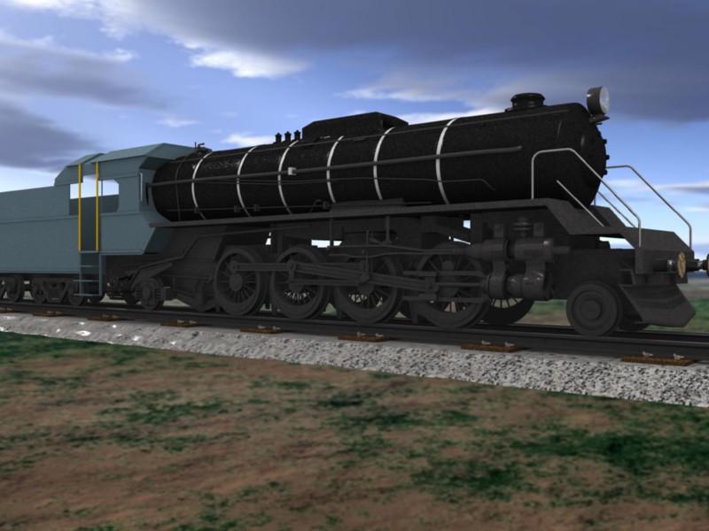
Looking for some Focused Critique on this.
Looks pretty good. My biggest crit right now is that the stones look like a cube type object with a texture. You should either add some displacement mapping or actually model a bunch of rocks. Also the interaction between the rocks and the dirt could be nicer.
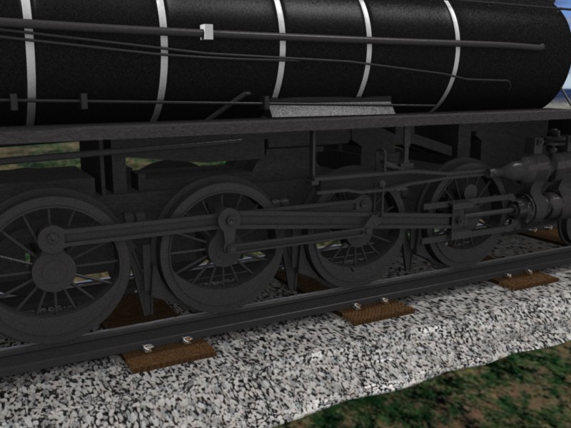
The bottom of the locomotive (wheels, chassis, cowpusher…) looks so good, with a lot of detail and the surface looks kinda’ realistic too. The rest of the train wants a little more attention now. Maybe show some more rivets and piping? Looks really great though, keep this one going.
This one looks pretty good, but weights on wheels are NEVER only on the one side… At each wheel it is different depending on the mechanics!!! 
Will you animate it?
Nice modeling !
I would just crit the ground textures…the grass and ground looks pretty flat, and like JayDez, I would add some displacement on the stones.
I would add some dirt. Gives more character. Also, the wagon behind is a bit bland. Add some details, rivets, and dirt. Dirt itXD But very nice nonetheless
I think it looks very good. One think I think could use a little tweaking - the texture of the iron looks a little off. I’ve had luck with setting the spec on the base color pretty low, and the hardness somewhat low, then turning “spec” on the texture on, and adjusting the DVar value accordingly. You might want to adjust the size of the texture as well. Take a look at this photo. Other than that, excelent job, keep it up. Will you be adding rivets and plate seams and that sort of thing?
You’ve done a good job on the shape of the loco. In addition to the comments above I suggest adding a logo for the line (AT&SF, SP, or something you make up) to the side of the cab and an engine number on the plate on the nose of the boiler. Depending on the line, engine numbers were also placed on the side of the cab or elsewhere on the sides of the loco.
The power piston chamber looks to be WAY too small, even if it were a high pressure chamber. I could be wrong, but I’ve never seen a piston so small as that one on this size of a loco.
Cheers,
John
Nice modelling but it’s a bit too clean texture wise. The wheels have a mat look that’s okay but the top barrel section is too nice to look real and the driver section a little plane. Maybe with the stone texture you could add that to the normals too and cause the shadowing to un-smooth it
…nice…I assume you’re doing this from reference photos…( maybe ya got one out back, I could be wrong)…but as Zapper said the cylinder looks small…but…and I always thought the counter weight was opposite the link connection like you have it…keep going…more nuts,bolts.rivets,oil cups,valves…
You certainly are approaching the level-of-detail that is necessary. (As you have already discovered, detail is extremely important to aficionados of steam locomotives, who are otherwise known as “walking encyclopedias.”)
Carefully study actual photographs of these engines. Notice how the machine is framed in the shot, and what lenses are used. Your lens-selection is too “wide,” and it is causing the beginnings of objectionable distortion.
Work to complete the modeling, in every respect, before you move on to texturing. Also finalize the camera setups.

