I’ve been wanting to create something steampunk inspired for awhile now and had an idea to create a small town that I could use for a short film. I want it to have a semi futuristic, post apocalyptic western theme to it. here are a few reference images that Ive gathered to help me be more precise in expressing whats in my head.
Heres a really rough blocking of an idea. gonna draw out a few different layouts and start modeling the structures and positioning them. Next post will be a base layout of the town
Indeed, hopefully I dont bite off more than I can chew haha. Im still in the ‘blueprint’ stage, just trying to get a feel for the town in terms of perspective. First thing, I need to get a layout im happy with, then switch all the place-holders with highly detailed models. Heres what Ive got so far.
Its all looking pretty basic right now, but with some detailed buildings and textures it will look a lot better. Im thinking of running a catwalk through the entire town, connecting most of the buildings from both sides of the street.
Just adding to the thread, Ill post more when I’ve made some good progress. Thanks for viewing.
Not finished yet, still a fair amount of detail to add plus the furniture and random objects (not to mention all the materials I need to place). You can see on the last picture that I’ll be using cloth sim’s to cover certain sections. This is going to be a restaurant, with a big hibachi styled grill in the middle, stairs to the second floor and tables/seating all around the deck. I wont be doing a whole lot on the insides (i.e. crown molding/fixtures etc) most of the detail will be on the outsides for the final renders. Any suggestions or critiques would be appreciated, thanks for viewing.
Just a bit of an update, getting near finished with the modeling portion of the one of the buildings. each model will get a few different detailing passes to add detail and imperfections then fixtures and cables/ropes. Once I have all of them done and in place I will be adding more detail to give it some continuity.
Update on the layout, its starting to form something pretty cool. Although I do have a plan I want to stick to, sometimes its better to just let the creative process take over and do its own thing haha. Ive started on the second building, its an apartment style with the bottom 2 floors bar/food. it connects on the third floor up via walkways that also have an atrium that extends to the top (for gardens and sunlight).
live render preview, nothing much to show off until I finish most of it. But just an idea for how its coming along. Heres the new layout of the town though, There will be a good amount of cloth simulations going on to soften up the hard edges. I really like how it looks hanging over as shade instead of a solid roof (scroll up for example).
Once all the buildings are complete you can bet your asses theres going to be a good amount of cables, ropes and steam/solar powered goodness to really tie the composition together. Theres so much left to do but its already progressed a good amount from first post. Any tips or critiques would be appreciated, thanks for viewing.
I’m really looking forward to see more wips and the finished result!
But atm I think that the propotions are a little off. Regarding the last picture you posted, the human in the lower left looks a little to tall, I mean… a normal room size is about 2,5 meters up to 3 meters (and in some cases even more… like castleshalls and so on)
Thanks man, Once I add all the fixtures/furniture/objects and texture it it will define the scale a bit more.
Heres a quick look at the more refined version of the building I was working on last night.
Ill be applying the cloth near the end so the rest of the modeling isnt slowed down. Im trying to make each building different but with a similar over-all theme. re-texturing everything is gonna be a pain in the ass but will make a HUGE difference in the end. If it turns out really nice I might render out a short fly over/walk-through. Thanks for viewing, stay tuned for more!
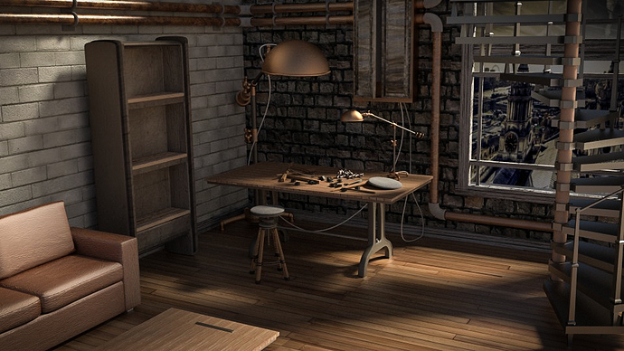
Not finished yet, still need to add more to make it look lived in (stuff on shelves, table). For the final render Im going to turn on the lights in the lamps, it makes for some really great lighting just didnt want to wait for all the fire-flies to cycle out of the frame. Im pretty stoked with the way its turning out though. Ill have it finished tomorrow most likely, any critiques on what does and does not work would be cool. thanks for viewing
Well im not an a pro or anything but that wall at the back on the larger image looks like its render should be on the outside of a building rarther than the inside (on the small vershion of the room the back wall looks fine) . I think you could also give more depth to the windoe becuase it looks kind of squashed so might I surgest a skybox?
Other than that the room seems fine to me and I like the rooms fittings.
Hope my post was not too critical.
Peronaly I liked the rooms lighting better with the lamp light off but thats just my pesonal apeal.
And finaly, Good Work.
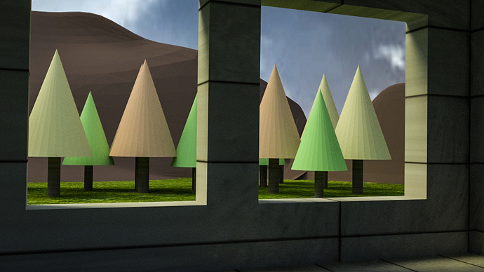
thanks man, still have a lot to change around and detail to add. As for the the window I was thinking the same thing too. didnt know how to make it look more 3d so I just added a plane then added an image texture. I did some searching on youtube and found out that I was doing it 100% wrong lol. I made a quick test, its pretty much half a sphere for the sky, then added a plane and some low poly trees/mountain to add depth. granted its a sloppy job, took about 10mins. Just trying to get a more 3d atmosphere. What do you think?
Hey! I think for the typical steampunk atmosphere (which often is kinda dystopia) the materials are way to clean and perfect. Some dirt/dust/scratches what ever would be nice! But all in all it’s a nice interior scene. Maybe you should consider thinking of using the rule of thirds (or golden ratio) (the worktable onto one of the lines)
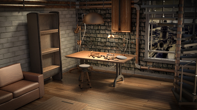
Thanks man, after taking a break from the scene and looking at it with a fresh pair of eyes Ive decided to change some things. Its near finished! I went with a different angle and changed around materials…added some dust/scratches/grime (good eye Fenyce) as well as added some clutter to make it look more lived in. Added some depth to the window by adding blinds and a few mirrors to help open it up a bit. I think all Im gonna do for the final render is add some volumetric lighting from the window, add some DoF and sharpen up a few things modeling wise. This was rendered at 7,500 samples in cycles, 4.5 hours total time (so much glossy materials and both emission lights had fireflies like a mofo haha. Well here it is, let me know what you guys think. If all goes well for the final render Im going to add to my portfolio.
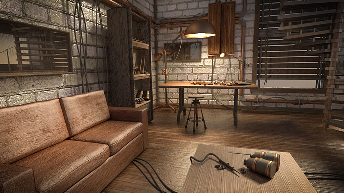
Nice render that is much better in my opinion, I dont want to be pointing out small details but the table’s render seems a litle too repetative and due to it being so close to the camera its a little strange. Other than that its all I can point out. BTW love the new clutter and the walls seem much more 3D, did you change them alot or has the new camera placement helped with that?
I think the materials are looking better now! But I would suggest to turn the gloss a little down and that you should have a look at the desk in the foreground, it seems kinda off, cause everything else around is much more shiny (stonewall, couch, ground).
I really like how the light at the lamp turned out and the bump of the stonewall! Also the structure of the ground is really nice!
I’m looking forward for the final render!