This is a logo I made and i was just looking for any advice to improve it, thanks
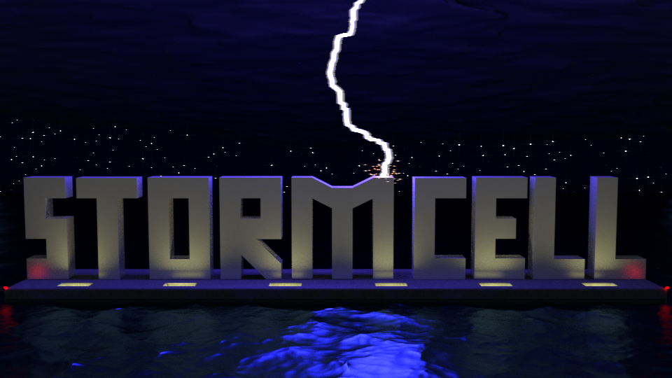
First of all, for a logo that is much too complicated.
A logo should be very simple, recognizable and memorable. So you need to make it much simpler, and have it work on different backgrounds.
Your render is also very dark and could use some more exposure.
I would also have put the lightning bolt in the middle of the M for symmetry (you should also make the lightning bolt a much simpler shape, instead of a fuzzy line).
Look up some of the most successful logos (nike, coca cola, apple, McDonalds, etc.) and you’ll get the idea.
What is it supposed to be a logo for?
It’d be cool if the lightning kind of put this electric buzz all around the letters like it was actually flowing through. And this works as like a presentation in an ad or something but the logo itself should probably be simplified to just the word, and maybe a stylized lightning bolt hitting it or something. Logos shouldn’t look like a scene, in fact they should usually not look realistic - but the goal is to present it in a simple enough way that it doesn’t have to be realistic.
Sorry, I wasn’t sure exactly what to call it but I already have the logo i was just trying to make a scene out of it. It is the name of my band and I was trying to make something cool for a facebook picture, And thank you for the advice