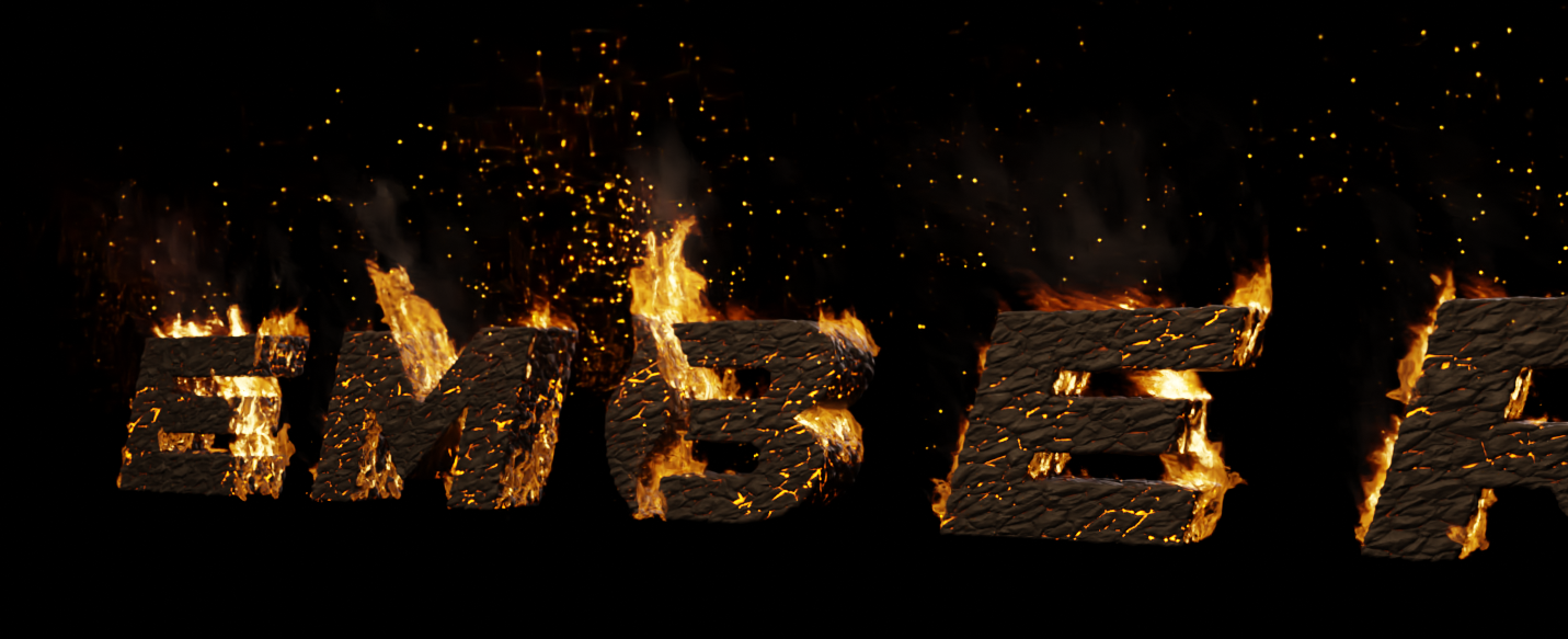
I’m currently making a firey logo, so I decided to import the new and improved Agx color management system from Blender 4.0 into Blender 3.6. It’s working as intended, but my fire seems a lot more red, and it’s not very realistic. I tried playing with the blackbody temperature, but to no avail. Any ideas for this use case?
Filmic:
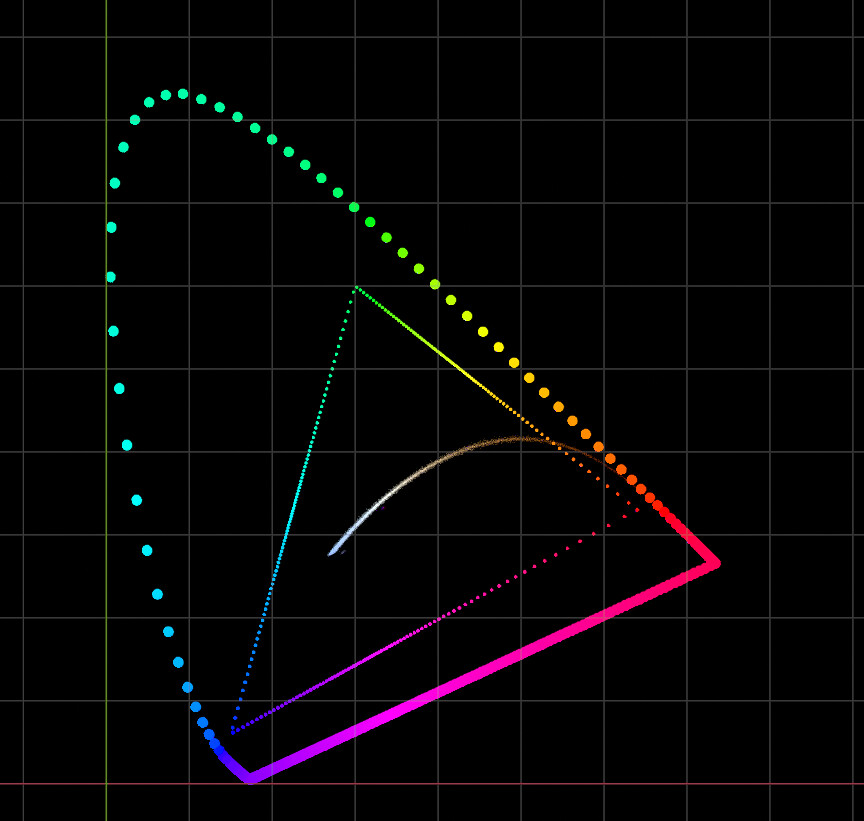
Hi, at least in this case I think that AgX presents the colors correctly, I don’t mean that it is correct according to what we usually see but rather the result that a camera would show, for example the ARRI cameras (there are some videos where you can see how it handles these scenarios), even in the development of the next version of the aces view transform a similar result can be seen.
That makes sense. I couldn’t get the look I wanted with Agx, so I think I’ll stick with filmic for this project. I suppose Agx wouldn’t work for emulating non-cinema type cameras as well.
Try using the curves under the color management if you are looking for a quick fix. It seems like the red channel is overall stronger. It is probably better to save as EXR and take it to your compositor like Fusion, Natron or Nuke.
Considering my primary compositor, After Effects, is absolutely trash at color management, this may give me another excuse to learn Nuke. From what I’ve found so far, there’s not a one size fits all color management system.
I’d probably second the ones saying stick to Agx, and eather adjust the color in Blender, or take it to post.
Agx is not just about colors, it improves a lot of things.
I really like the concept of Agx and how it handles really bright, saturated colors. I tried several different techniques to dial in the classic red → orange → yellow fire look, but I can’t seem to get it looking quite right in Agx. I’d be interested in seeing if there’s a physically accurate way of shading fire rather than just simply eyeballing the Blackbody values, which might help to make it look right. I know it’s less accurate, but at this point I’m considering just sticking to Filmic for this project.
But what is right ? You’ve said it yourself, you’re eyeballing it. Is you screen’s colors any good ? Is your vision good ? And how does real fire even look like? Do you have a reference you’re basing your eyeballing on ?
In filmmaking it’s a recurrent topic. You have several ways to get accurate colors (color checkers for examples).
But hey, it’s just art, so if you’re more comfortable stiking with filmic you probably should.
I am guessing that the blackbody node might not be up to date with the AGX, not that what AGX is giving you is wrong but there might be a need for an update to handle the perceptive side of colors with the blackbody node.
Yeah that’s fair. I have a reference board on Pureref of fire looks that I’m going for, and I suppose those weren’t taken on Arri cinema cameras. Like you said, it’s just art and what’s right for the look of the result might not be “right” on a mathematical level. I’ll keep playing around with it and post an update if I get it to look a bit more pleasing.
It’s kind of the opposite, the entire aesthetic of yellow fire was a result of mathematical approach when the digital cameras came into being, they apply a single mathematical curve on R, G, B channels separately without doing anything else, expecting film-like quality by simply applying the curve, they mathematically call the curve “tonemapping”, as if they are mapping some math values called “tone”. The result is the aesthetic of fire has been skewed by the maths those digital cameras are doing, including the one on your phone.
Yellow fire was an accident, caused by those digital cameras applying maths without caring about the resulted color. It went too prevalent that people nowadays think classic fire should be yellow. It’s sad.
That’s interesting to know! I guess I’m so used to looking at fire through digital cameras that a technically correct fire looks wrong. Thanks for the insight.
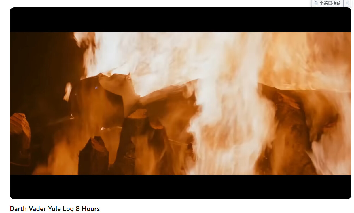
I really wish people would stop using fire as some defacto gauge for color, lol. Even something as standard as a camp fire can range from deep red to orange and yes even yellow. It’s literally one of the worst elements you could use to gauge color. Don’t get me wrong, Air and Water aren’t very consistent either.
Fire takes on many different colors depending on the fuel being burnt, the amount of available oxygen, and the temperature. Even with a simple camp fire the color emitted can depend on the wood used, yes certain logs burn hotter than others, the wind, the time the fire has been ignited, to even an hours long burn where you have added multiple logs on top of really hot coals below. Color shifts for traditional campfires from radish orange to bright yellow mostly depends on it’s temperature.
So even a campfire isn’t any one defined color, not by a long shot.
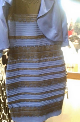
But what do I know? I see this dress a White and Gold.
It’s even more confusing in the case of CG since we don’t have a scene ready with all the physical conditions and reactions of a certain effect to know what contributes to the result we perceive, so we have to use models to approximate them, plus things like fire are not pure blackbody and therefore cannot be represented from those data alone.
That’s interesting that you said it’s not pure blackbody. I guess I always assumed blackbody would inherently produce more realistic fire. Does this mean the best way to create accurate fire in Blender is just using a colorramp node?
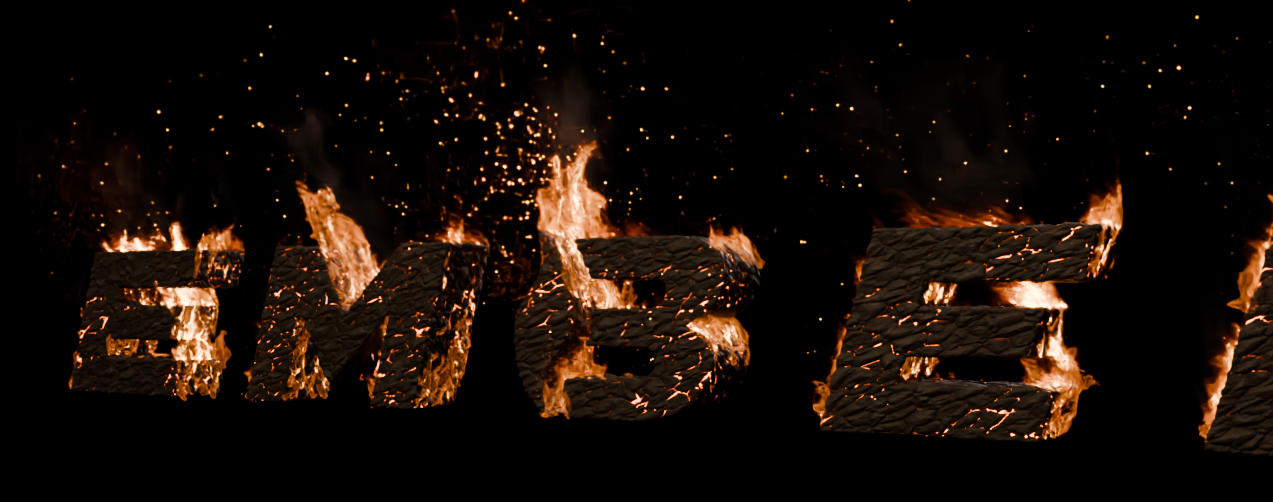
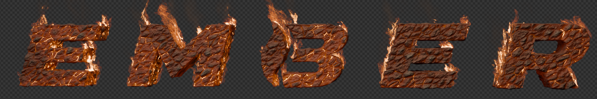
P.S. for anyone wondering, I was able to tweak my Agx fire to look a lot better. Any ideas on improvements are welcome:
The reason fire is a useful analysis is that the general trend of values required in a picture reveals much about the incredibly complex cognition that happens in picture reading. After all, we are not conducting an A to B analysis evaluation; a picture is a mind bending soup of memory encodings, neurophysiological signal interactions, and a plethora of other details that we don’t yet understand.
The notion of fire to yellow is likely not a mere aesthetic learned facet, but rather plausibly something much deeper. These trends can be seen in other representations of things as well.
I would exert extreme caution uttering “realistic” and “accurate”; these ideas are not correct, as seductive as they might seem.
A picture is not a “window” into “reality”, nor a mere simulacrum of “standing there”. Neither of these ideas, despite how seductive they are to believe, are correct. There have been more than a few hundred papers dedicated to dismantling this idea.
The “best” fire for one’s work, is the fire that invokes the cognitive meaning the author desires. Don’t sweat the nonsense of bogus diatribes out there on PBR and the rest of the bulls#it. It’s all completely bogus nonsense peddled by folks who haven’t read enough research papers on the subject pictures and visual colour cognition. Make the work kick ass, and ignore the number fscking.