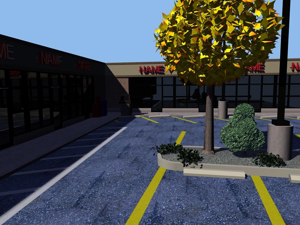
Hi everyone, I managed to talk my illustration professor into allowing me to do an independent study in CGI. My project is to create a series of images of “artificial landscapes,” i.e., landscapes which are highly modified by humans, such as parking lots, highways, and power lines. This is the first image I’ve started actual Blender work on, and I’d highly appreciate any feedback.
However, one caveat: the reason I am doing this project in CGI is because I’m trying to create a parallel between the artificiality of the landscapes and the artificiality of CGI. For this reason, these images are not supposed to be photorealistic. I am trying to make these look artificial, but obviously I don’t want them to look bad, either. Hitting the happy medium between not realistic but not ugly either is going to be one of the most difficult parts of this project, and I’d especially appreciate any suggestions along those lines.
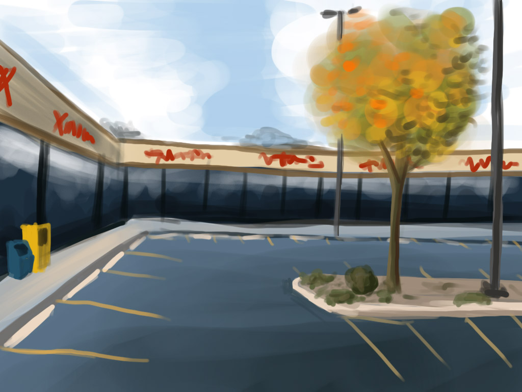
Here is the image as it currently appears, and a quick paint job I did before I started.
Also: can anyone tell me why I’m getting some jaggies on the parking lot lines? They’re a separate alpha texture overlaid on the asphalt texture.
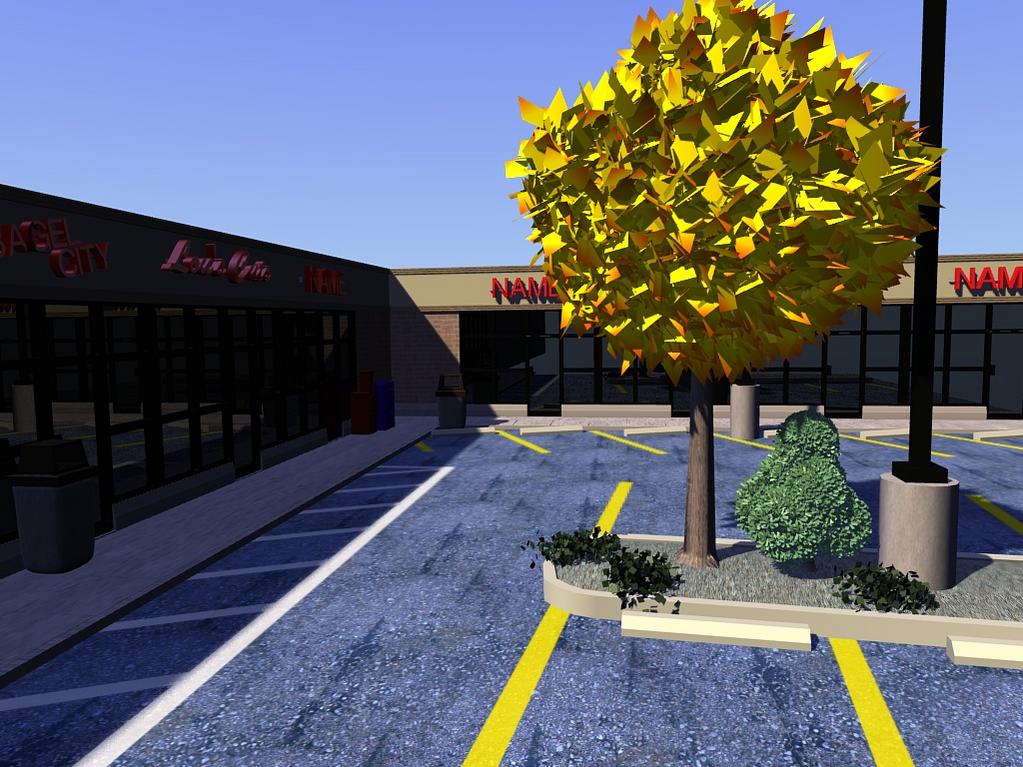
I don’t see any jaggies in your parkling lot lines, however I did notice that your parking space proportions are all wrong. If all those spaces were filled with cars, no one could drive between them, or back out, or come around that left corner.
sck5000, thanks for pointing that out. I thought there was enough space, but looking at it again I saw you were right. I think the lot benefits from being bigger anyway.
Anyway, various changes here. Probably I will improve the sky next.
I fixed the jaggies problem, too. For some reason the mipmaps were acting up, so turning them off fixed the problem. (Nobody else seemed to notice, though, which seems strange to me.)
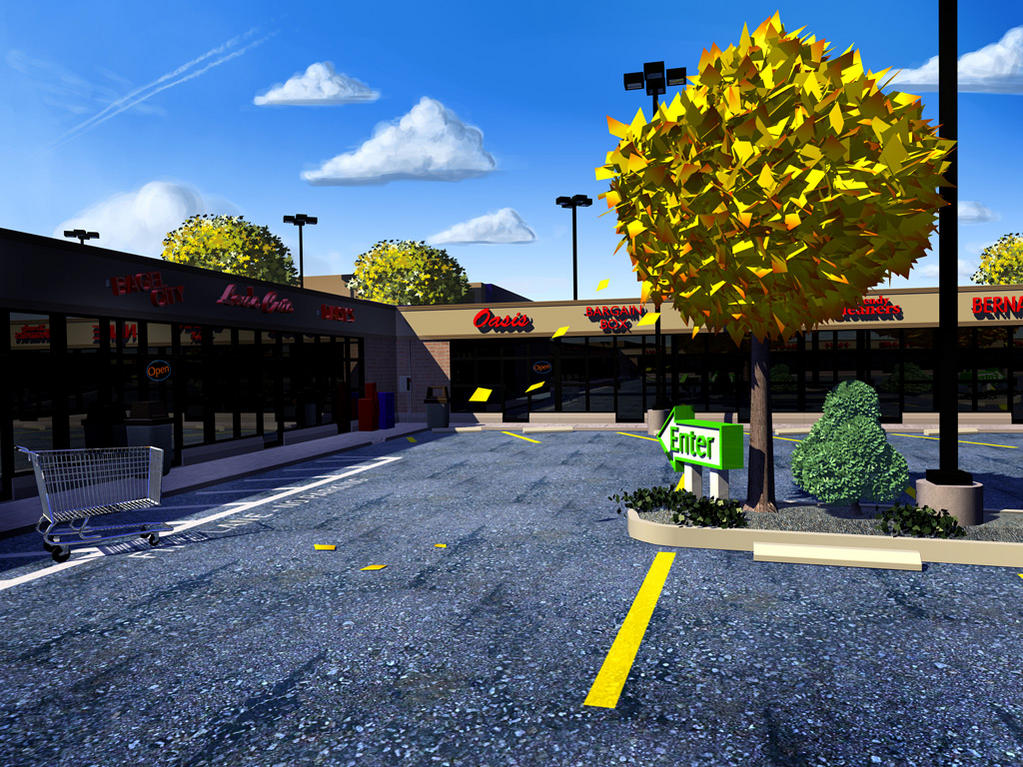
I made it blue on purpose so that it would better interact with the yellows in other parts of the piece here. My goal here is not photorealism but artistic stylization. That said, I may tone down the blue color somewhat.
I’m aware of the tiling “problem,” but I haven’t decided yet whether I want to keep it that way or not. To some extent in this piece I am intentionally doing things “wrong” in order to increase the sense of unreality.
Here are some more updates. Asphalt color toned down a bit. This image also has some post-processing applied.
I’d like some opinions about the sky. Is the painterly effect too clashing with the rendered elements?
This is a fast-paced project by necessity, so fairly soon this image will have to be declared finished. Are there any important points I should consider before I begin wrapping this one up?
Your parking lanes are still too narrow. The one in the corner shows a garbage can where you could only fit three of those garbage cans into the width of the space, but a car is wider than 3 garbage cans, plus there needs to be space on both sides of the car left over to open the doors. Same with the closest one, it looks like it’s about 7 of those tree trunks wide if the tree trunks were jammed right up together. But if that tree is about 8" in diameter as it looks like, then the entire parking space is less than 5 feet wide.
I definitly does look good in an artistic sense, but I find the way that the yellow lines sort of go strait under the barrier. Maybe off-set the lines, or create more of a border between the ground and the concrete. But that’s, just my opinion…
You really need to add an alpha layer on those leaves. Just the outline of a leaf, so that they don’t look like a bunch of planes.
Other than that, it looks great! Lighting could use a bit of work, it’s a tad too harsh. Also, lots of the textures are too clean. Concrete is NEVER that clean, especially in a parking lot