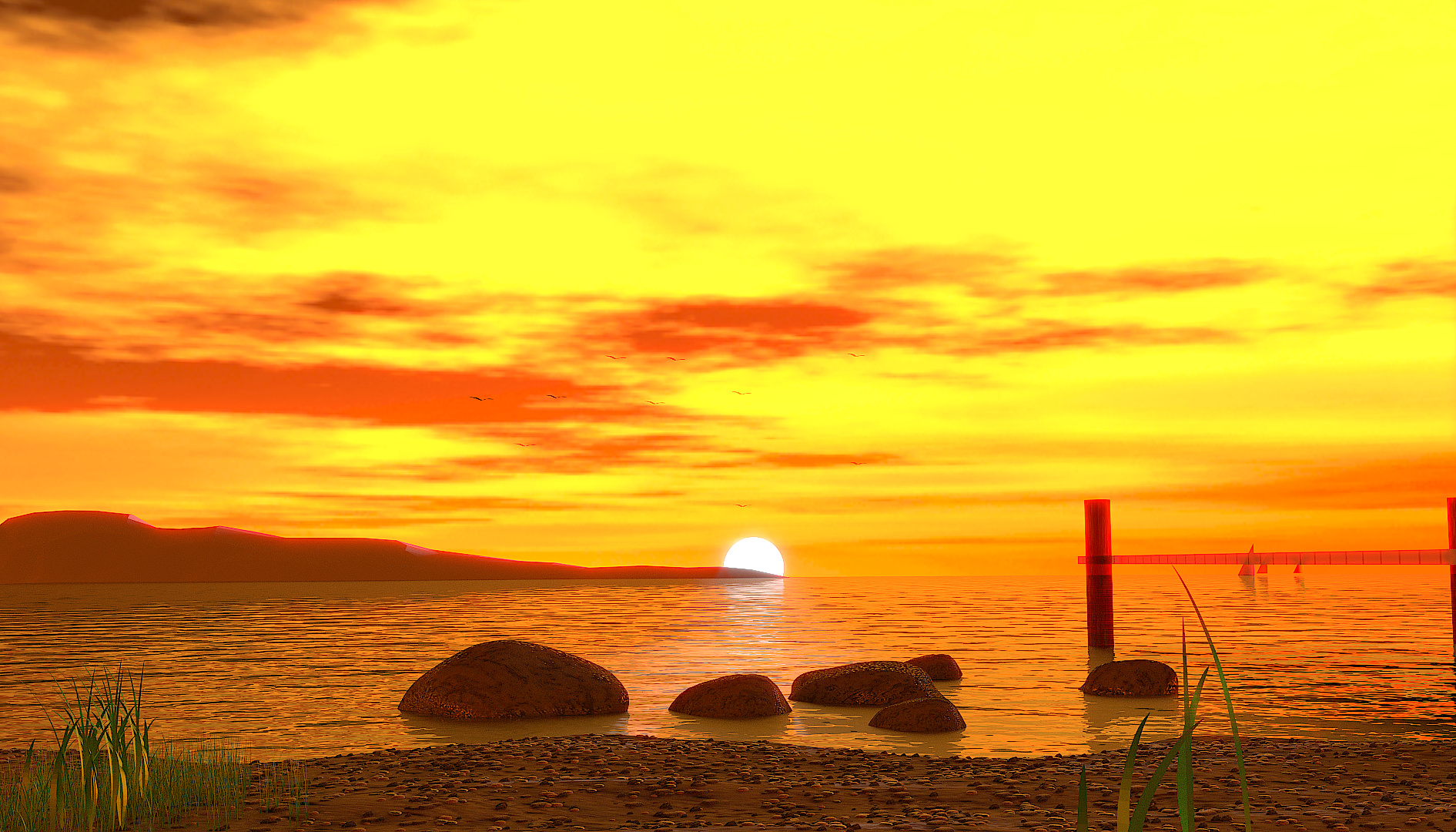
Well following some advice I read in an article no too long ago. Here is my project for this week, I am not quite finished this is the first test composite. I wanted to see how the light and glare was going to work before I finished it up. I still have a little modeling and texturing to do. Mainly the dock on the right of the frame( I may delete it all togethere) and to fill the negative space on the left of the frame.
Please tear it apart. I can take the critique, I want to become a better artist, modeler etc. So please tell me what you think. I would like to know what looks good and what sucks. Thank you in advance.
Not a bad first go, but being as you asked for us to tear it apart, here’s my two peneth.
The mooring posts you are thinking of deleting are at least in the wrong place, I think. Maybe if you mirrored at left to right and put it into the negative space on the left, it would help with depth as well as composition, as the hills in the background would be behind it. Two birds, one stone. Three actually, as you are blocking the view of the yachts right now, too. Speaking of birds, I think where you have placed them makes it difficult to see them, I would move them to a light area of the sky for better contrast. Some DOF might help, as would some other extra compositing. Some glare effects on the sun only would help. Is it an object or part of the sky image? If its a model, if you find it tricky to isolate in the compositor, set an object index, and render that pass to composite it back in with extra effects. If it is in the image, it can be more difficult, but can still be done. Also, I think this type of scene is ideal for using the new mist pass, try experimenting with compositing that in, that will give you something to do for the next few hours/days! Hope this all helps a little.
The sun is never yellow the entire sky. In the evening, it fades to black blue above the yellow, and in the morning, to light blue above the yellow. By above I don’t mean a stripe, but the clouds are yellow and above them are the ‘sky color’.
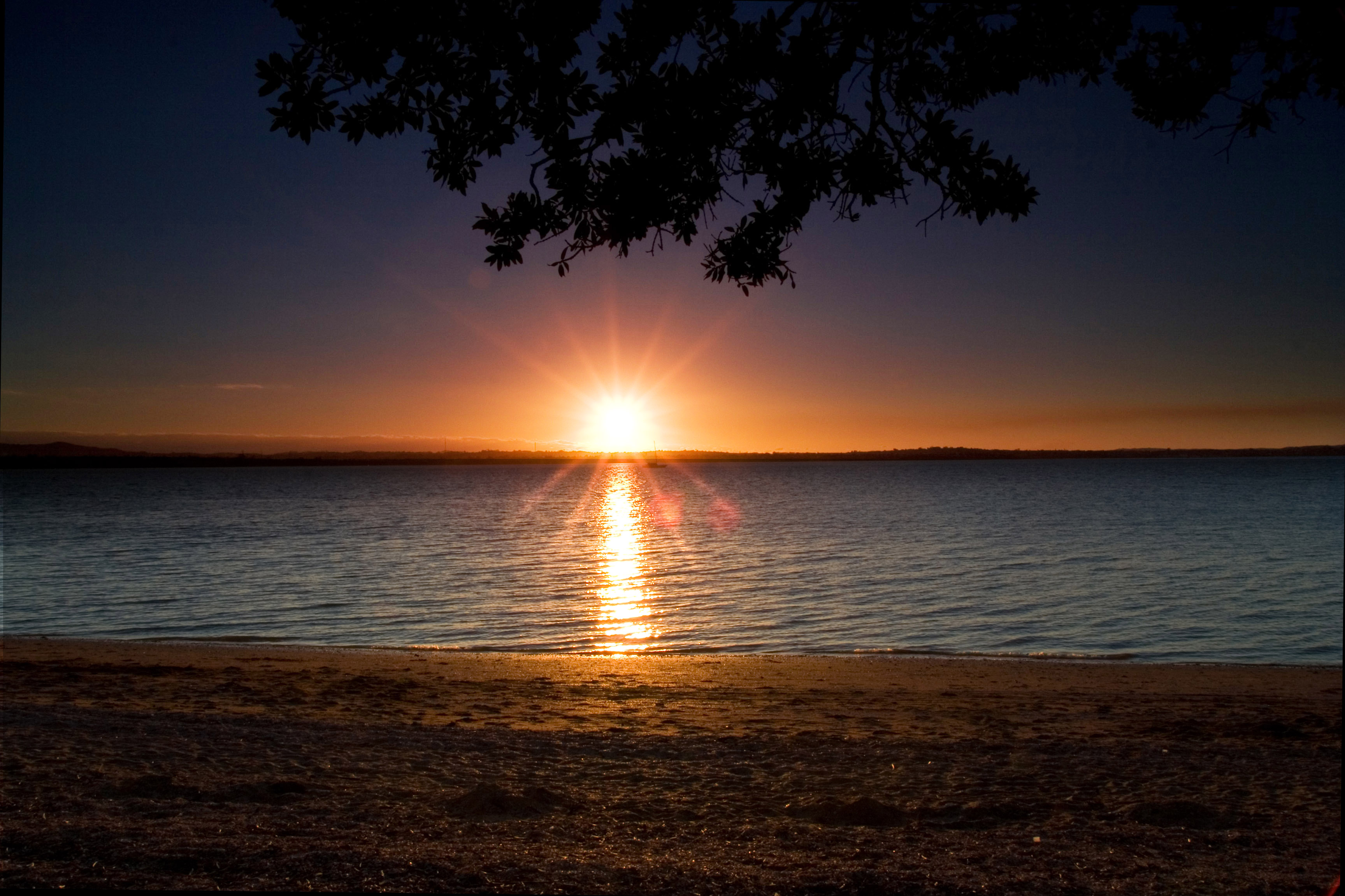
Have a look at some of these images: http://armpictures.com/sunset-1535-wallpaper.html
In fact, just googling beach sunset will show you the variations in sky colour that I would expect.
Specifically, what you want to use here is a gradient. As the sun approaches the horizon, more-and-more of the sky is lit (ooh, this sounds poetic …) “directly from the stars above.” So, the background (apart from the solar disc) should be a multi-step gradient from blue.
I think the glare surrounding the dock and the mountains is too strong, it feels like the whole sky is pouring light behind them, personally I would blur it or make it a lot less stronger. I kind of agree with zero on having glare on the sun only (if that was what he meant).
My biggest problem with it is the fact that the sunset is yellow with a little bit of orange, and yet the glare is an intense blood red. Doesn’t seem right. Other than that, the hills/mountains in the background are wayy too sharp, looks like they need a subsurf. And the rock textures are super flat, need some normal mapping and bump there. But for a first test, I’d say it’s pretty darn good.
i would find some way to blur out the edge of the sun - a bit too sharp for sunset (would be fine mid-afternoon) - i would also bring some of the cloud haze across the sun in horizontal bands to repeat the thin, horizontal clouds near the horizon. you’re going to have to “fake” it - but it would really sell the scene. a tad bit of mist to blur out the sharp horizon line, as well.
also, something that I’ve never seen done particularly well in Blender - blending the edge where the water meets the sand. very hard to do. but since it’s the foreground, essential, imo.
having said all that - an impressive first render! keep up the good work
what is the red thing on the right side, a bridge ??. think its too red, also ships to much red; they would be dark contrast or not visible depending on sail direction, grass is ok but you can use a lot more of it; that looks fine;
the water part is tricky here; i think you should use a fresnel to control its transparancy based on on viewing angle; in front it might be more transparant ??, well maybe i thing one at first would see a little bit of ground, just play with it, when doing water, as sea water color / transp changes on viewing angle
 So, the background (apart from the solar disc) should be a multi-step gradient from blue.