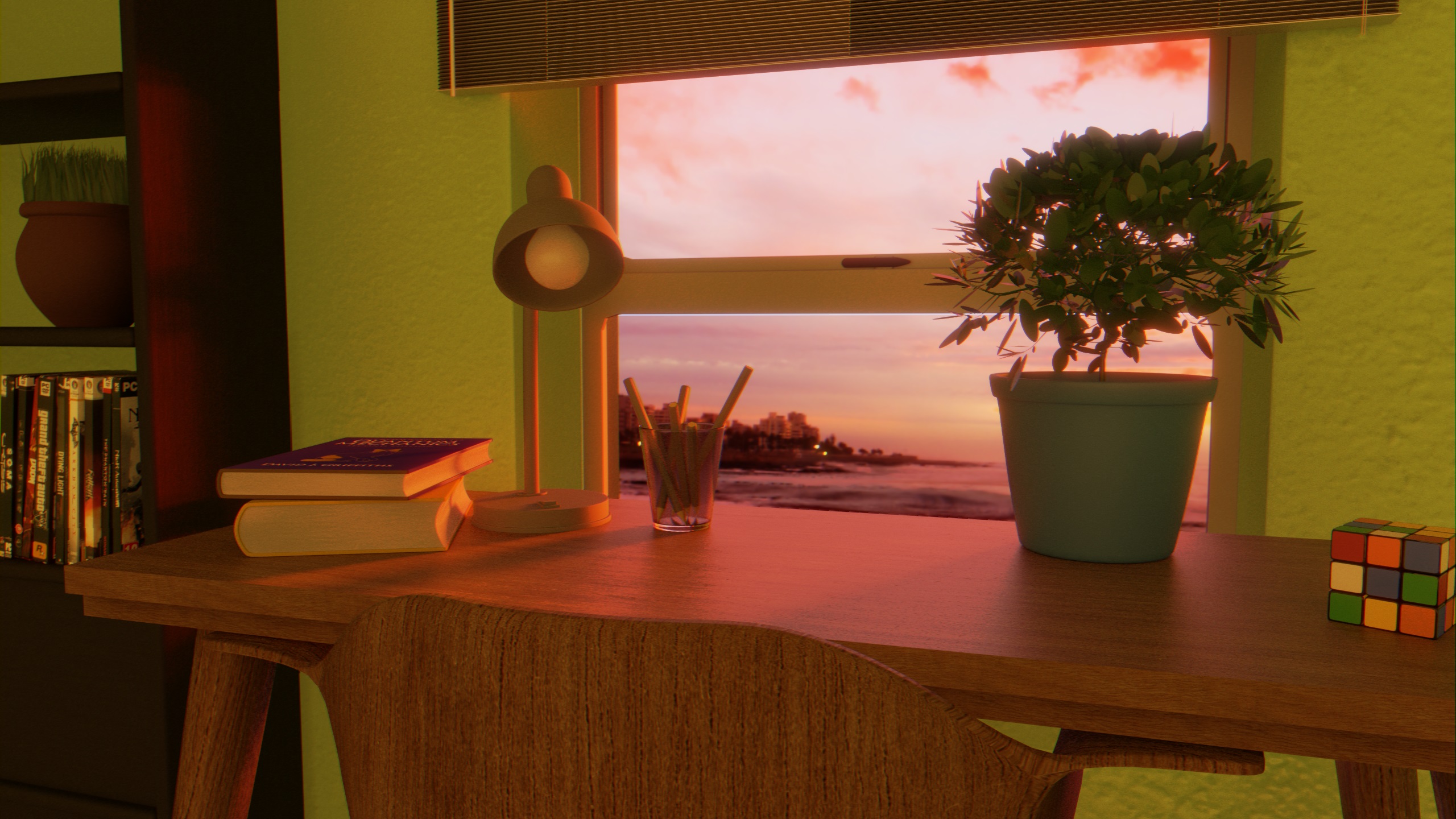
First time posting to the site. Looking for improvement tips. the image looks “wrong” to me but I don’t know what it is.
https://blenderartists.org/uploads/default/original/4X/1/f/a/1fa6d11ea34986490b28c0adeef55b098de86a2a.jpeg
2 Likes
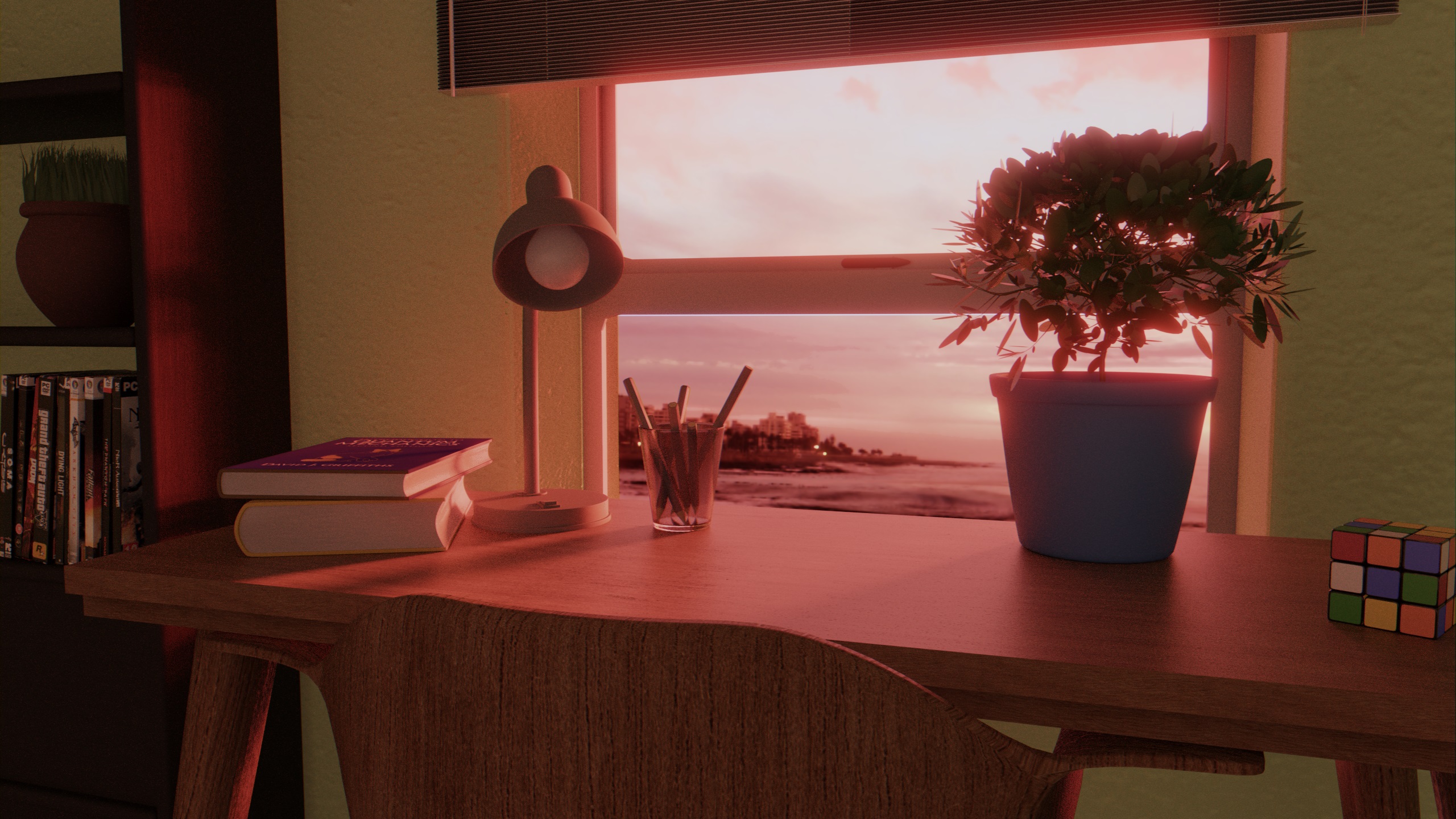
Updated the pic, desaturated the picture a bit and increased the red level a little and changed the lighting, added cooler light to fill the room
2 Likes
Hi @Mr_Nobody,
Always try modeling objects in your scene to real world scale. The proportions look very off to me.
And if you are going for a sunset, try removing the light that is lighting the indoors and let the sun or the exterior light source light your interior. This could make the image look significantly more appealing.
And the other thing you could try and explore is the composition of objects on the table itself. Currently the table feels like a collection to totally random objects. Doesn’t feel ‘someone’ uses this table regularly. May be try recreating your own table or someone else’s at your home.

Thanks for the help. I lit the scene with external lighting only and I do agree that it looks better. Though, its a bit dark now. My objects are to scale though, the only object i had to change was the Rubik’s cube it had lengths of 7 cm instead of 5.7 cm. I guess I could try rearranging the objects or add some more, however I did not randomly choose items to add to the desk, the textbooks are physics textbooks, the one on top is quantum physics, the pencils are used for calculations as its better than using pen, as there is the possibility of mistakes being made as you work out problems. The desk lamp is positioned that it lights up the area of the table the user would use to work. The pot plant is decoration, I like plants. The Rubik’s cube can be thought of as random though, I added it because I saw mine on my desk and decided to add it. I’m not objecting to your suggestions, I’m just explaining why I chose to add what I did.
Hi again @Mr_Nobody,
That looks great!
And yes I agree, some of the areas are really dark. In fact I tried a similar workspace scene about a year ago. Not a great example, but, it had some completely dark areas as well. I don’t think it’s necessarily a bad thing. Sometimes it helps. Maybe it’s my taste.
Since now you feel the scene is dark, you could try to go ahead add some lights in the background ‘if’ it helps the appeal of your lighting.
And regarding my comment on the objects being random, I didn’t mean ‘you’ placed things randomly without giving them enough thought, but, I meant it ‘feels’ random inspite of.
Your scene is already getting better. Keep trying different things. Maybe you could increase the window sill height to be in line with the table and place your pot and a few other objects there. People usually tend to like window places, so you could try making it significantly wide to make the image more appealing. May be some translucency to the plants and the venetian blinds could help. May be some weathering, scratches and fingerprints on the window glass. So on.
Really eager to see what you could come up with!