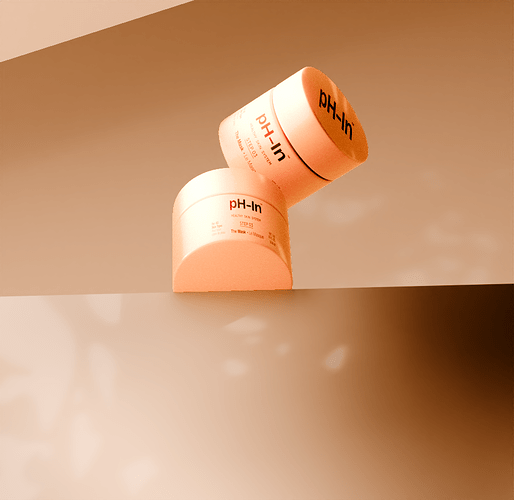
Did some compositing and align a few elements to create this with the shadows and would like to have some feedback in where i could improve next time
Nice colors and gradients! The main problem is that I am not sure what I am looking at. Are those containers falling? Am I looking at them from below or above? Are the big square shapes in the image surfaces?
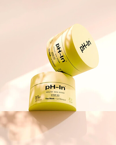
They are supposed to be positioned like that from the guide i followed . The camara is from below to above and i dont know what you mean by the square shapes . I got a question since the tutorial was a class from skillshare where you can post your final project and the class creator gave me feedback asking if this was rendered in cycles because it didnt look like that . I wonder because i did it on cycles experimental why it doesnt look that much realistic like this example
I see better what you are trying to do.
In your image, the way the background is placed and shaded makes it hard to see that it’s meant to be surfaces. It looks almost like the image was just split into sections with a selection in Photoshop and hand painted different colors. I think it’s probably because your leaf shadows aren’t clear enough. I didn’t understand what they were until I saw the reference image.
Is the image assembled together by compositing? If yes, that might be the problem. The elements don’t look like they shadow each other properly. In the reference, you can clearly see contact shadows where the pots touch each other or the surface, those are absent in your image.
If the elements of this image were rendered separately and then combined, try rendering them all together, they will affect each other’s shading and look much more realistic.
I did used the compositing yes and they were all render together like the tutorial mentioned
I am thinking something must have gone wrong in the compositing, because the elements don’t look like they affect each other. Well, the pot’s shadow is visible on the surface, but the surface should also affect the pot back and it looks like it doesn’t.
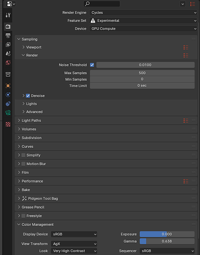
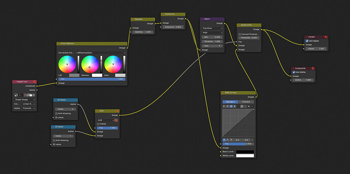
I can send screenshot of the settings from cycles to compositing . I added a index number on each object for the compositing .
Render :
Compositing :
If I understand correctly, you are using masks to color correct the 2 pots differently than the background? If that’s the case, that would explain why they don’t seem to fit in. And by the look of the image, those masks are in great need of some anti-aliasing too.
Honestly, I’m not sure I see the point of doing that kind of compositing in a scene so simple. Couldn’t the lighting and materials be adjusted so the pots have the correct color without needing to change it afterward? If the color was adjusted in the 3D scene, the lighting would fit better and the objects would look like they belong in the render.
Well, things do at least seem more grounded and part of the same image to me. Now, it would be all about lighting and color management.
First, I am wondering what your color management settings are. This render seems like it has quite a lot of contrast, maybe too much. If you have changed those settings a lot, maybe try bringing them back to this, at least as a starting point for more tweaking.
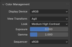
But I believe you should first get the lighting as close as possible to your vision before trying to do color correction. Your scene looks much darker than the reference, this tells me that the background is dark. Try giving the sky a brighter color, to give the whole scene a brighter and more even lighting.
From the angle of the shadows, I can tell that your light sources are placed way to the sides. This is the kind of lighting setup that works well in a dark, shadowy scene. But here, I would try moving at least one of the lights a bit closer to the camera’s angle to make the subject more fully lit. Though don’t bring it completely in the same direction as the camera, as that would flatten the scene too much.
If you want to cast shadows of leaves like in the reference, you should make that light source have sharper shadows (smaller light radius), so the pattern can be sharper.
