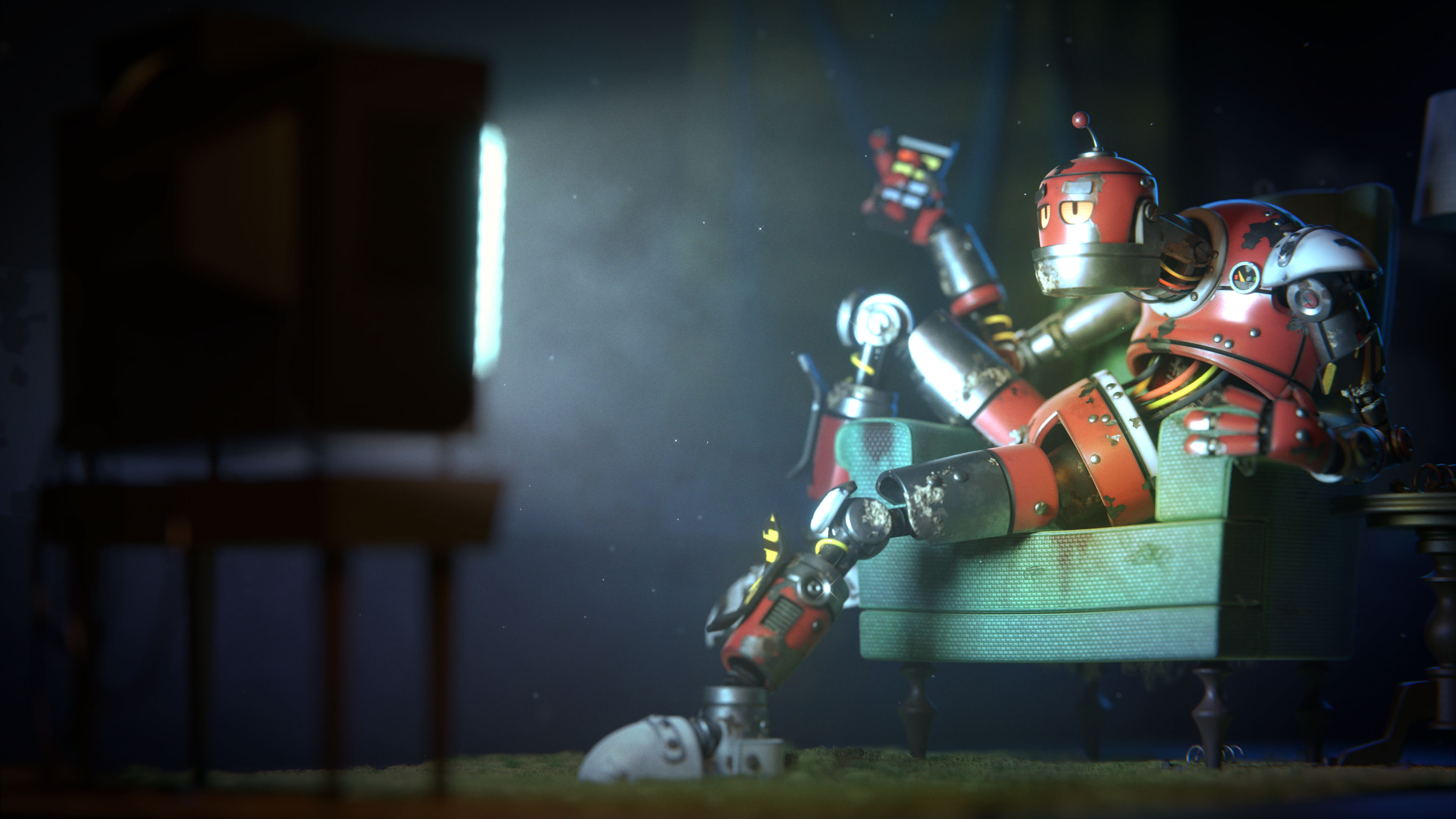
Surfbot is a robot lounging around watching TV after a long day of work.
This is a redo of a project I did way back in 2013 - one of my first completed renders with Blender. The original file was a mess, and I’ve always wanted to go back and re-work it. Turns out, I’ve learned a lot since then!
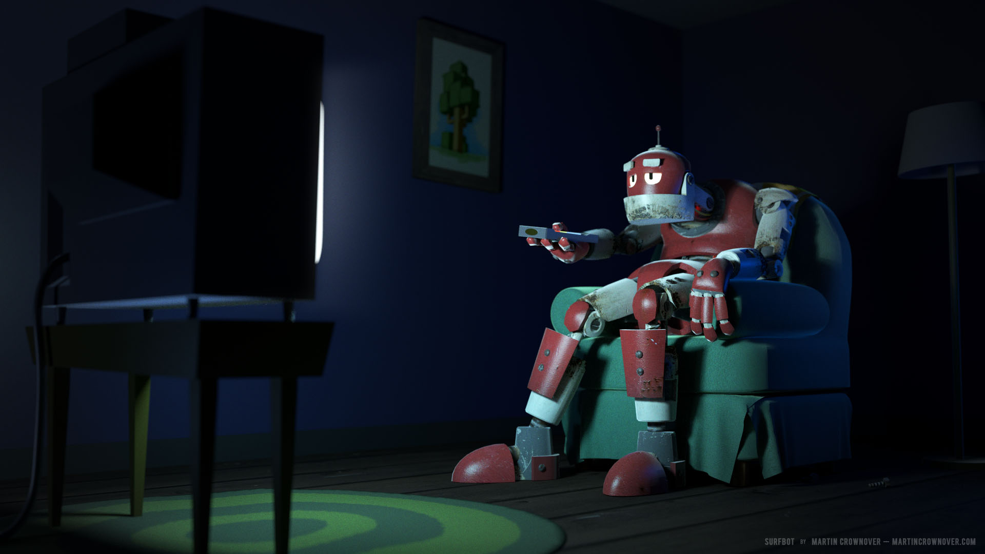
Here’s what the original render looks like:
And this was all based on a sketch I made for a year-long art project, back in 2011:

There were many steps to this redo. Here are all the things I did as I worked through the scene:
-
Reworked/recreated every part of the robot (often using the original models as a basis) - I didn’t want to completely change the look of the robot, so a lot of the work was cleaning up bad geometry and making the parts work with subdiv and bevels. I also discovered that the original robot’s proportions were quite strange - I think I modeled him to fit the chair - so I sorted that out as well.
-
Rigged the robot for easier posing - when I made the original model, I didn’t know how to use armatures, so everything was posed by keeping the pieces separately as child objects of the body, using the origins of each piece to transform. It was awful! The new design has a full armature and is much, much easier to pose. Of course, the new pose changes the nature of the scene a bit from the original, but I wanted to show off all the work I did on the robot body!
-
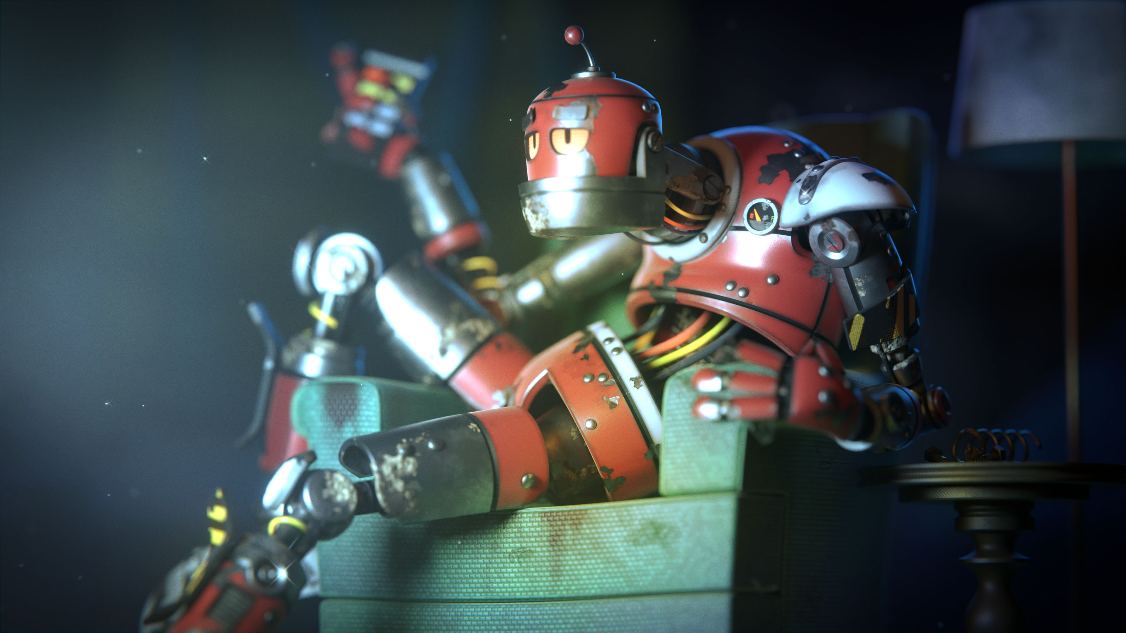
Brought the materials up to modern standards - I updated all the materials with better node setups that are almost all procedural. The original materials relied very heavily on image textures for details and were some of my first attempts at working with nodes. The new materials aren’t perfect and could probably use a little more hand-painting, but this is one of the most noticeable improvements to the scene. Some, such as the chair, use a layer of hand-painted detail, but most are all generated with nodes.
-
Cleaned up the other elements of the scene - The new chair was a pretty big part of the reconstruction, and I’m happy with how it turned out. The original chair always bothered me, but back when I made it, I didn’t have the ability to do much else. I also added detail to the TV, table, and lamp, added an end table near the chair, and added more, better debris to the floor.
-
Utilized particles - I’m still not great with Blender’s particle system, but I was able to use it to add some interesting details here. There are now dust motes in the air (using boids), carpet fuzz, and bits of string and fuzz coming off the chair. It helps give the scene a more natural, lived-in look that the original lacked.
-
Changed the camera angle and ramped up the depth-of-field - I like that the original camera was a bit tighter on the robot and TV, but it felt like it left a lot of empty space on both sides of the image that weren’t really important to the composition, so I adjusted the angle a bit to better fill the space. I also added more depth-of-field because I like how it blurs the TV glow and helps the viewer focus on the robot.
-
Added volumetric haze for the TV - I don’t often utilize volumes for my render work, but this seemed like the perfect opportunity to, especially given the new dust motes and the atmosphere of the scene in general. I love how the volume adds some color to the shadows.
-
Added a vignette and lens distortion/chromatic aberration - Small edits in the compositor that helps sell the scene and give it more authenticity.
-
Post-render work in Photoshop - I spent a lot of time making sure the output from Blender was as close to what I wanted as possible, but it still helped to bring the finished render into Photoshop to accentuate the haze, add a little extra color to the scene, and add some noise.
Here’s a comparison of the raw output from both the old and new renders, with the same camera angle as the original:
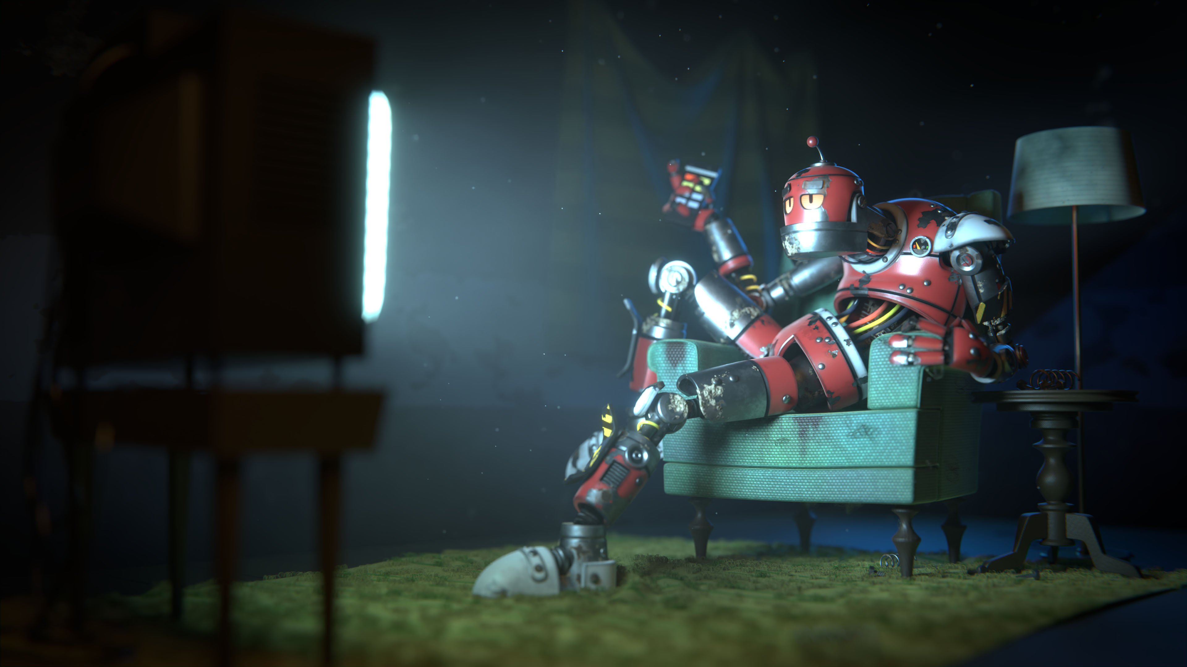
And a few other views of things:

This is the un-posed robot with viewport shading. The materials look a little different because a lot of them use object UV’s for the noise coordinates. Not something I would do for anything that needed motion of course, but this was always meant to be rendered as a still, so it’s fine.


A comparison showing the material updates for the red metal material on the robot’s exterior. The new node setup is much more complicated, but looks a lot more realistic. The two large node groups are for the red painted metal and the underlying bare, rusted metal that peeks through. There is a fade to black mixed in at the end as well, but that isn’t shown on this render, and was only used for part of the robot that pushed into its interior.

An ambient occlusion render. You can see the details of the back of TV a little better here.

Tools I used for this project: Blender (cycles), Photoshop, Procreate
I really enjoy revisiting old projects and challenging myself to improve them. Let me know what you think of the improvements! ![]()