In this project, I aimed to recreate a scene from Swallowed Star Hospital but struggled with achieving the desired look. I then decided to create a live-action version instead. As I’m not skilled in modeling realistic human characters, I overestimated my ability to replicate the Swallowed Star scene accurately.
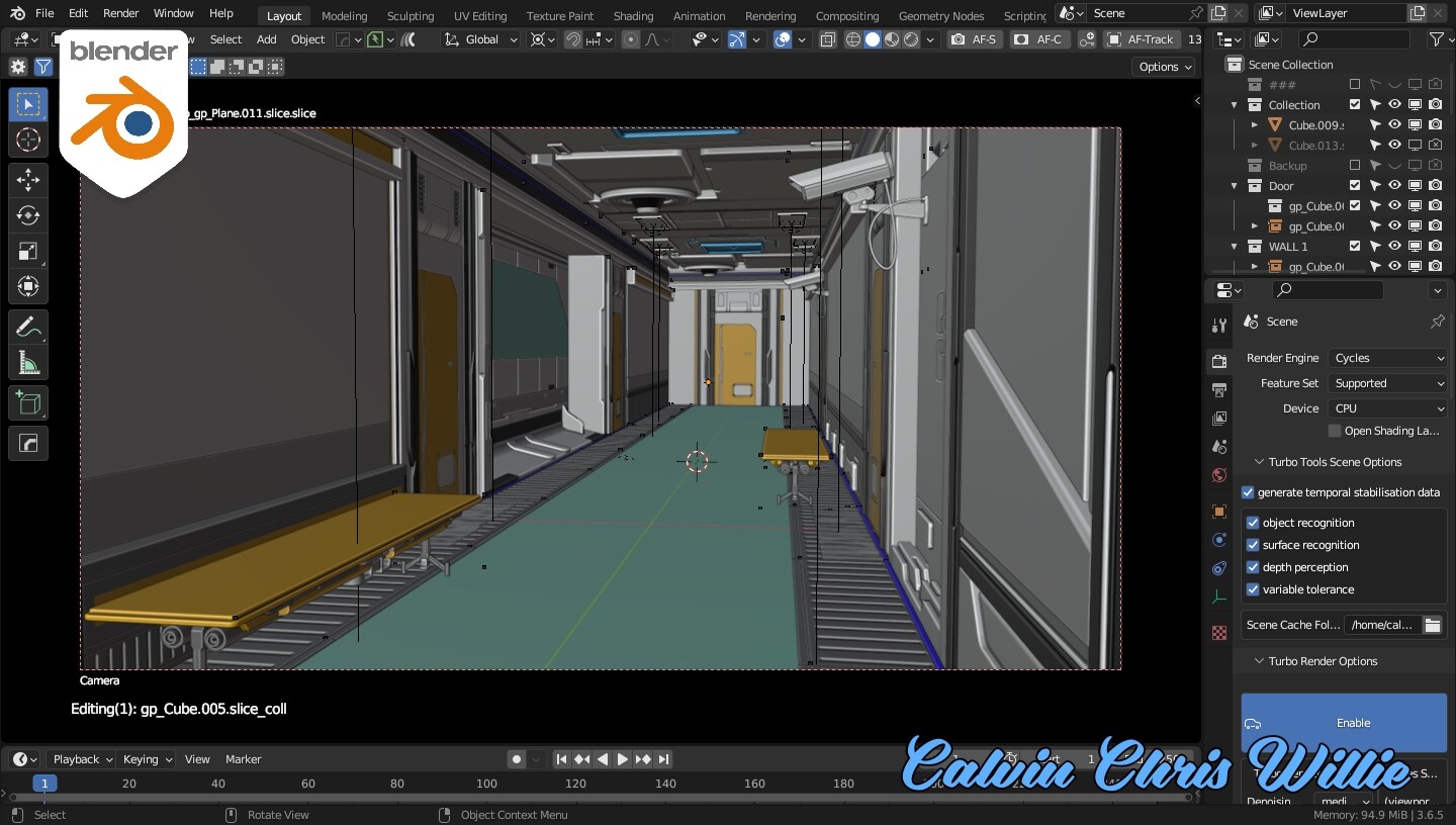
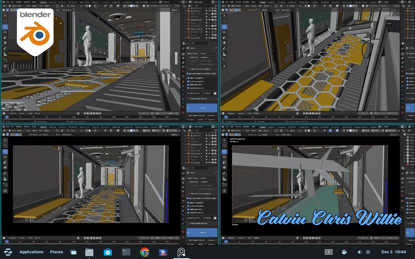
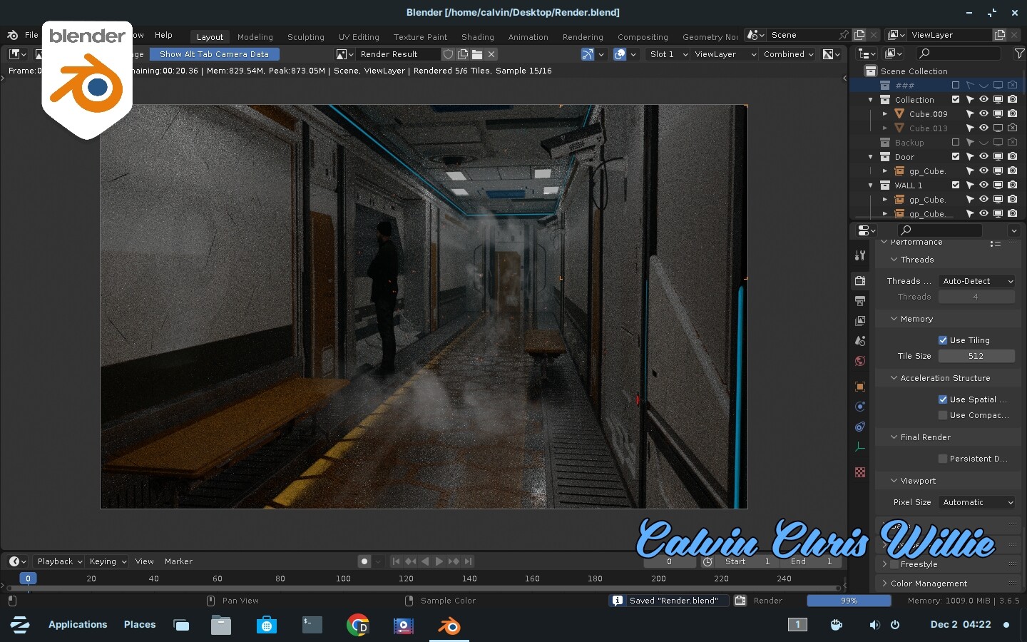
Honestly, I spent the last three days rendering the final image, investing over 50 hours with just 16 samples. Despite numerous crashes, Turbo Render ultimately saved a cached .exr file after attempting command line rendering, leading to success.
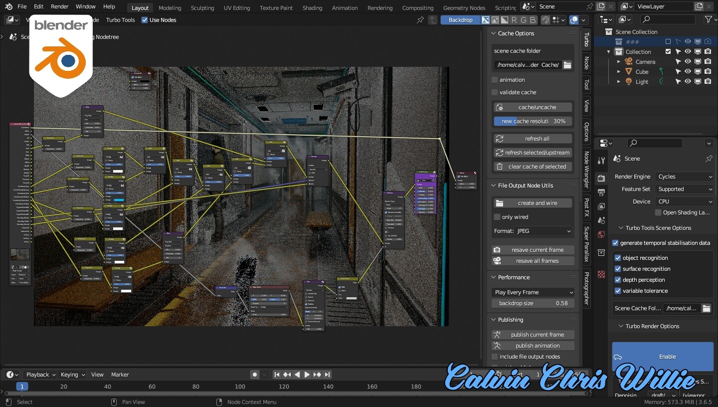
I considered seeking help from the community but faced challenges with missing textures, even after using Google Colab Cloud rendering. The Ian Hubert steam pack linked with KitOps caused issues, resulting in textures being absent. The entire project was created using Fluent Power Trip, Fluent Materializer, HardOps, Group Pro,Decal machine, and KitOps. I learned this environment creation workflow from Luan Vetoreti, featured in a Star Citizen Con video sharing the Cloud Imperium Games workflow.
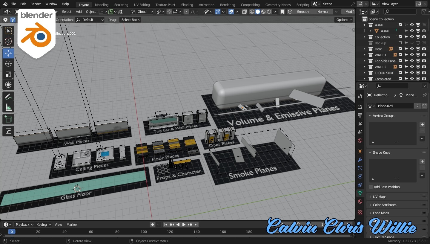
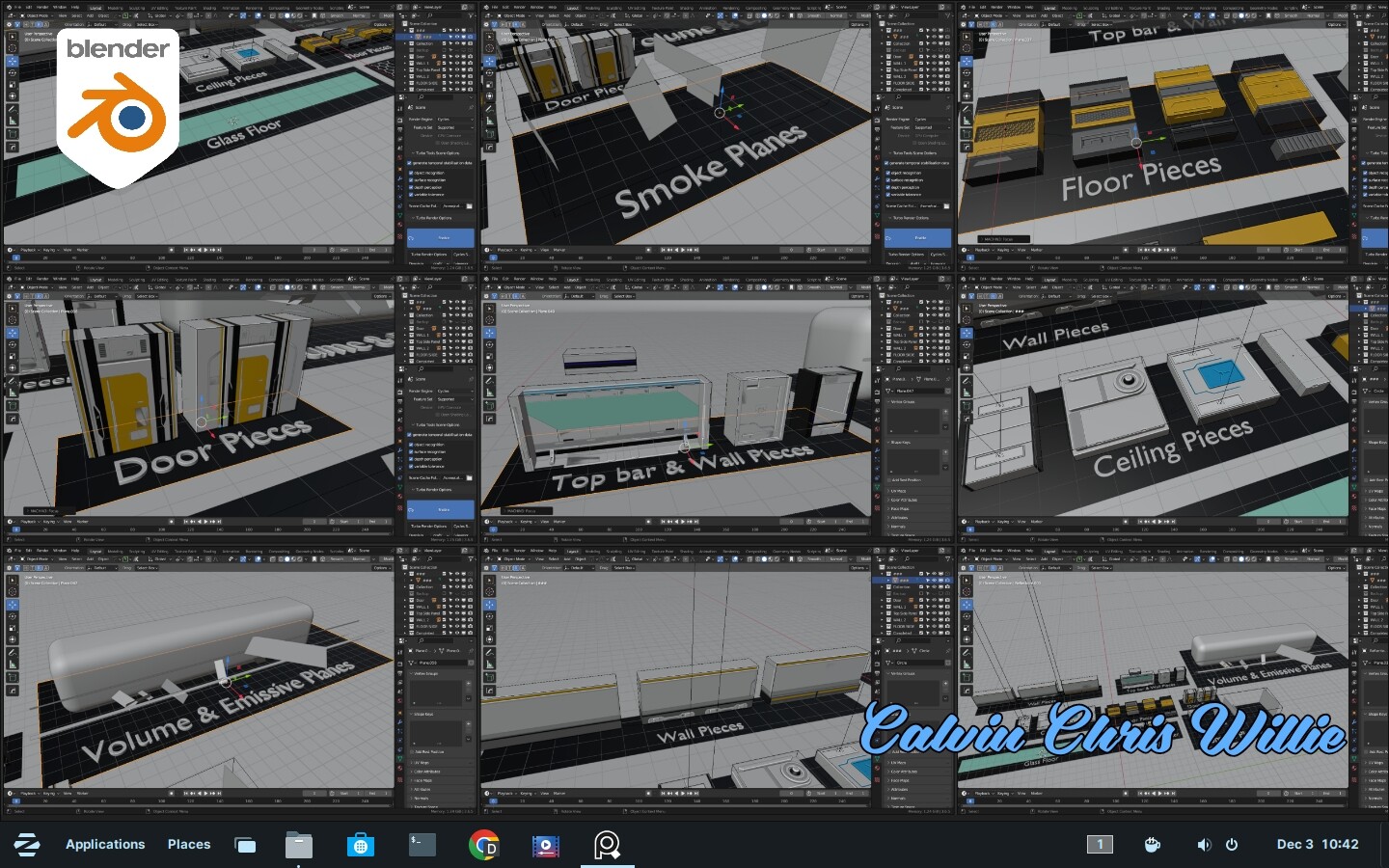
The Assets I created for instancing in Blender. All the assets are built with metrics so they snap perfectly. No need for unnecessary scaling and distorting the models.
The emissive planes scattered around the scene is for creating fake reflections in Comp since my potato LAPTOP was unable to handle the rendering process.
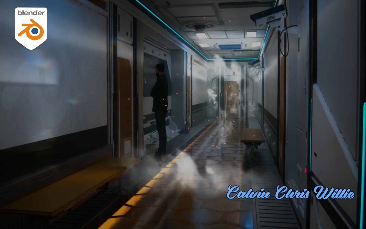
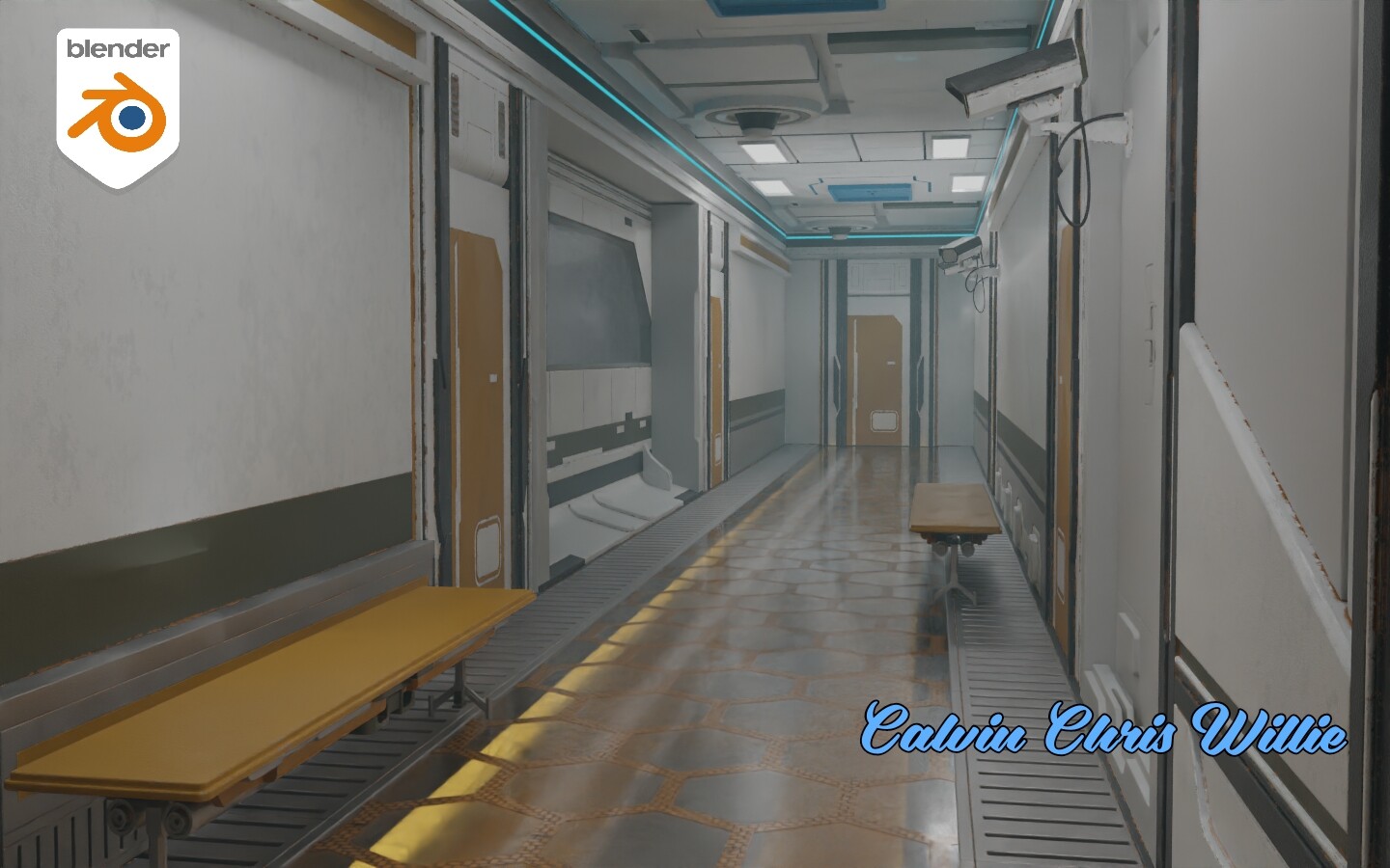
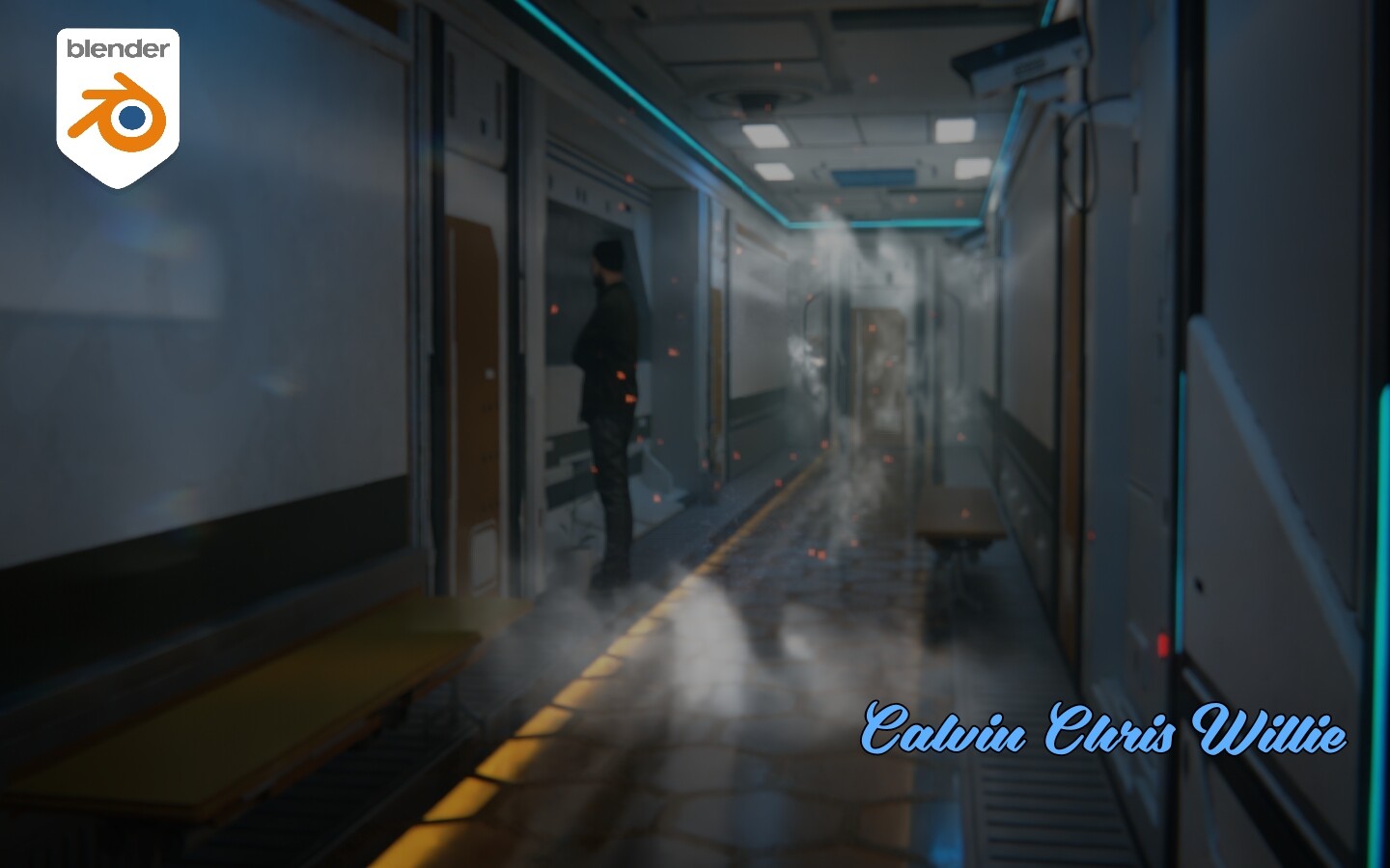
Final image after compositing with added depth of field in post and now only the Blender logo decal on the left side wall is in focus. ‘Dust Particles+’ asset was created by Creative Shrimp
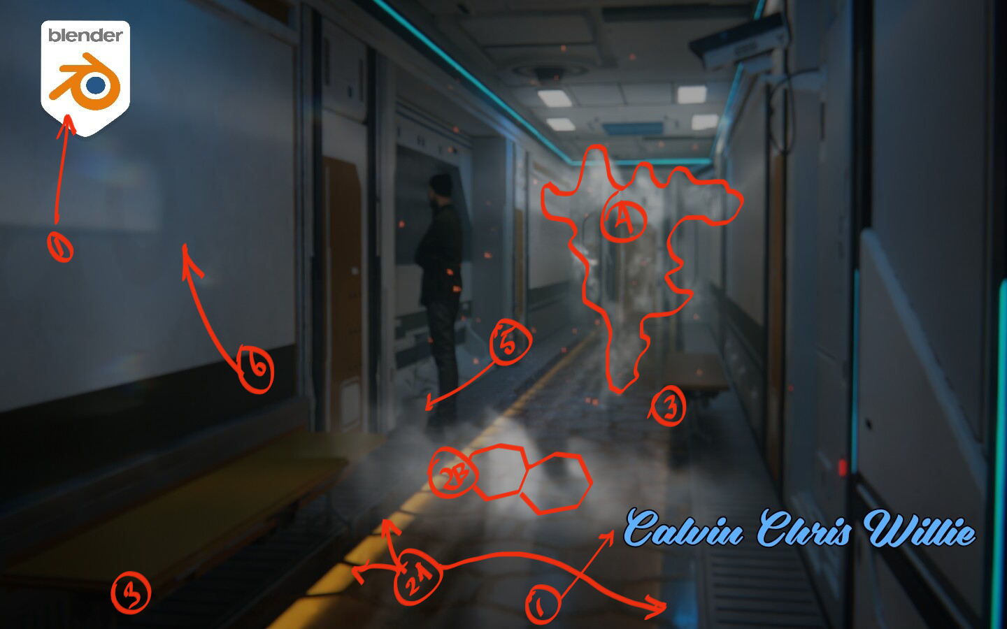
I can tell you’ve put a lot of time into this. I’m not familiar with your source material at all, so keep that in mind… here’s some thoughts, that correspond to what I circled.
Kill the logo and your name, those are the most dominant things in the image; if you want to add such things, make them far smaller and less clashing. You said in your notes “now only the Blender logo decal on the left side wall is in focus.” - ironically, I did not even see the blender logo on the wall in the final composite until you pointed it out.
A: I kept staring at the floor, trying to figure out where those glow lights were reflecting from. finally i realized the floor must be glass? B: If you make the hex grid thicker, this might help it look more like a thick pane of glass
Those are the most mechanically specialized ‘waiting benches’ I could ever imagine seeing. I don’t think benches in the future will have turbines or … whatever is going on there, I’d simplify those models.
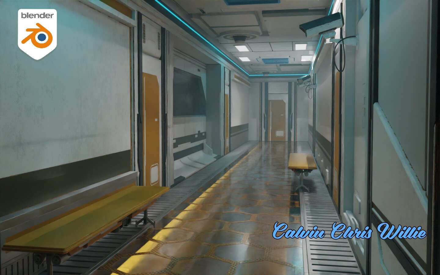
Lots of work done on the smoke, but i don’t see exactly where all the smoke should be coming from… no major pipe leaking, no explosion, no vent… it’s just … there. Outdoors, smoke is sort of allowed to just be there - fog, smoke, w/e - it’s magic, and it drifted by. Indoors, I think you need a visual cue as to why it’s there.
Houseplant seems out of place in this hallway.
Noted above. I think you see it more than the viewer, because you know it’s there.
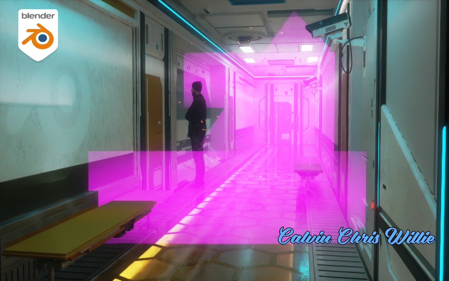
Overall, I think there’s a lot of blur/DOF there that sort of just over-blurs the entire thing. Maybe try establishing a focus point on the man, or something to draw the eye to a particular spot.
Good stuff - I think the colors you’ve gone with work well, good mix of lights and darks and monochromes. Camera angle/placement works for me. Set design doesn’t look too overly stark nor “cg cluttered”, except for the house plant. Most of what I’m seeing is just a few simple tweaks.