Hello!
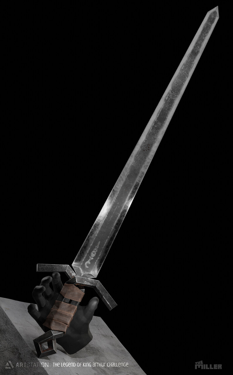
This is my first topic in BA. This project was created for a challenge (The Legend of King Arthur prop art - rendered). I ran out of time but i finished my submissions. As a self thought “student”, this is my first publicated project. 
I feel there is room for improvement in textures and renders. So I need some feedback, help . what do you think about these renders?
What do you think how can I improve the lighting and the materials?
3 Likes
There are a couple things you can do.
-
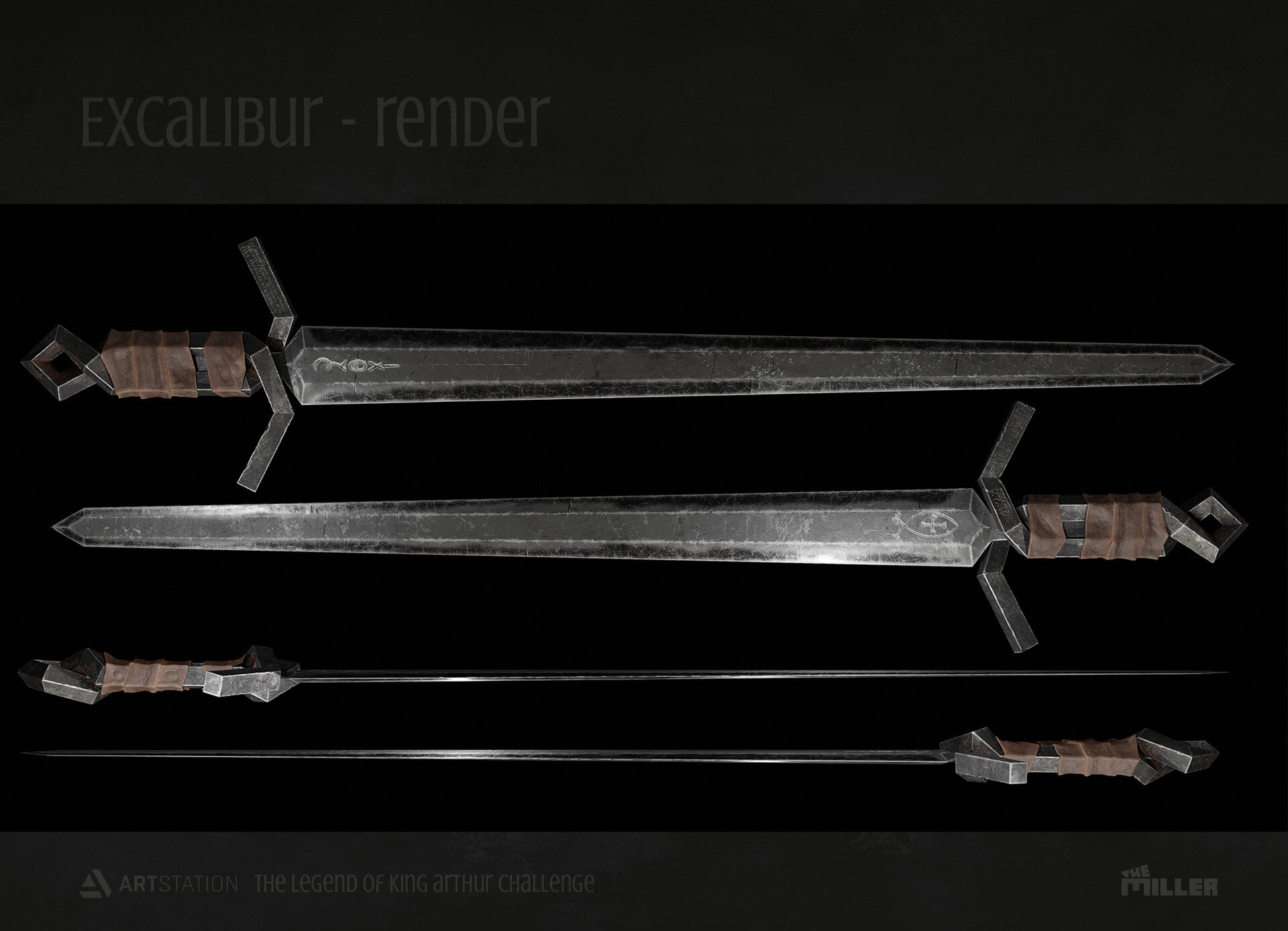
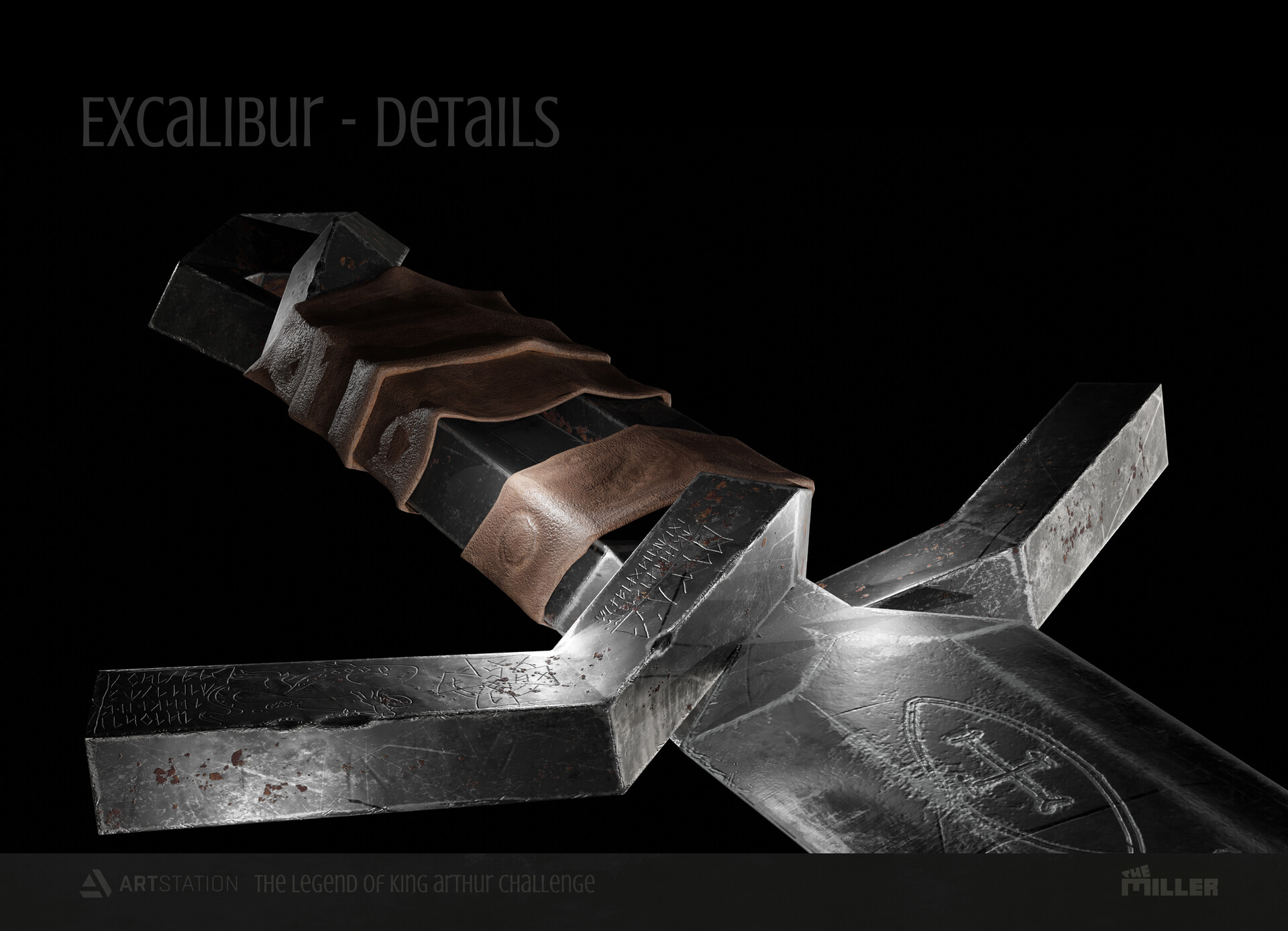
The edge wear is too high and too defined. Seems like the default edge wear generator from Substance Painter has been applied. You need to break it up. Place those layers under a new folder and use a mask to break up the form.
-
You’ve applied hard edges on your low poly when most likely your high poly had more rounded edges. In your last render notice the sharp lines running on the edges–it’s more noticeable at the sculpted dents. Instead of marking them as hard edges bevel the mesh. The bevel will handle the shading.
-
The scratches are too generic and general. Is this sword your own design? I’d recommend you follow a concept or a real sword so you can solely focus on that. Making an effective design and modeling something at the same time can be overwhelming.
-
The leather–it seems to be just floating there. It needs to be thicker and try using the shrinkwrap and solidify modifiers to really get that tightly wrapped look. Use the default leather stylized smart material in SP. It’s a good starting point for leather.
Hope it helps, good luck!
1 Like
Thank you for your reply, it’s very helpful. I’m very grateful to you!
You absolutely right. I just start learning SP so i used the standard generators and smart materials.
It was my concept, and of course I’m not a concept artist but i really like the creative process.  However I didn’t use reference images and it was a huge mistake.
I will try to take your advice in my next project.
I like the notion that you put the sword in a “hand,” but I think it might be even stronger if about half a forearm was sticking out of the stone base and holding the sword, not just a hand … and, truly grasping it (a creative choice that would simplify your “leather”). The hand is easily lost. It’s a powerful and creative idea, but it doesn’t get enough screen-space.
As for scratches and so forth, you’ve got the artistic choice of deciding whether this is a real “used sword” that’s had a lot of bloody action, or a modern replica sculpture which was recently-crafted with roughness.
In any case, certainly a fine sword.
2 Likes
It looks really good, but from a design perspective, as someone whose done a little bit of blacksmithing, the handle/crossguard/pommel area seems like a nightmare to hammer into shape, and also seems like it would harm the structural integrity quite a bit. Its hard to really see whats going on in there, but it looks like either the blade goes inbetween the two pieces of metal, in which case it has very little to keep it secure inside, and prevent it from flying out of them. Or it looks like maybe its been forge welded together? Which I guess is possible, but it would be hard not to create inclusions. I suppose it’s also possible its been cast, but of course cast swords are not as strong as forged swords.
With the handle being full metal, and the leather so thin, it’d hurt like hell when you hit it against something too.
Again, from a 3d modeling and texturing and rendering viewpoint, I think you did well, and it’s totally fine to disregard function for form when doing art, or props. but someone who likes swords too much will notice these things.
1 Like
Thank you for your reply.
In my concept the excalibur was a symbol rather than a real sword. The grip / crossguard is a celtic ritual ornament, while the blade came from a christian sword. Yes, you are absolutely right. I think it couldn’t work as a weapon in a real life.
Thank you very much for your reply.
I created 3 props for this challenge. I would have liked present my work stylish way, so the hand is just a part of the “backgroun enviroment”. That’s why it cant get more screen-space.
Yes, next time i have to figure out clearly the age or status of the tool.