Placeholder spot for thumbnail which I want to update occassionally:
I’ve fiddled with blender a few times over the past couple years, but would like to get more ambitious. So, here is my sketchbook, to help keep me motivated and sharing.
First off, I’d like to thank all the developers who have contributed to Blender. That this software is free simply blows my mind. I remember doing some 3D modeling on my Amiga 500 when I was a teenager and finding it really cool. And it was so powerful, for the time. If I only knew that 30 years later I’d be able to get free software which can literally make animated movies better than anything even professional studios had back then. Amazing.
Anyway, let me kick off my sketchbook with what I’ve been working on this week. I’d like to thank Blender Guru for this project and so much that I’ve already learned. I’m sure I’ll be watching a lot more of his tutorials.
3 Likes
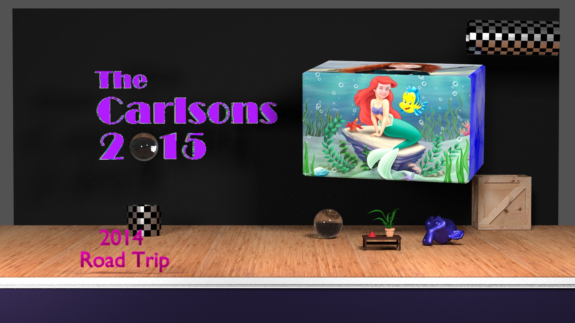
So this was my first Blender attempt - back in early 2015. It was to be the menu for a family DVD that I create annually. One of the movies was a road trip - hence the bottom left menu item. I was going to animate the glass ball popping out of the top right tube, and maybe falling into the other tube and repeating. Each time the glass ball fell, it would rotate the cube which had 4 pictures on it. Never finished it, this was as far as I got. It was nice to experiment. Not sure if I had any rhyme or reason - just things popped in my head. I had forgotten, this scene is actually not that simple.
To get decent at Blender, it is clear that you need to do a critical mass of work within a set time frame so that you can memorize the keyboard shortcuts and just how to do things.
1 Like
About a year later, in early 2016 I tried Blender some more. This time I made two brief animations for a video I shared of my daughter’s high school theater production. Just figured out they are called “production logos”, like the MGM Lion. I edited the two animations together along with the text and the music in Vegas Studio. The first one, obviously is for the Dunellen High School Drama. The second one is for “Carlson Productions”… uh - me. Just for fun because why not. Also does make the DVD / BluRay seem more “professional” when you first play it.
Full disclosure - this video is from 2017, but the Blender animations are the same as what I created in 2016. I used the same intro both years only editing the font and music. I ended up using the same Carlson Productions logo for several videos before changing it.
Quiz question for anyone who gets this far: the Carlson Production Logo has 3 simple shapes all about the same size. What other logo did I think of when choosing those shapes.
Next up, more production logos, created in early 2018. The first two are Blender animations. This is for an annual video and DVD/BluRay I share with members of my daughters dance team.
The first one is just flying text for the name of the team and event. I copied a tutorial on making text blur.
The second one is an update of my Carlson Productions Animation.
The last one is just a simple fade made in Vegas Studio, for another Dad who takes lots of awesome pictures of the team. I think this third logo, with the hip music, is really funny. I get a kick of out every time I watch it.
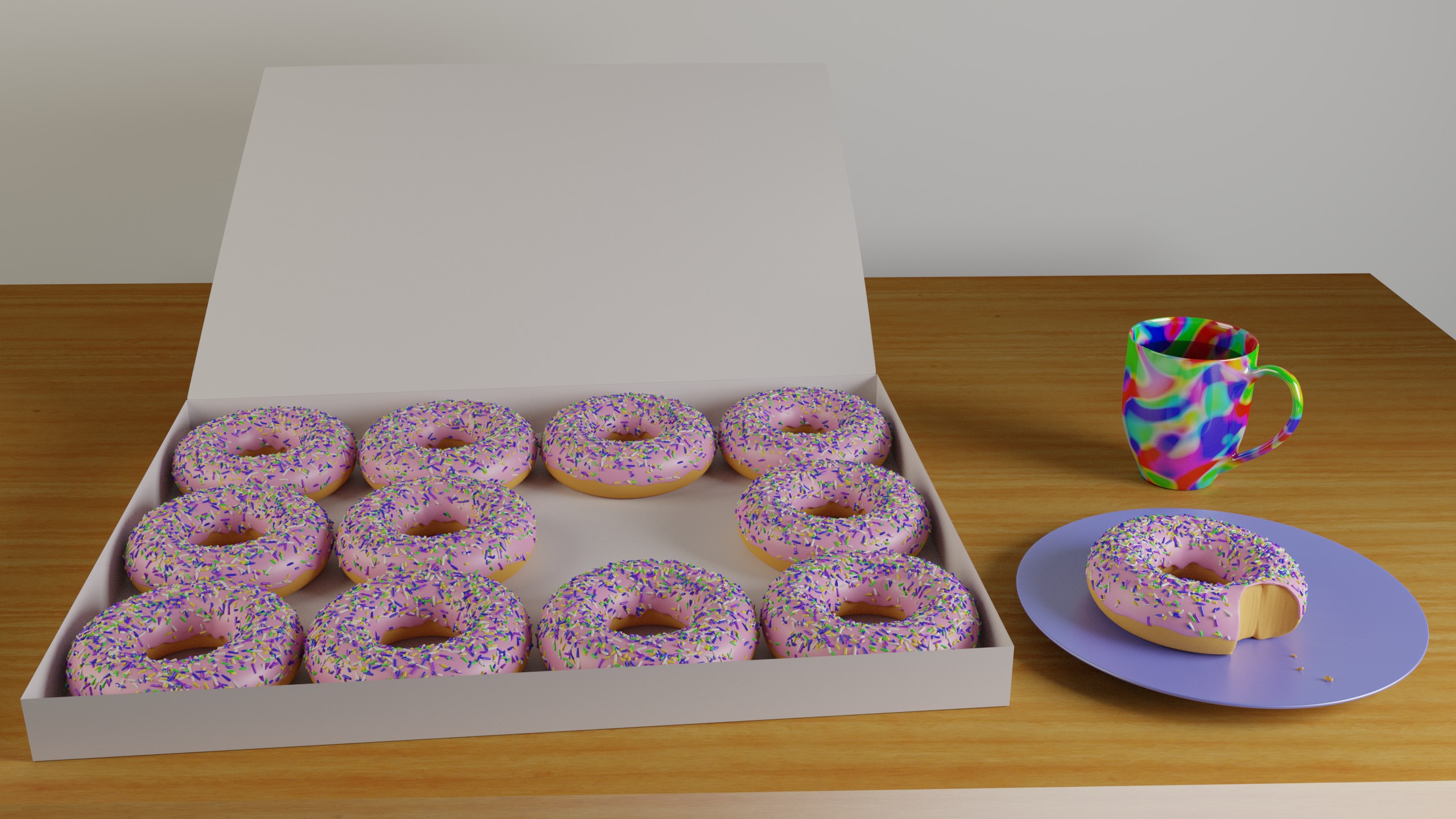
Lastly, I realized that the lighting of my donuts picture is just way too dark. Depressingly dark. What am I, eating a box of donuts in a room without a window and a single incandescent bulb? Some sort of interrogation by gluttony maybe. Anyway, here is a brighter version. Can you spot any changes besides the lighting? There are two.
I noticed before, but looked more closely now - I did a simple subtraction modifier of my donut on the plate with a cylinder that didn’t have a subsurface modifier or anything, and not too many sides. Sort of like the flat surfaces of my teeth - when we bite things the result isn’t a smooth half circle. Now, clearly this isn’t super realistic, but I did think that the bite looks pretty decent for a quick change. I see now that the polygons there are triangles and perhaps a bit screwed up. But anyway, I gotta start a new project rather than keep refining this one.
1 Like
First weekend competition entry! I know I could do more and do better, but I don’t want to put more time into this picture at this time. I actually started making a lava cake, but the youtube tutorial I was trying to follow was too difficult for me. For this cupcake, I learned a bit about making the ridges and the frosting. And I just need more practice, so this was good for me. I still have to figure out textures, in my donut table and in this cake texture - the bump map doesn’t work at all. Not worried though, I just need to focus on it for my future work.
Made in 2.8. Funny how it took me a while to left click select, even though I’m a total beginner I already had that in my mind as I use Blender.
1 Like
A picture I made in March of 2016. I rendered this with Sheepit. The darker squares came from that job - not sure what went wrong.
My entry for this weekend challenge. I’m really proud of it. It came out much better than I had hoped, and wasn’t as hard as I thought it would be. I started to make the arms by hand and then thought- silly me that is just an array. So it was good practice to make 4 arrays for the arms and legs.
Later I want to rig this an animate the juggling and perhaps some camera movement. Hmm… maybe a cartwheel trick during juggling.
I did a tiny bit of 3d art with my Amiga back when I was a teenager. But most of all, the idea of it stuck with me for the past 3 decades or so.
I’m pleased with how much faster and more comfortable I am with Blender in only the past three weeks. It is clear to me that you need consistent effort over a fair amount of time (without gaps) to just build a baseline understanding and comfort with working in Blender. I’ve used it a handful of times over a couple years, as I indicated in some of the above posts. But most of the time there was a gap of months between uses, and therefore each time I had to re-learn a lot. I never got comfortable, indeed I probably got even more frustrated because I was re-learning and not really growing. Anyway, I still have a ways to go, but I’m pleased so far.
The topic for this weekend’s challenge was “Sail Away”. My first inclination was that of an adult fulfilling a lifelong dream to sail to a remote island. How to indicate that? I choose a toy boat (it was supposed to have wear as if it was very old, and a globe and map with pins in them. And a boat portal window. Maybe a logbook “captains log”. So this is what I ended up with:
But then I changed my mind. I wanted something extra terrestrial. So I changed the room to be a child’s room, and the destination to be Mars. And have this:
I’m happy with this entry. It feels mostly complete. I could have added some crayons or more things to make it more alive. I like the patterns of colors and shapes - red and circles. I should have made the base of the spaceship model a cylinder.
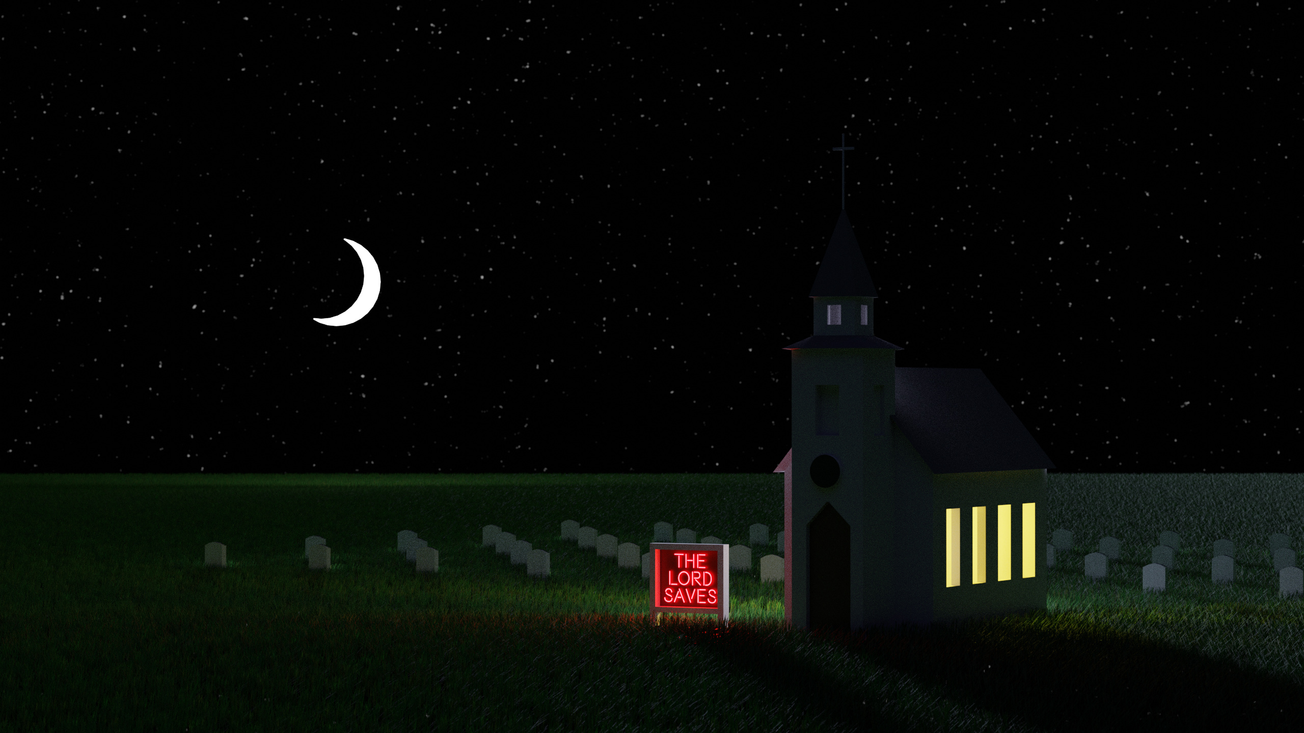
So this weekend challenge is “neon dreams”. So this is what I came up with:
There is a little bit of “playfulness” which almost makes the image work. But as it is, I feel it is missing something. I wanted to add a cornfield in the back, but didn’t want to spend the time. And I ended up putting a lot of grass into the distance, a half a million particles. I’m sure there is a more efficient way to render this, I used 4000 samples to keep the noise and fireflies down. I wanted to make the grass look dying in areas, but could not get weight painting working.
Modeling the church was so incredibly simple. I was happy with how comfortable I feel modeling. But I have to work on materials and textures. Everything looks very simple & CGI looking.
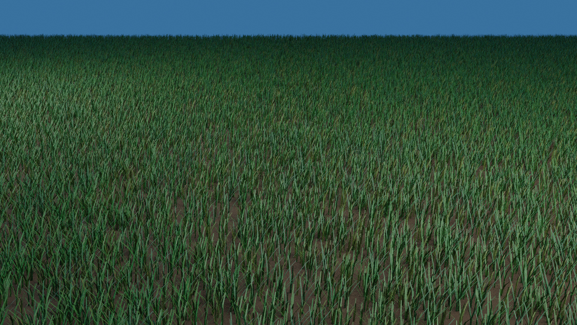
this is the grass I came up with. There are a few weeds in there, but you can’t see any. It looks okay, I think I need more texture and materials work mostly.
So after reflecting a couple days later, I think my The Lord Saves image is missing a few things:
- textures. The moon and church look like CGI. A little bit of texturing would go a long way. I’m better at modelling than I thought I’d be after a month, I need to focus on textures.
- There are three lights for the moonlight: there is a small area light way back which is emitting light without falloff, that is giving the shadows on the church and tombstones. From the camera’s point of view it is behind the moon. There is a large area straight up which brightens up the entire area some. The moon shape itself is also emitting. The emission from the moon is too high - causing the bright grass in the distance. Since it is a little cartoony, it works ok, could be considered on purpose. But if I got the image the way I want it, that bright grass would be removed.
- I could have put a squirrel, or something, in the shape of a question mark next to make it “The Lord Saves?”. That may make the image more direct, and more interesting for some.
So I’ve taken a few months off from Blender. Busy, and perhaps not inspired enough. But I pulled it up this weekend and tried some things.
I worked some at animating my Amiga juggler. I fixed a few of his joints to be more “lined up”, and rigged him with bones, and figured out the basics of moving the bones. But I’m not fluent yet with creating keyframes for the movements, I need to experiment and learn more before I can really do the animation I want.
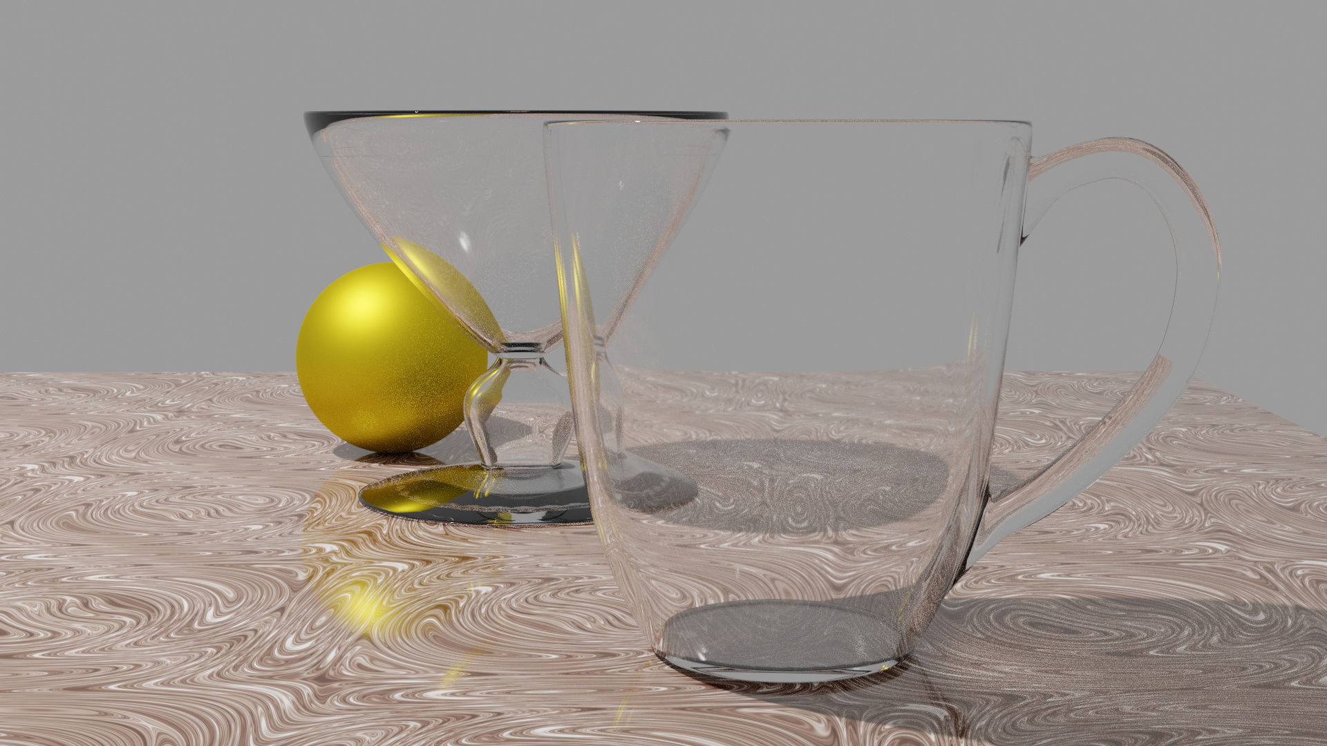
So I was a little frustrated and wanted a simple project. I created some balls and cubes and lights and spun the camera around. Didn’t take long. I love the reflective surfaces and the way light bounces. This interests me, so I’m going to run with it in my next few projects.
Rendered on my own, it would have taken over 5 hours. Rendered with Sheepit, it took 15 minutes.
Playing with Blender again after a long hiatus. Each time I have a hiatus, it takes me a while to re-learn what I forgot. But I do feel like that re-learning is quicker each time.
I aim to create a few glasses a week to create a collection. First one was without any help, the second one I watched a tutorial on youtube.