Broken’s patch is great. I spent an hour last night working on my icons, and it was so fast and easy to test how they looked in blender.
Edit: Bah! Was planning to make a build today but couldn’t set up cygwin for some reason. Anyway, I made a modified version of Jimmacs icon set. Changed manipulator and select mode icons. I don’t care for the icon discussion, this is just me playing around. But if you like - great
Bellorum, your icons are excelent! Very apealling and up-to date looking.
A few minor crits and sugestions… (very minor)
Slightly more contrast on the monkey-head icon (2d row)
A few more colours on the activated texture icon (3d row)
Being able to load your own icon file is a great idea.
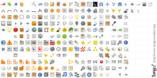
I’m still unabe to post new threads at the moment, and as this is vaguely relivent, here’s a printer friendly blender theme for use while making tutorials…
Thanks! I’m thinking most people will think their too much ´candy´ for their taste, though. :rolleyes: It was fun, although a bit tideous work. I can’t imagine how much work Jimmac must have put into his icons. I only modified 7.
Hi jimmac, hope you don’t mind some comments here.
Been trying out your icon theme, and generally speaking I like it… until I went back to my desktop computer (22 inch screen at 1600x1200- and not as sharp as an lcd) and I noticed some issues
some icons are just too low contrast and not different enough looking- the icons are so small (just a fact of blender) that they’re unreadable. An example of this is the show hidden files icon in the file browser; while the ghost metaphor in the original may be questionable, the icon is immeadiatly visible- it just pops out at you. The new icons for this, and the sort by name extension etc icons are so similar, that I have to hunch by the screen and squint to make out what they say. I think loosing the document/paper shape for these icons would be good- we already know we are dealing with files, since this is the file browser, and if we get rid of that shape, each icon can be given a special silhouette, to aid in speedy recognition. What do you think?
i tried this theme too now that it’s made simple in blender…
and noticed the contrast problem too… on my screen it was because of the theme colors (light brownish) i use… many of the icons were really hard to see. especially the ones that get highlighted when you mouse over them…
The set isn’t meant for dark themes specifically. The semi-opaque unfocused icons do pose a problem for backgrounds around 40% lightness. I’ll see about making those B/W. What doesn’t work well either in your case are the shading mode icons as they are close to your selected background hue. I need to add some outlines for those…
Raising a topic from the dead…
+1 I also vote for inclusion of these icons as default in the next or 2.5 release. It is amazing how a fresh tango icon theme can brighten up an application, especially whe compared to the almost grayscale icons currently used. It is so much nicer to use now!


