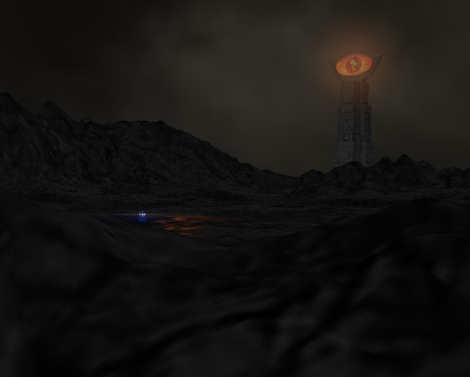
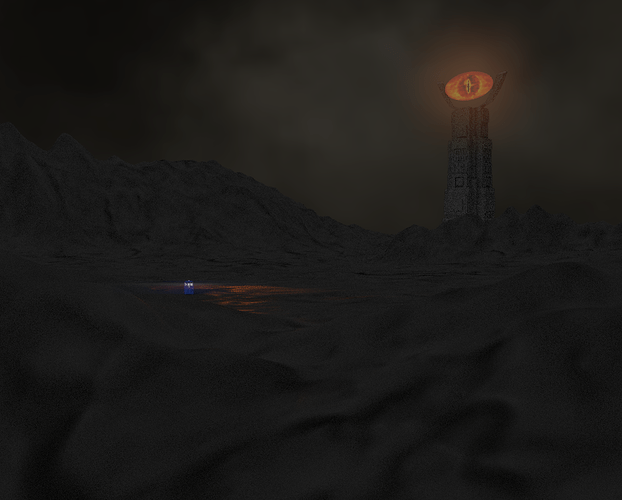
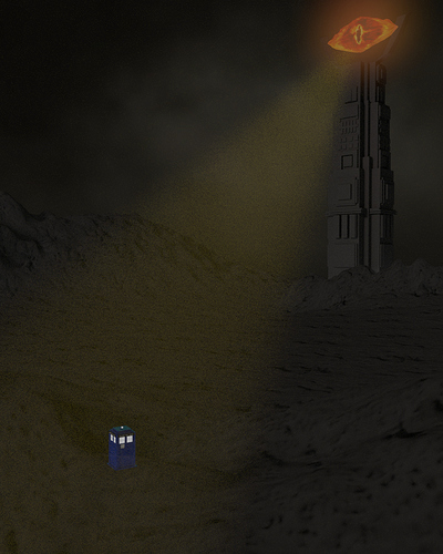
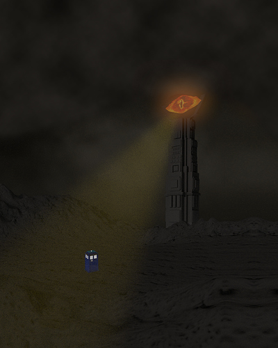
Here is my latest project. It is a combination of Dr.Who and LOTR. This is how it turned out. Any thoughts?
The tardis is sooo small. Is there a way you could bring it more to the forefront? That way the mind doesn’t have to work so hard to see the subject(s) of your art.
I do like the lighting in your background (upper right quadrant) but it does need some more light, even though it is a dark scene.
I actually like your top picture better. I like the idea and I would like to see more of this work as it progresses 
Doctor Who and The Lord of the Rings? AWESOME!
OK, what is the focal element here, The TARDIS, or Barad Dur? Both of them are fighting for control, but neither of them gets it.
It seems to me like The TARDIS should be the focal element (this is what I am going to assume for the rest of this post). It is already grabbing my attention because of the colouring. Blue really contrasts against a black and orange colour scheme, and not in a good way (check out the BG colour theory video). Barad Dur seems to me like it should be more like a menacing mountain instead of a focal element. This means hiding it behind mist and atmospheric effects in post.
The TARDIS is way too small. It needs to be brought into the foreground a bit more. Look at the composition for me BG Christmas Comp entry (sorry I don’t have a better example).
Do you see how The TARDIS is in the fore front? It’s clearly visible and you can tell what it is. What I would recommend that you do, is position your TARDIS in a similar way, except more off the the left. Then keep Barad Dur where it is, but make it bigger and more menacing (and work on the eye because to be honest, it looks like a child’s toy).
Also put a bit more work into texturing, don’t just use procedural textures because image textures work much better.
I hope this helps.
Okay, the Tardis was the LAST thing I saw here… you DEFINITELY need to scale that up… Um, After that, HOP INTO TO TEXTURE PAINT MODE, and get painting those mountains!
In contrast to the others here, I think that the TARDIS should be small, if you want it a little bigger, fine, but I think that part of the beauty of that vehicle is its unassuming nature. The size contrast with the tower is excellent.
That does not mean that you should not find other ways of drawing attention to the thing, either with colour, or perhaps adding definition to the beam of light coming from the eye to the box through volumetrics or that sort of thing, that was mentioned and I agree generally with TARDIS Maker here, except on the size.
let me guess, eye of mordor is a textured circle? too obvious mate xD
Unfoutunately I do not own anything like photoshop and gimp does not work on my comuter:(. Other than photoshop I have no idea how to make that look better. Also I was trying to make barad dur menacing and threatening but I see your point about the tardis. Any tips?
one thing you can try for saurans eye is to map the texture on to a slightly warped sphere.
or, subdivide the hell out of the eye and use the displace modifier.
even better: both! 
Here is the most recent update. I have added a spotlight and made the Tardis more visible
Any thoughts?
quite nice! now we can see tardis 
however i would texture barad dur and make sauran a UV sphere warped a bit.
i can work on a texture for barad dur if you like 
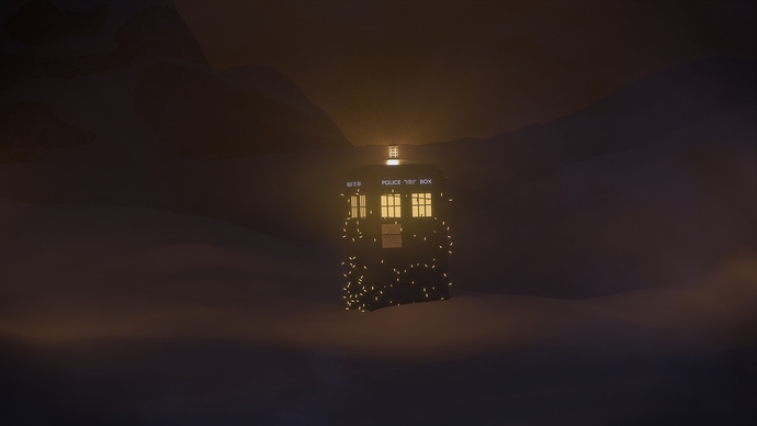
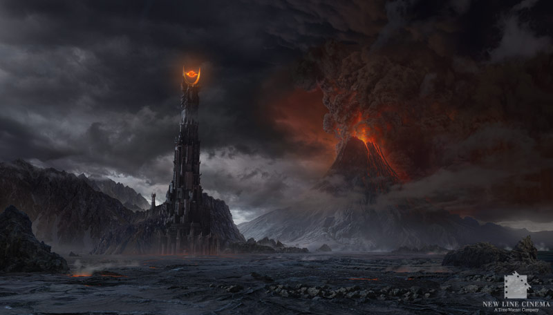
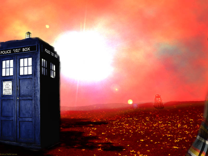
The overall design aesthetic is lacking there is no where that the eye is drawn to you want to keep the persons attention on the image nothing does that here. You can Place The Tardis In the bottom left corner. It is usually shown in one of the bottom corners in a landscape scene for this reason. It should be half the height of the image and only partially in view the Tardis will need to be a darker blue version. place a rocky outcropping in the bottom right corner. Place BARAD DUR in the upper center and have it atop a small mountain. Now for the eye you need a texture that fades to black by the time it gets to the edge of the plane so you can use alpha sort to get rid of those hard lines then add some particles to the eye. finally in the distance put mount doom erupting towards the top right. This would be allot like Tardis materialization scenes on the show. be sure to reduce the yellow of the eye and go more orange as orange and blue are complimentary colors however red oranges is preferable. The earlier comment about color schemes is not accurate not to insult anyone its just not true here are some examples illustrating points.
Both image’s have a Blue Black and Orange color scheme and they work very well it just has to be done right.
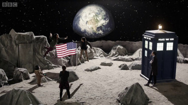
That would be much appreciated however would you need the file?
probably not, as long as you can UV map onto it.
for barad dur, in 1up3d’s picture of it it looks like you could use something like this with a beefy displaement:
if you need more bumps try cell noise, it gives you “square” displacement textures.
the rocks are gonna be trickier, but have an idea that ill try after school.
ok sorry i took so long.
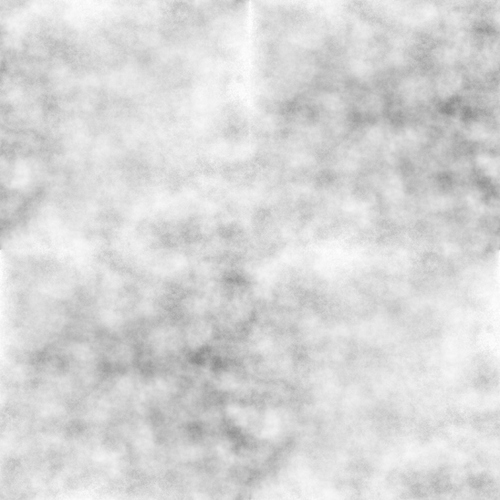
i think this should work for the rocks. it has smoother and rougher patches too, and tiles seamlessly:
if you like i can upload a .png, but its 2048x2048 so it didnt fit :spin:
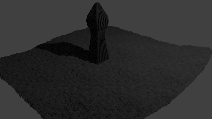
i tried this out on a little dummy scene:
altough the displacing needs ~8x subdivision.
Thanks for the files nickey. Unfortunately because of how I modeled barad dur the kind of texture didnt quite work. When I applied the rock texture I found it made things a bit to “bubbly” if you know what I mean. But thank you anyway.:rolleyes:
Here is the most recent edition. I have crinkled the eyes and darkened the rock. I have crinkled the eye and curved it a little. I still may have a few things I need to do. What do you think?
I think you should choose a focal point, and stick to it. Right now, both the Tardis and Mordor’s Eye is fighting for attention. Given the TARDIS has a ‘perception filter’ anyway, I think you could have the focus squarely on the eye and then have the TARDIS floating around in the background somewhere. That’s the point of that ship; to be just about unnoticable, but not quite.
You need to think about the rule of thirds in this picture as well.
Personally, I don’t like where the TARDIS is on both yours and mine here. I can’t line it up anywhere and I think it’s too out of place. I’d look at expanding the sky a little bit and possibly even the aspect ratio from a 960×1200 to maybe 1200×960 as the picture itself is too small. When I take the TARDIS out of the picture completely, the beam itself leads to no-where and is a bit distracting, so it would be better to either respoition its end within the picture somewhere, or simply take it out.
Basically, widen the picture a bit, and try and line up important focal points.
Something doesn’t look right about the lighting on the tardis. It looks like it’s being illuminated from the left, lighting both visible faces uniformly. I can’t see the edge between faces at all. It so small–which is okay–that I think you need more depth cues; otherwise it looks kinda flat.
