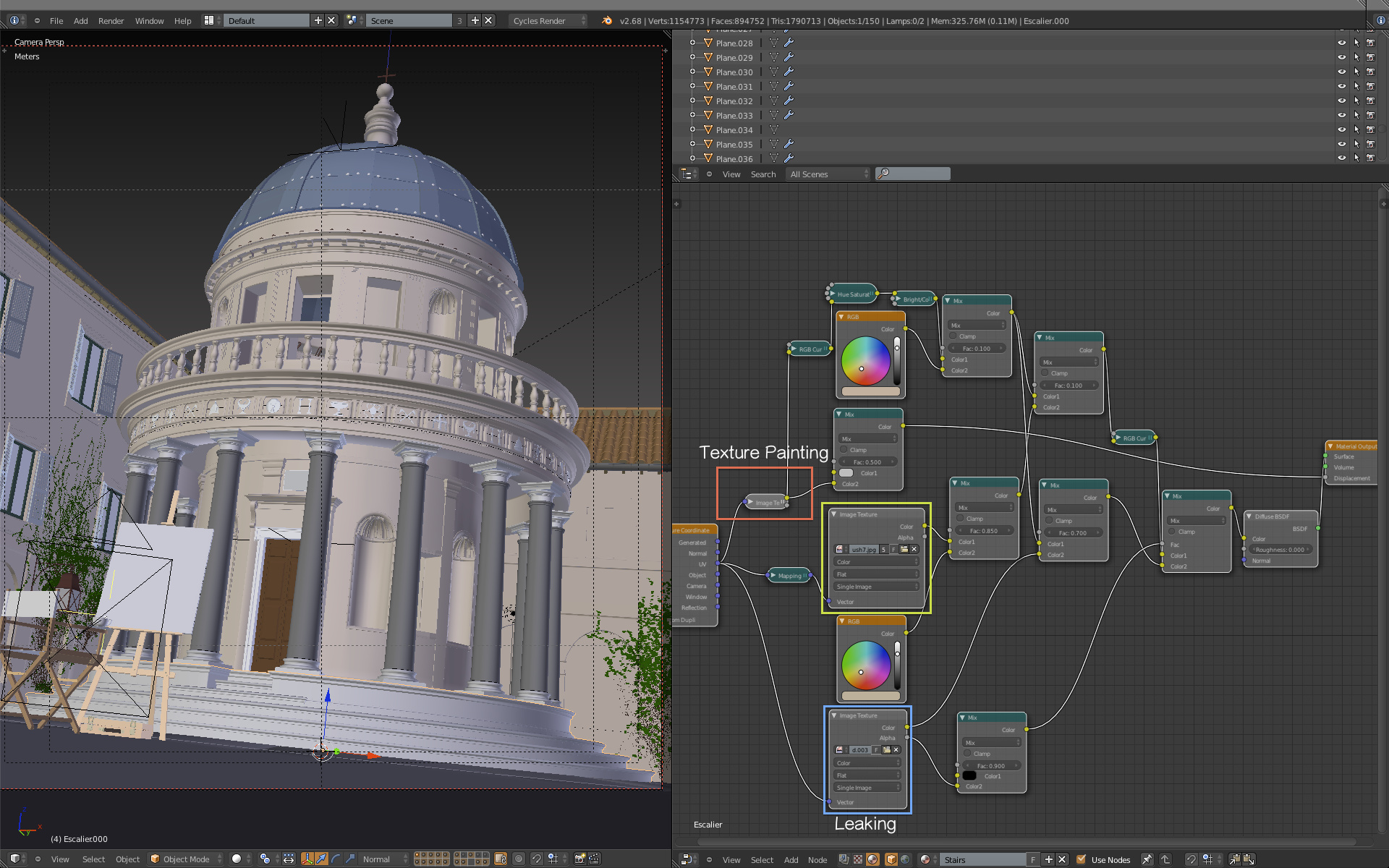
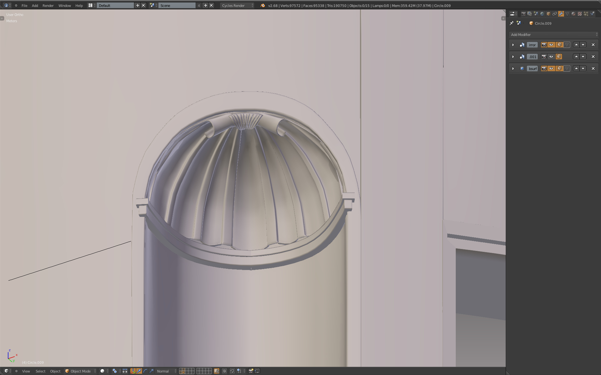
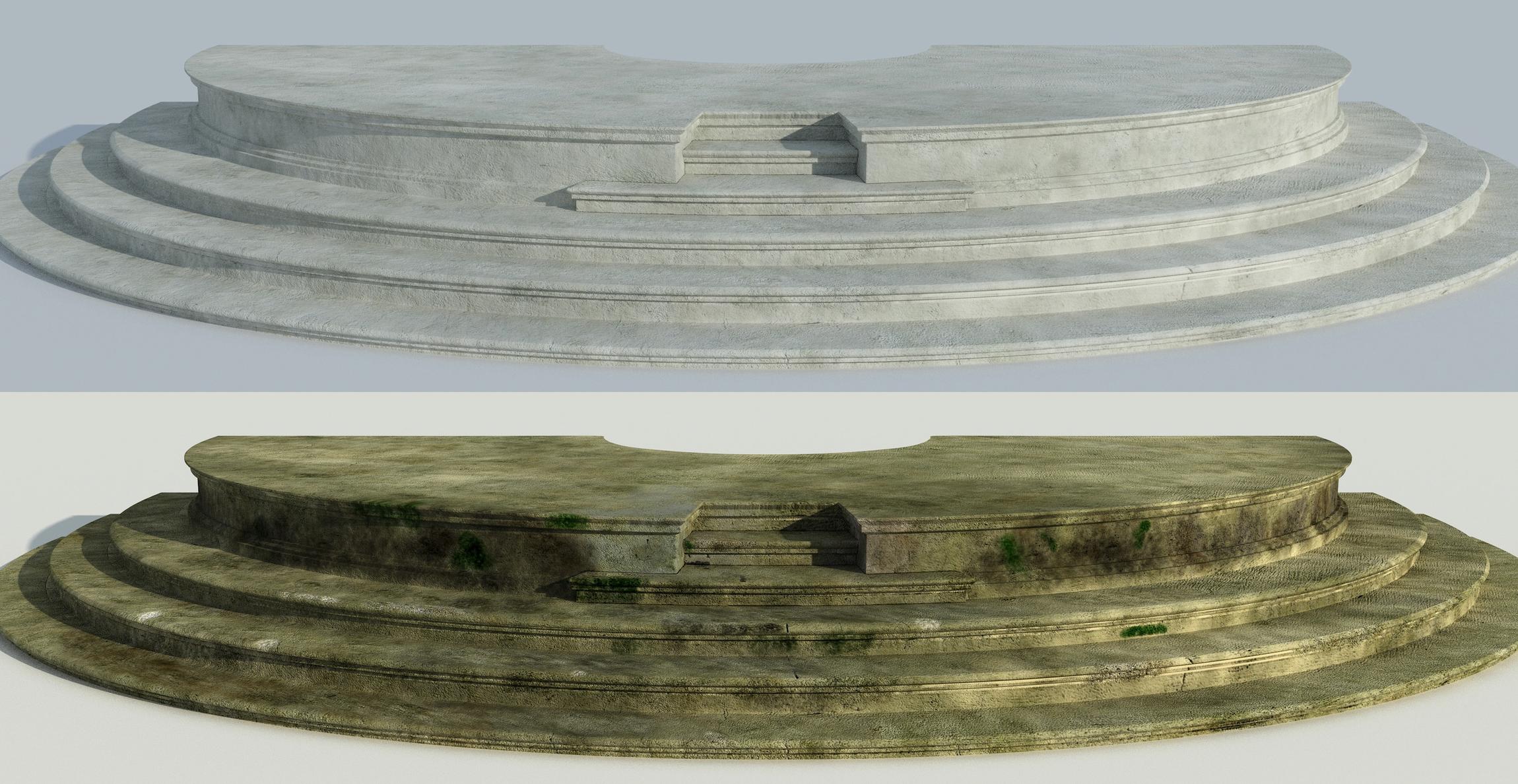
Texture painting was really useful, I created about 6 stone brushes, 2 leaking brush and 1 crack brush to achieve all the textures you see on the temple. The tutorial of Kent Trammell on Blender Cookie was very useful to me especially to make the image tileable in photoshop and how to use it properly in Blender.
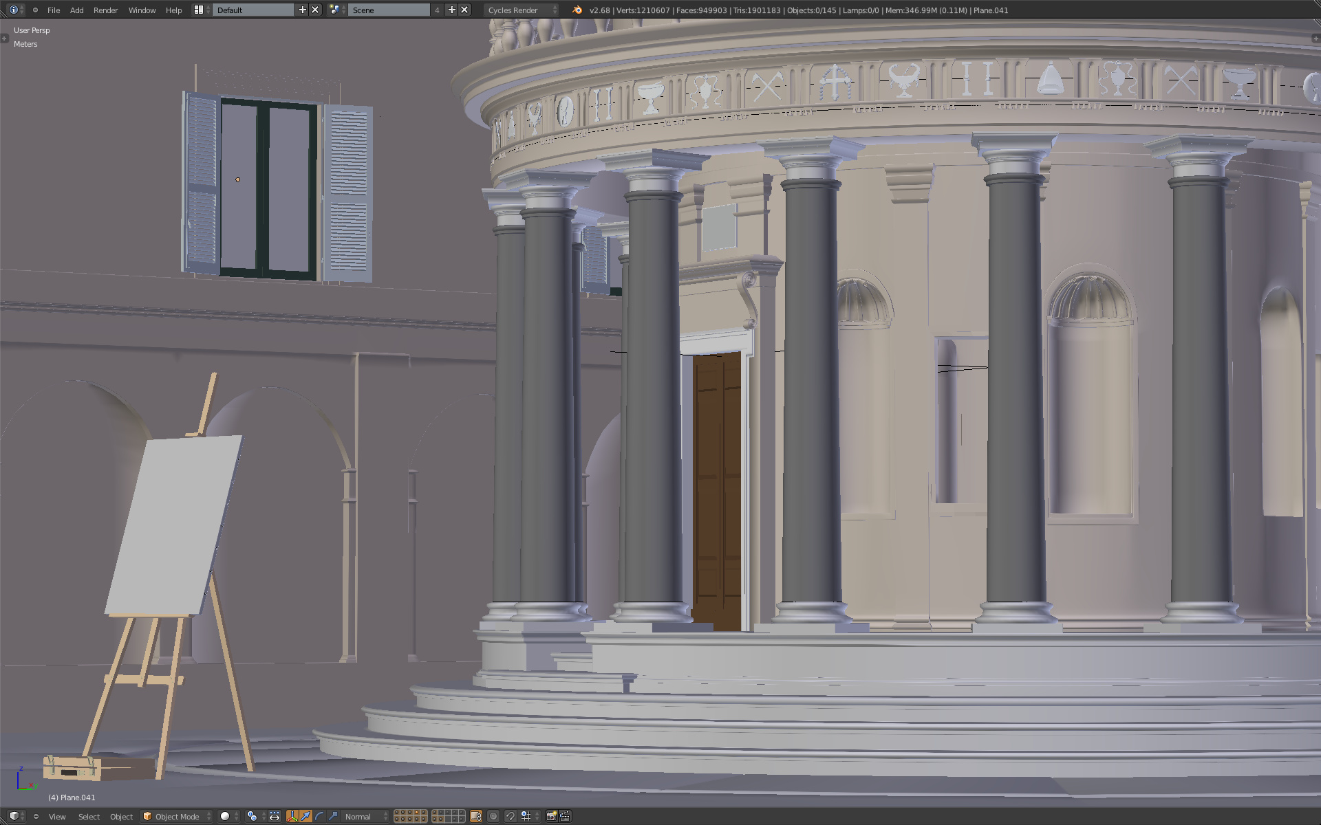
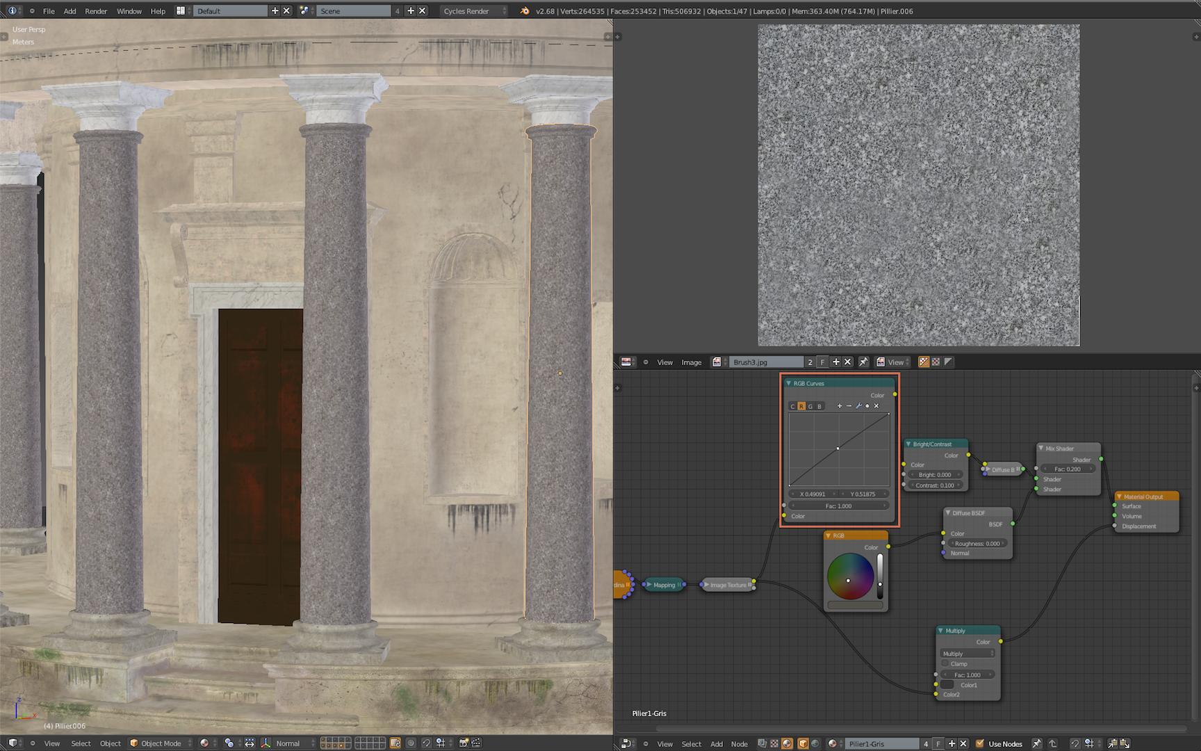
For the materials, I didn’t go on some complicated nodes, actually, no glossy for the stone material but I played on the color (RGB curve, Bright, contrast, saturation) to create an harmony in all the parts of the temple.
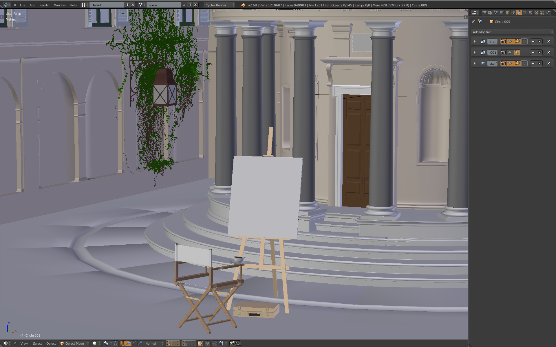
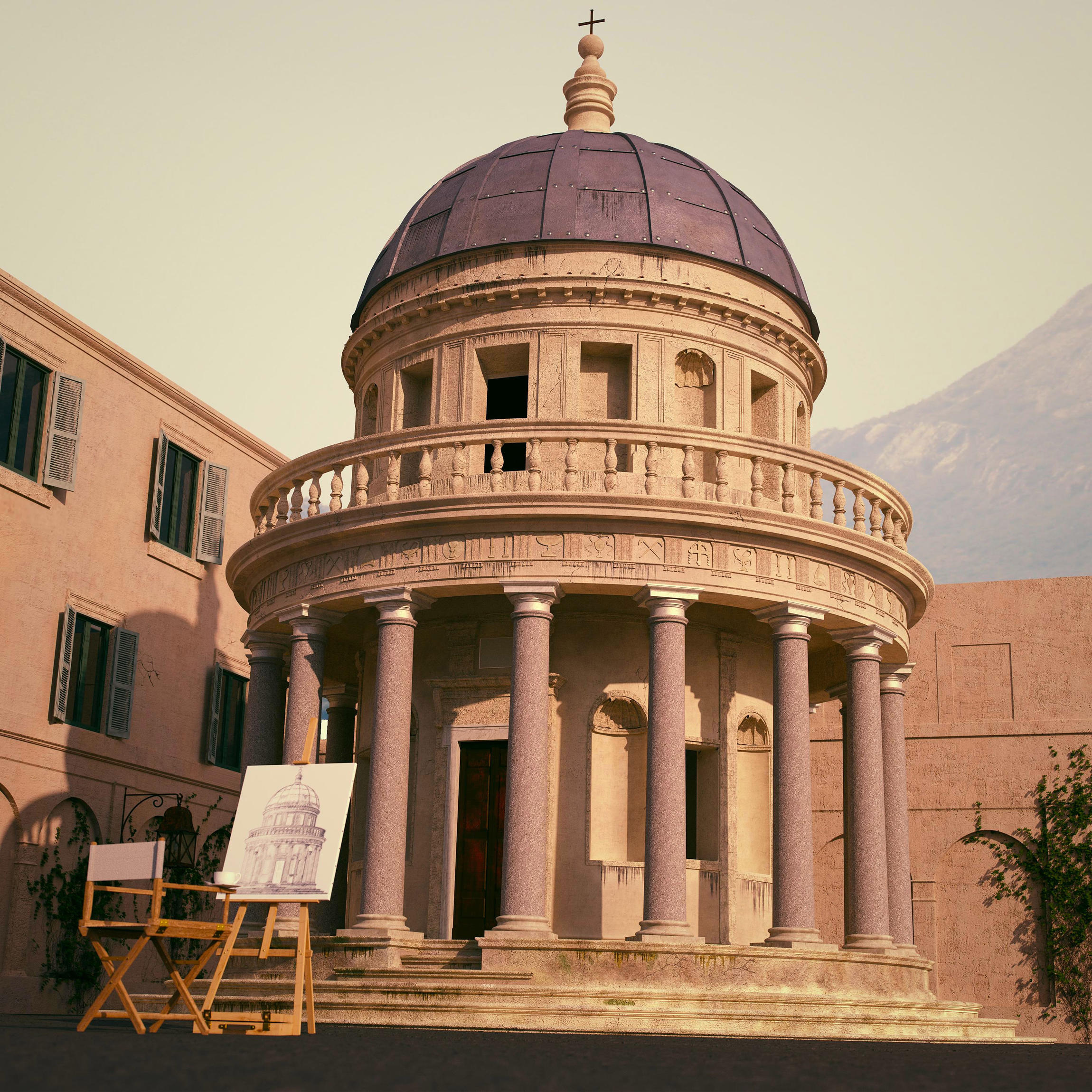
For the story I put a canvas and a chair to give a human presence to the scene. This created a " mise en abyme ", and show another type of art that I actually do not master at all.
I like the viewport more…
The colors are way better than in the render… it happens to me a lot…
But its good render anyway. Nice details and work. Cute idea with the painting. The only thing Im not so sure is the background… The shape is good (it draws the viewer eyes) but the ones again, the color is not fitting with the foreground.
You are right for the sketch, but if the canvas is to far, I will need to decrease the focal length and it is already at 34 mm.
For the pillars you’re right, I insisted too much on the red tint of the texture:
Exellent work everything is perfect , the only comment i have is about the angle of the camera it gives the feeling that the
building is going to fall , the scene is not balanced ( principals of design )
try to change the camera angle , or if u like that angle just put some strait weight in the bottom right of the scene and make it closer to
the camera ( in full focus ) to balance the scene.
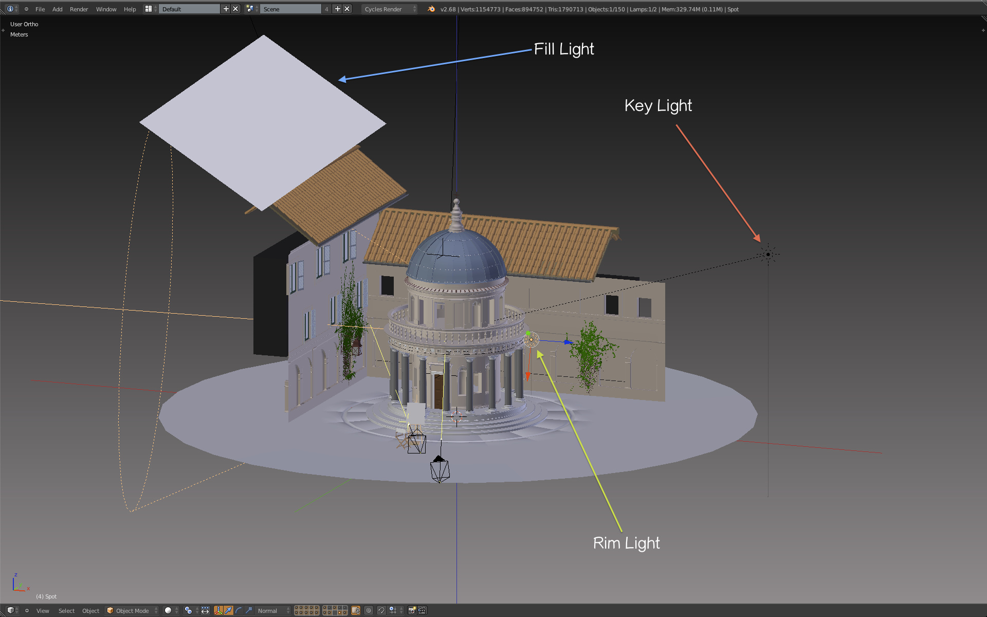
Well, I understand you, when I was doing some tests renders, the camera wasn’t rotate :
You will certainly notice that there is no roof on this render !
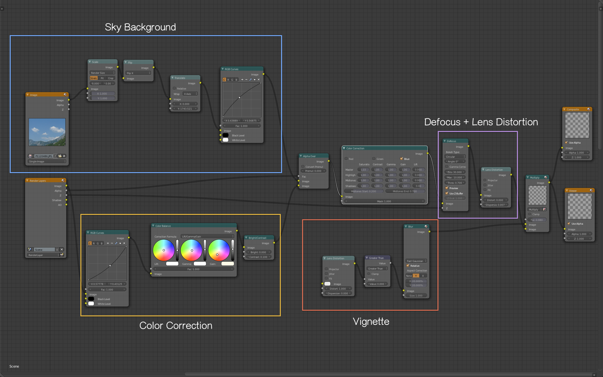
So after 4 hours of rendering, I found that the background was boring, so I replaced it with a landscape that I took in Montenegro and it fitted the scene perfectly when the camera was slightly rotate.

 : http://www.flickr.com/photos/98563336@N03/9704772712/sizes/k/
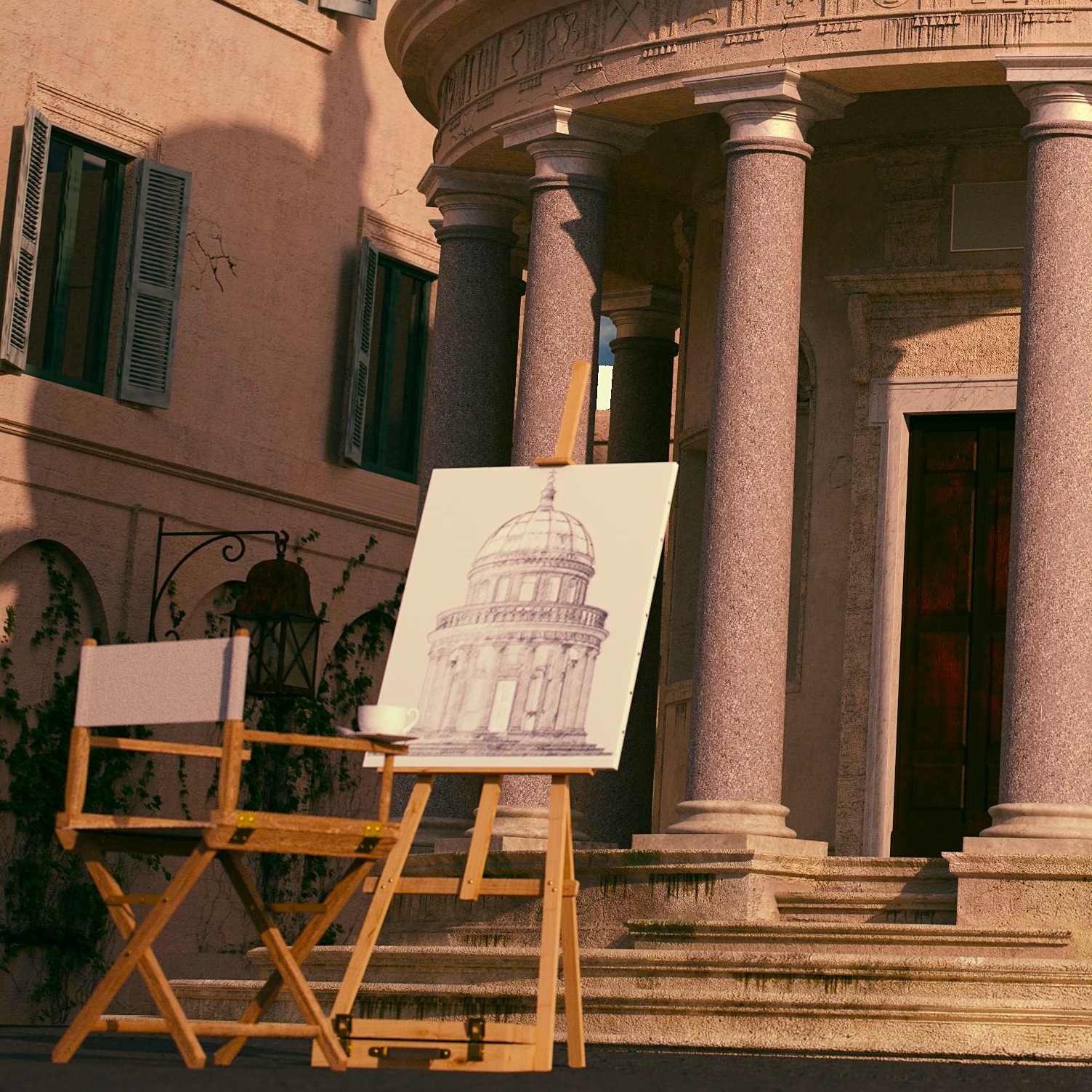


