Building upon my previous work, i am going to build upon the scene by adding more detail and being more imaginative without the constraint of recreating the original this time around. The idea is to put in more props, work on better textures and create something that looks good.
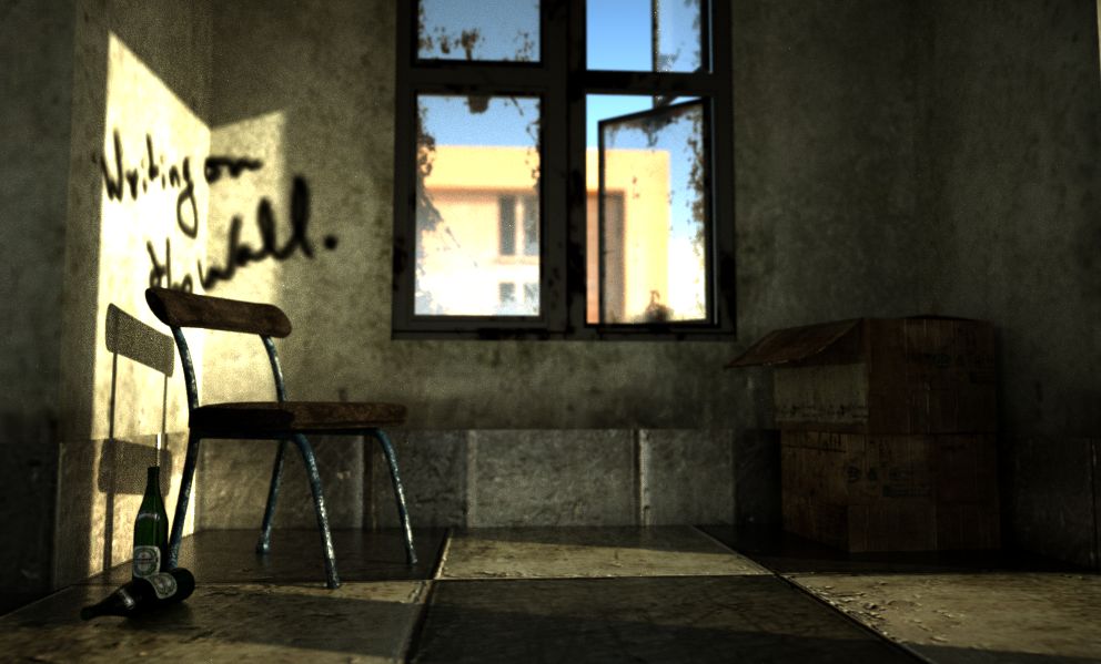
The actual cushion on the chair looks too new compared to the chair. The cloth should look more used and warn and squashed where people have been sitting in it over the years. I am liking the feel of the walls render. I will keep an eye on this thread to see where it goes
Just trying to see how it looks after putting everything together.
I kinda like it how it is currently - with no roof or doors. Doesn’t look like a bad place to be in - blue sky all around, sunny, with beer and a couple of cartons filled with books and old magazines. what do you think?
I guess i’m almost through modeling and texturing. Maybe i should move it to the focused critique section. What do you guys think? Please leave feedback.
The floor tiles are pretty large. Usually, floor tiles are 12" x 12", or larger in commercial spaces. Yours seem to be maybe 24" sq. I like the elements, but the render is a bit boring. What’s the story here? What’s going on? Why are we looking at this? Also, concerning the spray paint, I wouldn’t wrap it around a corner. If you were going to spray paint a wall, you’d probably pick a flat section. Also, the text of the spray paint should support the story (images other than simple product presentation should tell stories). The paint is also a bit isolated. I’ve not seen a lot of old buildings with 1 tag. They are usually filled. Like I said, I like the elements, but the image needs a purpose, if you get my meaning.
About 3dmedieval’s point about the picture telling a story? Honestly, i don’t know. I don’t have a story to tell with this one. I am going more for a mood piece than trying to set up a narrative. You tell me. What’s the story? I think the story is in the viewer’s head - i am not telling it!
Still to fix - the wall texture with the writing on it.
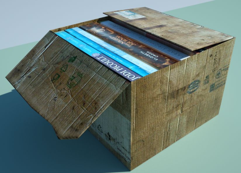
Ok, so here is my suggestions, first the beer bottles don’t look right, they look more like wine bottles in the shape and in size compaired to the chair. The texture on the chair looks good, but mabey to big, the fibers should look smaller. And the cardboard boxes, while the textures look great, the box is too perfect, the texture shows creases and bends, but the physical box is flawless, so mabey “beat” up the box a bit, that and the specularity looks a bit high for cardboard. Looks great, and your textures are awsome, just need some tweaking. Once again, execellent job.