I make my living doing interior visualizations and have worked with a few interior designers for a while and now I am starting to do interior design myself. I have to look at product photos for things like ceramic tiles all the time and have done it for years and my experience is that yes, neutral and carefully considered and controlled light is extremely important for products. First of all, if we are talking about visualizations, every time I see a visualization of a product, I never ever trust it. No matter how well it’s made, it’s always an interpretation and it’s a mistake to trust it. It could be poorly made and so the colors might not show well, or it could be very well made and then the look might be enhanced and not realistic as well and you can never know and on top of that even if it’s a photo, that’s the same deal - you cannot even trust photographs, because of different lighting, different camera settings and digital color representation in general. And on top of that even if you hold the product in your hands there is still a problem(this is getting ridiculous, isn’t it?..), because you may be in some environment that is different from the actual environment the product is going to be in and the lighting is going to be different and also in the actual environment the lighting changes so it looks different in different circumstances…  So terms like “accurate” do not even apply here. Still best to look at the actual product with our own eyes.
With that being said, if you add various extravagant kinds of artistic lighting effects to all inevitable preexisting confusion, that’s not good at all. Light should always be usual regular light that everyone is used to and it should be as generic as possible. So that probably means matching sRGB whitepoint and you probably don’t want a mix of light sources of different temperatures or colors. It should be clear and simple. Shadows are also a concern, because people judge only the product and often fail to consider the environment it is shown in. The context is always their context, not the context of the visualization or photograph and they have trouble switching those. Some are not used to observing and judging color in a professional sense, but even if they are, they are usually preoccupied with other stuff and have other things on their minds and don’t have time or reason to stop and admire the artwork of product visualization. So I think there should not be unusual circumstances when we are talking about product visualization.
When I try to understand how a product looks, I want to see photographs(strongly preferred) or visualizations(I hate them and don’t trust them and will search for photographs anyway) that show the product in a completely neutral light(D65 preferably) evenly lit, clear and sharp and then I want to see it in some familiar(extremely important) environment to see how the materials react to light. I want to see shadows and highlights and specularity, reflectivity, texture, but I want to have the most of the image lit uniformly and in neutral light. I want it to be correctly exposed and focused. In general I don’t like product visualization at all very ironically, because that’s what I basically do myself. If it is visualization it needs to be of highest standard possible.
I am not the consumer in this scenario, so forming a feeling is very slightly less important when “selling” to me, but it obviously still effects me, because I am a human being and I will like cool products and will present them better if I like them but images I want might probably be slightly different than what sells best to the consumer. Not sure about how much of a difference it is though. If we consider the consumer, you probably want to induce more feelings and communicate values and ideas with the imagery, but clearly seeing the product is still important and drastic artistic effects in light and colors may be very confusing.
In any case, I strongly believe that uniform, familiar and neutral lighting is extremely important here. Familiar does not equal realistic though. It’s about perception. Our eyes adjust to different white points so the light should match the white point of the medium, the image is for.
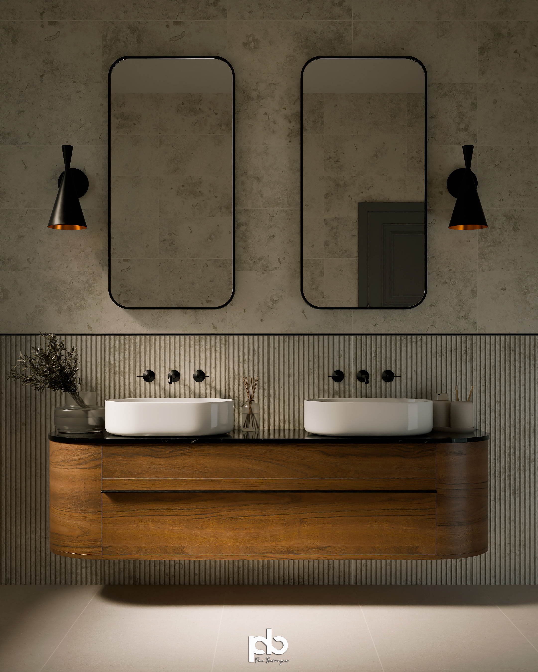
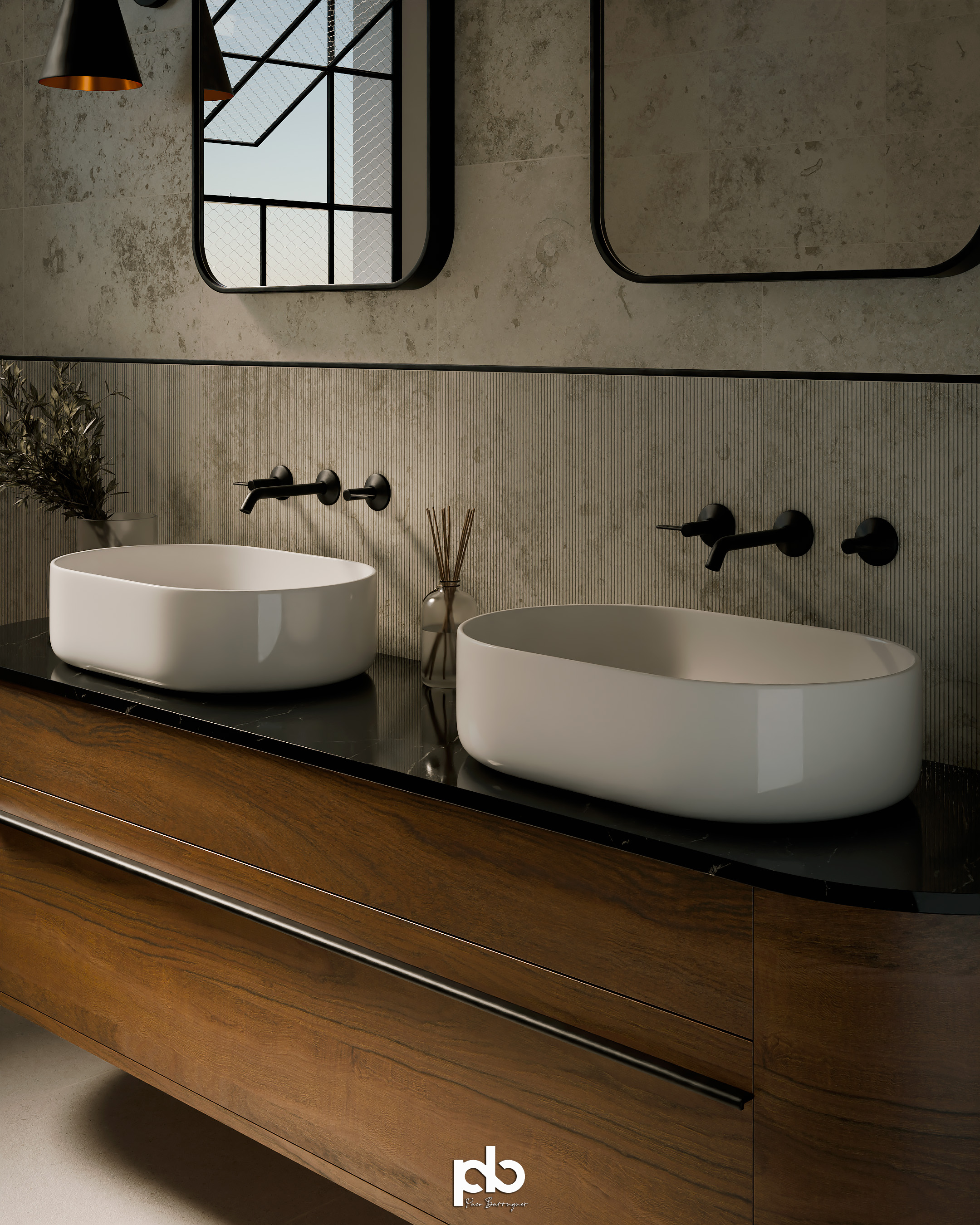
The images you show, seem to deviate slightly from the ideas I expressed because they tend to be warmer in color than neutral, but I don’t think it’s a huge problem, because they are of very high quality and it is quite obvious that they are warm. I still think there will be people slightly confused, but who knows if completely neutral color temperature would actually help a lot. People are often OK with things being slightly warmer. I think that’s fine, but I think more neutral could be very slightly better. No certainty there. In this case it’s very helpful to see other objects that I know are white and black like the sinks and faucets, because that immediately lets me adjust to the lighting of the scene. But I do it semi-consiously. Will every consumer do that?.. No, some will get confused and will perceive the tiles warmer and may be disappointed when they actually see the product in real life.