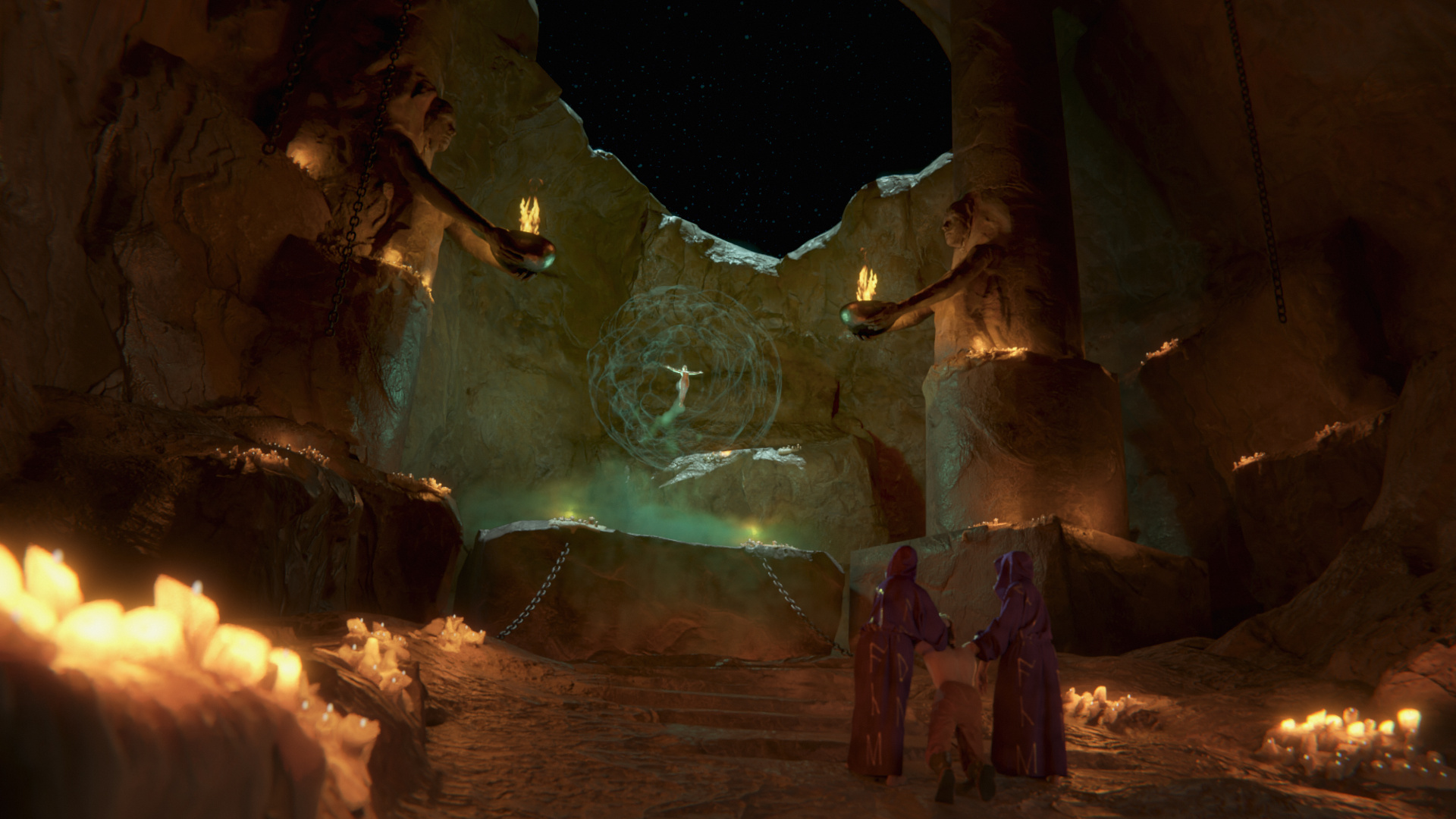
Hi guys! This is a weekend practice project. I rendered it using ecycles 2.8.
Hope you like it and I am looking forward for feedbacks and critiques!
EDIT: I did some additional CC in lightroom… what do you guys think? I might have gone a bit overboard, but then it really depends on the screen I am looking at…
nice work !!!
i would only say that the mountain top rim is overlighted to much , than the sky. which is odd…
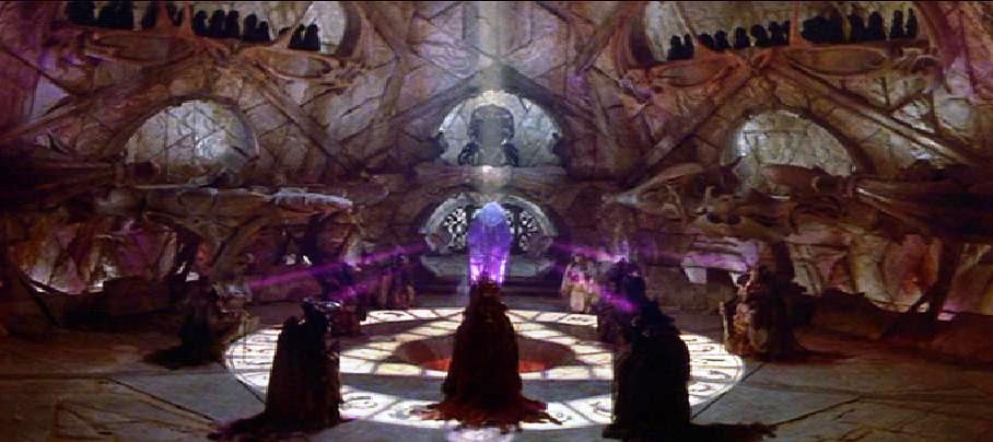
it looks like a rock floating on space… if is this case thin ther is nothing to fix
but if not… i think a volumetrec light would make sens on the black sky .
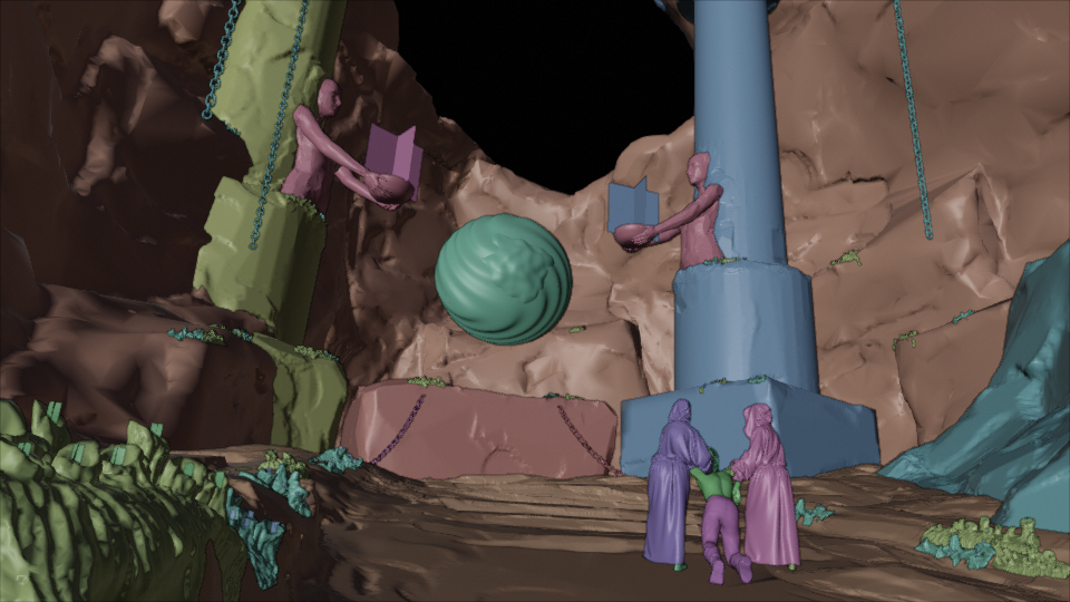
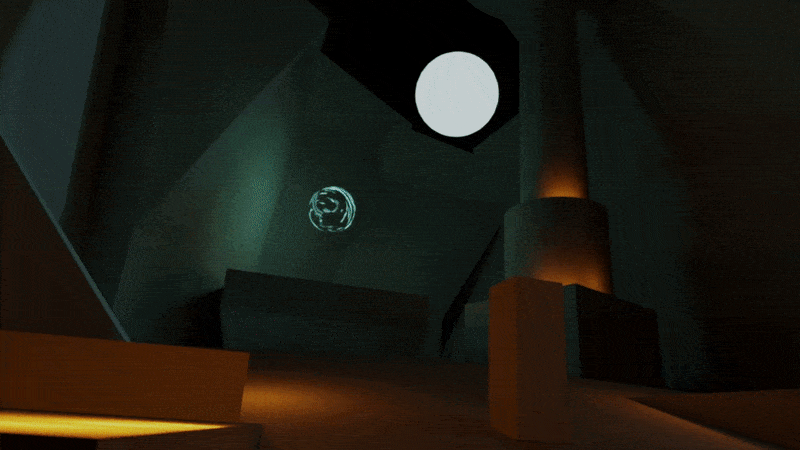
Thank you guys, I really appreciate your feedbacks. I think you are right, some kind of rays or atmosphere coming down from the hole would probably look good. As you can see from the progress gif at the beginning I planned some kind of moon in the sky, but I thought it wasn’t working so I took it out, but now is very dark out there . Maybe I’ll see if I’ll come back to this image one of these days, just to make some little change, even if my target was to close it before the end of the weekend (here is already Monday afternoon )
Beautiful lighting! You may want to make the foreground characters more distinguishable from the environment and the background where the ritual is taking place could have more shadow areas. I think we see too much of the cave but I could be wrong. Don’t forget to add some vignetting and more contrast
@Kangni Thank you! I am afraid I need to calibrate my monitors! I am on a a laptop and an old dell external screen… on the first one the image was saturated and super contrasted, while on the dell it appeared much more washed out. I tried to go somewhere in between. However today on the screen at work it appeared again a bit too washed out, so I think my laptop screen is the one less accurate. It means probably I can push the contrast a bit further. About the characters on the foreground, I tried to brign them out changing the color (you can see that’s one of the last changes on the gif) but if I messed up the contrast on the image, that probably didn’t help much I need a new screen
@polynut Thank you! Cool music!! I wish I was listening to it while working on this, it would have definitely helped me get into the mood! Do you have a topic about your game?
I’ve added a more color corrected image in the first post… still hard to say if it’s better now that I know my monitors are quite off the chart What do you guys think?
PS: looking it from the monitor in the office, I think I could push the contrast even more…

 . Maybe I’ll see if I’ll come back to this image one of these days, just to make some little change, even if my target was to close it before the end of the weekend (here is already Monday afternoon
 I need a new screen