Dear all,
before I upload my new scene I want to value this precious community and ask for some in depth critiques and thoughts.
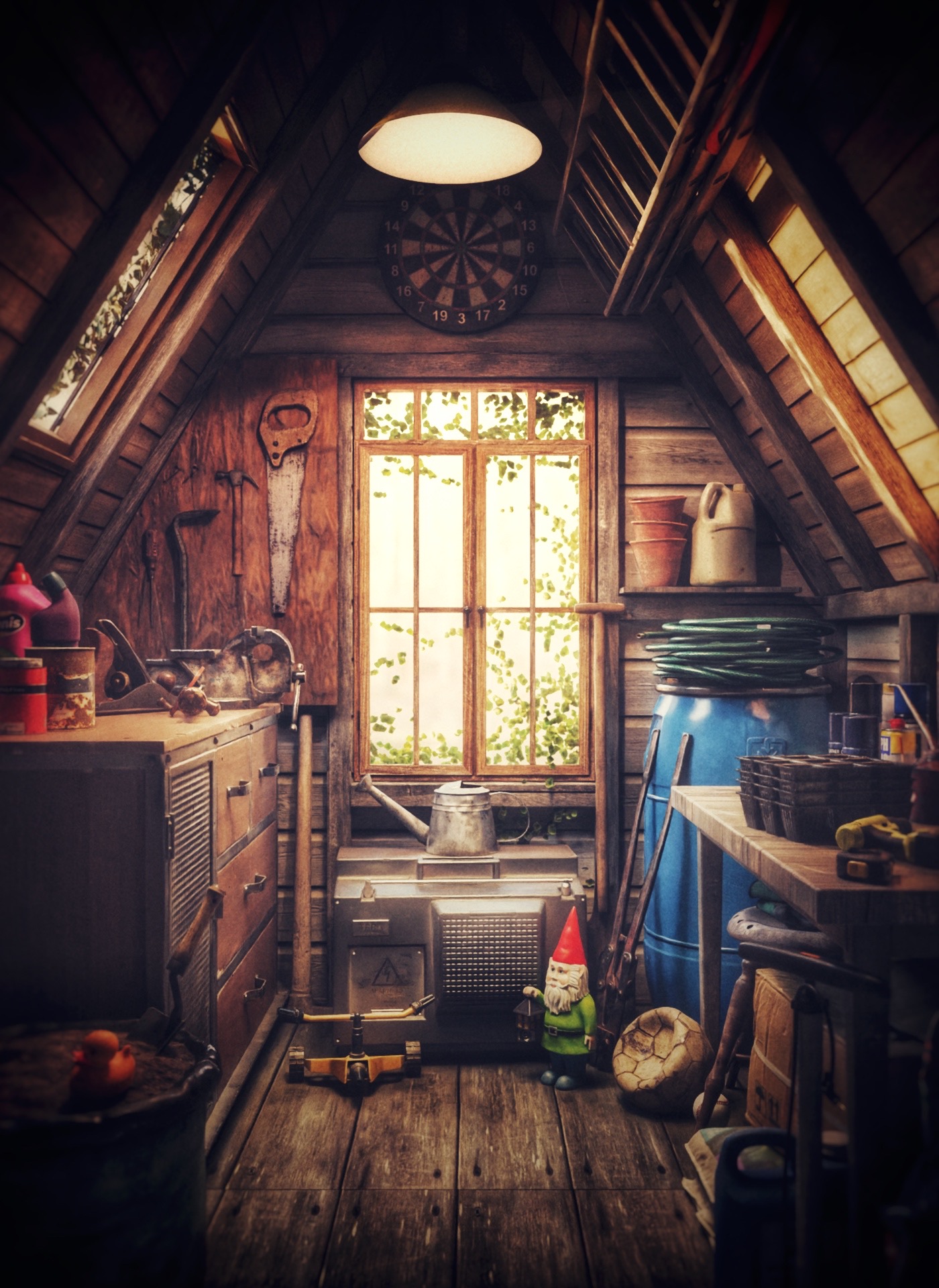
Since the polyhaven community project “the shed” took place (@JamesRay), I was planning to make a sample render with all the great props from that project. Now I have finished two versions - and I really can’t decide which way my story(telling) should go. So after some harsh discussions with myself I would love to hear your thoughts.
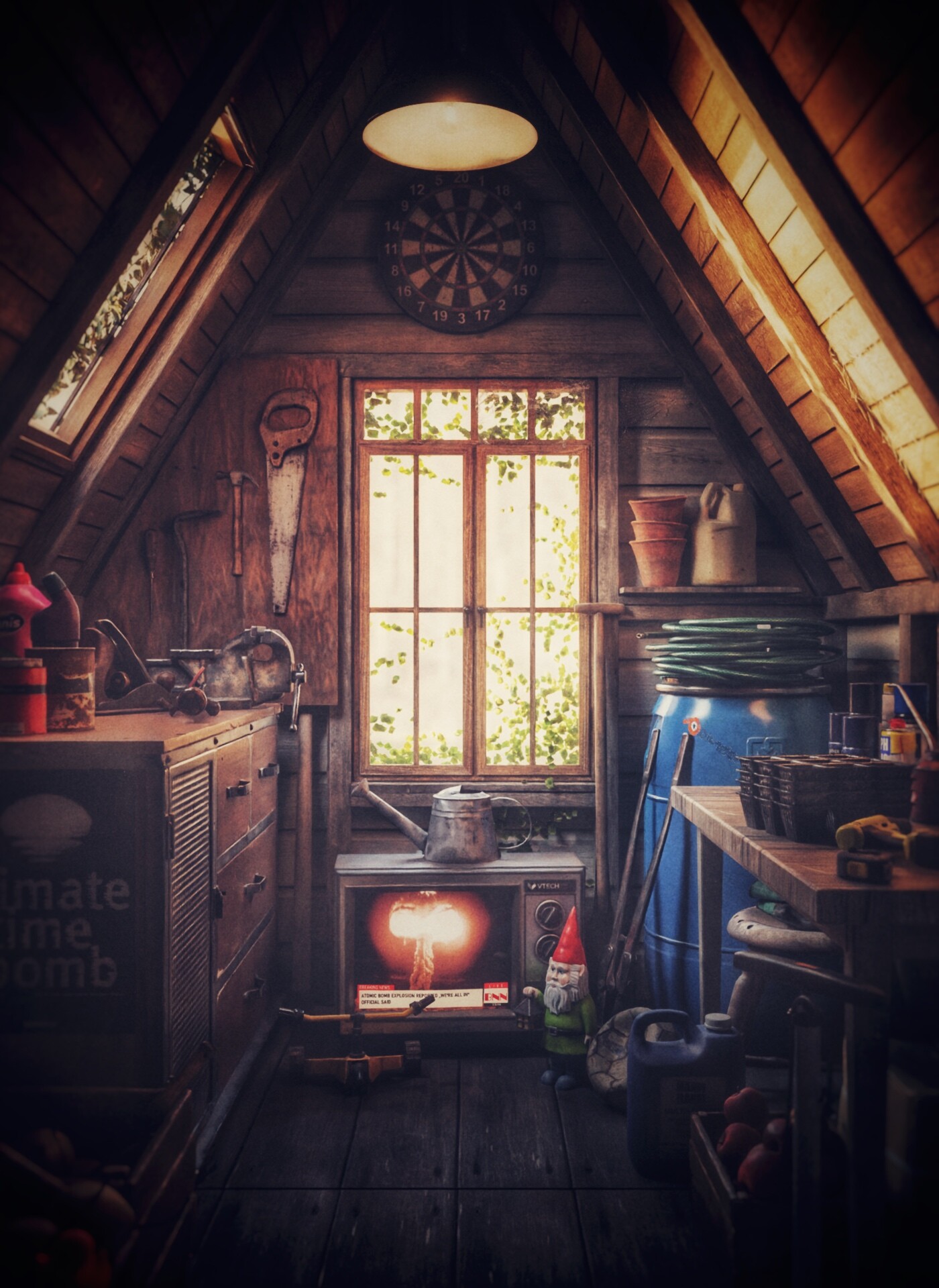
Which storyline do you prefer and why? Picture 1 (above) or Picture 2?
I’m more than curious!
CONCLUSION:
What I’ve done:
-only natural light
-dust/fog
-changed the bright blue barrel colour
-changes based on the most liked version 1
My main concerns are
1 the lighting: more or less light from the lamp? Or even try a night scene?
2 the story: is the story in the 2nd image working for you? Is it to obvious or to subtle?
Do you miss/see something else? I’m happy to hear about it!
Both are nice… according to story… the idea about a big explosion in the news… and now everbody went away? … Nitpicking mode on : an analog TV on the floor… and for sure the watering can dropped already endlessly on it and itslef will explode if you switch it on… maybe the owner will be pushed back abruply… well it worked… but other thanyou thought
I agree both are very nice. But, I prefer the 1st image… for some critique, I would turn off that light and see the old bulb, maybe even an Edison…everything is way too clean…I would like to see a few God rays through a few dust motes ( hard to pull off) with the window as well as the skylight the lamp would only be useful at night. The windows are plenty of daylight and could deepen some shadows to give a bit more depth. I’m not sure about the Blue barrel, not saying it isn’t good but maybe just too bright and pulls my eyes away from all the really nice things…maybe a green? or just a darker hue?
All in all, just a really nice job of using assets and getting to work well together!
Happy Blending…
I prefer the first. The 2nd has greater emotional impact, but I resist it, mainly because that’s a real fear and I don’t really enjoy it (too subtle? :snrk:, no, its a mushroom cloud!). The first one feels more nostalgic, and I enjoy that.
If you made it dirtier, it would change the mood again, I think, becoming more decrepit and less nostalgic. But the blue barrel could do with a bit more subdued shader anyway, less bright and shiny.
Thank you so much for your thoughts! Yeah, the fear is real… and it lurks everywhere… so that’s for the 2nd one. But as I intended to go for the shed and not for the sh*t I tried to make the 1st piece more dusty… did you see the result? The 3rd one? What do you think?
I think the third one looks a lot better! Excluding the light from the lamp makes a bit more sense since it’s day time. If anything, I believe the scene would have more immersive lighting and feel more realistic if it was lit mostly by the day light.
Thanks for your thoughts. I’m rendering like hell but I’m struggling to find the right balance between natural light and these summer vibes and the look of the floor - as without the ceiling light the floor gets much darker… but! I’m close!
Yeah, I realised that there’s a bit of difference in the lighting as though they were two different light sources! I really thought that you had a point light somewhere closer to the floor.
As for my idle thoughts, I’m not sure that “dust and godrays” really add too much to a scene, simply because they obscure things. Looking back to the beginnings of this thread, I actually think that the second image was the best, because every feature in it was: clearly visible.
Referring back to the notion of “student murk,” I think that every feature in any image should be “clearly visible.” Don’t ask me to “peer into the gloom to figure out what it is.”
Instead, I suggest that you should first establish a “base illumination” which allows each important feature to be visible. Then, very carefully adjust the lighting levels to “point” the viewer’s eye upon your intended “target.”
This is really cool, I really like the painterly feel that you managed to get in each render.
It’s possible to export each lights (and maybe try a few others) to a separate lightgroup and try a few things in a painting app.
It’s already working but probably by playing a bit you might find some ways to make it even better.
As for the story / storylines, I think it’s a bit too subtle, but it’s not that important. The place looks quite natural and that’s what matters. Furthermore it’s visually interesting compared to say some typical arch-viz renders that can be beautiful but might feel a bit artificial.
When adding “story” elements to an image you have two options, you make the story first, so the image is describing a situation first, or you include some story element within a subject.
Like you make a portrait of a character and include clues that echos who that person is , what they’re doing.
That image falls more in the second category and that’s perfectly fine !
Hm. I thought about it for a while, and for the most part I don’t like the 3rd one as much (except for the barrel, :heh:). It has less depth. I ought to probably add that I feel generally godrays are overdone – I like them in a properly dramatic scene, definitely, and they also have a place in dreamy scenes, to enhance that golden glow the light gets at a certain time of day. For the most part the latter always washes out some depth, I think. But in this case I feel the depth actually matters to the quality of the image.
So I think I still like the first one best, with a subdued barrel.
Ask 2 people for their artistic impression, get 3 opinions.