So I think Im done, though I will post the images in the WIP section just so people can give their feedback regarding things they find unusual. Texturing is kinda finished. Everything done in Blender. I was kinda worried to use external images so I dont break the contest rules. The worn-out metal is hand-painted in Blender. Im quite happy how it turned out.
Suggestions if I should use anything for the background is welcome, though Im quite short on time.
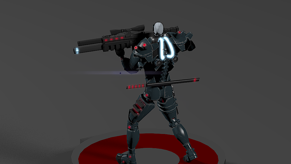
The gun and knife wont be included in the model. They are just something I made to complement the character. After the contest,I my model wont get nominated or whatever, if people like it I will post everything on Blendswap.
I named the gun Kmaru S-1(fictional assault rifle).
The model moves using a system of pistons(hidraulics) and some mechanic joints. Though I did spare time to rig the pistons, the rig is unfinished since I wanted my main focus to be on the model. And the contest did not say anything about a rigged model…sooo. I think the work so far should do the trick.
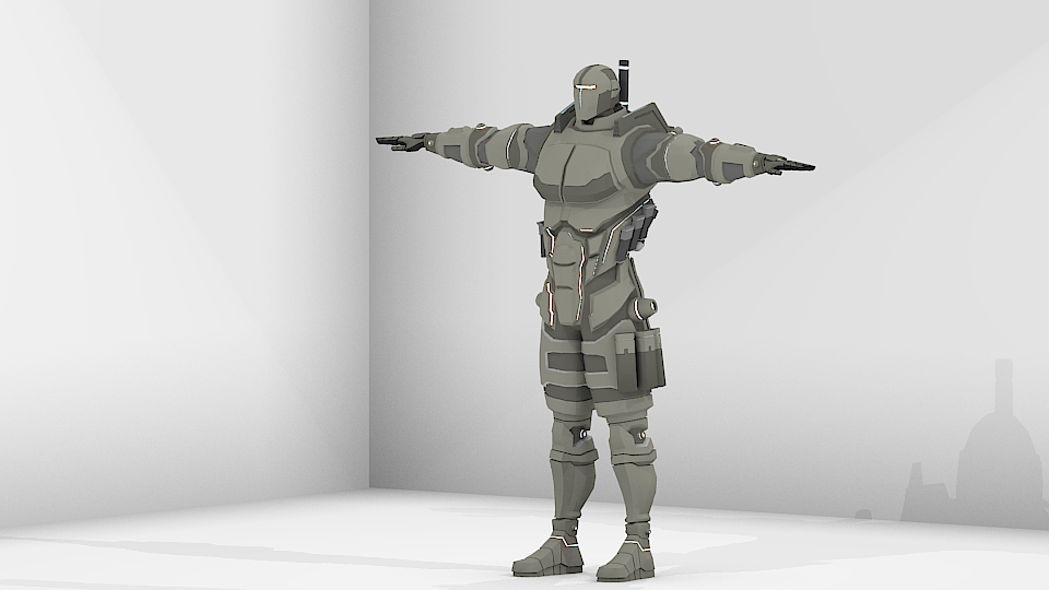
your models are good, but bit out of proportions. like head is too small , compared to the body. Gun looks to large. Some of the geometry looks unnecessary around shoulders (vanguard).
correct and re-post. A multi color bokeh effect is what i recommend for background.
Also, I doesn’t matter , if none is replying to your post, or isn’t giving you a feedback. Designing/Modeling is a passion and passion requires no ones approval or feedback.
Finished rigging but maybe I will spare some more time cleaning up. The deformations in the ‘ass’ area are almost fixed. Only some kind of background is left to add and include effects…maybe.
Some poses Im working on. So many ideas, I would not know witch to send to the contest.
The head looks a bit small. Could you make it bigger by any chance? I don’t quite like the textures. Maybe if you could make them a bit more steel-like.
Topology-wise, Im aware that this head is small compared to the body. When I started my idea was to make comic-like figure where the body of the protagonist is muscular and huge compared to the head, and on the other hand you have the antagonist who has a larger head compared to his body.
The other way I wanted to aproach this I wanted to create the feel that the hero is wearing a combat suit, thats why the head is so small.
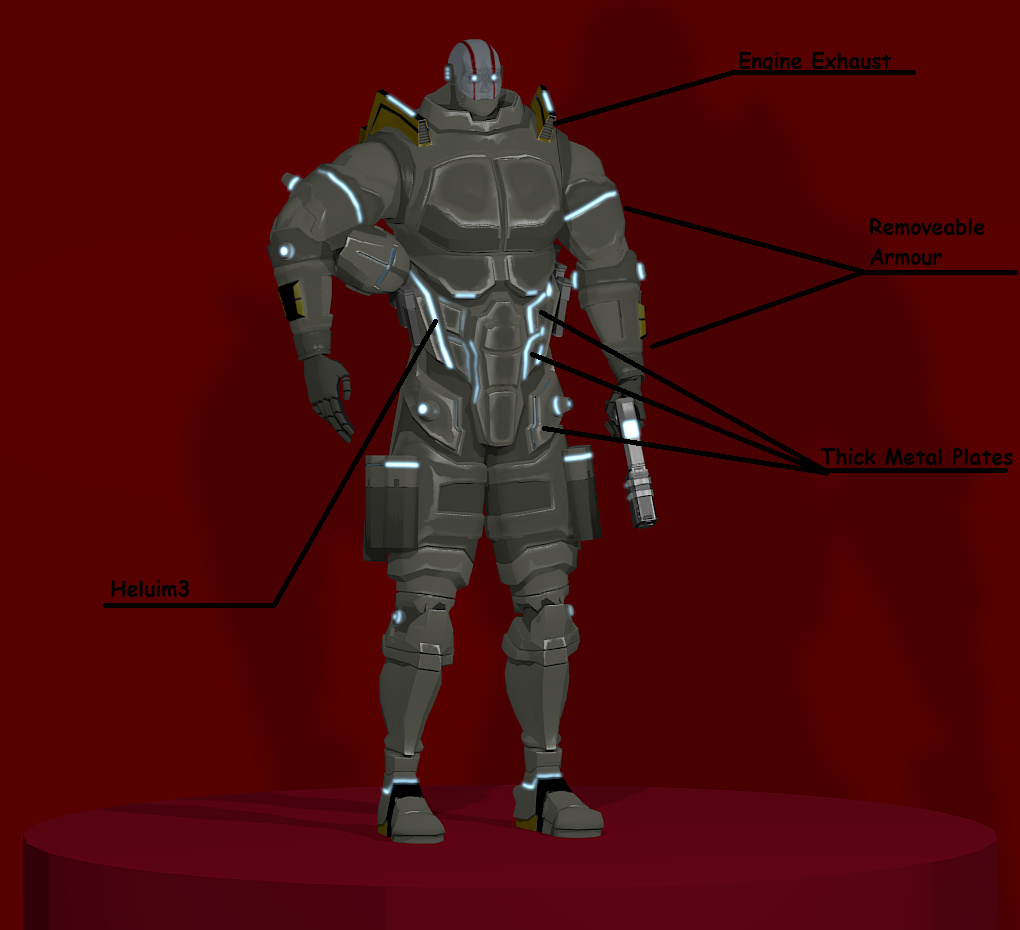
About the textures, I cant disagree with you. I know they can be better. Im trying to make everything in Blender and the proccess is bumpy. I want to make them more steel-like aswell.
Do you have any suggestions how can I aproach this and witch parts of the armour need more work in your opinion? I wont use cycles FYI. No fancy computer here. I still have 1 day left.
If I dont win anything I will share this model on Blendswap or I will give it to someone that likes it. I realy realy want to see the model rendered in Cycles or whatever. My PC cant handle heavy renders.