Thanks for the suggestion and the crits it’s what I need the most at the moment.
The hole is still on the list to do. I know it is kind of late but I thought to do it with textures but realized that texturing won’t do if the apple is so close to the camera. The bad thing is I have to do the UV mapping again
I just hope I’ll have the time… :spin:
It probably depends where you bite the worm if he actually dies or survives but it’s a common myth that worms like this survive when torn apart and that each part lives on.
well, I am not referring to the myth of a worm, where both parts living on.
I just meant (and for a fact: did read that just now in wikipedia),
that you can cut of the back part of a worm and he will live (if no infection takes place). But that is only true until you come to the thicker segment in the midst of the worm. Cut
that or further to his “head” and he will die.
Yes my intention is to do a more cartoonish scene as I believe I lack the skills to do a more realistic approach in the time given and considering that I only have a week left and I need to go to work it looks like I choose correctly :).
Thanks loramel exactly what I needed. I wonder why I didn’t check with the manual as that is normally my first place to look… As soon as I’m at home I’ll try it out and post an update.
Ok I managed to get the image updated. Afterall I think I will be able to produce a finished image. Maybe not as I desired but at least I can call it ready for the contest. (Not that I see a chance of winning :no:)
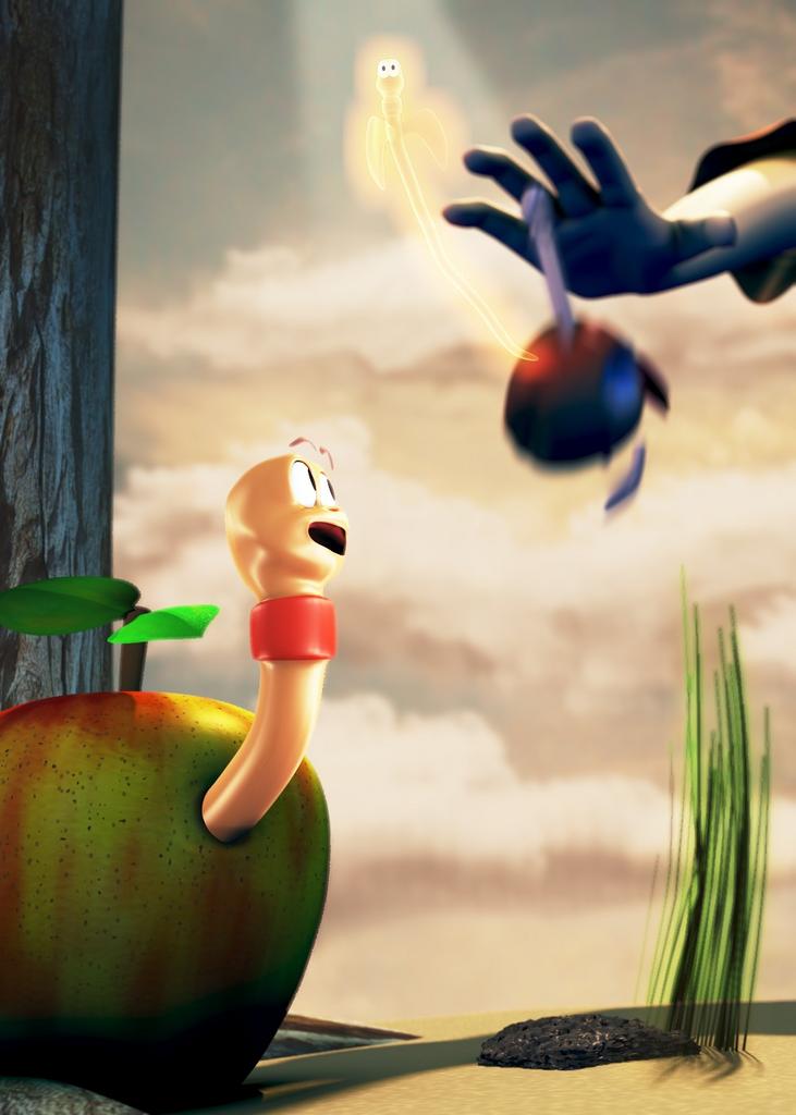
Anyway The new update is a preview without OSA so ignore the jagged edges. I added a background and brought the hand and the bitten apple a little more into the center.
Added some noise patterns to the apple up front and tweaked the worm material some more. I changed the expression of the worm slightly and gave a slight contour to the ground which isn’t really visible but is there.
I’m still working on a texture for the worm and a normal map to give him some structure but not sure if that will be done by the end of the week. And I’m working on to give more structure to the ground and add some stones and some grass to fill up the empty space and give some more guidance to the viewer. Let’s see how that works.
Advice, nodes, nodes, nodes and more nodes, go to the blenderwiki documentation section on the main page that should help.
Worm on the floor looks like he’s smiling and grinning, open the mouth more upwards, express shock to yourself in the mirror to see what I mean.
Worm could probably benefit from more depth on the skin, wrinkles, softer look in general etc. Tree needs bump mapping and a bit more work on the texture.
Darken the background scene to pull out the contrast between the lighting and the worms.
Dead worm needs a bit more depth and more roundness, right now he’s too 2D. Also his expression needs work, perhaps he should be looking towards the clouds in awe?
The worm is still in work. It doesn’t have a texture yet. But I’m working on that currently.
About the softness are you suggesting to reduce the hardness of the material or do you think I should rather try to increase the SSS? The material is giving me a hard time as I want a wet look but still a organic soft look. So any pointers in that direction are greatly appreciated.
The tree actually has a bump map, maybe if I increase it it will be more dominant. There is also a Defocus node on the scene so maybe the blur reduces the bump and I will try to give it more light as the only light source is momentarly a sun light and a hemi fill light.
I don’t see how I can make the dead worm less 2d as he is pretty blurred do to the vector blur. I experiment a little to see what I can do. Maybe more lights.
And I do not understand your node node node comment as this scene is heavily postprocessed using a node network and approximately 10 renderlayers so could you please specify what exactly you mean?
The contrast is a problem as I do not want the backdrop to be too dark but I want the angle still visible. Guess I’ll have to figure something out. I put it on my todo list.
I’d probably have put in a bloom and or HDR nodes settup. Probably want to tweak the colourmap and ramps there a bit too to emphasise certain details. You could probably use material nodes to handle the worm a bit.
Rather than using high spec values, try lowering them and spreading the lighting, make the SSS softer, not sure how to do that, go for a more skin shader look. Bump map and add a few wrinkles, as well as perhaps a tiny bit of reflection thrown in on top. You could probably edit the spec maps a bit too in the textures to get a nicer skin effect.
Also the ground would benefit from getting a bit more work into it, perhaps bump mapping with a dark ground texture of sorts. From the angle you’re shooting from, the clouds are too low, you would be seeing their undersides, not the tops.
Good luck. It looks good so far, excellent idea.
Thanks for the prompt reply.
I try to get that softer look once I have the basic textures setup for the worm. Probably try to lower the spec value and hard value to give it a softer look. Maybe even try a different spec shader. I’ll probably stay away from node materials as I have little experience with them and not a hell of a lot of time left.
The ground is currently in work. I have added bump and color textures to it to get it to look not so uniform but the render wasn’t finished when I went to work so I couldn’t post it.
I will see what I can do with the clouds.
Ok a small update that addresses some of the problems. The worm still has not textures and I haven’t changed the sky texture yet. I also added some textures to the ground and added the stone and the grass.
I tried to give the worm in the background some more light to make it more 3d but haven’t succeeded yet.
I’m planning on adding some more grass and making it larger thinning it out what is there at the same time.
I also need to tweak the color some more at the moment the whole image looks too sepia to me.
Again, the image would benefit a lot from a change in facial expressions.
You’ve done a good job with the ground, it makes a bit more uniform although I have to admit I didn’t realise apples grew in the desert =).
Actually I discovered too late that I forgot to change the ground color :o and there was no time this morning to do a rerender befor going to work. But hey the Dubai have golf fields in the desert why not apple trees?
Yeah the worm expression is in the making as are the textures for the worm. Going for a more O shaped mouth. This update basically just incorporates the stone the gras and the ground. All other updates will have to wait til next time … hopefully.
I also am thinking about adding more grass and maybe a flower in the background to give the background some more details. But I’m not sure that I will make it for the deadline. Probably going for a more refined version of this piece after the contest if I still have the muse for it.
Thanks again for your critics and I hope others will critic as well.
w:cool:w that was cool!!! nice!!! how i wish they post that at my forum site!!! www.onegig.co.ccso that my friends will see some of your graphics art works:spin:
well, when I compare your angel-worm with other “angels” out there, I mostly
see wings, that are gigantic compared to the body. His seem to be a little to
tiny
Other than that: I like your progress, especially on the lower apple and the overall
look!
On my first try I actually had bigger wings (not displayed in here) and I though it distracts too much from the rest of the scene because of the glow and stuff so I decided to go with the small wings. I actually also considered no wings at all but didn’t like that too much so I went with this compromise.
Thanks again for the criticism and keep it coming.
Ok here is my final image. Not quite as I imagined it to be but time just ran out. At least I can say I finished it.
Not sure if I will edit it again but if I find the muse I might go and make a second version of it…
Anyway good luck to everyone and I hope you like the image: