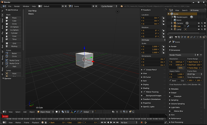
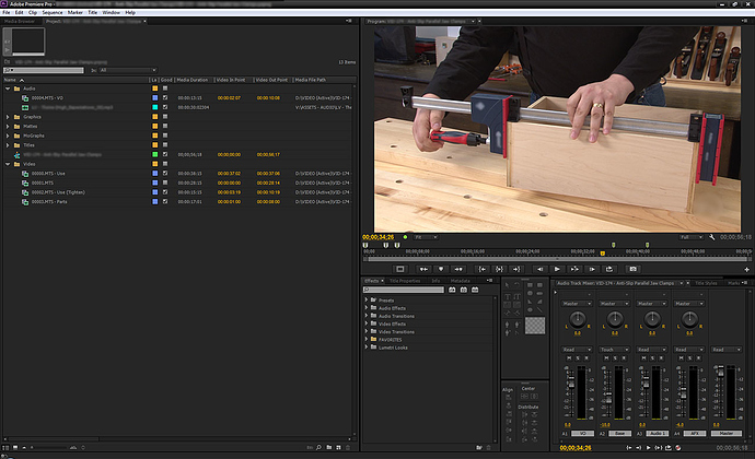
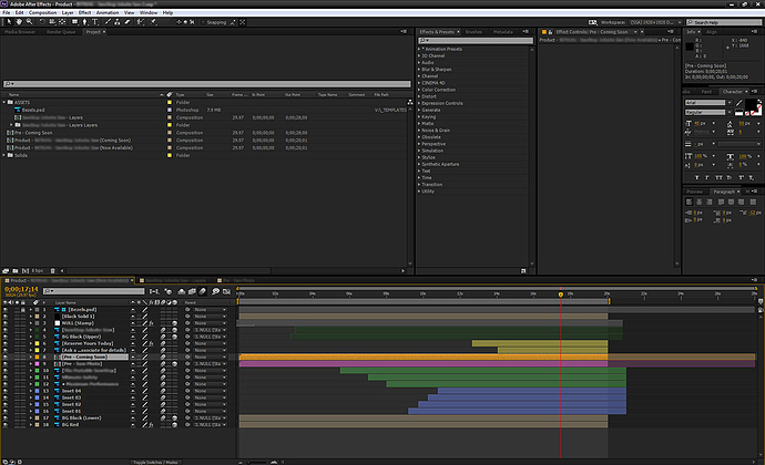
I’m just starting to get into Blender both for work and personal use. Since I’m a video editor who works extensively with the Adobe CC suite, I tweaked my Blender theme to match the darkest UI settings in Adobe CC (2013).
- Adobe CC Dark v1.2
I’m sure there may have been settings I missed, so please let me know what you think!
Update v1.2
- darkened the grey used for 3D View > Grid, to be less intense
- darkened the grey used for Info Panel > Header Text to be readable when error notices appear
- darkened the red used for the Current Frame indicator on all animation panels
Update v1.1
- adjusted the look of User Interface > Regular to better match the rest of the theme
- adjusted the look of User Interface > Toggle to better match the rest of the theme
Also available on Blend Swap (for forum lurkers).
Attachments
adobe_cc_dark_v1-2.zip (4.78 KB)


