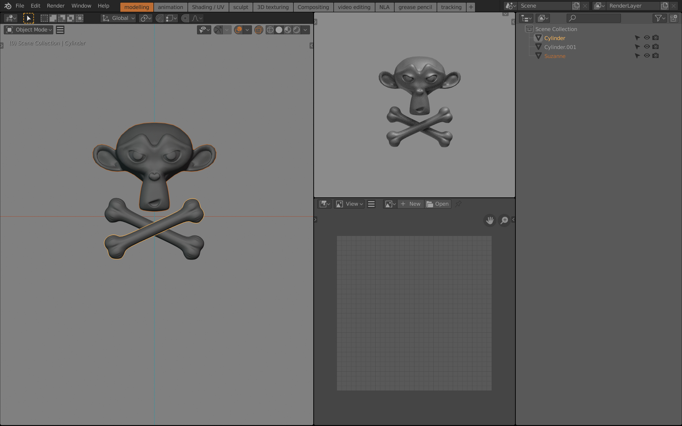
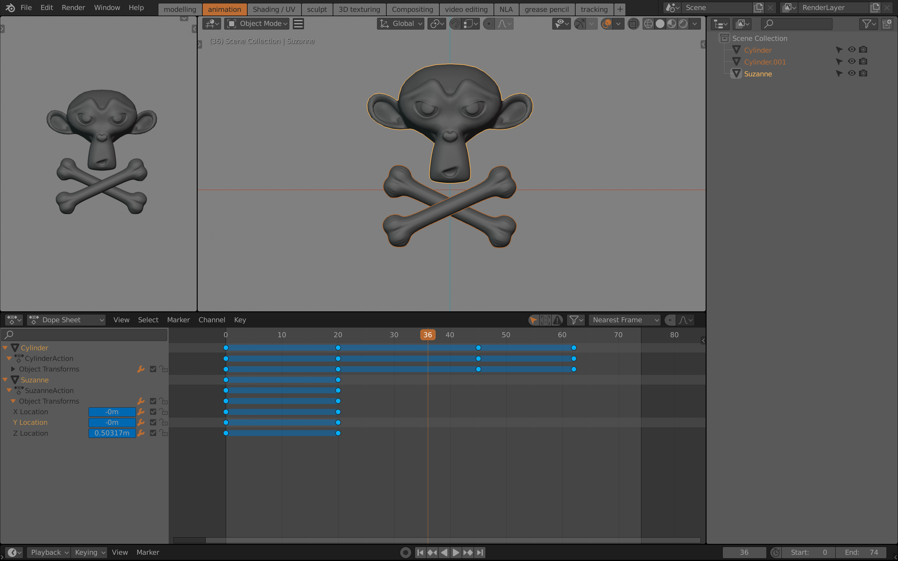
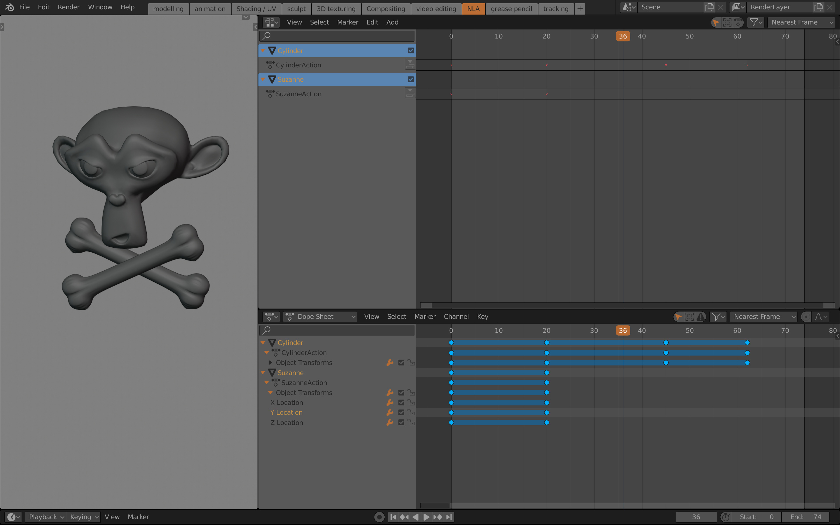
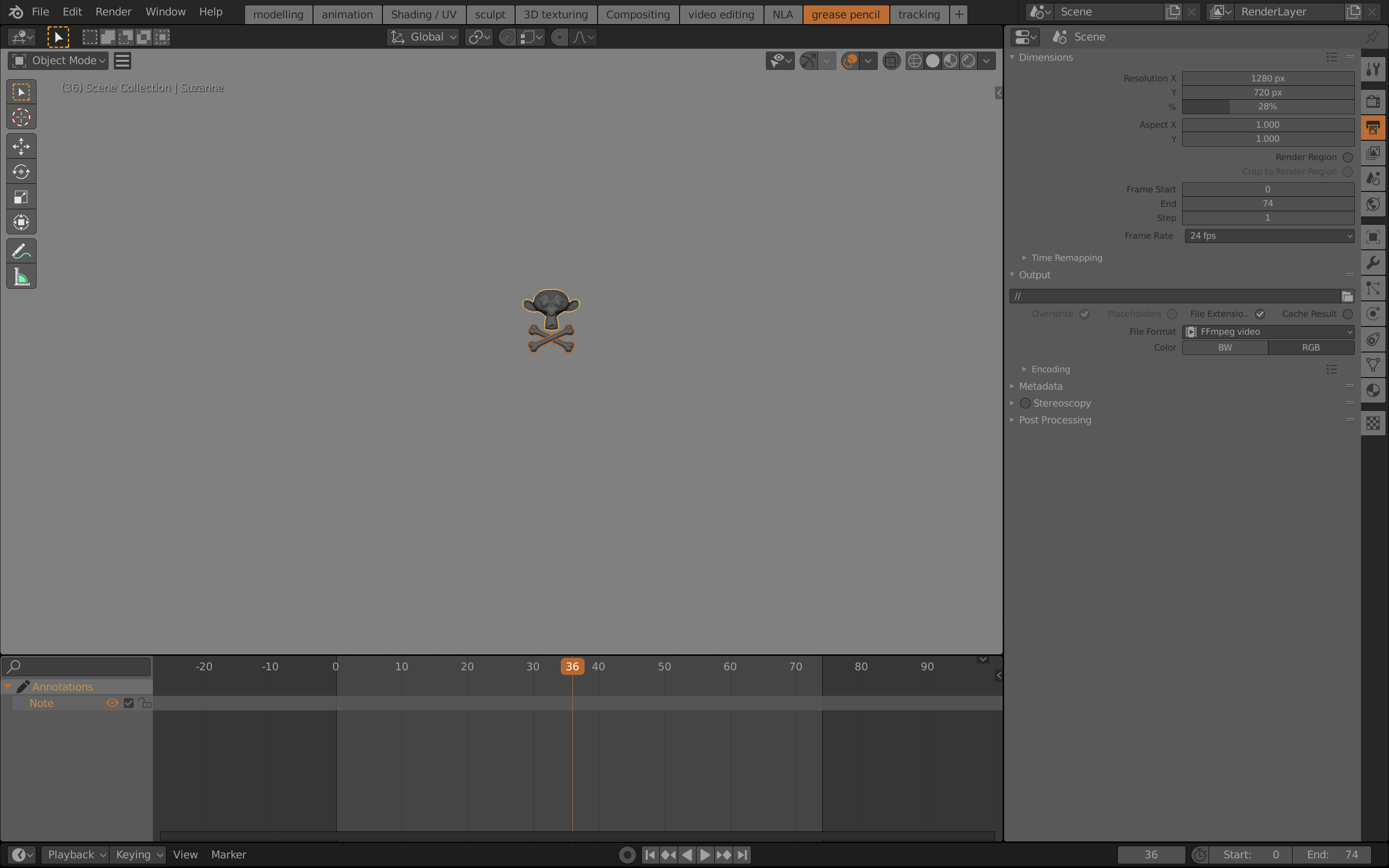
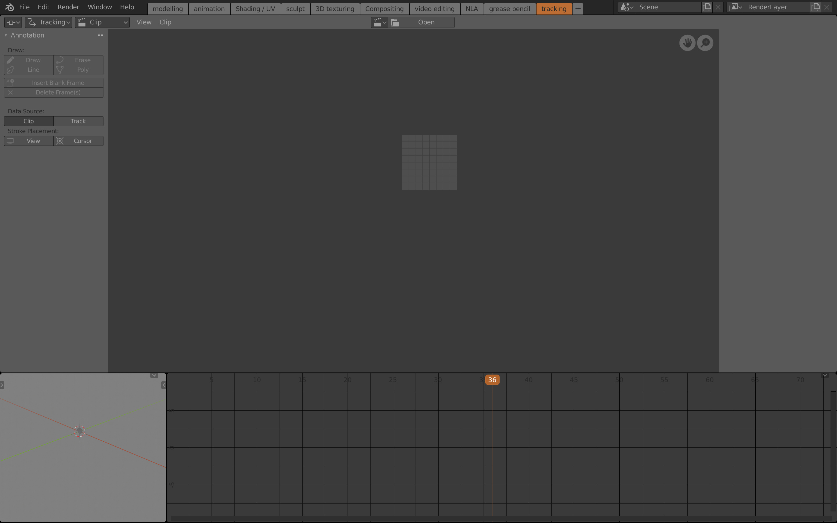
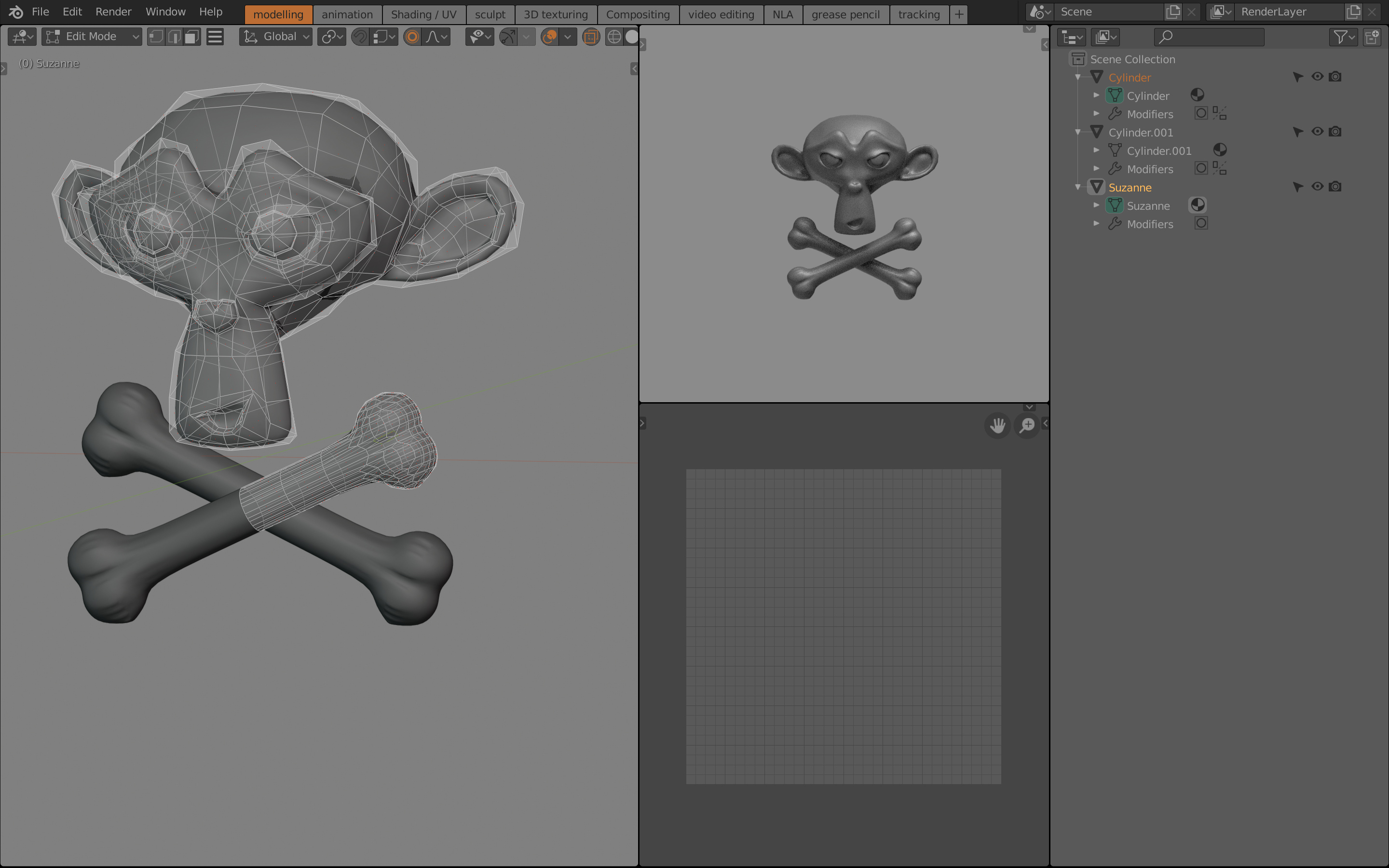
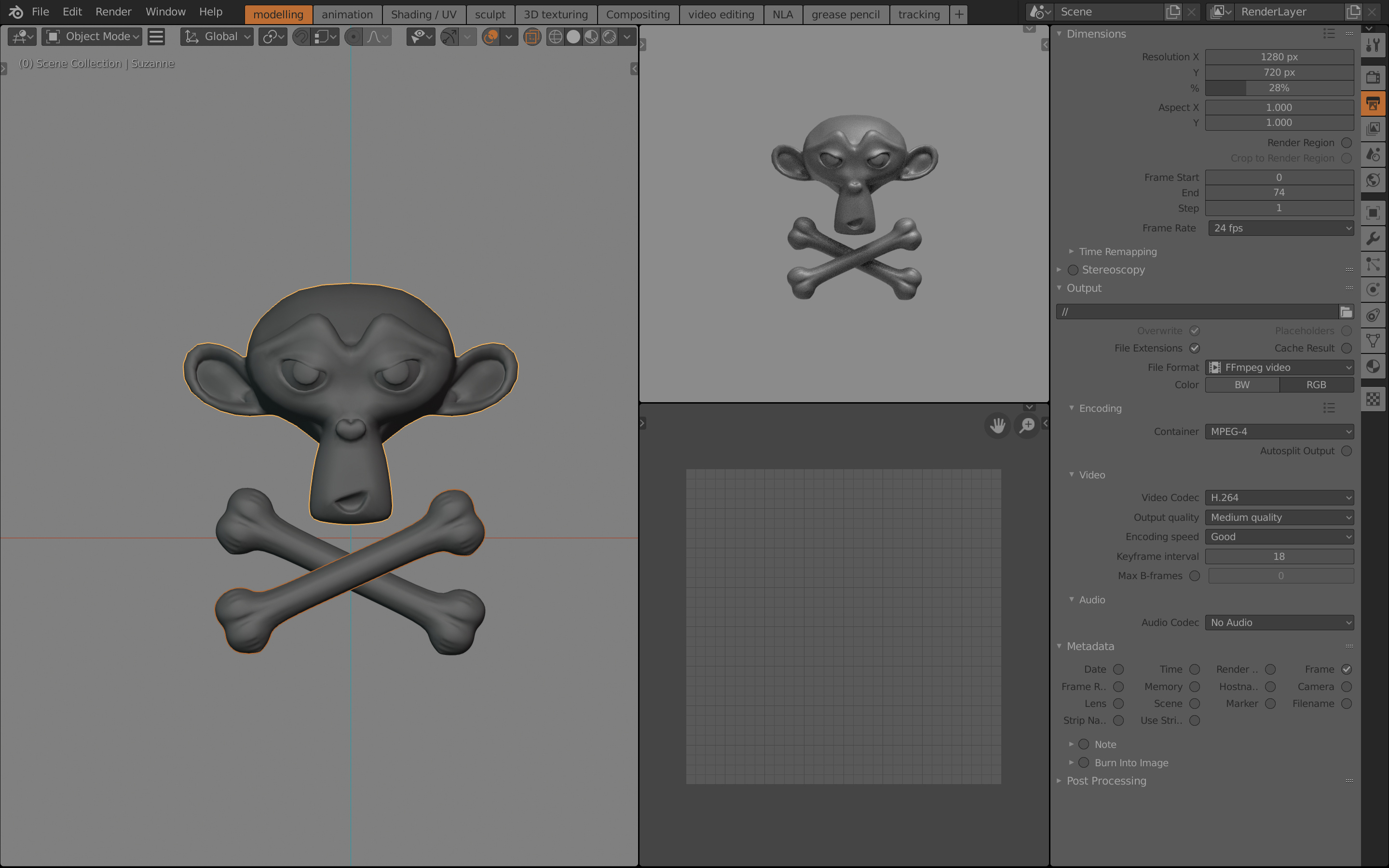
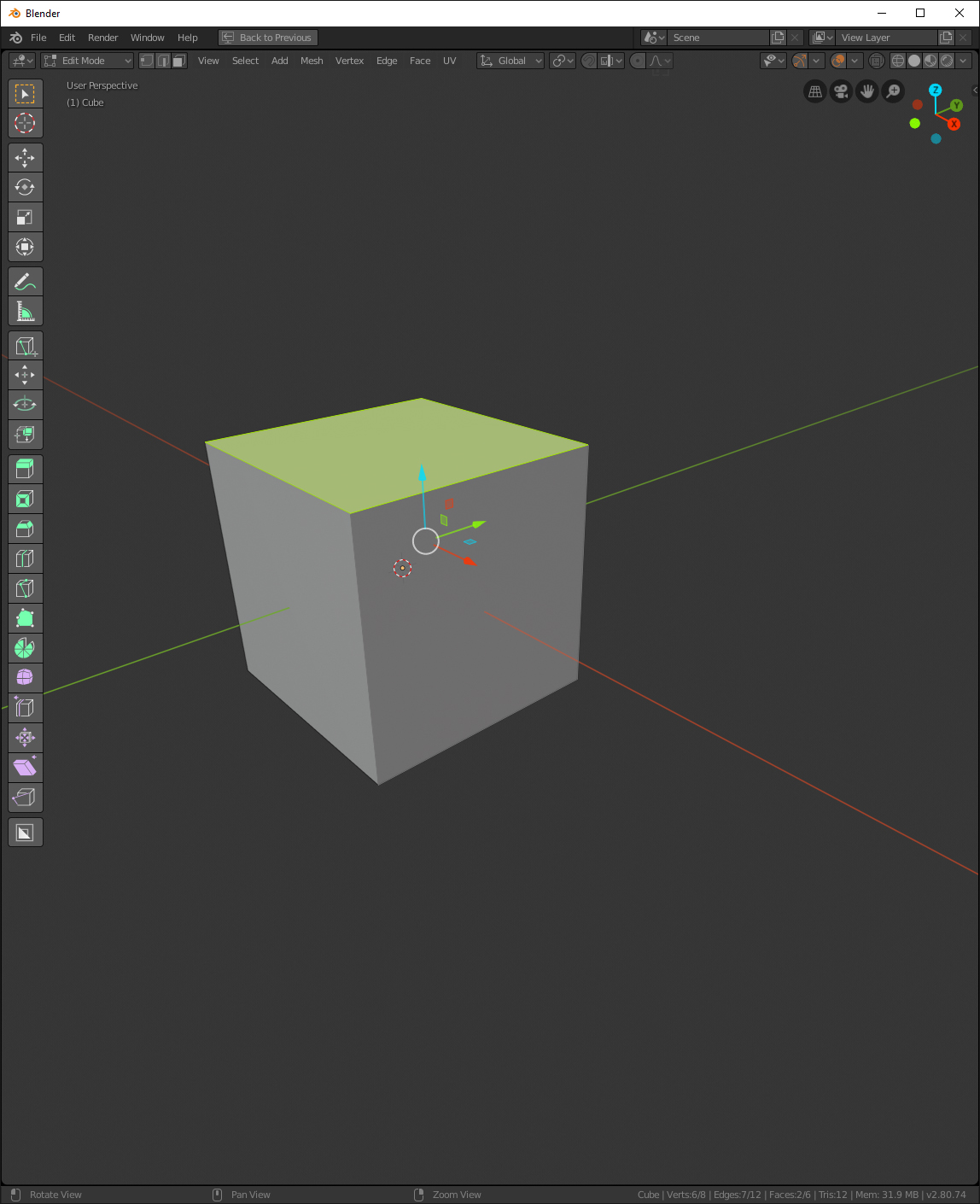
Hy there! If you consider blender default themes are too much darker or brighter, this is your theme. This one is the result of had being working several months in UI themes. At the same time blender 2.8 was redefiying its interface, I was recopiling some experience making UI Themes. Feedback welcome
SOME CONSIDERATIONS ABOUT THIS THEME:
1.minimalism vs noise:
Sobriety have priority in case of doubt. So we should consider any element (like colors, outlines, lines, icons …), something that can
impair the overall look. As example, this does not mean you can not use outlines, but use them carefully.
2.Colors:
UI must be as neutral as possible. Too much colors in the UI can distract from that really matters, your artwork, that is in the 3D viewport. The rest of windows are
absolutely secondaries.
3.Highlighting:
There are many ways to think about a theme. This one is based on a hierarchy of highlighting
4.Thin vs Thick
Blener offers 3 options about UI edges. I highly recommend thin option, is just a question of elegance.
5.UI is alive:
Does not exist the ultimate theme. This theme works under this premise, so expect constant tweaks and updates.
I like the theme - the hard corners and the muted colors are really easy on the eyes. One thing that I notice is an issue for me anyways is the non active selection color when using the default studio matcap. It’s too faint and difficult to see when selecting multiple faces on a mesh, for instance.
thanks for sharing, it is very hard to make themes for blender and Im not huge on the default one, so it is great to see a theme that I see myself using!
a couple of things I wonder about themes, so this are kind of notes/questions and would be cool to have your view on this topics:
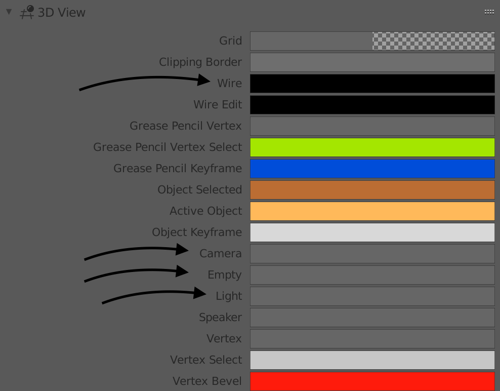
1- why not using different colors for lights and cameras and helpers? I never understood why blender doesnt differentiate that by defaults, since it is so useful to just look at wireframe and instantly locate visually all those different elements.
2- there is no contrast on the outlined rows, I believe that can be useful
3- the menus have really now contrast (like file>, edit> etc…), while low contrast can be nice on the eyes, this is at a level that makes it hard to read.
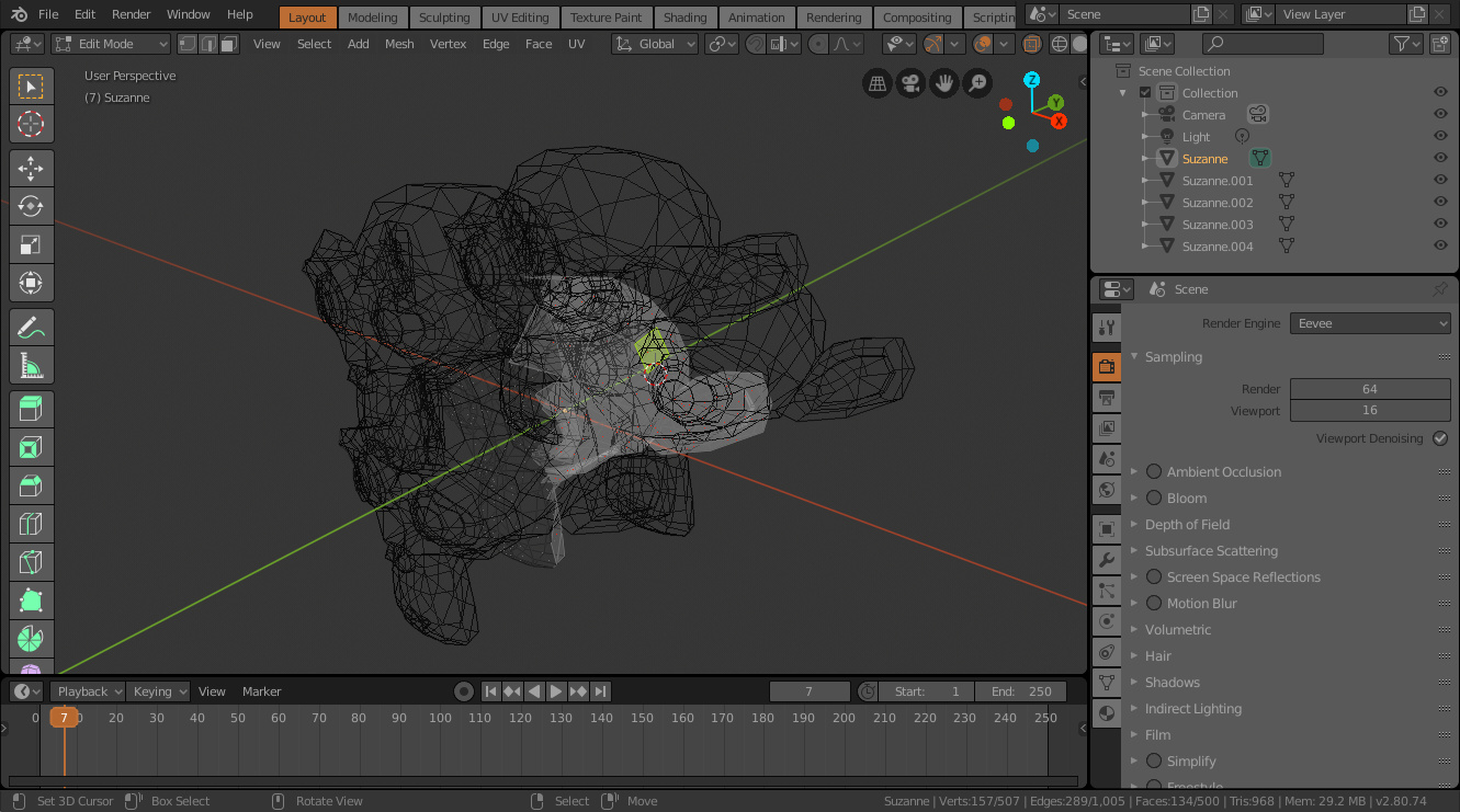
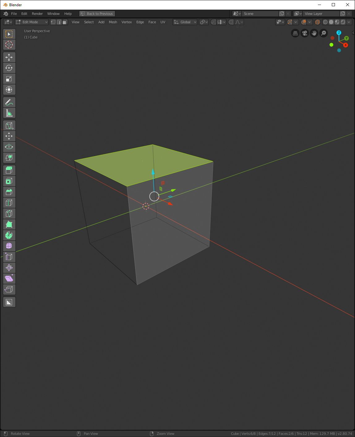
4- the wireframe on edit mode is difficult to see when you are editing a model overlapping several others. like this:
I agree, and the reason of that in my opinion, is the balance of all elements what is hard to achieve. Because the same element works fine in a specific context, and it doesn’t in other context.
about the issues you comment, doesn’t affect me especially. But you can solve here: